
Plotting correlations with Python is a relatively straight-forward affair. For this example, I have provided a basic correlation dataset which is in a CSV file. If you have your own dataset, you can obviously use that, although if you have it in a different format, you will likely have to import it into your Python code differently.
In order to follow along with this, first open your terminal and install the following Python modules unless you have already.
pip install numpy

pip install pandas

pip install matplotlib
Then create and open a new .py file and add those modules as imports like so:
import numpy as np
import pandas as pd
import matplotlib.pyplot as plt
The ‘as …’ allows us to alias the module to a more succinct series of characters and allow for more idiomatic Python code. For example it would be an absolute ballache to type out matplotlib.pyplot every time we wanted to access a function from that module, so instead we alias it to ‘plt’ and then we can simply call plt.whatever whenever we want to use function from that module.
Next we need to get the data into the programme. For this i’m going to assume you have the data saved in the same directory as your .py file. My example dataset which can be downloaded from the link below is called ‘memes.csv’. In this dataset we have two columns which we want to correlate. ‘Memes’ and ‘Dankness’. Note that this is case sensitive. Ideally you wouldn’t mix cases in your column names, but I have because I’m a buffoon and it’s too late to change it now.
We can use the read_csv function from the pandas python module to import the dataset. This will take the csv and turn into a lovely pandas DataFrame, which makes it nice and easy to manipulate the data. In order to access the individual columns we can simply pass the column names as below:
data = pd.read_csv('memes.csv')
x = data['Memes']
y = data['Dankness']
Now we have two variables, x and y, which we can correlate.
To do this, we can simply call the plt.scatter function, passing in our data. If we add the plt.show() function and run the programme we will see this:
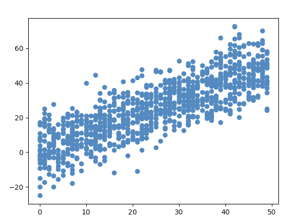
Python generated correlation with Matplotlib and pandas
plt.scatter(x, y)
plt.show()
But we’re not finished there. As any mathematics teacher will say, we need to add titles to the plot and axes, and we need to add a line of best fit.
Adding the titles is the simplest thanks to matplotlib, so let’s start with that:
plt.title('A plot to show the correlation between memes and dankness')
plt.xlabel('Memes')
plt.ylabel('Dankness')
In order to add the line of best fit we need to do the following:
plt.plot(np.unique(x), np.poly1d(np.polyfit(x, y, 1))(np.unique(x)), color='yellow')
Finally if we wanted to print the correlation coefficient, we could use the numpy function corrcoef like so :
print(np.corrcoef(x, y))```


Here is the full code from this tutorial:


```import numpy as np
import pandas as pd
import matplotlib.pyplot as plt

data = pd.read_csv('memes.csv')
x = data['Memes']
y = data['Dankness']

print(np.corrcoef(x, y))

plt.scatter(x, y)
plt.title('A plot to show the correlation between memes and dankness')
plt.xlabel('Memes')
plt.ylabel('Dankness')
plt.plot(np.unique(x), np.poly1d(np.polyfit(x, y, 1))(np.unique(x)), color='yellow')
plt.show()
This post was originally published here, where you can also download the example dataset we used for this tutorial.


Oldest comments (0)