
TL;DR
Through this article you can learn
- the basic method of React component testing
- how we test Semi Design react component with Jest/ Cypress.io/ Chromatic.
- how to combine test report of multiple test tools
Estimated reading time: 25 ~ 30 min
Related Introduction
Semi Design is maintained by the Douyin front-end and UED teams. It is committed to efficiently connecting designers and developers, linking DesignOps & DevOps, and providing a modern design system with high customization capabilities, 🎨 Provide more than 2,300+ Design Tokens and powerful DSM tools, easy to make Semi Design to Any Design
At present, Semi Design (@douyinfe/semi-ui) provides 60+ common components for Enterprise project. These include simple components such as Button, Input, Card, and complex components such as Form, Table, TreeSelect, Cascader. These components follow Semi’s design language by default, and users can also customize the package based on application scenarios.
In order to maintain the consistency of UI and interaction for each component during version iterations, the testing of component libraries is particularly important. In this article, we will share the following content around the theme of “How We Test Semi Design React Component”:
- Why should we test the component library?
- How to evaluate the test effect?
- How to implement component library testing?
- How to combine CI for testing?

1 Why test and what to test?
1.1 Why
Semi ui provides general and customizable React components. We need to ensure that the basic interaction of the components can work normally, for example, clicking a button can trigger a button click event, and clicking a selector can trigger an option selection event, etc.
In addition, Semi components have a set of standard design language by default, including text, color, size, spacing, etc. We need to ensure that the component display conforms to Semi's design specifications.
1.2 Where
// Semi Github Repository Directory
├── semi-animation          # js animation
├── semi-animation-react    # react animation
├── semi-animation-styled   # style animation
├── 👉🏻 semi-foundation      # foundation
│   ├── button
│   ├── ...
├── semi-icons              # icon
├── semi-illustrations      # illustrations
├── semi-theme-default      # theme
├── 👉🏻 semi-ui              # react adapter
│   ├── button
│   ├── ...
├── ...                     # Packaging related

// https://github.com/DouyinFE/semi-design/tree/main/packages
Semi component library is a React component library based on the foundation + adapter architecture. The foundation layer includes TypeScript code that has nothing to do with front-end frameworks such as React, Vue, etc. The adapter layer is a React implementation based on foundation. Our test scope is these two layers related code.
-
foundation:
@douyinfe/semi-foundation, includes framework-agnostic TS code, which is converted to JavaScript code when the component is published -
adapter:
@douyinfe/semi-ui, includes React UI code
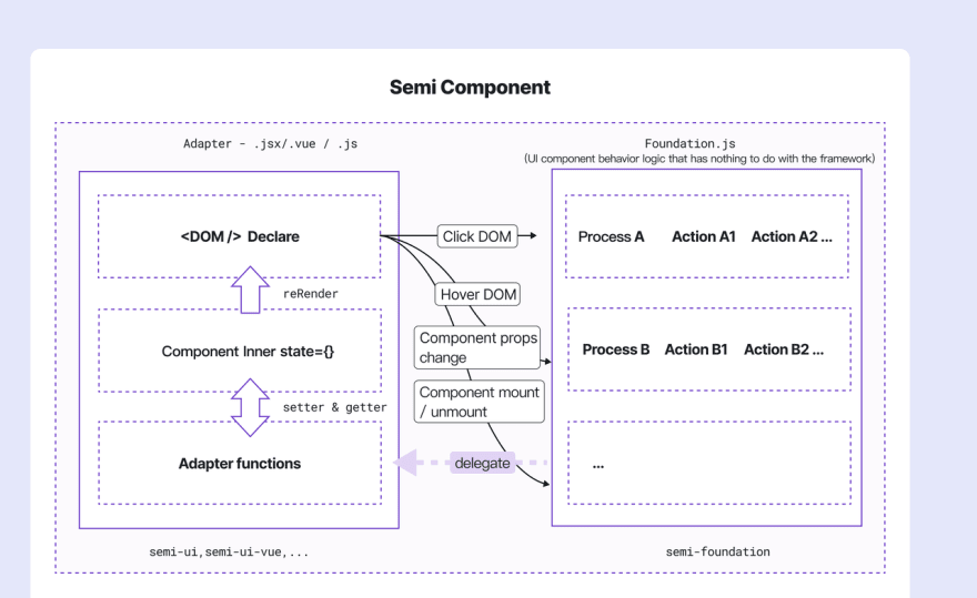
In addition, the animation of Semi components relies on semi-animation related packages, which are not in our testing scope due to less dynamic changes and high testing complexity.
2 How to evaluate the test?
Test evaluation includes two aspects: test pass rate and test coverage. The test pass rate is the bottom line, which ensures that the tested functions will not be affected by version iterations, and the test coverage rate measures whether the test code is comprehensive.
During the development of the component, we will use the manual test method to check whether the component function can run normally, and in the iteration of the version, we need to use the automated test to help us test.
2.1 Manual testing
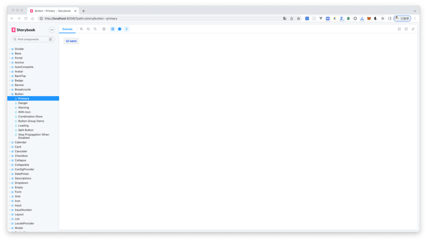
In Semi's component development process, we will first start a Storybook project, develop component based on Storybook, and write use cases corresponding to our component API through stories. With these use cases we can browse component styles and test component interactions
For example, in the image below, we create a story for the primary type of the Button component, and manually check whether the background color and font color are correct.
export const Primary = () => <Button type="primary">UI semi</Button>;
2.2 Automatic testing
Manual testing is only suitable for the development phase, and there is no guarantee that the component will maintain the consistency of UI and interaction during the iteration process. Therefore, we need to introduce test tools to help test. Semi Teams generally writes test cases after component development is complete. We test the functionality of the component by writing test cases, and then check whether the UI display and interaction behavior of the component meet expectations according to the pass rate and code coverage of the test cases.
2.3 Code coverage
In addition to the pass rate of manual and automated tests, code test coverage is also an important criterion for test evaluation. According to Wikipedia's definition,"Code coverage is a measure in software testing that describes the proportion and extent to which the source code in a program is tested. The resulting proportion is called code coverage". Code coverage includes function coverage, statement coverage, condition coverage, judgment coverage, and line coverage.
- Function coverage: are there calls to every function in the program? Whether the function has been called.
- Statement coverage: is there a call to each statement? In JS, values, operators, expressions, keywords, and comments are all statements.
- Condition Coverage: is each condition in each logical expression (logical expression that cannot be decomposed any more) executed?
- Judgment coverage: is there a call to every branch in the logical expression? The "if instruction" is true or not.
- Line Coverage:has this line been executed? A line may contain multiple statements and branches.
3 Semi Component Library Test Method
There are three testing methods for Semi component library, namely unit testing, E2E testing and Visual testing. The following describes the test scenarios of these three and how to use them to test components.
3.1 Unit testing by Jest
What is unit testing? According to the definition of Wikipedia, "In computer programming, unit testing, also known as module testing, is a test work for correctness verification of program modules (the smallest unit of software design)." From the perspective of the Semi component library, unit testing is the testing of components.
3.1.1 Technical solutions
Semi unit testing technical solutions:
- Test framework: Jest, which provides functions such as runnable environment, test structure, test report, assertion, mocking, etc.
- Auxiliary testing library: Enzyme, mainly used for React component render
- Auxiliary test library: JSDOM, which provides a DOM operation environment in the Node environment and is used in conjunction with Enzyme's Full DOM Rendering scene
- Auxiliary test library: Sinon, provides spy, stub, mock for event testing and callback function testing
3.1.2 Test content
Semi unit tests mainly include:
- the correct DOM tree the component should be rendered in
- Whether the properties of the component are passed correctly (whether the method is called correctly, etc.)
- Whether the individual behaviors within the component respond correctly
3.1.3 Common API Examples
🌰 For example, we want to test whether the className or style of the Button component is correctly rendered:
import Button from '../index';
describe('Button', () => {
    it('button with custom className & style', () => {
        // Mount a Button with className and style
        const wrapper = mount(<Button className="test" style={{ color: 'red' }} />);
        expect(wrapper.hasClass('test')).toEqual(true);
        expect(wrapper.find('button').getDOMNode().style.color).toBe('red');
    });
});
🌰 Or test that a Button with an icon renders the icon correctly:
it(`button with icon`, () => {
    const iconType = `semi-icon-edit`;
    const elem = mount(<Button icon={<IconEdit />} />);
    expect(elem.find(`.${iconType}`).length).toBe(1);
});
🌰 Test that the component's properties are passed correctly:
it('input', () => {
    const input = mount(<Input  />);
    expect(input.state().disabled).toEqual(false); // read state directly
    expect(input.props().disabled).toEqual(false); // read props
 })
🌰 Modify the state and props to test whether the component UI state has changed correctly:
// Simulate the external state changes of the component through the setState and setProps interfaces
// test whether the UI responds correctly when the component state changes dynamically
it('change props & state', () => {
    const input = mount(<Input />);
    input.setProps({ disabled: true }) ;
    input.setState({ value: 1 })
    input.update();
    expect(input.props().disabled).toEqual(true);
    expect(input.state().value).toEqual(1);
}
🌰 Test that the component's event callback is called:
 it('input should call onChange when value change', () => {
     let inputValue = 'semi';
     let event = { target: { value: inputValue } };
     let onChange = () => {};
     // Use sinon.spy to encapsulate callback functions
     // Function call information can be collected after spy
     let spyOnChange = sinon.spy(onChange);
     const input = mount(<Input onChange={spyOnChange} />);
     // Find the native input element, trigger the simulation event
     // simulate the value change of the input
     input.find('.semi-input').simulate('change', event);
     expect(spyOnChange.calledOnce).toBe(true); // onChange callback is executed once
 })
3.1.4 Some Tips of jest / enzyme
- 3.1.4.1 Mount a component with a popup layer, but can't find the DOM corresponding to the popup layer?
Enzyme's default mount will only mount the component itself to a div container, not to the document. The pop-up layer is inserted into document.body by means of appendChild, so the container of the portal cannot be found. If it is not inserted, there will be no pop-up layer.
Use attachTo to mount the container to a specific div in the body. Note that you also need to create and destroy in beforeEach and afterEach.
// mount(component, { attachTo: container })

describe('AutoComplete', () => {
    beforeEach(() => {
        // Avoid `attachTo: document.body` Warning
        const div = document.createElement('div');
        div.setAttribute('id', 'container');
        document.body.appendChild(div);
    });

    afterEach(() => {
        const div = document.getElementById('container');
        if (div) {
            document.body.removeChild(div);
        }
    });

    it('custom className & style', () => {
        let props = {
            className: 'test',
            style: {
                color: 'red'
            }
        };
        const wrapper = mount(<AutoComplete {...props} />, { attachTo: document.getElementById('container') })
    });
})
- 3.1.4.2 JSDOM does not contain a Layout engine, so when calling the getBoundingClientRect function and getting the offsetWidth, it always returns 0?
We can use getComputedStyle to get CSS properties, #135
- 3.1.4.3 Error when import es module in jest
For example, when we import { get } from lodash-es. Error reporting By default, modules in node_modules will not go to babel-jest, while lodash-es exports ES modules, and CommonJS is needed in the Node environment.
Solution:Put all packages under node_modules that need to be compiled with babel-jest, Configure the corresponding module path in transformIgnorePatterns
// The modules in node_modules that need to be processed by babel-jest are declared here
let ModuleNeedCompile2Cjs = [
    'lodash-es',
    'react-dnd',
    'dnd-core',
    'react-dnd-html5-backend'
].join('|');

jestConfig.transformIgnorePatterns: [`<rootDir>/node_modules/(?!(${ModuleNeedCompile2Cjs}))`]
3.1.5 Advantage & disadvantage
✅ Unit testing is a test from the programmer's point of view. When writing, it is more to test whether the return result of each function in the component is the same as the expected value. It is suitable for testing the state of React components, the invocation of callback functions, and the transfer of parameters and properties. Mounting and rendering of components, etc.
❌ However, this test method has some flaws. It relies more on the trust in the state of the component, rather than testing the real interaction of the user. For some interaction operations that are strongly related to the user, such as scrolling, delay or page jumping, therefore, we also need a test method that can simulate user behavior - E2E test.
3.2 E2E testing by Cypress
E2E is the abbreviation of "End to End". It tests whether the component behaves as expected by simulating the user's actions in the browser.
3.2.1 Plan selection
Semi has conducted research on various test platform tools in the industry (such as TestCafe, Testim.io, Cypress, CrossBrowserTesting, Webdriver.io, Nightwatch...), after comprehensive comparison of multiple dimensions such as ecological perfection, feature richness, GUI ease of use, the feasibility of secondary development of plug-ins, we finally adopted Cypress as our E2E testing tool and Chromatic as our UI testing tool.
3.2.2 Test content
In the early stage of the Semi component library, we used unit testing, which can satisfy most test scenarios, but with the iteration of components, we found that there are some untestable scenarios in unit testing, such as the calculation of Tooltip pop-up position, Slider dragging move a distance, etc. We urgently need a means to supplement these untested and more complex scenarios. After research, we introduced Cypress for E2E testing. Cypress complements existing unit tests, and its implementation cost will be much less than unit tests in the following two scenarios:
- The first one is to use unit tests to write tedious test cases for long operation paths;
- The second is some operations that are not easy to implement through unit testing.
It mainly includes (but is not limited to) the following operating scenarios:
- scrolling behavior:Anchor、BackTop、Table、ScrollList、DatePicker、TimePicker
- DOM location:Tooltip(The location of the popup is currently untestable with Enzyme + JSDOM)
- form submission:Form
- async delay behavior:Notification、Toast
- link jump:Navigation
- complex use case:Tree、TreeSelect、Table
JSDOM is a pure JS implementation of web standards like DOM and HTML for Node.js. When used with Enzyme, JSDOM emulates the DOM manipulation environment for Enzyme.
But there are some limitations like no navigation and layout. JSDOM will return 0 when using layout related functions like getBoundingClientRects and properties like offsetTop .
3.2.3 Common API examples
🌰 Test the scrolling behavior of the Anchor:
 it('scroll', () => {
      // visit storybook
      cy.visit('http://127.0.0.1:6006/iframe.html?id=anchor--target-offset&args=&viewMode=story');
      cy.get('#box').scrollTo('bottom');
      // Check whether the anchor title of the currently selected state after scrolling is doc1
      cy.get('.semi-anchor-link-title-active').contains('doc1');
      cy.get('#box').scrollTo('top');
      // See if the top header whatever appears in the page, i.e. successfully scrolled to the top
      cy.get('h1').contains('whatever').click();
  });
🌰 Test the Tooltip's popup behavior:
it('leftTopOver autoAdjustOverflow', () => {
    const viewportWidth = 1200;
    const viewportHeight = 660;
    const triggerWidth = 200;
    const triggerHeight = 32;
    const leftTopPosition = { offset: { top: 0, left: 0 } };
    const rightBottomPosition = { offset: { top: -viewportHeight + triggerHeight, left: -viewportWidth + triggerWidth } };
    cy.visit('http://127.0.0.1:6006/iframe.html?id=tooltip--left-top-over-auto-adjust-overflow&args=&viewMode=story');

    // Control viewport size
    cy.viewport(viewportWidth, viewportHeight);
    const dataSelector = `[data-cy=leftTopOver]`;
    cy.get(dataSelector).scrollIntoView(leftTopPosition);
    cy.get(dataSelector).click({ force: true });

    // Determine whether the tooltip pop-up position is correct
    cy.get('[x-placement="leftTopOver"]').should('have.length', 1);

    // After changing the offset position of the scroll bar, determine whether the pop-up position of the tooltip is correct
    cy.get(dataSelector).scrollIntoView(rightBottomPosition);
    cy.get('[x-placement="rightBottomOver"]').should('have.length', 1);
});
🌰 Test that the autoplay of the carousel is as expected:
it('auto play interval', () => {
    cy.visit('http://127.0.0.1:6006/iframe.html?id=carousel--auto-play-example&args=&viewMode=story');
    cy.get('.semi-carousel-content-item-active h3').contains('1');
    cy.wait(1300); // Autoplay interval is 1300ms
    cy.get('.semi-carousel-content-item-active h3').contains('2');
    cy.wait(1300);
    cy.get('.semi-carousel-content-item-active h3').contains('3');
});
3.2.4 Advantage & disadvantage
✅ Cypress used by Semi makes up for the inadequacy of the Jest unit test and is suitable for testing the real API of the browser. We can use the browser's getBoundingClientRects to obtain the DOM position information, or pass in pageX and pageY in the mouseover event to achieve Drag to the specified location.
❌ But it is precisely because the test is a real browser, its test case execution time will be significantly greater than the execution time of Jest + Enzyme.
3.3 Visual testing by Chromatic
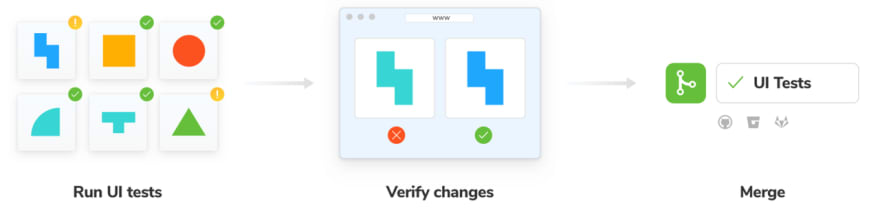
Chromatic is a static component visual comparison test tool that detects the visual differences of stories by comparing snapshots (images rendered by components, or snapshots). Snapshot tests are run in parallel and can run 2000+ tests in 1 minute.
Chromatic can provide us with the following services to ensure the consistency of our UI library:
- Shared workspace. With each code push action, Chromatic publishes a Storybook of the code to its CDN, while providing the team with a shared workspace to comment on and review UI changes together. It works with the Github action used by Semi.
- Provides visual regression in test components. Chromatic turns stories into benchmarks. Each story is simultaneously rendered in Chrome, Firefox and Internet Explorer 11, then compared to a "last known good" snapshot to detect bugs.
- View visual changesets for components affected by each PR. Chromatic compares new and updated components on a given branch to the target branch to generate UI changesets. Use Chromatic for UI testing, no need to write additional test case code, each story is its snapshot use case. The following is a brief introduction to the use process of Chromatic.
3.3.1 Process of UI diff
- Step 1: Build Storybook, publish to Chromatic Cloud

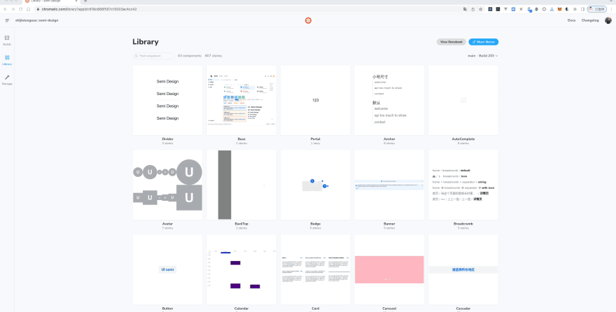
In Chromatic testing, each PR (rebuild after update) is a build process. Currently Semi Design has created 807 stories for 63 components, each story contains use cases of one or more components, and each build will compare the snapshots created by these 807 stories.
- Step 2: UI regression testing, comparing changes, updating baseline
 On the Chromatic platform, we can click the build details to see if the changes are as expected. Accept for conforming changes and deny for non conforming changes.
- Accept:Update the baseline of the story. When a snapshot is accepted, unless it changes, it does not need to be re-accepted (even via git branch or git merge)
- Deny:Marked as "rejected", this build is immediately updated to fail status. A build can reject multiple changes.
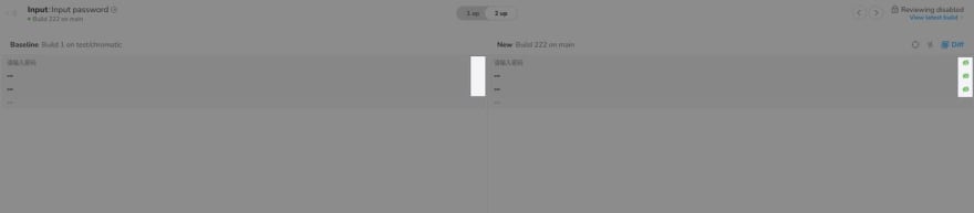
Accept Example: The Input password button has changed. The left is the baseline, and the right is the new build change. You can see that the password button in the non-disabled state on the right side of the picture has become a permanent display, which was displayed when the hover or focus input box was used before. However, this update was expected, so we chose to accept this change.
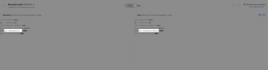
Deny Example: Breadcrumb provides the ability to display ellipses when the text exceeds the set width. The new build on the right below does not show ellipsis, here we expect no change, so choose to reject this change.。
When we find an unexpected change in the style, we first need to reject the change, and then modify our style code. After pushing the code to the Github repository, Chromatic will rebuild it, and finally we review the change again.
3.3.2 Advantage & disadvantage
✅ Chromatic is suitable for UI regression testing of static components. It can compare snapshots of components between different builds, reducing the cost of manual regression testing of component styles. It provides event-triggered hooks that can be fired at different stages of the test.
Through this hook, a message can be sent to the developer after the test is completed to inform the status of the component test.
❌ Of course, Chromatic also has some limitations. Currently, it can only test static components. The number of snapshot tests varies according to different services. The open source free plan only provides 35,000 snapshot tests per month. So we need to choose the timing to trigger the diff comparison more precisely. ( This is reasonable, because we cannot occupy the test resources infinitely)
4 Code coverage statistics
We wrote relevant unit test and E2E test code for the component API. And which line or function in the source code has not been tested, we need to check the code coverage.
Semi uses Jest and Cypress to write our test code, both of them can get corresponding code coverage.
For example, in Jest, we wrote test code such as component callback functions, and in Cypress, we wrote test code for scroll events, and the test report generated by them only includes the code coverage corresponding to the test code.
However, for the component library, what we need is to obtain the overall code coverage of the repository, which can be tested in any way, so we need to combine the test reports of these two parts together when counting the code coverage.
4.1 The principle of coverage statistics
The statistics of code coverage includes two core steps. The first step is to insert a counter in each line of the source code. The second step is to run the test code, and count the execution of the source code during the running process, and accumulate the counters.
There are corresponding tools for these two steps, and we briefly show the process below.
Take a simple count function as an example:
module.exports = function count(a, b) {
    return a + b;
}
The first step is to insert a counter into the source code. We use nyc to process the count function. After nyc processing, the function will become:
nyc is a package for statistical code coverage.
// cov_1mo7xf3ci8 is a function name randomly generated
// by nyc
// Calling it returns a global object that holds a reference // to the counter
const counters = cov_1mo7xf3ci8();
module.exports = function count(a, b) {
  // When the code executes to this line
  // the count function is called once,
  // and the counter f[1] will be incremented by 1
  counters.f[0]++;
  // When the code executes to this line
  // it means that return a+b is called once
  // and the counter s[1] will be incremented by 1
  counters.s[1]++;
  return a + b;
};
our test code:
const count = require('../src/index');
const assert = require('assert');

// A very simple test code that checks count(1,2)=3
describe('test', () => {
    it("count", () => {
        assert.equal(count(1, 2), 3);
    });
});
After running, nyc will generate a code coverage report of the count function according to the statistics of the counter.
======= Coverage summary ===============
Statements   : 100% ( 2/2 )
Branches     : 100% ( 0/0 )
Functions    : 100% ( 1/1 )
Lines        : 100% ( 2/2 )
========================================
Corresponding to the statistics of Semi Design code coverage, in the first step, we need to convert the semi-ui and semi-foundation source code and insert the counter;
The second step runs our Enzyme and Cypress test code to generate a test coverage report for the source code. Because Enzyme and Cypress test frameworks are different, we need to generate two test reports and merge the test reports.
4.2 Testing report
4.2.1 Jest + Enzyme
Jest provides the --coverage parameter. When running a unit test, we can generate a test report for the unit test by passing this parameter on the command line.
We put Jest's code coverage report in the test/coverage directory under the root directory by setting the Jest configuration.
NODE_ENV=test type=unit ./node_modules/.bin/jest --coverage
4.2.2 Cypress
Generating code coverage for Cypress is a little trickier.
We need to customize insert counters and generate coverage reports.
Cypress provides documentation for getting code coverage.
- Step 1: Insert the counter
We need to first transform the Semi source code and insert the counters needed to generate code coverage. The source code can be transformed using the nyc or babel plugins.
Semi chose the babel plugin 😉. The reason is that the babel plugin connects seamlessly with Storybook's Webpack configuration. If using nyc needs to generate a temporary directory, we also need to change the source directory referenced by Storybook, so this solution is not adopted.
We insert the babel-plugin-istanbul plugin into the Storybook Webpack configuration, and the corresponding configuration is as follows.
const nycConfig = require('../../nyc.config');

// storybook webpack config
module.exports = {
  // ...,
  babel: (options) => {
    const istanbulPluginOption = [
      'babel-plugin-istanbul',
      {
        "include": nycConfig.include,
        "exclude": nycConfig.exclude
      }
    ];

    // If it is a test environment, insert the istanbul babel plugin
    if (utils.isTest()) {
      options.plugins.unshift(istanbulPluginOption);
    }

    return ({
      ...options,
    })
  }
 }
babel-plugin-istanbul set exclude to filter out Semi source code that does not need to be tested, such as story files and packaging related files.
We create a new nyc.config.js in the root directory, configure the variables related to code coverage statistics, and refer to the relevant configuration in the Storybook above.
module.exports = {
    // cypress's code coverage statistics file is here
    "report-dir": "cypress/coverage",
    "reporter": ["text", "json", "lcov"],
    "all": true,
    "include": [
        "packages/semi-ui/**/*.{js,jsx,ts,tsx}",
        "packages/semi-foundation/**/*.{js,jsx,ts,tsx}"
    ],
    "exclude": [
        "**/*.test.js",
        "**/*.stories.js",
        "packages/**/scripts/**",
        "packages/**/types/**",
        "packages/**/__test__/**",
        "packages/**/_story/**",
        "packages/**/getBabelConfig.js",
        "packages/**/gulpfile.js",
        "packages/**/webpack.config.js"
    ]
};
- Step 2: Collect code coverage reports
We follow the Cypress documentation to configure the Semi source code coverage when running Cypress test cases.
First, install
@cypress/code-coverageas the dev dependency of the project and introduce the dependency inplugin/index.js.
module.exports = (on, config) => {
    require('@cypress/code-coverage/task')(on, config);
    return config;
};
Second, add a reference to support/index.js.
import '@cypress/code-coverage/support';
@cypress/code-coverage merges Cypress's individual tests and produces merged test results. (Actually, it also calls nyc to generate the corresponding test report)
4.2.3 Combined testing report
After generating the two code coverages, we use the instanbul-combine package to merge the code coverage reports of Enzyme and Cypress, and generate a merged report. These files stored in:
- Enzyme: test/coverage/coverage-final.json
- Cypress: cypress/coverage/coverage-final.json
- Combined: test/merged
Run the command to merge the code coverage:
npx istanbul-combine -d test/merged -p detail -r lcov -r json cypress/coverage/coverage-final.json test/coverage/coverage-final.json
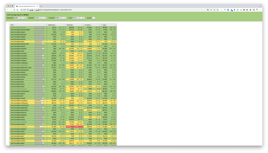
You can see that the combined code coverage is:
- Statement Coverages:86.5%
- Branches Coverages:74.9%
- Functions Coverages:84%
- Line Coverages:86.7%
5 Continuous Integration (CI)
Running test commands manually and getting test reports is too tedious.
We are now automating this process with CI (Continuous Integration) tools.
5.1 Github action
Github action provides continuous integration capabilities. We hope to automatically run the test process and merge test reports when pushing code to the repository or when there is a pull request to the repository.
Now we add the test.yml file under workflows in the repository.
name: test

on:
  push:
    branches: [ main, release, test-code-coverage ]
  pull_request:
    branches: [ main, release ]

  workflow_dispatch:

jobs:
  jest:
    runs-on: ubuntu-latest
    steps:
      - uses: actions/checkout@v2
      - uses: actions/setup-node@v2
        with:
          node-version: '14'
      - name: Run install
        run: npm i -g lerna && npm run bootstrap
      - name: Run Jest test
        run: npm run test:coverage
      - name: Archive Jest coverage
        uses: actions/upload-artifact@v3
        with:
          if-no-files-found: error
          name: jest
          path: test/coverage/coverage-final.json
  cypress:
    runs-on: ubuntu-latest
    steps:
      - uses: actions/checkout@v2
      - uses: actions/setup-node@v2
        with:
          node-version: '14'
      - name: Run install
        run: |
          npm i -g lerna
          npm run bootstrap
      - name: Build storybook
        run: |
          npm run pre-story
          TEST_ENV=test npm run build-storybook
      - name: Serve storybook
        run: nohup npx http-server -p 6006 storybook-static &
      - name: Run Cypress test
        run: npx wait-on http://127.0.0.1:6006 && ./node_modules/.bin/cypress run
      - name: Archive Cypress coverage
        uses: actions/upload-artifact@v3
        with:
          if-no-files-found: error
          name: cypress
          path: cypress/coverage/coverage-final.json
  coverage:
    runs-on: ubuntu-latest
    needs: [jest, cypress]
    steps:
      - uses: actions/checkout@v2
      - uses: actions/setup-node@v2
        with:
          node-version: '14'
      - name: Download Jest coverage
        uses: actions/download-artifact@v3
        with:
          # upload jest and cypress coverage to output dir
          path: output
      - name: Code coverage merge
        run: |
          tree output
          npx istanbul-combine -d test/merged -p detail -r lcov -r json output/cypress/coverage-final.json output/cypress/coverage-final.json
          tree test/merged
      - name: Run codecov
        run: npx codecov --token=${{ secrets.CODECOV_TOKEN }} --file=test/merged/coverage-final.json
This workflow first installs the project's dependencies, then runs the test cases, merges the test reports, and finally uploads the test results to Codecov.

5.2 Codecov
In the workflow above, we finally uploaded the code coverage report to the Codecov platform.
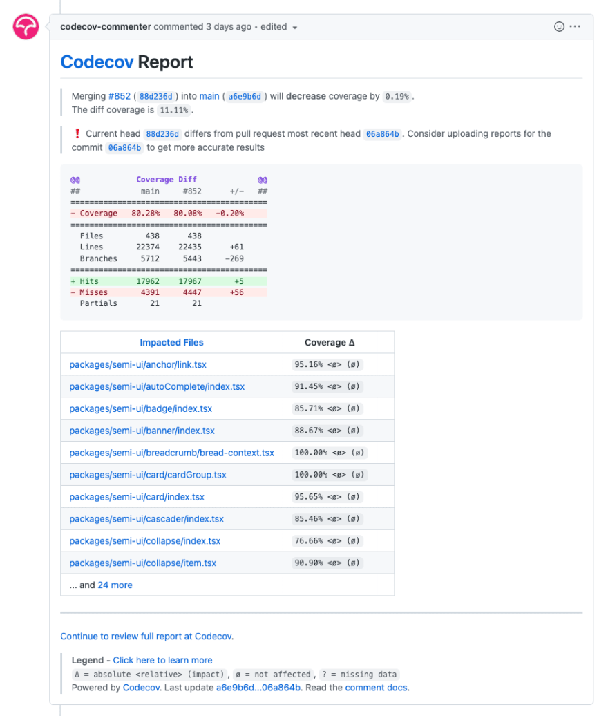
Codecov.io provides coverage online viewing, PR comment test coverage reporting, and badge generation.
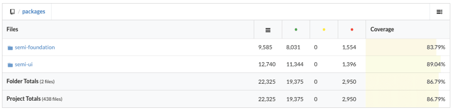
On the Codecov platform we can view the code coverage of each file.
On the Github PR page, after running the test workflow, Codecov will comment on the code coverage changes for the current PR.
The comments will show which file's coverage has changed by how much.
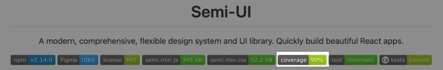
Codecov.io can also generate a badge showing the current code coverage of the repository.
We open Codecov's settings and copy the badge's link to the repository's README.md.

Finally, we get a badge like this.
6 Summary
The testing solution of the Semi Design used Jest + Enzyme in the early stage. As the project iterated, we found that it could not meet our testing needs. After comparing the popular E2E testing frameworks in the community, we chose Cypress, which can supplement the scenarios that Jest cannot test and further improve our testing scope and code coverage.
The two tools have their own usage scenarios, and they can be used in combination to test the component library in the project.
Ultimately, Semi achieved ~90% line coverage with Jest and Cypress. In addition to this, we also visual testing the UI with Chromatic to avoid unexpected UI changes to components.
Going forward, in addition to testing the interaction and UI of the component, the performance of the component is also an issue that we need to pay attention to.
In the future, Semi will also add tests related to component performance, so that maintainers can perceive the performance loss caused by component changes and avoid major performance problems during component iteration.


Top comments (0)