
Differences between CSS Grids and Flexbox
- Flexbox is one dimensional while CSS Grids is two dimensional.
- This leads us to one advantage, you can use CSS Grids to arrange the main elements of the website (the core sections) and then use flex-box to change the behavior of the elements/content depending on the page size.
grid-template-columns specifies the size of the grid by listing the number of columns the page will be made out of. The width of the individual grid cells can be scaled when the page is resized.
grid-template-rows specifies the number of rows on the page. The height of the individual grid cells can be scaled when the page is resized.
Both can be changed in size by using different tags
- such as repeat(3, 1fr) = 3 1 fractions of the page.
- using the fraction tag allows for the proportional rescaling of the elements.
When creating a div
Create a CSS Body/Container Class
.BODY {
    display: inline-grid;
    grid-template-columns: repeat(7, 1fr);
    grid-template-rows: repeat(63, 1fr);

    width: 100%;
    height: 5724px;
    background-color: rgb(0, 0, 0);
    margin: 0px;
}
Essentially, the grid-template-columns: repeat (7, 1fr) divides the with of the page into 7 columns that are one fraction of the page.
This allows for multiple different elements to be placed on the page such as photos, text boxes, buttons, etc. that are all proportionally distanced in its column.
The grid-template-rows: repeat(63, 1fr) does the same just divides the page vertically into 63 different sections fractionally.
I set the width of the body to be 100% to take up the entire width of the page and each child element will be a percentage of this percentage.
However, to set adequate height for all of the elements on this page, I needed to set the page height to be a non-scalable height of 5724px.
This allowed me to make sure that the row height was exactly 1/63 of 5724, thus creating a uniform website height.
Create a CSS Cell Class
.Cell-1 {
     grid-column-start: x1;
     grid-column-end: x2;
     grid-row-start: y1;
     grid-row-end: y2;
}
By specifying the starting column and row of the cell, you are essentially stating the exact space on the page it will take up.
Depending on if you use repeat(3, fr) or repeat(3, 25px) the cells will be scaled differently following the different viewport sizes of the page.
- Apply class to div
- Make sure the div is inside of the container class (essentially, make sure it is inside the div that establishes the entire grid system)
Figma Sheet**
- Comprised of multiple sections
Section 1 (SEC-PH)
Section 2 (SEC-INFO)

Section 3 (SEC-AMERICA)

Structure for Index.html
The goal for the Index page was to layout the core functionality first to both save time and increase the efficiency/quality of work in the team.
In doing so, multiple CSS classes were created and organized into specific section files. I created a SEC-INFO, SEC-PH, class, and id stylesheets to reduce the clutter of the multiple-unrelated sections.
SEC-PH.css
This stylesheet included these classes:
.PH-HEADER {
margin-top: 40px;
background-color: rgb(84, 84, 84);
width: 100%;
height: 750px;
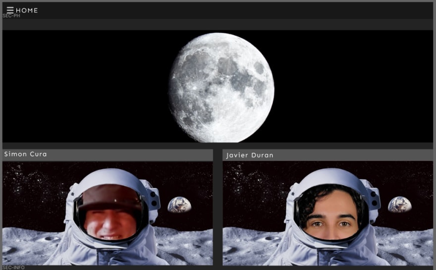
background-image: url(imgs/moon\ image.jpg);
background-position: center;
}
This class creates the main section at the top of the page underneath the bootstrap NavBar.
It lays out the parent div with adequate space for its children which are scaled based on the BODY Div.
.PH-MISC-MAIN {
    margin-top: 40px;
    width: 100%;
    height: 500;
    display: inline-block;
}
This class lays out the top section of the PH-HEADER div which will contain the various images and descriptions needed to fill out the PH-MISC section.
.PH-MISC-1 {
    float: left;
    width: 49%;
    height: 100%;
}
A specific class was created to align the divs properly.
It could have been optimized by setting float left to an ID.
.PH-MISC-2 {
    float: right;
    width: 49%;
    height: 100%;

}
A specific class was created to align the divs properly.
It could have been optimized by setting float right to an ID which would have saved some time in addition to following the DRY Don't Repeat Yourself coding guidelines
.PH-MISC-HEADER {
    width: 100%;
    height: 52px;
    background-color: rgb(84, 84, 84);
    margin: auto;
}
This class sets the proper style to the h1 div of the MISC section of PH.
.PH-MISC-TEXT {
    margin-top: 20px;
    width: 100%;
    height: 100%;
    background-color: rgb(54, 54, 54);
    align-self: center;
}
This class sets the proper style to the image div of the MISC section of PH.
.navbar{
    background-color: black;
}
This simple class states the color of the NavBar to black to create a uniform color scheme.
We created this CSS class as opposed to placing it in the index.html just in case the NavBars color needs future iteration.
This method creates the foundation for proper coding etiquette and will prove to be effective when creating larger, more complex websites.
SEC-INFO.css
.SEC-INFO {
    margin-top: 40px;
    grid-column-start: 1;
    grid-column-end: 8;
    grid-row-start: 23;
    grid-row-end: 32;
}
This class lays the main structure for the INFO section of the futuristic website.
As you can see, we used grid-column-start: 1 and grid-column-end: 8; to set the width of the INFO section.
We then used grid-row-start: 23 and grid-row-end: 32 to set the maximum bounds of the INFO section vertically.
We did this to allow room for our expanding info module section which adds to the overall interactive experience with the user.
.SEC-INFO-MID {
width: 100%;
height: min-content;
}
Sets the appropriate width and height based on the content provided in this section.
.SEC-INFO-MID-SEC-1 {
    width: 100%;
    height: min-content;
    margin-top: 20px;
    margin-bottom: 20px;
    border-color: white;
    border-top: white solid;
}
We added a margin-top: 20px to evenly space out the multiple INFO sections on the website.
This was because we wanted to use this CSS class for multiple divs, thus increasing our overall efficiency.
Main base section for each info module that will be displayed and configured in the index using ids.
.SEC-INFO-MID-SEC-1-TOP {
    margin-top: 20px;
    margin-bottom: 20px;
    width: 100%;
    height: 70px;
    background-color: rgb(34, 34, 34);
}
The specific top bar of the main section that will contain the title and dropdown button.
.SEC-INFO-MID-SEC-1-HEADER {
    justify-content: center;
    text-align: center;
    margin: auto;
    width: 25%;
    height: 69px;
    background-color: rgb(54, 54, 54);
    padding-top: 5px;;
}
The h1 div class style and properties.
.SEC-INFO-MID-SEC-1-HEADER-TEXT {
    margin: auto;
    height: 100%;
    width: 100%;
    color: white;
    font-family: -apple-system, BlinkMacSystemFont, 'Segoe UI', Roboto, Oxygen, Ubuntu, Cantarell, 'Open Sans', 'Helvetica Neue', sans-serif;
    font-weight: lighter;
    letter-spacing: 10px;
    font-style: normal;
}
The proper styling for the h1 class of the INFO text section of the website to appropriately maintain its visual quality through rescaling the page.
.SEC-INFO-MID-SEC-1-HEADER-ICON-DIV {
    margin-right: 20px;
    margin-left: 20px;
    height: 100%;
    width: 8%;
    border-radius: 50px;
    justify-content: center;
}
The addition of an Icon div section to the header.
.SEC-INFO-MID-SEC-1-HEADER-ICON {
    margin: auto;
    vertical-align: middle;
    height: 25%;
    width: 100%;
    background-color: white;
    border-radius: 10px;
    transition-duration: .25s;
}
The correct icon styling.
.SEC-INFO-MID-SEC-1-HEADER-ICON:hover {
    background-color: rgb(186, 186, 186);
    height: 100%;
    transition-duration: .25s;
}
Icon effect with a .25 second transition state which increases visual quality by over 9000%.
.SEC-INFO-MID-SEC-1-BOTTOM {
    vertical-align: middle;
    overflow: hidden;
    margin-top: 20px;
    width: 100%;
    height: 40px;
    border-color: rgb(0, 255, 251);
    border-radius: 10px;
    background-image: url(https://encrypted-tbn0.gstatic.com/images?q=tbn%3AANd9GcQIkSsGMj_WZBvn8cVBYhv8ogBba4fGlGzglg&usqp=CAU);
    transition-duration: 2s;
}
Correct scaling for the bottom main section of the INFO section.
.SEC-INFO-MID-SEC-1-BOTTOM:hover {
    vertical-align: middle;
    margin-top: 20px;
    width: 100%;
    height: 545px;
    transition-duration: 2s;
}
Bottom section transition state.
@font-face {
    font-family: space;
    src: url(fonts/space.otf);
Added a font family in order to modify some text boxes for a more space themed look.
We, however, mainly used the apple font with its weight set to lighter and an increased letter-spacing.
Conclusion
I really enjoyed working on this project with my team as we were both able to develop our skills using CSS-Grids, Flex-box, and different CSS classes. We developed very interesting methods of creating dynamic websites that captivate the user's attention by making interactable/expandable sections, using a visually aesthetic color scheme, by keeping a minimalist design. In doing so, we were able to utilize CSS-Grids to block out the main divs in our page to accurately and proportionally scale each child div relative to its parent. This then creates not only a uniformly scaling page based on the user's viewport size but also allowed us to work efficiently in our code by using percentages relative to the parent section div. Lastly, my team and I were able to set up visual studio code to work collaboratively at the same time in addition to using GitHub as a file storage server in which we both would upload and pull the files on our own accord.
[Resources]
https://www.w3schools.com
https://www.figma.com
https://code.visualstudio.com
Github: https://github.com/SCQuantum/Satin
https://htmlpreview.github.io/?https://github.com/SCQuantum/Satin/blob/main/root/index.html


Top comments (0)