
“I have 4 .css files and in total, they’re over 10,000 lines of code. How did things get so big?”
CSS files can get out of control, pretty quickly.
But it doesn't have to be this way.
Let's dive into some actionable CSS techniques to help you write more modular & flexible code:
- Technique 1: Leverage inheritance in CSS
- Technique 2: The power of the elements
- Technique 3: Use a CSS methodology
Technique 1: Leverage inheritance in CSS
Do you ever find yourself in CSS repeating a declaration, even though you know that you've used that declaration before?
Understanding inheritance in CSS might help.
Inheritance in CSS allows us to define styles at a high level so that these styles can be trickled downstream and style descendant elements.
This is simple, entry-level CSS skills.
However, despite its well-understood nature, I believe the inheritance rule is often being underutilised.
When leveraged correctly, it can save you hundreds of lines of code in the long run.
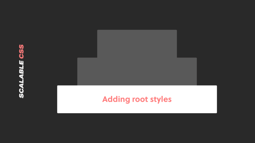
Starting at the highest level, for the majority of websites, there will be styles that will be consistent across all of your HTML elements:
html {
 background-color: #fafafa;
 color: #424242;
 font-family: 'Helvetica';
 font-size: 100%;
 font-weight: 300;
 line-height: 1.5;
 box-sizing: border-box;
}
Don't forget about inherit
Adding styles to the root as shown above is a great place to start.
There are, however, some HTML elements (like <input> or <textarea>) that by default will not inherit styles that you've defined.
This means if you set the font-family: Helvetica in the root as shown in the example above, the font in the <input> will not inherit this style, they will take the browser default font family.
You can override this by adding the following declaration: font-family: inherit to these elements that do not inherit properties by default.
A common technique to ensure all elements inherit the styles you've defined on the root element is to use the universal selector * {} and apply the inherit value to specific properties:
* {
 font-family: inherit;
 line-height: inherit;
 color: inherit;
 box-sizing: inherit;
}
Important to note: Properties like font-size and font-style are not included in the universal selector snippet above, as applying these syles will override the user-agent styles.
For example, if you styled font-size: 20px within the universal selector, this will override the user-agent font-size for all the heading tags (h1, h2, h3...)
Putting it all together, here's an example of of some common declarations used to leverage the inheritance rule and save you some lines of CSS:
html {
 background-color: #fafafa;
 color: #424242;
 font-family: Georgia, serif;
 font-size: 100%;
 font-weight: 300;
 line-height: 1.5;
}

* {
 font-family: inherit;
 line-height: inherit;
 color: inherit;
}
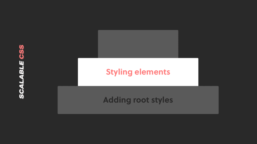
Now, let's dive a little deeper and discuss styling elements.
Technique 2: The power of the elements
Getting more granular than styling the root, adding styles directly to element selectors is a great way to keep your CSS file lean and efficient.
For example, a content-heavy website like a blog, you can style the typographic selectors like this:
p {
 /* paragraph styles are not required
 as they are inherited from the root */
}

h1, h2, h3, h4, h5, h6 {
 font-family: Helvetica, sans-serif;
 font-weight: 700;
 line-height: 1.3;
}

h1 {
 font-size: 2rem;
 max-width: 32rem;
}

h2 {
 font-size: 1.75rem;
 max-width: 24rem;
}

h3 {
 font-size: 1.5rem;
 max-width: 20rem;
}

h4 {
 font-size: 1.25rem;
 max-width: 16rem;
}
This has 2 benefits:
- Your HTML will be much cleaner, as the styles are applied natively to the HTML element selectors (i.e. no need to add classes to your HTML tags)
- In some cases, it can remove the need to add custom classes, simplifying your CSS stylesheet and making it more scalable
I like to view this as setting up the core foundation of the styling in a project to give yourself a good base to begin styling components and building out more complex parts of your website.
Technique 3: Use a CSS methodology
Leveraging CSS inheritance rules and styling element selectors will only get you so far.
Using classes to design various components and layouts on your website is inevitable (and where you'll spend most of your time).
Therefore, what we need is a "system" to write CSS in a modular, flexible way to keep our CSS efficient and organised.
That's where a CSS methodology comes in.

A CSS methodology is a consistent set of naming conventions that a team of developers will follow to ensure they write consistent, reusable CSS that is scalable over time.
Some of the most popular methodologies include BEM, SMACSS, OOCSS and Atomic CSS.
Out of these, it appears BEM has taken the pole position as the most adopted of the methodologies as noted from the State of CSS 2019.
So, let's zero in on BEM: what it is and how you can start to implement it in your projects.

BEM stands for Block-Element-Modifier, which are the 3 core pillars.
Each pillar has a different naming convention to use when creating components:
- Block is the component itself, for example, a card component (e.g.
.card) - Element is a child that lives within the Block and uses the naming convention
[Block]__[Element](e.g..card__title) - Modifier is a variation in the design of a Block or Element and uses the naming convention
[Block]--[Modifier](e.g..card--dark)
Let's dive into a real example, sticking with a card component:
In this example, the .card is the Block.
You can see the children elements within the .card Block uses the naming convention [Block]__[Element].
For example, the class used for the image of the card is .card__image
Now, let's dive into an example with 'Modifier':
You can see the naming convention [Block]--[Modifier] is being used for the Modifier (.card--dark).
It's important to note here that when you used a Modifier, you use it with the Block (not instead of the Block).
You can see in the CodePen above that the Modifier class .card--dark does not replace the Block class .card.
For more code examples and a deeper dive into BEM, I recommend checking out Sparkbox's article.
Summary
Perhaps you've been authoring CSS stylesheets for a long time but often look back and say: "Damn. My CSS is an absolute mess!"
If implemented, the techniques covered in this article will help remedy that feeling and you will be well on your way to becoming a modular & scalable CSS master.
To summarise up, here are the 3 CSS techniques you can start using today:
- Understand how inheritance works in CSS and use it to your advantage
- Style element selectors directly to give your design a solid foundation
- Use a CSS Methodology like BEM to design your components in a modular and flexible way.
What do you think? Any tips/strategies to write less messy CSS?


Top comments (5)
What do you think about CSS Modules and shadow styles for web components?
Hey Lars! I haven't got much experience in either, so I can't comment. That being said, I'm super interested in the whole CSS in JS space with CSS Modules/Styled components and other solutions as a way to manage CSS with JS frontend frameworks. If you have any resources worth reading, please share!
I only tried CSS Modules based on this small React sample: create-react-app.dev/docs/adding-a....
Angular can use either shadow DOM or use what they call emulated view encapsulation which similar to CSS modules assigns unique selectors to each class used in a component. However, the component uses a regular stylesheet and applies regular classes to the HTML elements, the framework does the wiring up.
Interesting. Thanks Lars. I’m going to give CSS modules a shot 👍
I absolutely love them when combined with React.