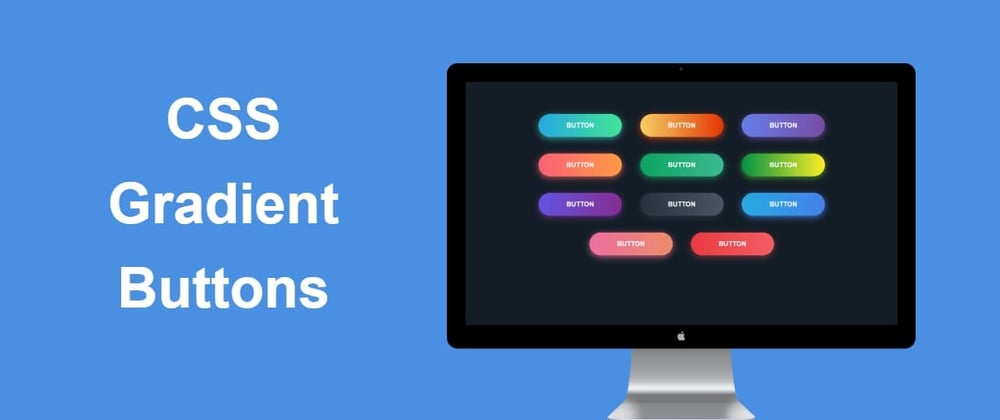
In this article , we will look at how we can easily create a beautiful ❤️ gradient buttons with cool hover effect with HTML and CSS. For this tutorial ,
you must have basic knowledge of HTML and CSS properties.
✨ Writing HTML
Our HTML code will be only few lines for the markup.The code is
<div class="container">
        <button class="btn-gradient btn-gradient--color__1">BUTTON</button>
        <button class="btn-gradient btn-gradient--color__2">BUTTON</button>
        <button class="btn-gradient btn-gradient--color__3">BUTTON</button>
        <button class="btn-gradient btn-gradient--color__4">BUTTON</button>
        <button class="btn-gradient btn-gradient--color__5">BUTTON</button>
        <button class="btn-gradient btn-gradient--color__6">BUTTON</button>
        <button class="btn-gradient btn-gradient--color__7">BUTTON</button>
        <button class="btn-gradient btn-gradient--color__8">BUTTON</button>
        <button class="btn-gradient btn-gradient--color__9">BUTTON</button>
        <button class="btn-gradient btn-gradient--color__10">BUTTON</button>
        <button class="btn-gradient btn-gradient--color__11">BUTTON</button>
    </div>
Here div with class of container will be just simple container to laying all buttons in it. And then all the button elements have class of btn-gradient which will have all the styles common to all the buttons. While the class of say btn-gradient--color-1 all these classes are modifier classes which will provide particular specific styling to buttons like their background which is different for each button here.
🤩 Lets Style Our Buttons With CSS
Here , first we will apply some basic styling to all buttons with btn-gradient class and also to the container class.
.container {
    margin: 10%;
    text-align: center;
}

.btn-gradient {
    width: 200px;
    font-size: 16px;
    font-weight: 600;
    color: #fff;
    cursor: pointer;
    margin: 20px;
    height: 55px;
    text-align: center;
    border: none;
    background-size: 300% 100%;
    border-radius: 50px;
    transition: all .4s ease-in-out;
        outline: none;
}
Now lets add modifier classes to give specific background and box shadow to each button.
You can style them with whatever gradients you want. I will style them as below.
.btn-gradient--color__1 {
    background-image: linear-gradient(to right, #25aae1, #40e495, #30dd8a, #2bb673);
    box-shadow: 0 4px 15px 0 rgba(49, 196, 190, 0.75);
}
.btn-gradient--color__2 {
    background-image: linear-gradient(to right, #f5ce62, #e43603, #fa7199, #e85a19);
    box-shadow: 0 4px 15px 0 rgba(229, 66, 10, 0.75);
}
.btn-gradient--color__3 {
    background-image: linear-gradient(to right, #667eea, #764ba2, #6b8dd6, #8e37d7);
    box-shadow: 0 4px 15px 0 rgba(116, 79, 168, 0.75);
}
.btn-gradient--color__4 {
    background-image: linear-gradient(to right, #fc6076, #ff9a44, #ef9d43, #e75516);
    box-shadow: 0 4px 15px 0 rgba(252, 104, 110, 0.75);
}
.btn-gradient--color__5 {
    background-image: linear-gradient(to right, #0ba360, #3cba92, #30dd8a, #2bb673);
    box-shadow: 0 4px 15px 0 rgba(23, 168, 108, 0.75);
}
.btn-gradient--color__6 {
    background-image: linear-gradient(to right, #009245, #fcee21, #00a8c5, #d9e021);
    box-shadow: 0 4px 15px 0 rgba(83, 176, 57, 0.75);
}
.btn-gradient--color__7 {
    background-image: linear-gradient(to right, #6253e1, #852d91, #a3a1ff, #f24645);
    box-shadow: 0 4px 15px 0 rgba(126, 52, 161, 0.75);
}
.btn-gradient--color__8 {
    background-image: linear-gradient(to right, #29323c, #485563, #2b5876, #4e4376);
    box-shadow: 0 4px 15px 0 rgba(45, 54, 65, 0.75);
}
.btn-gradient--color__9 {
    background-image: linear-gradient(to right, #25aae1, #4481eb, #04befe, #3f86ed);
    box-shadow: 0 4px 15px 0 rgba(65, 132, 234, 0.75);
}
.btn-gradient--color__10 {
    background-image: linear-gradient(to right, #ed6ea0, #ec8c69, #f7186a, #fbb03b);
    box-shadow: 0 4px 15px 0 rgba(236, 116, 149, 0.75);
}
.btn-gradient--color__11 {
    background-image: linear-gradient(to right, #eb3941, #f15e64, #e14e53, #e2373f);
    box-shadow: 0 5px 15px rgba(242, 97, 103, 0.4);
}
Now all buttons will get beautiful gradient backgrounds. But we also want to create little wave like effect on hovering these buttons. So for that we will use background-position property in CSS. To know more about background-position , Click Here .
So for creating little wave like effect from right to left , we will make background-position property of buttons to 100% in horizontal direction which is 0% by default. Lets see how can we write this is CSS
.btn-gradient:hover {
    background-position: 100% 0;
    transition: all .4s ease-in-out;
}
As simple as that. And we have created 10-11 beautiful CSS Gradient Buttons With Cool Hover Effects with such a little code. Hope this will help you 😇. Thanks for reading. You can visit my Personal Blog for more tutorials like this.


Top comments (1)
Nice