
The latest and most up-to-date version of this post can be found here https://hackernoon.com/optimising-the-front-end-for-the-browser-f2f51a29c572
Optimisation is all about speed and satisfaction.
- For the User Experience (UX) we want our front end to deliver a fast loading and performant web page.
- And for the Developer Experience (DX) we want the front end to be fast, easy and exemplary.
If you've been spending a lot of time improving your site's Google Pagespeed Insights score then this will hopefully shed light on what it all actually means and the plethora of strategies we have to optimise our front end.
Background
Recently my whole team got a chance to spend some time spiking out our proposed upgrade to our codebase, potentially using React. This really got me thinking about how we should build our front end. Pretty quickly I realised that the browser would be a large factor in our approach and equally large bottleneck in our knowledge.
Approach
Firstly
We can't control the browser or do much to change the way that it behaves, but we can understand how it works so that we can optimise the payload we deliver.
Luckily, the fundamentals of browser behaviour are pretty stable, well documented and unlikely to change significantly for a long time.
So this at least gives us a goal to aim for.
Second
Code, stack, architecture and patterns on the other hand are something we can control. They're more flexible, change at a more rapid pace and provide us with more options at our end.
Therefore
I decided to work from the outside in, figuring out what the end result of our code should be, and then form an opinion on writing that code. In this first blog we're going to focus on all we need to know about the browser.
What the browser does
Let's build up some knowledge. Here's some trivial HTML we'll expect our browser to run.
<!DOCTYPE html>
<html>
  <head>
    <title>The "Click the button" page</title>
    <meta charset="UTF-8">
    <link rel="stylesheet" href="styles.css" />
  </head>

  <body>
    <h1>
      Click the button.
    </h1>

    <button type="button">Click me</button>

    <script>
      var button = document.querySelector("button");
      button.style.fontWeight = "bold";
      button.addEventListener("click", function () {
        alert("Well done.");
      });
    </script>
  </body>
</html>
How the browser renders the page
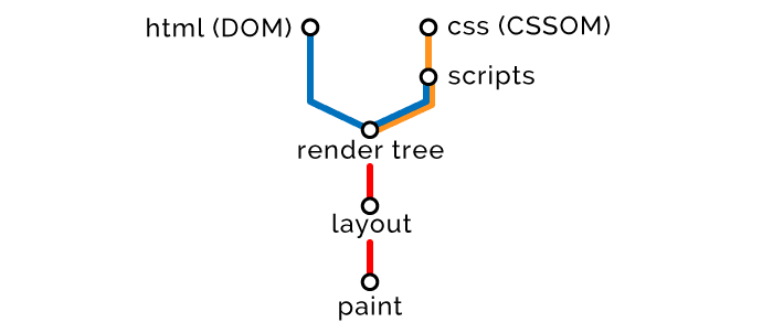
When the browser receives our HTML it parses it, breaking it down in to a vocabulary it understands, which is kept consistent in all browsers thanks to the HTML5 DOM Specification. It then runs through a series of steps to construct and render the page. Here's the very high level overview.
1 - Use the HTML to create the Document Object Model (DOM).
2 - Use the CSS to create the CSS Object Model (CSSOM).
3 - Execute the Scripts on the DOM and CSSOM.
4 - Combine the DOM and CSSOM to form the Render Tree.
5 - Use the Render Tree to Layout the size and position of all elements.
6 - Paint in all the pixels.
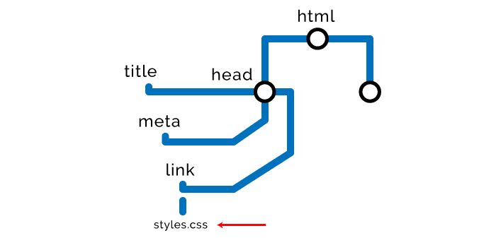
Step one – HTML
The browser starts reading the markup from top to bottom and uses it to create the DOM by breaking it down in to Nodes.
HTML delivery optimisation strategies
- Styles at the top and scripts at the bottom
While there are exceptions and nuances to this rule, the general idea is to load styles as early as possible and scripts as late as possible. The reason for this is that scripts require the HTML and CSS to have finished parsing before they execute, therefore we put styles up high so they have ample time to compute before we compile and execute our scripts at the bottom.
Further on we investigate how to tweak this while optimising.
- Minification and compression
This applies to all content we're delivering, including HTML, CSS, JavaScript, images and other assets.
Minification removes any redundant characters, including whitespace, comments, extra semicolons, etc.
Compression, such as GZip, replaces data in code or assets that is repeated by instead assigning it a pointer back to the original instance. Massively compressing the size of downloads and instead relying on the client to unpack the files.
By doing both you could potentially thin your payload down by 80 or 90%. E.g. Save 87% on bootstrap alone.
- Accessibility
While this won't make your page download any faster it will drastically increase the satisfaction of impaired users. Make sure to provide for everyone! Use aria labels on elements, provide alt text on images and all that other nice stuff.
Use tools like WAVE to identify where you could improve with accessibility.
Step two –  CSS
When it finds any style related Nodes, i.e. external, internal or inline styles, it stops rendering the DOM and uses these Nodes to create the CSSOM. That's why they call CSS “Render Blocking”. Here are some pros and cons of the different types of styles.
// External stylesheet
<link rel="stylesheet" href="styles.css">

// Internal styles
<style>
  h1 {
    font-size: 18px;
  }
</style>

// Inline styles
<button style="background-color: blue;">Click me</button>
The CSSOM nodes get created just like the DOM nodes, later they will be combined but here's what they look like for now.

Construction of the CSSOM blocks the rendering of the page so we want to load styles as early as possible in the tree, make them as lightweight as possible, and defer loading of them where efficient.
CSS delivery optimisation strategies
- Use media attributes.
Media attributes specify a condition that has to be met for the styles to load, e.g. Is there a max or min resolution? Is it for a screen reader?
Desktops are very powerful but mobile devices aren't, so we want to give them the lightest payload possible. We could hypothetically deliver only the mobile styles first, then put a media conditional on desktop styling, while this won't stop it downloading it will stop it blocking loading of our page and using up valuable resources.
// This css will download and block rendering of the page in all circumstances.
// media="all" is the default value and the same as not declaring any media attribute.
<link rel="stylesheet" href="mobile-styles.css" media="all">

// On mobile this css will download in the background and not disrupt the page load.
<link rel="stylesheet" href="desktop-styles.css" media="min-width: 590px">

// Media query in css that only computes for a print view.
<style>
  @media print {
    img {
      display: none;
    }
  }
</style>
- Defer loading of CSS
If you have styling that can wait to be loaded and computed until after the first meaningful paint, e.g. stuff that appears below the fold, or stuff that is not essential until after the page becomes responsive. You can use a script to wait for page to load before it appends the styling.
<html>
  <head>
    <link rel="stylesheet" href="main.css">
  </head>

  <body>
    <div class="main">
      Important above the fold content.
    </div>

    <div class="secondary">
      Below the fold content.
      Stuff you won't see until after page loads and you scroll down.
    </div>

    <script>
      window.onload = function () {
        // load secondary.css
      }
    </script>
  </body>
</html>
Here is an example of how to achieve this, and another.
- Less specificity
There's one obvious drawback in there being physically more data to transfer with more elements chained together, thus enlarging the CSS file, but there's also a client-side computational drain on calculating styles with higher specificity.
// More specific selectors == bad
.header .nav .menu .link a.navItem {
  font-size: 18px;
}

// Less specific selectors == good
a.navItem {
  font-size: 18px;
}
- Only deliver what you need
This may sound silly or patronising, but if you've worked on the front end for any length of time you'll know one of the big problems with CSS is the unpredictability of deleting stuff. By design it's cursed to keep growing and growing.
To trim CSS down as much as possible use tools like the uncss package or if you want a web alternative then look around, there's a lot of choice.
Step three - JavaScript
The browser then carries on building DOM/CSSOM nodes until … it finds any JavaScript Nodes, i.e. external or inline scripts.
// An external script
<script src="app.js"></script>

// An internal script
<script>
  alert("Oh, hello");
</script>
Because our script may need to access or manipulate prior HTML or Styles, we must wait for them to all be built.
Therefore the browser has to stop parsing nodes, finish building the CSSOM, execute the script, then carry on. That's why they call JavaScript “Parser Blocking”.
Browsers have something called a “Preload Scanner” that will scan the DOM for scripts and begin pre-loading them, but scripts will execute in order only after prior CSS Nodes have been constructed.
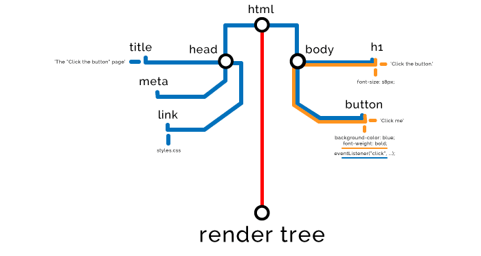
If this was our script:
var button = document.querySelector("button");
button.style.fontWeight = "bold";
button.addEventListener("click", function () {
  alert("Well done.");
});
Then this would be the effect on our DOM and CSSOM.

JavaScript delivery optimisation strategies
Optimising our scripts is one of the most important things we can do and equally one of the things that most websites do worst.
- Load scripts asynchronously
By using an async attribute on our script we can tell the browser to go ahead and download it with another thread on low priority but don't block the rest of the page loading. As soon as it's finished downloading it will execute.
<script src="async-script.js" async></script>
This means it could execute at any time, which leads to two obvious issues. First that it could execute long after the page loads, so if we're relying on it to do something for the UX then we may give our user a sub optimal experience. Second, if it happens to execute before the page finishes loading we can't predict it will have access to the right DOM/CSSOM elements and might break.

async is great for scripts that don't affect our DOM or CSSOM, and definitely great for external scripts that require no knowledge of our code and are not essential to the UX, such as analytics or tracking. But if you find any good use case for it then use it.
- Defer loading of scripts
defer is very similar to async in that it will not block loading of our page, however, it will wait to execute until after our HTML has been parsed and will execute in order of appearance.

This is a really good option for scripts that will act on our Render Tree but are not vital to loading the above the fold content of our page, or that need prior scripts to have run already.
<script src="defer-script.js" defer></script>
Here's another really good option for using the defer strategy, or you could use something like addEventListener. If you want to know more then this a good place to start your reading.
// All of the objects are in the DOM, and all the images, scripts, links and sub-frames have finished loading.
window.onload = function () {
};

// Called when the DOM is ready which can be prior to images and other external content.
document.onload = function () {
};

// The JQuery way
$(document).ready(function () {
});
Unfortunately async and defer do not work on inline scripts since browsers by default will compile and execute them as soon as it has them. When they're inlined in HTML they are immediately run, by using the above two attributes on external resources we're merely abstracting away or delaying the release of our scripts to our DOM/CSSOM.
- Cloning nodes before manipulation
If and only if you're seeing unwanted behaviour when performing multiple changes to the DOM then try this.
It may be more efficient to first clone the entire DOM Node, make the changes to the clone, then replace the original with it so you avoid multiple redraws and lower the CPU and memory load. It also prevents ‘jittery' changes to your page and Flashes Of Unstyled Content (FOUC).
// Efficiently manipulating a node by cloning it

var element = document.querySelector(".my-node");
var elementClone = element.cloneNode(true); // (true) clones child nodes too, (false) doesn't

elementClone.textContent = "I've been manipulated...";
elementClone.children[0].textContent = "...efficiently!";
elementClone.style.backgroundColor = "green";

element.parentNode.replaceChild(elementClone, element);
Just be careful when cloning because it doesn't clone event listeners. Sometimes this can actually be exactly what you want. In the past we have used this method to reset event listeners when they weren't calling named functions and we didn't have JQuery's .on() and .off() methods available.
- Preload/Prefetch/Prerender/Preconnect
These attributes basically do what they say on the tin and are pretty damn good. But they're quite new and don't have ubiquitous browser support, meaning they're not really serious contenders for most of us. But if you have that luxury then do have a look here and here.
Step four - Render Tree
Once all Nodes have been read and the DOM and CSSOM are ready to be combined, the browser constructs the Render Tree. If we think of Nodes as words, and the Object Models as sentences, then the Render Tree is a full page. Now the browser has everything it needs to render the page.
Step five - Layout
Then we enter the Layout phase, determining the size and position of all elements on the page.

Step six - Paint
And finally we enter the Paint phase where we actually rasterize pixels on the screen, ‘painting' the page for our user.

And all that usually happens in seconds or tenths of a second. Our job is to do it quicker.
If JavaScript events change any part of the page it causes a redraw of the Render Tree and forces us to go through Layout and Paint again. Modern browsers are smart enough to only conduct a partial redraw but we can't rely on this being efficient or performant.
Having said that, obviously JavaScript is largely event-based on the client side, and we want it to manipulate our DOM, so it's going to do exactly that. We just have to limit the unperformant effects of it.
By now you know enough to appreciate this talk by Tali Garsiel. It's from 2012 but the information still holds true. Her comprehensive paper on the subject can be read here.
If you're loving what you've read so far but still hunger to know more low level technical stuff then your oracle of all knowledge is the HTML5 Specification.
We're nearly there, just stay with me a bit longer! Now we discover why we need to know all of the above.
How the browser makes network calls
In this section we'll understand how we can most efficiently transfer to the browser the data required to render our page.
When the browser makes a request to a URL our server responds with some HTML. We'll start off super small and slowly increment the complexity.
Let's say this is the HTML for our page.
<!DOCTYPE html>
<html>
  <head>
    <title>The "Click the button" page</title>
  </head>

  <body>
    <h1>
      Button under construction...
    </h1>
  </body>
</html>
We need to learn a new term, Critical Rendering Path (CRP). It just means the number of steps the browser has to take to render the page. Here's what our CRP diagram would look like right now.

The browser makes a GET request, it idles until we respond with the 1kb of HTML needed for our page (there is no CSS or JavaScript yet), it is then able to build the DOM and render the page.
Critical Path Length
The first of three CRP metrics is path length. We want this to be as low as it can be.
The browser makes one round trip to the server to retrieve the HTML it needs to render our page, and that's all it needs. Therefore our Critical Path Length is 1, perfect.
Now let's kick it up a notch and include some internal styles and JavaScript.
<!DOCTYPE html>
<html>
  <head>
    <title>The "Click the button" page</title>
    <style>
      button {
        color: white;
        background-color: blue;
      }
    </style>
  </head>

  <body>
    <button type="button">Click me</button>

    <script>
      var button = document.querySelector("button");
      button.addEventListener("click", function () {
        alert("Well done.");
      });
    </script>
  </body>
</html>
If we examine our CRP diagram we should see a couple of changes.

We have two extra steps, build CSSOM and execute scripts. This is because our HTML has internal styles and scripts that need computing. However, because no external requests had to be made, they do not add anything to our Critical Path Length, yippie!
But hold on, not so fast. Notice also that our HTML increased in size to 2kb, so we have to take a hit somewhere.
Critical Bytes
That's where the second of our three metrics comes in, Critical Bytes. This measures how many bytes have to be transferred to render the page. Not all the bytes that will ever download on the page, but just what is needed to actually render our page and make it responsive to the user.
Needless to say we want to minimise this as well.
If you think that's great and who needs external resource anyway, then you would be wrong. While this looks tempting it isn't workable at scale. In reality if my team had to deliver one of our pages with everything it needed internally or inline it would be massive. And the browser is not built to handle such a load.
Look at this interesting article on the effect of page load while inlining all styles like React recommends. The DOM quadruples in size, takes twice as long to mount and 50% longer to become responsive. Quite unacceptable.
Also consider the fact that external resources can be cached, therefore on return visits to our page, or visits to other pages that use the same resources (e.g. my-global.css) the browser will not make a network call and instead use its cached version, thereby being an even bigger win for us.
So let's grow the hell up and use external resources for our styles and scripts. Note that we have 1 external CSS file, 1 external JavaScript file and 1 external async JavaScript file.
<!DOCTYPE html>
<html>
  <head>
    <title>The "Click the button" page</title>
    <link rel="stylesheet" href="styles.css" media="all">
    <script type="text/javascript" src="analytics.js" async></script>  // async
  </head>

  <body>
    <button type="button">Click me</button>

    <script type="text/javascript" src="app.js"></script>
  </body>
</html>
Here's what our CRP diagram looks like now.

The browser gets our page, builds the DOM, as soon as it finds any external resources the preload scanner kicks in. This goes ahead and begins downloading all external resources it can find in the HTML. The CSS and JavaScript take high priority and other assets take lower.
It has picked up our styles.css and app.js and carves another Critical Path to go fetch them. It didn't pick up our analytics.js because we gave it the async attribute. The browser will still download it with another thread on low priority but because it doesn't block rendering of our page it does not factor in to the Critical Path. This is exactly how Google's own optimisation algorithms rank sites.
Critical Files
Finally, our last CRP metric, Critical Files. The total number of files the browser has to download to render the page. In our case 3, the HTML file itself, the CSS and the JavaScript. The async script doesn't count. Smaller is better, of course.
Back to the Critical Path Length
Now you might be thinking that surely this is the longest the Critical Path can ever be? I mean we only need to download HTML, CSS and JavaScript to render our page, and we've just done that in two round trips.
HTTP1 file limit
Once again, life isn't that simple. Thanks to the HTTP1 protocol our browser will only simultaneously download a set maximum number of files from one domain at a time. It ranges from 2 in really old browsers to 10 in Edge, Chrome handles 6.
You can view how many max concurrent files your user's browsers can request from your domain here.
You can and should get around this by serving some resources off of shadow domains to maximise your optimisation potential.
Warning: Do not serve critical CSS from anything but your root domain, the DNS lookup and latency alone will negate any possible benefit in any possible scenario.
HTTP2
If your site is HTTP2 and your user's browser is compatible then you can totally obliterate this limit. But those wonderful happenings aren't too common yet.
You can test your site's HTTP2'ness here.
TCP round trip limit
Another enemy approaches!
The maximum amount of data that can be transferred in any one round trip is 14kb, this is true for all web requests including HTML, CSS and Scripts. This comes from a TCP Specification that prevents network congestion and packet loss.
If our HTML or any accumulation of resources in a request is larger than 14kb then we need to make additional round trips to fetch them. So, yes, those massive resources do add many paths to our CRP.
The Big Kahuna
Now let's go all out with our massive web page.
<!DOCTYPE html>
<html>
  <head>
    <title>The "Click the button" page</title>
    <link rel="stylesheet" href="styles.css">     // 14kb
    <link rel="stylesheet" href="main.css">       // 2kb
    <link rel="stylesheet" href="secondary.css">  // 2kb
    <link rel="stylesheet" href="framework.css">  // 2kb
    <script type="text/javascript" src="app.js"></script>  // 2kb
  </head>

  <body>
    <button type="button">Click me</button>

    <script type="text/javascript" src="modules.js"></script>    // 2kb
    <script type="text/javascript" src="analytics.js"></script>  // 2kb
    <script type="text/javascript" src="modernizr.js"></script>  // 2kb
  </body>
</html>
Now I know that's a lot of CSS and JavaScript for one button, but it's a very important button and it means a lot to us. So let's not judge, okay?
Our entire HTML is nicely minified and GZipped and weighs in at 2kb, well under the 14kb limit, so it comes back to us just fine in one round trip of the CRP and the browser dutifully begins constructing our DOM with the 1 critical file, our HTML.

CRP Metrics: Length 1, Files 1, Bytes 2kb
It picks up a CSS file and thanks to the preload scanner identifies all external resources (CSS and JavaScript) and makes a request to begin downloading them. But wait a minute, the very first CSS file is 14kb, maxing out the payload for one round trip, so that's one CRP unto itself.

CRP Metrics: Length 2, Files 2, Bytes 16kb
It then carries on downloading resources. The remainder weigh in under 14kb so could make it in one round trip but there's 7 of them and because our website isn't on HTTP2 yet, and we're using Chrome, we can only download 6 files in this round trip.

CRP Metrics: Length 3, Files 8, Bytes 28kb
Now we can finally download the final file and render the DOM.

CRP Metrics: Length 4, Files 9, Bytes 30kb
Bringing our CRP to a total of 30kb of critical resources in 9 critical files and 4 critical paths. With this information and some knowledge of the latency in a connection you can actually begin to make really accurate estimates about performance of a page for a given user.
Browser networking optimisation strategies
- Pagespeed Insights
Use Insights to identify performance issues. There's also an audit tab in Chrome DevTools.
- Get good at Chrome Developer Tools
DevTools are sooo amazing. I could write a whole book on them alone, but there's already a lot of resources out there to help you. Here's a really useful read to start interpreting network resources.
- Build in a good environment, test in a bad one
Of course you want to build on your Macbook Pro with 1tb SSD and 32gb of RAM, but for performance testing you should head over to the network tab in Chrome, if that's what you use, and simulate a low-bandwidth, throttled-CPU connection to really get some useful insight.
- Concatenate resources/files together
So in the above CRP diagrams I left out some stuff you didn't need to know then. But basically, after every external CSS and JavaScript file is received, the browser constructs the CSSOM and executes scripts on it. So even though you might deliver several files in one round trip, they each make the browser waste valuable time and resources, so it's better to combine files together where practical and eliminate unnecessary load.
- Internal Styles for Above the fold content in the header
There's no real black and white over whether to internalise or inline CSS and JavaScript to stop having to fetch external resources, and the opposite, making resources external so they can be cached to keep the DOM light.
But there's a very good argument for having internal styles for your essential above the fold content, meaning that you can avoid fetching resources to do your first meaningful paint.
- Minify/shrink images
Pretty easy and basic, there's many options for doing this, pick your favourite.
- Defer loading images until after page load
With some simple vanilla JavaScript you can defer loading of images that appear below the fold or are not vital for the first user-responsive state. There's a really good strategy for doing this over here.
- Load fonts asynchronously
Fonts are very expensive to load and if you can you should use a webfont with fallbacks and then progressively render your fonts and icon sheets. This may not seem great but the other option is that your page loads with no text at all if the font hasn't loaded, this is called a Flash Of Invisible Text (FOIT).
- Do you really need all that JavaScript/CSS?
Well, do you? Answer me! Is there a native HTML element that can produce the behaviour you're using scripts for? Is there styling or icons that can be created inline instead of internal/external? E.g. Inline an SVG.
- CDNs
Content Delivery Networks (CDNs) can be used to serve your assets from a physically closer and lower latency location to your user, thereby lowering load times.
Good reads
Now you're tickled pink and know enough to go out there and discover more on this subject yourself. I would recommend doing this free Udacity course and reading Google's own documentation on optimisation.
If you yearn for even more low level knowledge then this free eBook on High Performance Browser Networking is a good place to start.
Wrapping up
The Critical Render Path is all important, it gives us some pretty solid and logical rules to optimise our web site. The 3 metrics that matter are:
1 – Number of critical bytes.
2 – Number of critical files.
3 – Number of critical paths.
What I've written about here should give you enough to get a grasp on the fundamentals and help you interpret what Google Pagespeed Insights has to say about your performance.
The application of best practice will come with the meshing together of a good DOM structure, network optimisation and the various strategies we have available to minimise our CRP metrics. Making the user happier, and making Google's search engine happier.
In any enterprise scale website this will be a monumental task but you'll have to do it sooner or later so stop incurring even more technical debt and start investing in solid performance optimisation strategies.
Thank you so much for reading this far if you actually made it. I really hope this helps you and if you have any feedback or corrections for me then send ‘em my way.
In the next part of this blog I hope to give a real world example of how I would implement all these principles in my own team's massive codebase. We own over 2,000 content-manageable pages on one domain and serve hundreds of thousands of page views a day, so this will be fun.
But that might be a while yet, I need a lie down now.


Top comments (26)
Thank you for this very nice overview of web page rendering optimization. I only had some difficulty understanding 2 points:
1) the first graph under the § "How the browser renders the page": I don't understand why the JS scripts branch is grouped with the CSS branch. Why isn't it on its own separate branch?
2) I didn't quite grasp how layout is different from CSS? What do you mean by layout?
I also found this resource helpful: developers.google.com/web/fundamen...
Hi Olivier,
I'm really glad you enjoyed my article and thank you very much for your questions.
1) The diagrams are for illustration purposes and only a high level overview of what happens. I put scripts below CSS because scripts have to wait for prior CSS to download and compute, they do then act on the CSSOM and DOM.
2) CSS is the rules for the styles, it gets used to create the CSSOM which gets combined with the DOM to form the Render Tree. The phase after that is called Layout, in which the browser takes all the elements and decides what their dimensions are and where to put them.
I hope this answers your questions.
Use aria labels on elementsWell as much as I appreciate WAI-ARIA, but the first rule is (loose interpreted) "Don't use WAI-ARIA". You should rather use the correct HTML5 elements than using WAI-ARIA labels. Just to add this :)Thanks for the knowledge, always love it when people share :)
Thank you Sanjay, Beautiful article, explained in the most lucid way possible...
Could you please write an article on 'flushing HTML'...ie. how in code, do we flush only the 'Above the Fold' HTML while in the second round trip fetch the remaining 'below the fold' and the entire document as a whole..
I mean is there any function in PHP or some Wordpress function that could do the same..
Advice on this would be really helpful, or could I just write the CSS and JS inline until I hit Below the fold and then start requesting external files, would that be helpful instead of some weird buffer concept of flushing?
Once again thank you Sanjay, It was really a beautiful article, eagerly waiting for the next one..
Hey Subin, thanks so much for the feedback and questions, and my apologies for only seeing this now :)
What you're asking is something we've just done at work and seen a massive boost in our page scores, I may start working on a relevant article soon but it will take a while to research and write.
In the meantime I would advise you that yes it's really worth it to have above the fold content prioritised and then load the rest asynchronously.
In the broadest way, I would suggest inlining critical styles in the head. Defer as many scripts as possible. And use the loadcss git/npm package to then async load the below the fold styles.
If you actually want to send below the fold html async then look at something like how webpack can codesplit and write html files.
Really nice post, easy to understand even for a backend dev. Is the CRP metrics in dev tools or did you use an extension?
Someone just pointed out to me that Google's Lighthouse actually does give you critical metrics, along with a tonne of other useful optimisation stuff. It is actually more geared towards progressive web apps but useful nonetheless for what you're asking about.
developers.google.com/web/tools/li...
Thanks Francois! CRP is a way to help you understand what is affecting your page rendering and how to optimise it. I don't think it appears in DevTools but there may be an extension out there.
Hi Sanjay,
Just wondering, you said that in one trip, onlu 14kb is sent/received. Does this mean, if we have three js files with sizes: 8kb, 2kb, and 2kb, it's better to merge those? Because what I understand from your article, it will do 1 round trip instead of 3 round trips. Thanks before for the amazing article and replies!
Hello!
Because the total of the 3 files can fit into one request packet it only counts as one round trip in both cases. And only if they are blocking the loading of the DOM, they will not count against the critical path metrics if they are async, defer, or don't execute until after the DOM loads.
But in most cases you're better off bundling them into one, that will save on the workload the browser has to do, optimise networking and potentially save space on shared modules.
I have seen this article before
Probably on hackernoon on medium, that's where I first posted it :)
Fantastic write up Sanj! There's a great talk by one of my old colleagues about CSS and the critical path that's well worth a watch youtu.be/_0Fk85to6hA
Thank you Simon! I shall check that video out.
Thank you Sanjay!!! Such important concepts for digital marketers, devs, webmasters, etc. to be aware of. Will be referencing this a lot.
Keep up the incredible work.
Thanks Britney. I stand on the shoulders of giants :)
Great arcticle!
Cheers Philipp!
Hands down for this article
Thanks Tommaso!
HI Sanjay, great article!
Greetings from Argentina.
Thanks :)
Hi Sanjay,
Excellent article. Thank you.
Waiting for your next blog :).
Thanks,
Anil Pinto
Thanks Anil!
Excellent post! You should include in this article the CSS property 'will-change', it's very important to use when animations are triggered, to avoid excessive rendering