Writing CSS is an important skill for every frontend developer. CSS stands for Cascading Style Sheets, and it allows us to style our web pages to our liking. There are a ton of CSS rules that we can set giving us a lot of flexibility. When we're looking at creating our styles, the properties we have in our CSS tool belt can thought of in a certain way. For example margin helps us add more space outside of our item and padding lets us add more space inside, both giving our content more or less room to breath.
A new way of thinking about CSS layout is called CSS Logical Properties. Logical properties allow us to change the layout of our CSS in a more logical way. Throughout this post we're going to look at logical properties by using margin, padding and border.
CSS Logical Properties define properties and values for us to work in block & inline dimensions. The main goal of logical properties is to help developers effectively write layouts for different writing views such as right to left and vertical languages. Like mentioned earlier, we're going to be using margin, padding and border properties to learn about logical properties. For anyone who doesn't know/needs a quick refresher on the CSS Box Model it might be helpful to go over that first.
CSS Box Model
The CSS box model is an important aspect of CSS because it's how we understand the sizing of our content. When we're writing our HTML, you can think of each element you write as a box. Each one of these boxes has four parts to it that are important to know.
| Name | Description |
|---|---|
| Content | This is the actual content of the HTML. |
| Padding | Padding is a transparent space around the inside of the content border. |
| Border | Border is a space the wrap around the content and its padding. |
| Margin | Margin is a transparent space around the outside of the content border. |
For you folks out there who love a good visual, here is a picture representation of the box model.

With the box model cleared up, let's get into those logical properties!
Thinking Physically vs Logically
When you're thinking about CSS in a physical way we base our thinking in setting properties by how they size and shape our content. For example, when I am setting a margin on an h1 tag my first thought is about how the margin will affect the sizing of the content. In contrast to this, when we're thinking logically we base our thinking off of the current flow of the content. When setting logical property like max-block-size (determines the max size of the content oppose the writing mode), we first need to think about the writing mode.
In this sense, you can think of the two paradigms as what you consider first. Physical properties first consider the size of the content, where logical properties first consider the flow of content. Logical properties try to help developers by giving us an easy way to control the flow of content, and that ability to control the content flow means we have to consider orientation when assigning logical rules. To control the content flow, we need to look at block vs inline and writing modes.
Block vs Inline & Writing Modes
In CSS logical properties, the terms block and inline allow us to determine the direction/flow our properties should follow. Here is how you can define these.
| Block | Inline |
|---|---|
| The opposite direction of the current writing mode. | The parallel direction of the current writing mode. |
Block & inline can be straight forward, but for them to make complete sense we need to understand what writing modes are.
Writing modes in CSS allow us to dictate which direction our content flows by setting a direction property. These help us accommodate languages that don't read left to right like English. Examples of these would be how Arabic is written right to left (<). Below is a code example that describes the writing modes and available directions. Just to note, the default direction is left to right.
html {
    direction: ltr;
}
/* Flows horizontally left to right & vertically top to bottom */
h1 {
    writing-mode: horizontal-tb;
}

/* Flows vertically top to bottom & horizontally right to left */
p {
    writing-mode: vertical-rl;
}

/* Flows vertically top to bottom & horizontally left to right */
span {
    writing-mode: vertical-lr;
}

/* Less Supported Values*/

/* Flows vertically bottom to top */
.sidways-1 {
    writing-mode: sideways-rl;
}

/* Flows vertically top to bottom */
.sidways-2 {
    writing-mode: sideways-lr;
}
Now that we've gone through block vs inline and what writing modes are, lets look at some visual examples.


CSS Logical Properties vs Physical Properties
Now that we have a good understanding off CSS Logical Properties and how they work, let's look at some code comparing how to do things physically and logically. For these examples we're going to take a look at common CSS properties including width & height, padding, border & margin. Also, a good thing to remember while reading through these examples is that because we can change the writing-mode, the logical properties effect is determined by the mode we set.
Logical Properties Syntax
Width & Height
| Type | Shorthand | Longhand |
|---|---|---|
| Physical | width height |
|
| Logical | block-size inline-size |
Physical Properties
.greeting1 {
    width: 300px;
    height: 300px;
}
Logical Properties
.greeting2 {
    writing-mode: horizontal-tb;
    block-size: 300px; /* Acts as height*/
    inline-size: 300px; /* Acts as width*/
}

.greeting3 {
    writing-mode: vertical-lr;
    block-size: 300px; /* Acts as width*/
    inline-size: 300px; /* Acts as height*/
}

.greeting4 {
    writing-mode: vertical-rl;
    block-size: 300px; /* Acts as width*/
    inline-size: 300px; /* Acts as height*/
}
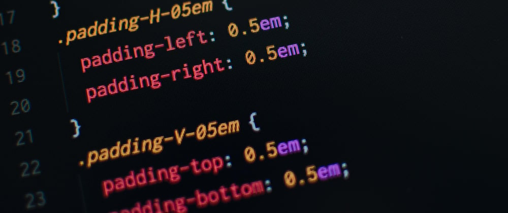
Padding
As a refresher from our box model, padding allows us to define a size of space on the insider of our contents border.
| Type | Shorthand | Longhand |
|---|---|---|
| Physical | padding | padding-top/right/bottom/left |
| Logical | padding-block padding-inline |
padding-block-start/end padding-inline-start/end |
Physical Properties
.greeting1 {
    padding: 24px; /* Sets all four sides equally */
}
Logical Properties
.greeting2 {
    writing-mode: horizontal-tb;
    padding-block: 24px; /* Sets top/start & bottom/end padding */
    padding-inline: 24px; /* Sets left/start & right/end padding */
}

.greeting3 {
    writing-mode: vertical-lr;
    padding-block: 24px; /* Sets left/start & right/end padding */
    padding-inline: 24px; /* Sets top/start & bottom/end padding */
}

.greeting4 {
    writing-mode: vertical-rl;
    padding-block: 24px; /* Sets right/start & end/end padding */
    padding-inline: 24px; /* Sets top/start & bottom/end padding */
}
Border
As a refresher from our box model, the border is a line around our content that defines the edges/ending of the content.
| Type | Shorthand | Longhand |
|---|---|---|
| Physical | border | border-width border-style border-color |
| Logical | border-block border-inline |
border-block-start/end inline-block-start/end border-block-color/style/width |
Note: Each of the long hand physical border properties can be individually set using top, right, bottom and left for further control.
Physical Properties
.greeting1 {
    border: 2px solid black; /* Sets four sides of our border equally */
}
Logical Properties
.greeting2 {
    writing-mode: horizontal-tb;
    border-block: 2px solid black; /* Sets top/start & bottom/end border */
  border-inline: 2px solid black; /* Sets left/start & right/end border */
}

.greeting3 {
    writing-mode: vertical-lr;
    border-block: 2px solid black; /* Sets left/start & right/end border */
  border-inline: 2px solid black; /* Sets top/start & bottom/end border */
}

.greeting4 {
    writing-mode: vertical-rl;
    border-block: 2px solid black; /* Sets right/start & left/end border */
  border-inline: 2px solid black; /* Sets top/start & bottom/end border */
}
Margin
As a refresher from our box model, margin allows us to define a size of space on the outside of our contents border.
| Type | Shorthand | Longhand |
|---|---|---|
| Physical | margin | margin-top/right/bottom/left |
| Logical | margin-block margin-inline |
margin-block-start/end margin-inline-start/end |
Physical Properties
.greeting1 {
    margin: 16px;
}
Logical Properties
.greeting2 {
    writing-mode: horizontal-tb;
    margin-block: 16px; /* Sets top/start & bottom/end margin */
    margin-inline: 16px; /* Sets left/start & right/end margin */
}

.greeting3 {
    writing-mode: vertical-lr;
    margin-block: 16px; /* Sets left/start & right/end margin */
    margin-inline: 16px; /* Sets top/start & bottom/end margin */
}

.greeting4 {
    writing-mode: vertical-rl;
    margin-block: 16px; /* Sets right/start & left/end margin */
    margin-inline: 16px; /* Sets top/start & bottom/end margin */
}
Some Extra Info
CSS logical properties are a cool addition, and with all cool additions in code there are some things to remember before we start using them in our projects.
Browser Support
When new features come to a coding language it takes time for all of the different browsers support them. Whenever you're curious about which features are supported in what browsers, you can check a handy website called Can I Use. Here is the can I use page for CSS logical properties.
can I use screen shot here
If you want to check out the actual page here is the link: Can I Use CSS Logical Properties.
Diving Deeper
In addition to size, padding, margin & border, some other logical properties you can set values with are:
- floating
- positioning
If you want more info, here is the CSS Logical Properties MDN Page.
Well That Was Fun 😄
Whew! Size, padding, border and margin are super common CSS properties to use, and now we know how to change them via CSS logical properties. I hope that you find CSS Logical Properties as cool as I do, and that this post helped you learn lots about them.
Happy Learning 😄👋🏾!


Top comments (2)
Great article Sandrico!
Thank you 😊!