In this post, I will give a rundown of some of the Best Data Visualization Courses that will help you develop industry ready Data Visualization Skills.
All these courses are available online, some are available at minimal costs and will help you learn and excel at Data Visualization using Python, Tableau, d3.js, and other programs or tools. These courses are suitable for beginners and intermediate learners.
Best Data Visualization Courses and Specialization 🤞[2018]
This post is part of an article originally published here >> Data Visualization Courses.
1. Data Visualization with Tableau Specialization (Coursera)
This course is created by the University of California - Davis. In this course, Data Visualization Course, you will learn to visualize business data with Tableau by understanding what data visualization is, and how you can use it to better see and understand data.
You'll examine the fundamental concepts of data visualization and explore the Tableau interface, identifying and applying the various tools Tableau has to offer.
By the end of the course, you will be able to prepare and import data into Tableau and explain the relationship between data analytics and data visualization.

What You'll Learn?
- Fundamentals of Visualization with Tableau
- Essential Design Principles for Tableau
- Visual Analytics with Tableau
- Creating Dashboards and Storytelling with Tableau
- Data Visualization with Tableau Project
You can Sign up here 🔗
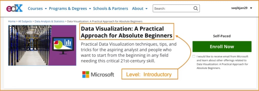
2. Data Visualization: A Practical Approach for Absolute Beginners (edX)
This course is created by Microsoft and published on edX. In this course, Data Visualization for Beginners, you will understand Practical Data Visualization techniques, tips, and tricks for the aspiring analyst and people who want to start from the beginning in any field needing this critical 21st-century skill.
You can learn all the four modules in this course for free and by the end of the program, you will become a practitioner of the art.
What You'll Learn?
- Visual Literacy: Build the most-used and simplest data visualizations and chart types
- Visual Analysis: Understand how interaction, design, and the science of visualization enhances basic data visualization artifacts
- Visualizations of Business: Create basic reports and dashboards for applications in work and life
- Visualization of Tomorrow: Learn how to avoid common pitfalls, and make the visualization that works.
You can Sign up here 🔗
3. Data Visualization Using Tableau Public (Pluralsight)
This course is created by Robert Spent who worked with Microsoft in Team Foundation Server on the Administration and Version Control team for nearly 10 Years.
This course has 4.8-star ratings on Pluralsight and will help you get on grips with building Data Visualization skills using Tableau Public.
What You'll Learn?
- Creating Your First Dashboard
- Charting Consumer Spending
- The Cost of Winning
You can Sign up here 🔗
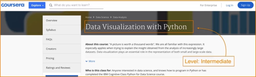
4. Data Visualization with Python (Coursera)
This course is created by IBM and has 4.6-star user rating on Coursera. In this course, Data Visualization with Python you will learn how to take the data at first glance that has little meaning and present that data in a form that simply makes sense to people.
You will be learning various techniques already developed for presenting data visually and using several data visualization libraries in Python like Matplotlib, Seaborn, and Folium.
What You'll Learn?
- Introduction to Data Visualization Tools
- Best and Specialized Visualization Tools
- Advanced Visualizations and Geospatial Data
You can Sign up here 🔗
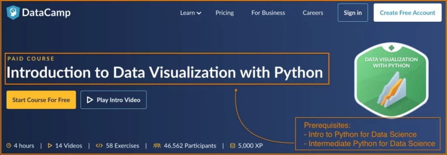
5. Introduction to Data Visualization with Python (DataCamp)
This course is created by DataCamp instructors Dhavide Aruliah who is Data Scientist and Applied Mathematician, and Bryan Van de Ven who is Software Engineer at Anaconda and Developer of Bokeh.
The topics covered in this course include customizing graphics, plotting two-dimensional arrays (e.g., pseudocolor plots, contour plots, images, etc.), statistical graphics (e.g., visualizing distributions & regressions), and working with time series and image data.
What You'll Learn?
- Customizing plots
- Plotting 2D arrays
- Statistical plots with Seaborn
- Analyzing time series and images
You can Sign up here
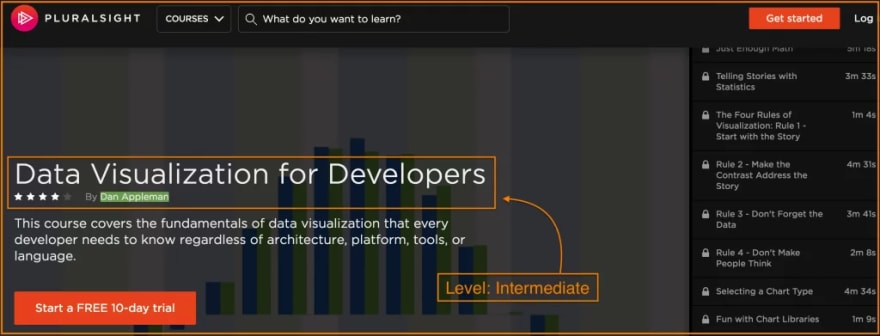
6. Data Visualization for Developers (Pluralsight)
This course is created by Dan Appleman who is CTO of Full Circle Insights and a well-known public speaker and author. This course on Data Visualization for Developers has 4.2-star ratings on Pluralsight and will introduce any developer to every aspect of Data Visualization, from story to numbers, to architecture, to code.
The topics covered in this course include fundamentals of data visualization that every developer needs to know regardless of architecture, platform, tools, or language.
What You'll Learn?
- Introduction to Data Visualization
- Charting -1 A
- Business Intelligence
- Visualization Architecture
- Hands-On Visualization
You can Sign up here 🔗
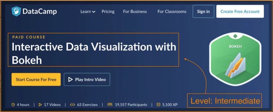
7. Interactive Data Visualization with Bokeh (Datacamp)
Interactive Data Visualization course is a complete guide to mastering Bokeh which is a Python library for building advanced and modern data visualization web applications. Created by Bryan Van de Ven, Software engineer at Anaconda and developer of Bokeh. In this course, you will learn to make use of Bokeh Visualization library for Python (and other languages) that target modern web browsers for presentation and build complex statistical plots quickly and through simple commands.
What You'll Learn?
- An in-depth introduction to Basic plotting with Bokeh and its use.
- Combine multiple Bokeh plots into layouts, links plots together, use legends and hover tooltips for annotations.
- Build interactive apps with Bokeh and integrate Numpy and Pandas.
- Use Bokeh built-in widgets alongside plots and connect to python code using the Bokeh server.
- Build sophisticated Bokeh data exploration application from the scratch, based on the famous Gapminder data set.
You can Sign up here 🔗
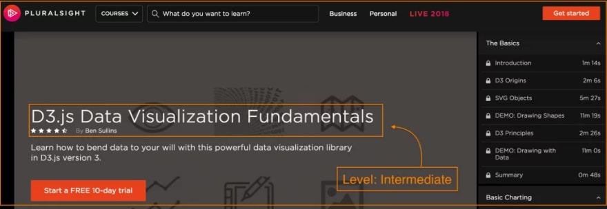
8. D3.js Data Visualization Fundamentals (Pluralsight)
Pluralsight Logo
This course is created by Ben Sullins who is a certified data geek and author with 15 years of industry experience. This course has a 4.8-star rating on Pluralsight and will you help learn how to use D3.js (data-driven documents) make powerful data visualization.
This course mainly focuses on how to visually encode and present data to an audience once an insight has been found.
What You'll Learn?
- The Basics and Charting
- Working with Data External Data Sources
- Enhancing Your Visualization with Scales and Axis
- Enhancing Your Visualization with Interactivity
- Mapping and Putting It All Together
You can Sign up here 🔗
Before You Go 🍻
If you liked this article, please do share it with your friends and also follow this Dev.to Handle to keep up with similar content once every fortnight.
Wishing you the best with your career! Cheers!


Top comments (1)
Great article, I have also written an article, where I mentioned some more best data visualization courses-mltut.com/best-data-visualization-...
I hope people will be benefitted with this article too.
Some comments have been hidden by the post's author - find out more