
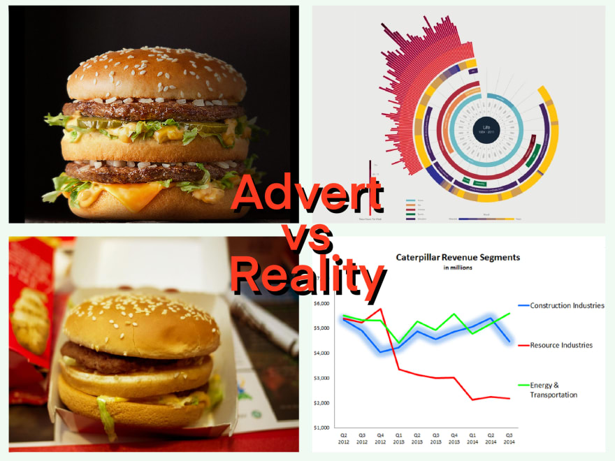
They are Advertised like fast food.
Just like Fast Food, the data community has flashy but problematic advertising.
Analytical products such as Tableau and Power BI ironically can’t visualize hard hitting insights in an advert so resort to gorgeous screenshots of perfectly designed visualizations based off of perfectly manicured data.
This then normalizes the notion that analytics are pretty. We have a saying at work 'people will believe wrong analytics that are pretty' and that's a big problem in a world where data literacy isn't quite there yet..
Data isn't uniform or easy to whip up into something sexy. A sexy dashboard shouldn't be what customers are envisioning when they ask for data.
They offer drive-through results
Just like fast food offers instant satisfaction and convenience by way of a drive-through. Dashboards offer instant numbers on a web page in seconds.
However data is always more than what meets the eye. Every person is coming to the same dashboard for different reasons and yet the data in that dashboard was built for one specific reason. So it's not always a good situation to have this golden number so easy for people to get to.
I like to think of data as an Iceberg, where you really need to delve beneath the surface to understand what what you are dealing with.
Jordan Morrow, Head of Data Literacy at Qlik, says "move past the observation and onto the insight."
With drive-through / drive-by dashboards it doesn't challenge anyone to stop and think about what that data represents. No one sits down at a dashboard and really pulls it apart, asks questions, or even arranges for it to be fact checked. It's something they glance at 3 minutes before a strategy meeting.

No Nutritional Value
They are the empty calories of the insights world. If you only ever look at Dashboards you will never learn what's driving the data. Just like it's important that you make sure you are getting your nutritional needs met by real food, it's absolutely vital that you step away from what you are delivered and understand what makes up that data. Is it complete? How does it behave? What went into making this number?
Making numbers easy to access in handy dandy dashboards doesn't result in an increase in data literacy. Just like constant burgers don't meet your nutritional requirements. Teams need to understand what their nutritional (data) needs are, and work towards them, by familiarizing themselves with the reality of the underlying data. Once a team is familiar with how their data works then they can pull out meaningful insights.
Probably made from harmful ingredients
I see this a lot in my job. People using a report thinking that it represents something it doesn't. A series of data sharing and Chinese Whispers results in a wrong understanding. It hearkens back to the drive-through issue, where the customer is convinced by the the number they see in front of them and they won't question it. In some cases I've seen customers claim that reports represented data it actively excluded or data that didn't exist in our systems.
Prevents you from learning actual skills.
If you eat fast food every night you'll arguably loose the ability to cook.
Dashboards are not the end of your journey to being Data fluent. It's great that companies are becoming more comfortable with data driven decision making but the drive needs to go further. It's like a muscle that will atrophy if you don't use it.
Who am I?


 Ronsoak 🏳️🌈🇳🇿@ronsoak
 Who Am I❓
|🇳🇿 |🇬🇧 |🏳️🌈
📊 Senior Data Analyst for @Xero
⚠️ My words do not represent my company.
✍️ Writer on @ThePracticalDev (dev.to/ronsoak)
✍️ Writer on @Medium (medium.com/@ronsoak)
🎨 I draw (instagram.com/ronsoak_art/)
🛰️ I ❤️ space!03:11 AM - 13 Oct 2019


Top comments (5)
I've watched this exact problem happen so many times as I've worked. It's so hard to fight as well. Once your palate shifts over to high salt, high sugar, high fat Viz, it's hard to change back to whole meal, high fibre data. Data needs to drive decision and action.
That's why I've found 'low viz' data communication methods so interesting recently. Natural language output, categorical decision delivery, binary yes no icons. That's what's been driving my work recently.
I thoroughly love your commitment to the metaphor!
“High fat viz” is the perfect slang for the stuff that’s being relied upon.
Not sure if your take on dashboards being merely for a glance is accurate. In education we deal with a lot of different dashboards (in fact I design a few) and the data that gets projected is always looked at carefully by teachers and admin. So I guess it depends on context and setting for what the dashboard is for and who is seeing it. Not having a clear vision will make any tool, regardless of how intuitive it may be, feel empty. Noteworthy post though.
Great article. What's your perspective on the concept of the Executive Dashboard? The premise being that execs just want the summary?
Hi Eddie, I still think Dashboards have a place, just like I still think McDonalds is great :) and there are perfectly legitimate times for dashboards to exist to serve high level data needs, like a New Relic dashboard.
In terms of executive dashboards specifically, it would differ everytime, and the question is not "should blah person have dashboards" but more... how tricky is this data, how data literate is my audience, do they have the tools to then self serve some questions. And that last point is the kicker, if the exec doesn't have the tools to dive under the dashboard then they will take the dashboard at face value, regardless of type 1 / type 2 / sampling errors / data quality levels.