We will be adding a color picker that allows to change the text color of a selection. A color picker that allows to change the background color. And Bold and Italic versions with custom UI elements instead of Tri'x default toolbar.
Terminologies
- Editor: The Trix editor.
- Document: The Trix document.
- Piece: A substring of a text in the Document(see above)
- Attribute: a transformation to apply on the selection
- Activate attribute: apply attribute
- Deactivate attribute: remove attribute
Trix editor is a rich text editor, i.e a glorified <input> tag that allows to add styles to the text written inside of it. Think of typing applications, such as Google Docs, MS Word, etc.
I really liked the simplicity that Trix provides out of the box and it's Document model. And of course, it has seamless integration with Ruby on Rails.
Here is a very abstract way of how Trix is designed
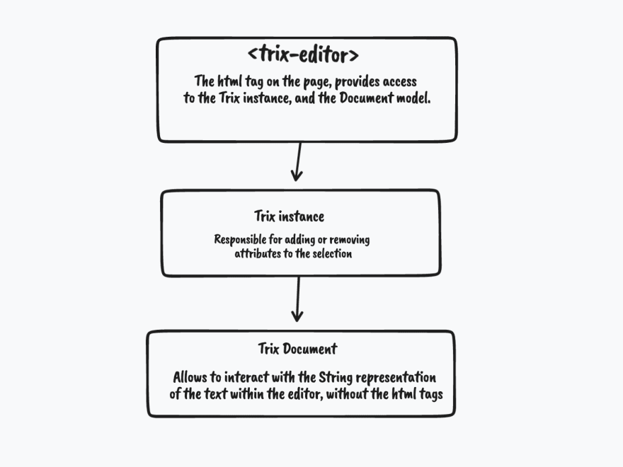
In this post we will work with second, the <trix-editor>.editor.
Every text passed through the trix editor will be converted into a Piece class. Which represents a piece of text in the Document.
Trix comes with a beautiful toolbar that allows to most of the things you want.

But, sometimes you need to adjust the styles to match the design that your team has given you. Or, you need to have some type of "Custom action" that needs to act and change a Piece of the Document. Then you would need to do some manual configuration(although Trix makes it really easy to add another action!, you'll see).
In this post. We will add a custom toolbar that allows to change the text color and background color of a selection. In future posts, we will add the ability to change the text size of a selection!.
After creating the project and installing the libraries, we end up with this
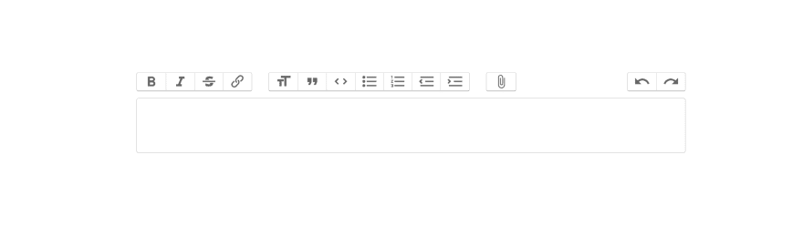
First things first. Let's hide the default trix toolbar. Open up app/assets/stylesheets/application.css.
trix-toolbar {
    display: none;
}
and add our custom toolbar. It looks like this initially,
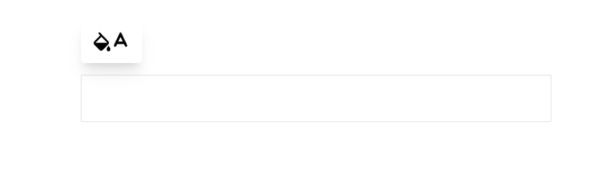
To offer a color picker. We use a color picker package and encapsulate the logic into a color_picker_controller Stimulus Controller.
The color picker controller looks like this
import {Controller} from "@hotwired/stimulus"

export default class extends Controller {
  static targets = ["picker"]

  connect() {
    this.colorPicker =  new window.iro.ColorPicker(this.pickerTarget, {
      width: 280,
      color: this.defaultValue,
      layout: [
        {
          component: iro.ui.Box,
          options: {
            boxHeight: 160
          }
        },
        {
          component: iro.ui.Slider,
          options: {
            sliderType: "hue",
          }
        },
      ]
    })


    this.colorPicker.on("input:change", (color) => {
      this.dispatch("change", {
        detail: color.hexString
      })
    })
  }
}
It sets up an Iro instance that will dispatch a change event whenever the color was changed via the mousewheel.
The real thing happens inside the trix_controller. To add a custom attribute to trix, you need to register the attribute in Trix's configuration. Luckily, it's a simple task doing so,
    Trix.config.textAttributes.foregroundColor = {
      styleProperty: "color",
      inheritable: 1
    }

    Trix.config.textAttributes.backgroundColor = {
      styleProperty: "background-color",
      inheritable: 1
    }
We access the Trix.config.textAttributes object which contains all of the already provided action's attributes in Trix's toolbar, then set the backgroundColor and foregroundColor. The styleProperty needs to correspond to a valid CSS property. This tells trix that this transformation will apply this css property on the selection.
To activate the text or background attribute, we listen to the color-picker:change event emitted by color_picker_controller, eventually it reaches this method
  changeColor(e) {
    this.colorValue = e.detail
    if(this.backgroundColorTarget.contains(e.target)) {
      this.trixEditor.activateAttribute("backgroundColor", e.detail)
    } else {
      this.trixEditor.activateAttribute("foregroundColor", e.detail)
    }
  }
Because we have two different color pickers that will change the text color and background color, we need to know which one has emitted the event. Simply checking which one of the targets contains the event will suffice.
If it's the background, then we activate the attribute and pass the value for the attribute for Trix to apply.
this.trixEditor.activateAttribute("backgroundColor", e.detail)
It's just like calling a method, i.e the attribute and passing an argument, i.e the e.detail. Only Trix does that behind the scene, we only need to call activateAttribute method.
Same is true for text color, we simply have to tell Trix to apply the correct attribute(foregroundColor) and apply the color on the selection.
Eventually, we end up with this
You can clone the repository here
Thank you for reading, and Happy Coding!.
You can also view other articles where we add new content to Trix's toolbar

Resources
- Trix's website
- Trix's Repository
- tldraw for drawing.
- Tailwind CSS
- iro.js
- Tailwind CSS Stimulus Components


Latest comments (3)
Thank you, very helpful. I want to modify the link toolbar button to allow to enter both the text and the url for the href. Right now, the button only allows for the url entry. How would you go about customizing this? Thanks!
Hi. Glad you liked it.
Could you explain your case a bit more?
Very informative..