So far, all the programs we have looked at have been entirely text based. They have taken text input and produced text output, on the console or saved to files.
While text is flexible and powerful, sometimes a picture is worth a thousand words. Especially when analysing data, you'll often want to produce plots and graphs. There are three main ways of achieving this using Repl.it.
- Creating a front-end only project and using only JavaScript, HTML and CSS.
- Creating a full web application with something like Flask, analysing the data in Python and passing the results to a front end to be visualised.
- Using Python code only, creating windows using X and rendering the plots in there.
Option 1 is great if you're OK with your users having access to all of your data, you like doing data manipulation in JavaScript, and your data set is small enough to load into a web browser. Option 2 is often the most powerful, but can be overkill if you just want a few basic plots.
Here, we'll demonstrate how to do option 3, using Python and Matplotlib.
Installing Matplotlib and creating a basic line plot
Matplotlib is a third-party library for doing all kinds of plots and graphs in Python. We can install it by using Repl.it's "magic import" functionality. Matplotlib is a large and powerful library with a lot of functionality, but we only need pyplot for now: the module for plotting.
Create a new Python repl and add the following code.
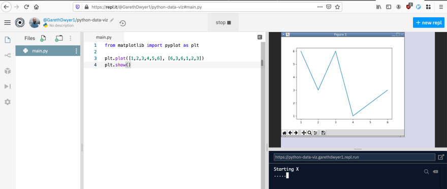
from matplotlib import pyplot as plt

plt.plot([1,2,3,4,5,6], [6,3,6,1,2,3])
plt.show()
There are many traditions in the Python data science world about how to import libraries. Many of the libraries have long names and get imported as easier-to-type shortcuts. You'll see that nearly all examples import pyplot as the shorter plt before using it, as we do above. We can then generate a basic line plot by passing two arrays to plt.plot() for X and Y values. In this example, the first point that we plot is (1,6) (the first value from each array). We then add all of the plotted points joined into a line graph.
Repl.it knows that it needs an X server to display this plot (triggered when you call plt.show()), so after running this code you'll see "Starting X" in the main output console and a new graphical window will appear.
The X server is very limited compared to a full operating system GUI. Beneath the plot, you'll see some controls to pan and zoom around the image, but if you try to use them you'll see that the experience is not that smooth.
Line plots are cool, but we can do more. Let's plot a real data set.
Making a scatter plot of US cities by state
Scatter plots are often used to plot 2D data and look for correlations and other patterns. However, they can also loosely be used to plot geographical X-Y coordinates (in reality, the field of plotting geographical points is far more complicated). We'll use a subset from the city data from simplemaps to generate our next plot. Each row of the data set represents on city in the USA, and gives us its latitude, longitude, and two-letter state code.
To download the data and plot it, replace the code in your main.py file with the following.
from matplotlib import pyplot as plt
import requests
import random

data_url = "https://raw.githubusercontent.com/sixhobbits/ritza/master/data/us-cities.txt"

r = requests.get(data_url)

with open("us-cities.txt", "w") as f:
    f.write(r.text)

lats = []
lons = []
colors = []
state_colors = {}

# matplotlib uses single letter shortcuts for common colors
# blue, green, red, cyan, magenta, yellow, black
all_colors = ['b', 'g', 'r', 'c', 'm', 'y', 'k']

with open("us-cities.txt") as f:
    for i, line in enumerate(f):
        state, lat, lon = line.split()
        lats.append(float(lat))
        lons.append(float(lon))

        # we assign each state a random colour, but once we've picked
        # a colour we always use it for all cities in that state.
        if state not in state_colors:
            state_colors[state] = random.choice(all_colors)
        colors.append(state_colors[state])
plt.scatter(lons, lats, c=colors)
plt.show()
If you run this, you'll notice it takes a little bit longer than the six point plot we created before, as it now has to plot nearly 30 000 data points. Once it's done, you should see something similar to the following (though, as the colours were chosen randomly, yours might look different).

You'll also notice that while it's recognisable as the US, the proportions are not right. Mapping a 3D sphere to a 2D plane is surprisingly difficult and there are many different ways of doing it.
More advanced plotting with seaborn and pandas
Plotting X-Y points is a good start, but in most cases you'll want to do a little bit more. seaborn is a plotting library built on top of Matplotlib that makes it easier to create good-looking visualisations.
Let's do another scatter plot based on GDP and life expectancy data to see if people live longer in richer countries.
Replace the code in main.py with the following. Remember how we mentioned earlier that data scientists have traditions about how to import certain libraries? Here you see a few more of these "short names". We'll use seaborn for plotting but import it as sns, pandas for reading the CSV file but import it as pd and NumPy for calculating the correlation but import it as np.
import requests
import seaborn as sns
import pandas as pd
from matplotlib import pyplot as plt
import numpy as np

data_url = "https://raw.githubusercontent.com/holtzy/data_to_viz/master/Example_dataset/4_ThreeNum.csv"

r = requests.get(data_url)

with open("gdp-life.txt", "w") as f:
    f.write(r.text)

df = pd.read_csv("gdp-life.txt")
print(df.head())

print("___")
print("The correlation is: ", np.corrcoef(df["gdpPercap"], df["lifeExp"])[0, 1])
print("___")

sns.lmplot("gdpPercap", "lifeExp", df).set_axis_labels(
    "Life expectancy", "GDP per capita"
)

plt.title("People live longer in richer countries")
plt.tight_layout()
plt.show()
If you run this, you'll see it plots each country in a similar way to our previous scatter plot, but also adds a line showing the correlation.
In the output pane below you can also see that the correlation coefficient between the two variables is 0.67 which is a fairly strong positive correlation.

Data science and data visualisation are huge topics, and there are dozens of Python libraries that can be used to plot data. For a good overview of all of them and their strengths and weaknesses, you should watch Jake Vanderplas's talk.
Saving plots to PNG files
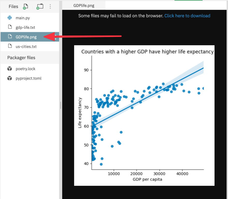
While visualising data right after you analyse it is often useful, sometimes you need to save the figures to embed into reports. You can save your graphs by calling plt.savefig(). Change the last line (plt.show()) to
plt.savefig("GDPlife.png")
Rerun the code. Instead of seeing the plot appear in the right-hand pane, you'll see a new file in the files pane. Clicking on it will show you the PNG file in the editing pane.
Make it your own
If you followed along, you'll already have your own version of the repl to extend. If not, start from ours. Fork it from the embed below.
Where next?
You've learned how to make some basic plots using Python and Repl.it. There are millions of freely available data sets on the internet, waiting for people to explore them. You can find many of these using Google's Dataset Search service. Pick a topic that you're interested in and try to find out more about it through data visualisations.
Next up, we'll explore the mutiplayer functionality of Repl.it in more detail so that you can code collaboratively with friends or colleagues.


Latest comments (0)