
Author: Abdullah Numan
Introduction
In this article we look at how to implement responsive layouts with CSS Grid using TailwindCSS Grid classes.
TailwindCSS, or just Tailwind, is a CSS framework used for rapidly building websites. It comes with a core set of already defined CSS utility classes that can be composed and easily custom configured afterwards to implement any design with respect to responsiveness, layout and themes.
It is possible to build multi column layouts using Tailwind with its Flexbox classes by dividing the width of the container with w-{fraction} classes. However, with versions 1.2 and above, we can build highly elaborate layouts with Tailwind's CSS Grid classes.
Steps we'll cover:
- What is Tailwind Grid System
- Basic Tailwind Grid Example
- Add Grid Formatting Context
- Size and Placement
- Grid Rows
- Reorder Regions
- Customizing TailwindCSS Theme
What is Tailwind Grid System
Unlike Twitter's Bootstrap and Foundation, that still use flexbox to implement their 12 column layout under the hood, Tailwind uses CSS Grid to allow us build responsive and highly customizable layouts of any number of columns and rows. It ships with CSS classes that implement a CSS Grid container with names like grid, grid-cols-{n} and grid-rows-{n}, etc. It also comes with Grid child classes that helps us define grid behavior of child elements of the grid with classes like col-span-{n}, row-span-{n}, and so on.
Tailwind's default configuration allows a maximum of 12 columns on a screen. It can be customized from the tailwind.config.js file. Many other options related to Tailwind's CSS Grid classes can be altered according to our taste and needs. In this post, we are going to explore extending the number of columns to 16.
In this post, mostly, we will be playing with responsive application of Tailwind Grid classes that allow us to change layouts after a certain breakpoint, such as using grid-cols-3 md:grid-cols-3.
I recommend following the documentation for Grid classes starting from this section of TailwindCSS refrences and those that follow.
Project Goals
We'll implement a simple layout having a navbar, a side content area, a main content area and a footer. It will consist of three columns and five rows.
We'll start from scratch with a set of divs that follow the Block Formatting Context or BFC, and then gradually cover the concepts related to Grid Formatting Context by introducing new classes according to our needs.
## Project Setup
Before we begin though, in order to get things ready, follow these steps:
- Navigate to a folder of your choice and clone this repo
- Open the cloned repository. It is important that it has the Live Server added and enabled.
Install dependencies with
npx tailwindcss -i ./src/styles.css -o ./dist/styles.css --watch
Start Live Server and navigate to the port number. Or just click on the
Go Livebutton at the bottom right corner of the your code editor:
## Basic Tailwind Grid Example
First, we have the following index.html document that is linked to the TailwindCSS styles in the <head>:
<!-- index.html -->
<!DOCTYPE html>
<html lang="en">
<head>
<meta charset="UTF-8">
<meta http-equiv="X-UA-Compatible" content="IE=edge">
<meta name="viewport" content="width=device-width, initial-scale=1.0">
<link href="/dist/styles.css" rel="stylesheet">
<title>Document</title>
</head>
<body>
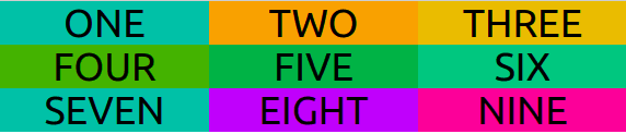
<div class="container m-auto">
<div class="tile bg-teal-500">
<h1 class="tile-marker">ONE</h1>
</div>
<div class="tile bg-amber-500">
<h1 class="tile-marker">TWO</h1>
</div>
<div class="tile bg-yellow-500">
<h1 class="tile-marker">THREE</h1>
</div>
<div class="tile bg-lime-600">
<h1 class="tile-marker">FOUR</h1>
</div>
<div class="tile bg-green-600">
<h1 class="tile-marker">FIVE</h1>
</div>
<div class="tile bg-emerald-500">
<h1 class="tile-marker">SIX</h1>
</div>
<div class="tile bg-teal-500">
<h1 class="tile-marker">SEVEN</h1>
</div>
<div class="tile bg-purple-500">
<h1 class="tile-marker">EIGHT</h1>
</div>
<div class="tile bg-pink-500">
<h1 class="tile-marker">NINE</h1>
</div>
</div>
</body>
</html>
Add Grid Formatting Context
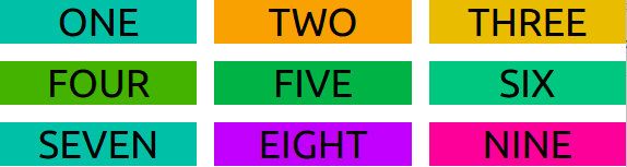
If we introduce grid class to the container div, nothing happens:
<div class="container m-auto grid">
That's because the default grid has only one column.
Column Numbers
Let's add three explicit columns:
<div class="container m-auto grid grid-cols-3">
Now, we have all the divs flowed into 3 columns according to Grid Formatting Context:
Notice that grid-cols-3 just divides the screen into 3 equal parts of each 1fr as with: grid-template-columns: repeat(3, minmax(0, 1fr));.
Grid Gap
Let's add some gap with gap-{size} class. We have to set it to the grid container:
<div class="container m-auto grid grid-cols-3 gap-4">
Now we have a gap between the children divs:
Responsive Column Numbers
We can add columns at larger breakpoints:
<div class="container m-auto grid grid-cols-3 md:grid-cols-5 lg:grid-cols-8 gap-4">
Here, we're using Tailwind's default breakpoints at md: 768px and lg: 1024px. We can see the number of columns increasing at 768px and 1024px:

It's important to notice that Tailwind's responsive classes such as md and lg do not represent screensizes, but rather mobile-first breakpoints. So grid-cols-3 lays out 3 columns for all screen sizes, but since column numbers change after md we get 5 columns after that screen size. And because it changes again after lg we get 8. It doesn't change afterwards, so we continue getting 8 columns even in xl, 2xl screen sizes.
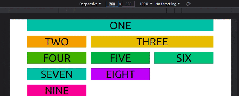
Size and Placement
Tailwind's CSS Grid sizing and placing classes gives us more control over how many columns a section should span and where we want to start and end it.
Setting Size with Span
Below, we place the first div as a navbar. We are doing this with col-span-{n} for each screen size. We have to make sure it starts at the beginning of the grid and spans the entire screen at each screen size:
<div class="tile bg-teal-500 col-span-3 md:col-span-5 lg:col-span-8">
  <h1 class="tile-marker">ONE</h1>
</div>

We can refactor the above div as:
<div class="tile bg-teal-500 col-span-full">
  <h1 class="tile-marker">ONE</h1>
</div>
We can also use col-start-{n} and col-end-{n} to achieve this:
<div class="tile bg-teal-500 col-start-1 col-end-4 md:col-start-1 md:col-end-6 lg:col-start-1 lg:col-end-9">
  <h1 class="tile-marker">ONE</h1>
</div>
But look at the double responsive classes for at each breakpoint for each of start and end:
md:col-start-1 md:col-end-6 lg:col-start-1 lg:col-end-9
They are not very DRY. col-span-{n} classes are better for setting the size.
Let's set some more sizes. The width of the second and third divs like so:
<div class="tile bg-amber-500 col-span-1 md:col-span-2 lg:col-span-3">
  <h1 class="tile-marker">TWO</h1>
</div>
<div class="tile bg-yellow-500 col-span-2 md:col-span-3 lg:col-span-5">
  <h1 class="tile-marker">THREE</h1>
</div>
Placement
col-span-{n} classes provide limited freedom to place divs inside the grid container, whereas col-start-{n} and col-end-{n} leads to a lot of repetition when repsonsive classes are used.
We can combine start classes with span classes to write more succint code. Start classes can be used to place a div and span classes can be used to define its width and height.
Let's see an instance of it with the fourth div:
<div class="tile bg-lime-600 lg:col-start-4 lg:col-span-2">
  <h1 class="tile-marker">FOUR</h1>
</div>

As we can see, at lg and onward the fourth div starts at column four and spans two columns to the right.
OK.
Now if we look closely at the layout, we see that everything is haphazard and it is still not a well set and usable grid to work with - as the last two divs seem to be isolated from the rest. This is because, we have applied the half of the equation: only Grid column classes. The other half involves the Grid rows.
Is your CRUD app overloaded with technical debt?
Meet the headless, React-based solution to build sleek CRUD applications. With refine, you can be confident that your codebase will always stay clean and boilerplate-free.
Try refine to rapidly build your next CRUD project, whether it's an admin panel, dashboard, internal tool or storefront.

Grid Rows
If we want to have finer control over the Grid, we need to explicitly set the number of rows, just like we have the columns. We'll do this by introducing grid-rows-{n}.
For our grid, we want 5 rows. The number of rows has been defined implicitly so far, but we want to define it explicitly this time. So, we add grid-rows-5 to our container:
<div class="container m-auto grid grid-cols-3 grid-rows-5 md:grid-cols-5 lg:grid-cols-8 gap-4">
Now, we can go ahead and set the last div to become a footer. This footer will be placed to the bottom row. To the left side on smaller screens but span the entire bottom row after md:
<div class="tile bg-pink-500 row-start-5 md:col-span-full">
  <h1 class="tile-marker">NINE</h1>
</div>
Here, row-start-5 tells the footer to be placed to the bottom row. It looks like this:
Span Rows
We can go further and make it more structured. Let's make the second div span the left side of the grid - between the navbar and the footer. We can do this by choosing the second row as the starting point of the div and ending at 5:
<div class="tile bg-amber-500 row-start-2 row-end-5 col-span-1 md:col-span-2 lg:col-span-3">
  <h1 class="tile-marker">TWO</h1>
</div>
We have it shaping into a better website layout:

Reorder Regions
We can change the order of a region by altering the the value of n in row-start-{n} and col-start-{n}. The second div could be an ad section which we want to display at the bottom on smaller screens and at the top on larger screens. Let's set its order at smaller screens first and then change it at md:
<div class="tile bg-yellow-500 row-start-4 row-end-5 md:row-start-2 md:row-end-3 col-span-2 md:col-span-3 lg:col-span-5">
  <h1 class="tile-marker">THREE</h1>
</div>
We have something looking like this:

And the final index.html looks like this:
<!-- index.html -->
<!DOCTYPE html>
<html lang="en">
  <head>
    <meta charset="UTF-8">
    <meta http-equiv="X-UA-Compatible" content="IE=edge">
    <meta name="viewport" content="width=device-width, initial-scale=1.0">
  <link href="/dist/styles.css" rel="stylesheet">
  <title>Document</title>
  </head>
  <body>
    <div class="container m-auto grid grid-cols-3 grid-rows-5 md:grid-cols-5 lg:grid-cols-8 gap-4">
      <div class="tile bg-teal-500 col-span-full">
        <h1 class="tile-marker">ONE</h1>
      </div>
      <div class="tile bg-amber-500 row-start-2 row-end-5 col-span-1 md:col-span-2 lg:col-span-3">
        <h1 class="tile-marker">TWO</h1>
      </div>
      <div class="tile bg-yellow-500 row-start-4 row-end-5 md:row-start-2 md:row-end-3 col-span-2 md:col-span-3 lg:col-span-5">
        <h1 class="tile-marker">THREE</h1>
      </div>
      <div class="tile bg-lime-600 lg:col-start-4 lg:col-span-2">
        <h1 class="tile-marker">FOUR</h1>
      </div>
      <div class="tile bg-green-600">
        <h1 class="tile-marker">FIVE</h1>
      </div>
      <div class="tile bg-emerald-500">
        <h1 class="tile-marker">SIX</h1>
      </div>
      <div class="tile bg-teal-500">
        <h1 class="tile-marker">SEVEN</h1>
      </div>
      <div class="tile bg-purple-500">
        <h1 class="tile-marker">EIGHT</h1>
      </div>
      <div class="tile bg-pink-500 row-start-5 md:col-span-full">
        <h1 class="tile-marker">NINE</h1>
      </div>
    </div>
  </body>
</html>

Customizing TailwindCSS Theme
As mentioned above, TailwindCSS Grid configuration can be changed according to our needs.
Let's say for some reason we want to set the maximum number of Tailwind's grid columns to be 16. This means we will need to be able to generate all the grid-cols-{n} classes starting from n 0 to 16. This also means we will need to generate all the col-start-{n} and col-end-{n} classes.
We can generate these classes by extending the related properties in the tailwind.config.js file. For our purposes, the gridTemplateColumns, gridColumnStart and gridColumnEnd properties:
// tailwin.config.js

module.exports = {
  theme: {
    extend: {
      gridTemplateColumns: {
        // Simple 16 column grid
        '16': 'repeat(16, minmax(0, 1fr))',
      },
       gridColumnStart: {
        '13': '13',
        '14': '14',
        '15': '15',
        '16': '16',
        '17': '17',
      },
      gridColumnEnd: {
        '13': '13',
        '14': '14',
        '15': '15',
        '16': '16',
        '17': '17',
      }
    }
  }
}
This will make all the relevant grid classes available for us to use.
Conclusion
In this article, we built a simple responsive layout using Tailwind's CSS Grid classes. These classes allow us to set the number of columns and rows explicitly, and help us make the layout responsive by allowing us to reset them at larger breakpoints.
We can also easily alter the size and placement of a given section with Tailwind Grid. Reordering of sections at different breakpoints are also commonly done. And perhaps more conveniently, Tailwind allows us to customize many of the properties for generating classes we need so that we can build fluid and responsive layouts according to our individual needs.


Oldest comments (2)
It's interesting even though I don't know anything about Tailwind yet, but I plan to learn it.
It gives a perspective of CSS inside HTML without an external CSS file.
Tailwind is the champ on the block.
Some big tech that uses Tailwind: are Google, Facebook and others.
Very interesting, I'm used to Bootstrap. I'm going to give Tailwind my next project a try.