Data visualization is a key skill for aspiring data scientists. Matplotlib makes it easy to create meaningful and insightful plots.
In this article, we’ll see how to build line plots, scatter plots, histograms and customize them to be more visually appealing.
Data used in this article, are created based on the data which is available at World Development Indicators | DataBank.
Line plot
With matplotlib, we can create a bunch of different plots in Python. The most basic plot is the line plot.
Example:
import matplotlib.pyplot as plt
plt.plot(x,y)
plt.show()
We have to
import matplotlib.pyplot as plt.pyplotis a sub-package ofmatplotlib.Use
plt.plot()to build a line plot.yearswill be mapped on the horizontal axis,world_population_billionon the vertical axis.Then
plt.show()function to actually display the plot.
years = [ '2011','2012','2013','2014','2015','2016','2017','2018','2019','2020','2021']
world_population_billion = [7, 7.09, 7.17, 7.26, 7.35, 7.43, 7.52, 7.6, 7.68, 7.76, 7.84]
# Import matplotlib.pyplot as plt
import matplotlib.pyplot as plt
print('World pouplation at', years[-1], 'is', world_population_billion[-1])
# Make a line plot: years on the x-axis, world_population_billion on the y-axis
plt.plot(years, world_population_billion)

# Display the plot with plt.show()
plt.show()

Now that we've built our first line plot, let's work on the next data.
-
life_expectancywhich contains the life expectancy(2020) for each country and -
gdp_per_capita, which contains the GDP per capita(2020) for each country expressed in US Dollars.
GDP stands for Gross Domestic Product. It basically represents the size of the economy of a country. Divide this by the population and you get the GDP per capita.
life_expectancy = [65.173, 78.686, 77.063, 61.487, 77.146, 76.813, 75.224, 76.434, 83.2, 81.19268293, 73.123, 74.053, 77.419, 72.868, 79.308, 74.22682927, 80.79512195, 74.754, 62.077, 72.08, 71.771, 77.545, 69.793, 76.084, 75.998, 73.60731707, 61.981, 61.916, 73.166, 70.054, 59.626, 81.74878049, 53.679, 54.505, 80.329, 77.097, 77.46, 64.525, 60.971, 64.804, 80.465, 58.104, 77.72439024, 78.892, 81.135, 78.22682927, 81.55121951, 67.49, 74.257, 77.216, 72.15, 73.533, 59.057, 78.34634146, 60.721, 66.953, 67.561, 82.13170732, 82.17560976, 77.836, 66.69, 62.383, 73.919, 80.94146341, 64.347, 81.08780488, 72.426, 80.277, 74.529, 61.962, 58.634, 70.023, 64.315, 75.448, 85.38780488, 75.61707317, 83.06585366, 69.887, 71.908, 76.87, 70.748, 82.20487805, 82.34390244, 74.586, 84.61560976, 74.655, 71.37, 66.991, 68.611, 83.42682927, 75.586, 71.8, 68.219, 75.38780488, 79.004, 54.836, 64.423, 73.082, 74.92926829, 81.74146341, 84.37, 67.39, 64.694, 76.306, 79.208, 59.692, 82.65365854, 65.129, 74.17707317, 75.131, 68.002, 72.006, 70.056, 75.93170732, 76.901, 61.387, 67.363, 64.045, 71.067, 81.4097561, 77.77117073, 82.05609756, 74.697, 62.792, 55.018, 75.69317073, 83.2097561, 78.078, 67.428, 78.68, 64.725, 74.363, 76.947, 71.36, 76.6, 80.97560976, 80.08746341, 80.363, 74.35365854, 71.33878049, 69.329, 73.45, 70.583, 75.28, 68.213, 55.066, 83.74390244, 76.86585366, 80.53170732, 73.132, 57.697, 64.379, 82.33414634, 77.144, 76.343, 72.658, 65.53, 71.802, 82.40731707, 83.1, 71.301, 65.815, 77.344, 69.712, 61.34, 71.018, 73.628, 76.891, 77.928, 63.713, 71.18512195, 78.12, 80.90243902, 77.2804878, 78.056, 71.848, 70.623, 75.493, 79.8195122, 66.181, 64.194, 61.738]
gdp_per_capita = [20116137326.0, 15131866271.0, 145000000000.0, 53619071176.0, 1370281481.0, 390000000000.0, 12641209802.0, 2496648045.0, 1330000000000.0, 433000000000.0, 42693000000.0, 9699500000.0, 34723357447.0, 374000000000.0, 4689534962.0, 61489588895.0, 522000000000.0, 1585631670.0, 15651545332.0, 2315436303.0, 36629843806.0, 19955120005.0, 14930072799.0, 1450000000000.0, 12005825770.0, 69889347433.0, 17933606353.0, 2780510625.0, 1703698677.0, 25872798012.0, 40804449726.0, 1650000000000.0, 2326720921.0, 10715396135.0, 253000000000.0, 14700000000000.0, 270000000000.0, 1223876065.0, 48716960860.0, 10483151094.0, 62158002233.0, 61348579465.0, 57203783203.0, 107000000000.0, 24692095945.0, 245000000000.0, 356000000000.0, 3181071154.0, 78844702329.0, 99291124000.0, 365000000000.0, 24638720000.0, 10099157270.0, 30650285472.0, 3984840580.0, 108000000000.0, 4574413823.0, 272000000000.0, 2630000000000.0, 5669368717.0, 15316824039.0, 1830413000.0, 15842922533.0, 3850000000000.0, 70043199814.0, 189000000000.0, 1043411111.0, 5844000000.0, 77604632621.0, 14169626010.0, 1431758243.0, 5471256595.0, 14508218017.0, 23827840810.0, 345000000000.0, 157000000000.0, 21718075725.0, 2670000000000.0, 1060000000000.0, 232000000000.0, 184000000000.0, 426000000000.0, 1890000000000.0, 13812425037.0, 5040000000000.0, 43697659296.0, 171000000000.0, 101000000000.0, 180911843.6, 1640000000000.0, 106000000000.0, 7780874537.0, 18981800705.0, 33645460617.0, 25948915861.0, 2250717718.0, 3039982540.0, 52320215472.0, 56546957475.0, 73353132794.0, 25586111076.0, 13225591804.0, 12172128470.0, 337000000000.0, 3742769967.0, 17465392779.0, 14917038504.0, 7915985514.0, 10926820603.0, 1090000000000.0, 407515928.0, 11859730544.0, 13312981595.0, 4780722122.0, 115000000000.0, 14028811072.0, 78930257227.0, 10562637376.0, 33433670512.0, 914000000000.0, 9435529927.0, 212000000000.0, 12586941393.0, 13741378450.0, 432000000000.0, 12116981815.0, 362000000000.0, 73971391417.0, 300000000000.0, 53977037000.0, 24667052023.0, 35432178068.0, 202000000000.0, 362000000000.0, 597000000000.0, 229000000000.0, 103000000000.0, 144000000000.0, 250000000000.0, 1490000000000.0, 10184345442.0, 807147527.6, 472914469.9, 703000000000.0, 24493157583.0, 4063289450.0, 345000000000.0, 105000000000.0, 53589609581.0, 1545888426.0, 6965285325.0, 335000000000.0, 1280000000000.0, 80969683537.0, 1616772748.0, 872134546.8, 26987563444.0, 2884248048.0, 541000000000.0, 752000000000.0, 8133996648.0, 62409709111.0, 500000000000.0, 1902156800.0, 7574636979.0, 488829964.1, 21392536138.0, 42514151614.0, 720000000000.0, 37600368181.0, 157000000000.0, 359000000000.0, 2760000000000.0, 20900000000000.0, 53560755047.0, 59894305353.0, 896827873.1, 343000000000.0, 4204000000.0, 18840511908.0, 18110631358.0, 18051170799.0]
- Build a line chart, with
life_expectancyon the x-axis, andgdp_per_capitaon the y-axis. Does it make sense to plot this data on a line plot?
# Make a line plot, gdp_per_capita on the x-axis, life_expectancy on the y-axis
plt.plot(gdp_per_capita, life_expectancy)

# Display the plot
plt.show()

Well, this doesn't look right. Let's build a plot that makes more sense.
Scatter Plot
When we have a time scale along the horizontal axis, the line plot is good to go most of the time. But in many other cases, when we're trying to assess if there's a correlation between two variables, for example, the scatter plot is the better choice.
Example:
import matplotlib.pyplot as plt
plt.scatter(x,y)
plt.show()
Let's continue with the gdp_per_capita versus life_expectancy plot, the GDP and life expectancy data for different countries in 2020. Let's see if a scatter plot is a better alternative?
# Use a scatter plot
plt.scatter(gdp_per_capita, life_expectancy)

# Show plot
plt.show()
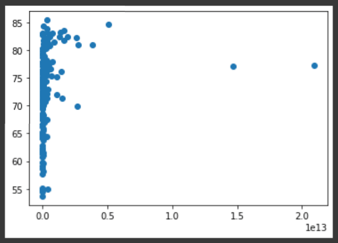
Great! The scatter plot looks much better than line plot in this case.
- A correlation will become clear when we display the GDP per capita on a logarithmic scale using
plt.xscale('log').
# Use a scatter plot
plt.scatter(gdp_per_capita, life_expectancy)

# Put the x-axis on a logarithmic scale
plt.xscale('log')

# Show plot
plt.show()
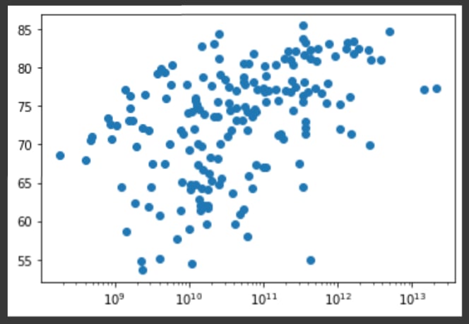
It looks like the higher GDP usually corresponds to a higher life expectancy. Is there a relationship between population and life expectancy of a country?
population = [38928341.0, 2837849.0, 43851043.0, 32866268.0, 97928.0, 45376763.0, 2963234.0, 106766.0, 25693267.0, 8916864.0, 10093121.0, 393248.0, 1701583.0, 164689383.0, 287371.0, 9379952.0, 11544241.0, 397621.0, 12123198.0, 771612.0, 11673029.0, 3280815.0, 2351625.0, 212559409.0, 437483.0, 6934015.0, 20903278.0, 11890781.0, 555988.0, 16718971.0, 26545864.0, 38037204.0, 4829764.0, 16425859.0, 19116209.0, 1411100000.0, 50882884.0, 869595.0, 89561404.0, 5518092.0, 5094114.0, 26378275.0, 4047680.0, 11326616.0, 1207361.0, 10697858.0, 5831404.0, 988002.0, 10847904.0, 17643060.0, 102334403.0, 6486201.0, 1402985.0, 1329479.0, 1160164.0, 114963583.0, 896444.0, 5529543.0, 67379908.0, 280904.0, 2225728.0, 2416664.0, 3722716.0, 83160871.0, 31072945.0, 10700556.0, 112519.0, 168783.0, 16858333.0, 13132792.0, 1967998.0, 786559.0, 11402533.0, 9904608.0, 7481000.0, 9750149.0, 366463.0, 1380004385.0, 273523621.0, 83992953.0, 40222503.0, 4985674.0, 59449527.0, 2961161.0, 126261000.0, 10203140.0, 18755666.0, 53771300.0, 119446.0, 51836239.0, 4270563.0, 6579900.0, 7275556.0, 1900449.0, 6825442.0, 2142252.0, 5057677.0, 6871287.0, 2794885.0, 630419.0, 649342.0, 27691019.0, 19129955.0, 32365998.0, 540542.0, 20250834.0, 515332.0, 4649660.0, 1265740.0, 128932753.0, 115021.0, 2620495.0, 3278292.0, 621306.0, 36910558.0, 31255435.0, 54409794.0, 2540916.0, 29136808.0, 17441500.0, 271960.0, 5090200.0, 6624554.0, 24206636.0, 206139587.0, 2072531.0, 5379475.0, 5106622.0, 220892331.0, 4314768.0, 8947027.0, 7132530.0, 32971846.0, 109581085.0, 37899070.0, 10297081.0, 3281538.0, 2881060.0, 19257520.0, 144073139.0, 12952209.0, 198410.0, 219161.0, 34813867.0, 16743930.0, 7976985.0, 5685807.0, 5458827.0, 2102419.0, 686878.0, 15893219.0, 59308690.0, 47363419.0, 21919000.0, 183629.0, 110947.0, 43849269.0, 586634.0, 10353442.0, 8636561.0, 9537642.0, 59734213.0, 69799978.0, 1318442.0, 8278737.0, 105697.0, 1399491.0, 11818618.0, 84339067.0, 45741000.0, 44132049.0, 9890400.0, 67081000.0, 331501080.0, 3473727.0, 34232050.0, 307150.0, 97338583.0, 106290.0, 29825968.0, 18383956.0, 14862927.0]

# Build Scatter plot
plt.scatter(population, life_expectancy)

# Show plot
plt.show()

Let's see the plot with x axis in a logarithmic scale.
# Build Scatter plot
plt.scatter(population, life_expectancy)

# Put the x-axis on a logarithmic scale
plt.xscale('log')

# Show plot
plt.show()
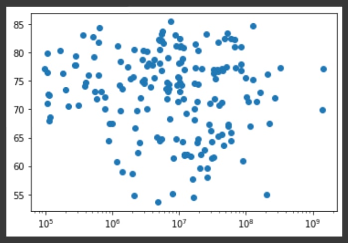
There's no clear relationship between population and life expectancy, which makes perfect sense.
Histogram
The histogram is a type of visualization that's very useful to explore the data. It can help use to get an idea about the distribution of our variables.
To see how life expectancy in different countries is distributed, let's create a histogram of life_expectancy using plt.hist().
# Create histogram of life_expectancy data
plt.hist(life_expectancy)

# Display histogram
plt.show()
In the above code, we didn't specify the number of bins. By default, Python sets the number of bins to 10 in that case. The number of bins is pretty important.
- Too few bins will oversimplify reality and won't show you the details.
- Too many bins will overcomplicate reality and won't show the bigger picture.
To control the number of bins to divide your data in, you can set the bins argument.
We'll create two plots specifying bins.
- Build a histogram of
life_expectancy, with 5 bins. Can you tell which bin contains the most observations?
# Build histogram with 5 bins
plt.hist(life_expectancy, bins=5)

# Show and clean up plot
plt.show()

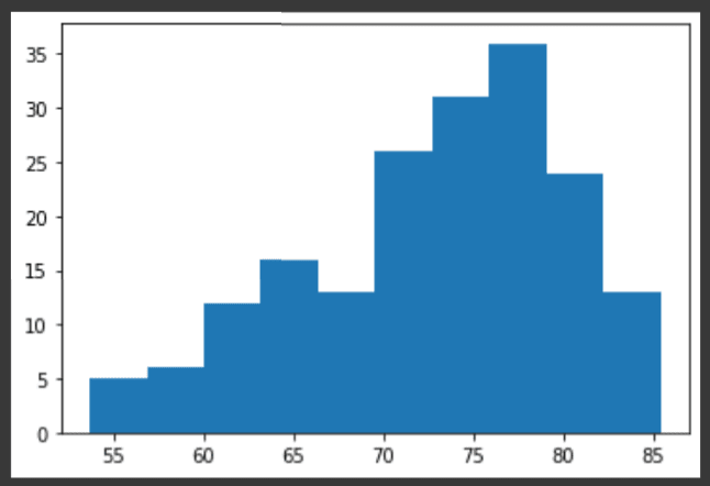
- Build another histogram of
life_expectancy, this time with 20 bins. Is this better?
# Build histogram with 20 bins
plt.hist(life_expectancy, bins=20)

# Show and clean up again
plt.show()

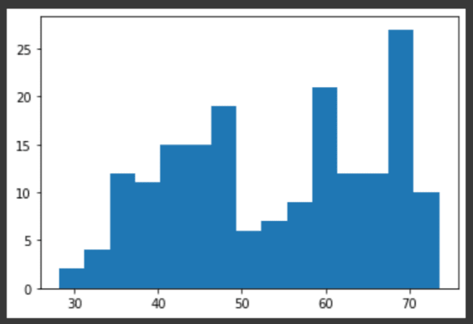
Compare using histograms
Histograms are helpful in doing comparisons. life_expectancy contains life expectancy data for different countries in 2020. life_expectancy_1960, containing similar data for 1960. Let's make a histogram for both datasets.
- Build a histogram of
life_expectancywith 15 bins. - Build a histogram of
life_expectancy_1960, also with 15 bins.
and let's see is there any pattern?
life_expectancy_1960 = [32.446, 62.283, 46.141, 37.524, 61.968, 65.055, 65.972, 65.662, 70.81707317, 68.58560976, 61.034, 64.74, 51.869, 45.379, 64.472, 67.70809756, 69.70195122, 59.981, 37.271, 34.526, 41.82, 60.353, 49.179, 54.143, 54.81, 69.24756098, 34.432, 41.281, 48.461, 41.242, 41.785, 71.13317073, 36.249, 38.02, 57.219, 43.725, 57.269, 41.447, 41.098, 45.721, 60.381, 36.095, 64.60865854, 63.834, 69.618, 70.34878049, 72.17658537, 44.038, 51.602, 52.982, 48.042, 49.95, 36.535, 67.90290244, 43.572, 38.419, 60.811, 68.8197561, 69.86829268, 56.282, 39.694, 32.054, 63.651, 69.31002439, 45.843, 68.16390244, 62.231, 60.97, 46.702, 34.89, 37.478, 60.26, 41.762, 46.274, 66.96168293, 68.00317073, 73.42317073, 41.422, 46.664, 44.947, 48.022, 69.7965122, 69.12390244, 64.77, 67.66609756, 52.651, 58.36758537, 46.76, 47.061, 55.41553659, 59.343, 56.12807317, 43.204, 69.78682927, 63.267, 47.919, 34.264, 42.609, 69.84731707, 68.44639024, 64.828, 39.962, 36.672, 59.991, 37.343, 28.199, 69.4332439, 44.432, 58.74521951, 57.077, 54.513, 61.995, 48.392, 63.70560976, 48.458, 39.439, 42.381, 46.483, 35.583, 73.39268293, 58.63902439, 71.23658537, 46.998, 35.053, 36.976, 60.62280488, 73.5497561, 42.672, 45.299, 60.864, 38.935, 63.881, 48.012, 61.105, 67.6804878, 63.27290244, 68.71960976, 61.094, 65.64243902, 66.05529268, 42.616, 56.902, 50.378, 45.638, 38.223, 31.566, 65.65982927, 69.92365854, 68.97804878, 48.123, 36.976, 48.406, 69.10926829, 59.369, 56.739, 59.26, 48.194, 59.682, 73.00560976, 71.31341463, 50.613, 43.6, 54.701, 33.729, 40.297, 59.885, 62.222, 42.021, 45.369, 44.359, 68.29953659, 51.537, 71.12682927, 69.77073171, 67.783, 58.835, 48.975, 59.039, 66.22485366, 29.919, 46.687, 53.019]

# Histogram of life_expectancy_1960, 15 bins
plt.hist(life_expectancy_1960, bins=15)

# Show and clear plot
plt.show()
# Histogram of life_expectancy, 15 bins
plt.hist(life_expectancy, bins=15)

# Show and clear plot
plt.show()

By comparing 2 histograms, we can see that most of life expectancies in 1960 are lower compared to most of life expectancies in 2020.
Does life expectancies become higer as the world become more advanced in health care system?
Customizing Plots
Creating a plot is great. Making the correct plot, that makes the message very clear, is the real challenge.
For each visualization, we have many options. First of all, there are the different plot types. And for each plot, you can do an infinite number of customizations.
You can change
- colors,
- shapes,
- labels,
- axes, and so on.
The choice depends on
- the data, and
- the story you want to tell with the data.
There are so many possible customizations. Let's see the code script which we wrote to build a simple line plot of world population from 2011 to 2021.
# Make a line plot: years on the x-axis, world_population_billion on the y-axis
plt.plot(years, world_population_billion)

# Display the plot with plt.show()
plt.show()
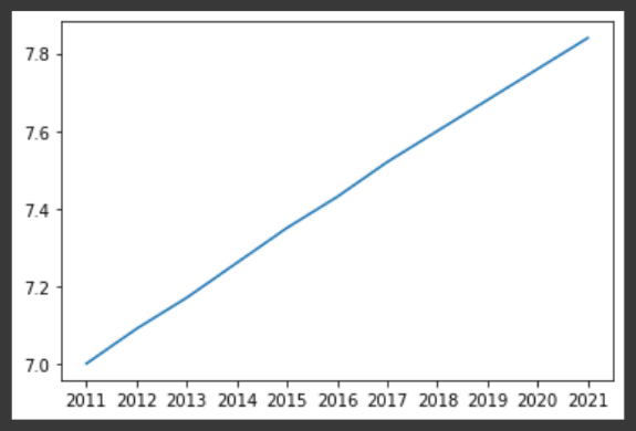
We already get a pretty nice plot.But some things can be improved. It should be clear which data we are displaying, especially to people who are seeing the graph for the first time.
Label the axes
The first thing you always need to do is label your axes.
Let's do this by adding the xlabel and ylabel functions. As inputs, we pass strings that should be placed alongside the axes. We have to call these functions before calling the show function, otherwise our customizations will not be displayed.
# Make a line plot: years on the x-axis, world_population_billion on the y-axis
plt.plot(years, world_population_billion)

plt.xlabel('Year')
plt.ylabel('Population')

# Display the plot with plt.show()
plt.show()

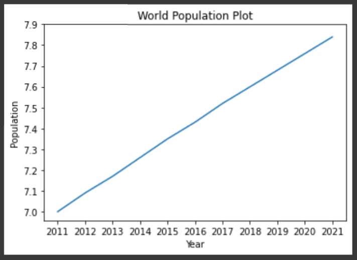
Add Title
We're also going to add a title to our plot, with the title function. We pass the actual title, 'World Population Plot', as an argument.
# Make a line plot: years on the x-axis, world_population_billion on the y-axis
plt.plot(years, world_population_billion)

plt.xlabel('Year')
plt.ylabel('Population')
plt.title('World Population Plot')

# Display the plot with plt.show()
plt.show()

Now we can give readers more information about the data on the plot, telling what the plot is about.
Ticks
We can also customize the y-axis.We can do this with the yticks function. First specify the list of ytick locations.
# Make a line plot: years on the x-axis, world_population_billion on the y-axis
plt.plot(years, world_population_billion)

plt.xlabel('Year')
plt.ylabel('Population')
plt.title('World Population Plot')

plt.yticks(ticks=[7,7.1,7.2,7.3,7.4,7.5,7.6,7.7,7.8,7.9,],)

# Display the plot with plt.show()
plt.show()
The reslut showing ticks exactly at the positons we specified.
We want to make it clear we're talking about billions, we can add a second argument to the yticks function, which is a list with the display names of the ticks. This list(labels) should have the same length as the first list(ticks).
# Make a line plot: years on the x-axis, world_population_billion on the y-axis
plt.plot(years, world_population_billion)

plt.xlabel('Year')
plt.ylabel('Population')
plt.title('World Population Plot')

plt.yticks(ticks=[7,7.1,7.2,7.3,7.4,7.5,7.6,7.7,7.8,7.9, ],
           labels=['7 B','7.1 B','7.2 B','7.3 B','7.4 B','7.5 B','7.6 B','7.7 B','7.8 B','7.9 B', ])

# Display the plot with plt.show()
plt.show()

The labels changed accordingly. Awesome!
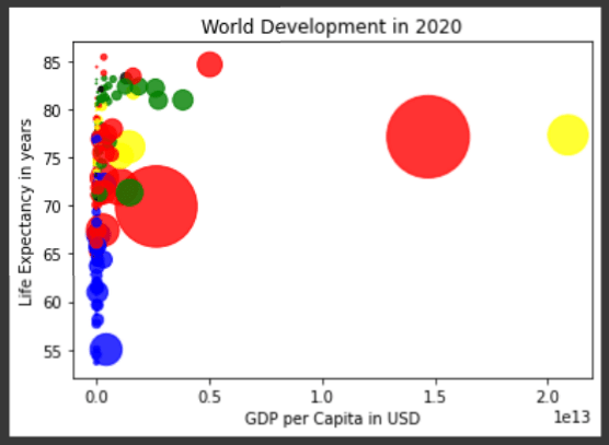
Sizes
We have seen that the scatter plot is just a cloud of blue dots, indistinguishable from each other. Wouldn't it be nice if we can set the size of the dots corresponds to the population? We can do that by using the argument s, for size. dot_size_list is a list containing size of each point scaled to each country's population.
dot_size_list = [item*2/1000000 for item in population]

plt.scatter(gdp_per_capita, life_expectancy, s = dot_size_list)

# plt.xscale('log')
plt.xlabel('GDP per Capita in USD')
plt.ylabel('Life Expectancy in years')
plt.title('World Development in 2020')

# Display the plot
plt.show()

Now the dots have their own sizes but the plot is still difficult to observe.
Color
Next we will make the plot more colorful!
dot_color is a list with a color for each corresponding country, depending on the continent the country is part of. dot_color is already created for each country using the following continent_colors mapping.
continent_colors = {
    'Asia':'red',
    'Europe':'green',
    'Africa':'blue',
    'Americas':'yellow',
    'Oceania':'black'
}
- Add
c = dot_colorto the arguments of theplt.scatter()function. - Change the opacity of the bubbles by setting the
alphaargument to0.8insideplt.scatter(). Alpha can be set from zero to one, where zero is totally transparent, and one is not at all transparent.
dot_color = ['red', 'green', 'blue', 'blue', 'yellow', 'yellow', 'red', 'yellow', 'black', 'green', 'red', 'yellow', 'red', 'red', 'yellow', 'green', 'green', 'yellow', 'blue', 'red', 'yellow', 'green', 'blue', 'yellow', 'red', 'green', 'blue', 'blue', 'blue', 'red', 'blue', 'yellow', 'blue', 'blue', 'yellow', 'red', 'yellow', 'blue', 'blue', 'blue', 'yellow', 'blue', 'green', 'yellow', 'red', 'green', 'green', 'blue', 'yellow', 'yellow', 'blue', 'yellow', 'blue', 'green', 'blue', 'blue', 'black', 'green', 'green', 'black', 'blue', 'blue', 'red', 'green', 'blue', 'green', 'yellow', 'black', 'yellow', 'blue', 'blue', 'yellow', 'yellow', 'yellow', 'red', 'green', 'green', 'red', 'red', 'red', 'red', 'green', 'green', 'yellow', 'red', 'red', 'red', 'blue', 'black', 'red', 'red', 'red', 'red', 'green', 'red', 'blue', 'blue', 'blue', 'green', 'green', 'red', 'blue', 'blue', 'red', 'red', 'blue', 'green', 'blue', 'blue', 'yellow', 'black', 'green', 'red', 'green', 'blue', 'blue', 'red', 'blue', 'red', 'green', 'black', 'black', 'yellow', 'blue', 'blue', 'green', 'green', 'red', 'red', 'yellow', 'black', 'yellow', 'yellow', 'red', 'green', 'green', 'yellow', 'red', 'green', 'green', 'blue', 'black', 'blue', 'red', 'blue', 'blue', 'red', 'green', 'green', 'black', 'blue', 'blue', 'green', 'red', 'yellow', 'yellow', 'blue', 'yellow', 'green', 'green', 'red', 'blue', 'red', 'red', 'blue', 'black', 'yellow', 'blue', 'red', 'blue', 'green', 'red', 'green', 'yellow', 'yellow', 'red', 'black', 'red', 'yellow', 'red', 'blue', 'blue']

# Specify c and alpha inside plt.scatter()
plt.scatter(gdp_per_capita, life_expectancy, s = dot_size_list, c=dot_color, alpha=0.8)

# Previous customizations
plt.xlabel('GDP per Capita in USD')
plt.ylabel('Life Expectancy in years')
plt.title('World Development in 2020')

# Show the plot
plt.show()
let's scale the x axis into log to get another point of view.
# Specify c and alpha inside plt.scatter()
plt.scatter(gdp_per_capita, life_expectancy, s = dot_size_list, c=dot_color, alpha=0.8)

# Previous customizations
plt.xscale('log')
plt.xlabel('GDP per Capita in USD(log scaled)')
plt.ylabel('Life Expectancy in years')
plt.title('World Development in 2020')

# Show the plot
plt.show()
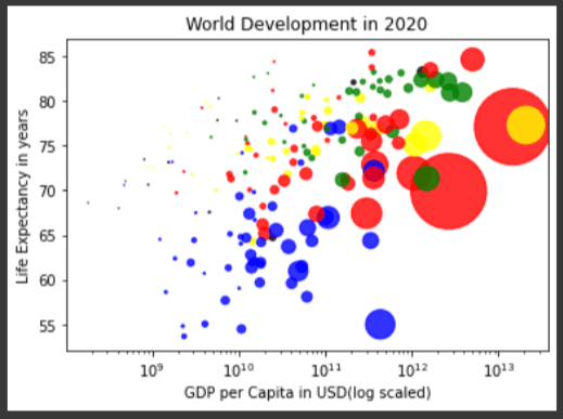
Interesting. We can see the plot more clearly in this plot with log-scaled x-axis.
Display text on the plot
Now we will display text on the plot by specifying x, y positions as arguments using text function.
# Specify c and alpha inside plt.scatter()
plt.scatter(gdp_per_capita, life_expectancy, s = dot_size_list, c=dot_color, alpha=0.8)

# Previous customizations
plt.xscale('log')
plt.xlabel('GDP per Capita in USD(log scaled)')
plt.ylabel('Life Expectancy in years')
plt.title('World Development in 2020')

# China
plt.text(1.470000e+13, 77.097, 'CHN')
# United state
plt.text(2.090000e+13, 77.280488, 'USA')
# Myanmar
plt.text(7.893026e+10, 67.363, 'MMR')

# Show the plot
plt.show()

Looks like we need to customize the size of the figure to get a better view.
Figure size
We can do it by specifying figsize=[Width inches, height inches] in plt.figure().
plt.figure(figsize=[14,6])
# Specify c and alpha inside plt.scatter()
plt.scatter(gdp_per_capita, life_expectancy, s = dot_size_list, c=dot_color, alpha=0.8)

# Previous customizations
plt.xscale('log')
plt.xlabel('GDP per Capita in USD(log scaled)')
plt.ylabel('Life Expectancy in years')
plt.title('World Development in 2020')

# China
plt.text(1.470000e+13, 77.097, 'CHN')
# United state
plt.text(2.090000e+13, 77.280488, 'USA')
# Myanmar
plt.text(7.893026e+10, 67.363, 'MMR')

# Show the plot
plt.show()

Here we notice that the countries in blue, located in Africa, have both low life expectancy and a low GDP per capita.
Beautiful! A visualization only makes sense if we can interpret it properly.
In this article we learned how to plot line, scatter, histogram using matplotlib and how to customize them.
Connect & Discuss with us on LinkedIn


Oldest comments (0)