Introduction
A boxplot is a graph that is usually used for the descriptive analysis of numerical data. It provides us with information about data structures and distributional features of the data based on measures of central tendency and measures of dispersion including the median, quartiles, maximum, minimum, and symmetry. Boxplot can also be used to identify outliers in a dataset.
Boxplots consist of a box and whiskers. Boxplots can either be in a vertical or horizontal position. When in a vertical position, the bottom end of the box is the lower quartile while the top end of the box is the upper quartile. The height of the box which extends from the lower to the upper quartile is the interquartile range. It contains 50% of the data. The median is the horizontal line inside the box. Whiskers appear at the end of the plot. They mark the minimum and maximum observations of the data. The data observations that appear beyond the whiskers are the outliers.

If the median is in the middle of the box, the distribution of the data is symmetric otherwise it is skewed.

When the median is closer to the lower quartile and the lower whisker is shorter, then it is a right-skewed distribution (positive skewness), otherwise when the median is closer to the upper quartile and the upper whisker is shorter, then it is a left-skewed distribution (negative skewness).

How to create a Boxplot
To create our boxplot, we are going to use the CarPrice_Assignment.csv Dataset from Kaggle.
As a first step, we are going to import libraries that we will be using.
import pandas as pd

import seaborn as sns

import matplotlib.pyplot as plt
In the next step, we are going to read the dataset and view the first 5 rows
df = pd.read_csv('../input/car-price-prediction/CarPrice_Assignment.csv')

df.head()

Now we are going to create a boxplot for the feature ‘price’ to get a descriptive analysis of it.
sns.set_style('whitegrid')

sns.boxplot(y='price', data = df)

plt.ylabel('price') #setting text for y axis

plt.show()
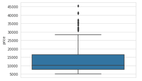
From the boxplot, we can see that on average, the price of a car is around 10,000. The minimum price of a car is 5,000 and the maximum price is around 28,000 to 29,000. We can also note the outliers in the dataset and that the distribution is right-skewed.
Boxplots as a way to compare several datasets
Although boxplots are usually used for descriptive analysis, they can also be used to visualize correlations and associations between variables. They show the descriptive analysis of a dependent numerical feature against each unique value of an independent categorical feature.
As an example, we are going to use the dataset from before. We are going to create a boxplot to show the descriptive analysis of the feature ‘price’ against each unique value of the feature ‘fuel type’.
sns.set_style("whitegrid")

sns.boxplot(x='fueltype', y='price', data =df)

plt.xlabel('fueltype') #Set text for the x axis

plt.ylabel('price') #Set text for y axis

plt.show()

As per the boxplots above, we can see that the price for cars with fuel type diesel and fuel type gas differ and that on average, the cars with the fuel type diesel have a higher price as compared to the cars with the fuel type gas.
Creating a boxplot with nested grouping
Still using the same dataset, we are now going to group both the cars with fuel type gas and fuel type diesel by the feature ‘door number’ and plot them against the price to see how their prices vary.
sns.set_style("whitegrid")

sns.boxplot(x ='fueltype', y='price', hue='doornumber', data=df)

plt.xlabel('fueltype') #Set text for the x axis

plt.ylabel('price') #Set text for y axis

plt.show()

We can see that the cars that use diesel, whether with two doors or four doors have a higher price as compared to cars that use gas. The average price of cars that use diesel and have two doors is the lowest as compared to all the others. With the cars that use gas, there is a slight variation in the average price between the cars with two doors and those with four doors. While for the
cars that use diesel, there is a big variation in the average price between cars with two doors and those with four doors.
Creating a boxplot with nested grouping with some bins being empty
For this, we are going to group both cars with fuel type gas and diesel by the feature ‘drivewheel’ and plot them against price to see how their prices vary.
sns.set_style("whitegrid")

sns.boxplot(x ='fueltype', y='price', hue='drivewheel', data=df)

plt.xlabel('fueltype') # Set text for the x axis

plt.ylabel('price')# Set text for y axis

plt.show()

We can see that with cars that use diesel, there is none that is a four-wheel drive. For both the cars that use gas and diesel, the cars that are rear-wheel drive have the highest prices and the forward-wheel drive cars have the lowest prices. Generally, the cars that use diesel have higher prices as compared to those that use gas, we can see that rear-wheel-drive cars that use diesel have a higher price as compared to the rear-wheel-drive cars that use gas and this is also seen with the forward-wheel drive cars.
In conclusion
This was a brief explanation of boxplots. Understanding what they
are, how to create them, interpret them, and use them to get insights from data. Hopefully, those who read this article will find it useful.


Latest comments (2)
What do you use to make the drawings?
I make the drawings in microsoft word using shapes, then I use snipping tool to get screenshots. So it's the screenshots that I use in the article.