Formik is a popular option for creating forms in React because it simplifies handling form state, submission, validation, etc. It's also very flexible, allowing you to customize and override the behaviour of its components according to your needs.
This is useful because we need to tie into some of these features to build a form that works for all users.
Who benefits from these changes?
- Users of screen readers who are informed of errors
- Magnification users who may have their software configured to follow the keyboard focus
- People who have chronic pain or for whom it would be a burden to backtrack through the form manually e.g. using a switch system
- All keyboard users who can work more efficiently
Let's dive into it.
A basic Formik form
This simple example of a Formik form has two fields and a submit button, and displays error messages when there are validation errors.
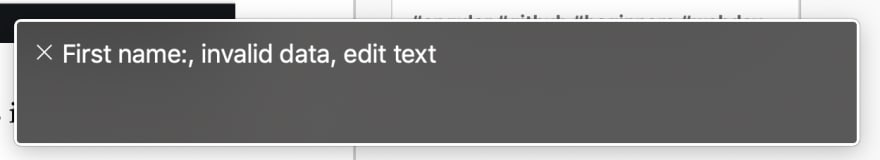
It's important to note that these error messages are not programmatically associated to form fields, so screen reader users would not be informed that there are errors with the input.
State and error message
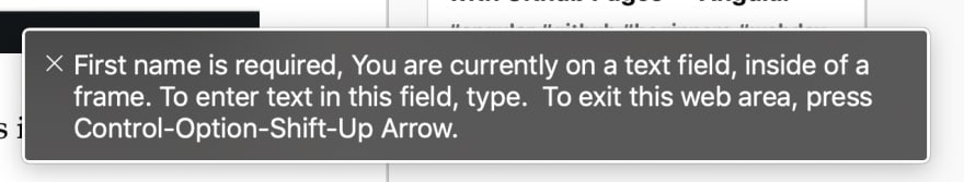
When a field has an error, we need to add aria-invalid="true" so that screen readers will announce that it is invalid. We also need to associate the field with its error message. We can do that by giving the error message wrapper a unique id attribute and adding aria-describedby=[error wrapper id] to the field when it has an error.
I've also added the
aria-required attribute.
Here's the original example again with these changes made:
Screen readers will now correctly announce that the field is invalid, and read the error message after the label of the field.
Focus handling

Now our form fields are properly marked as invalid and associated with their error messages, but a screen reader user would not be immediately informed that there are validation errors when submitting the form. A user could tab backwards to check whether any fields have errors, but we can improve the experience for everyone by focusing the first field with an error when there are validation errors.
To this end, I was happy to find the ErrorFocus component by Nigel Fish in a Formik github issue. Place <ErrorFocus /> inside of <Formik> where it will have access to the Formik props. You might also consider using the Palmer Group's approach for Form Field Scroll Management.
I could set focus to a summary of errors at the top of the form instead, but for a simple form such as this, it doesn't feel like the right choice.
Focusing the first field when the form loads
In my case, when a user starts editing the form they want to start at the beginning of the form and work through it. So let's focus the first field when the form is rendered. We can do this by using a React ref, which Formik provides access to via the innerRef property of <Field>.
Finished example
As someone working on a product primarily used by people with disabilities, ensuring form accessibility is a standard part of my development process. I hope this example shows that with the declarative style of React and Formik, it's pretty straightforward to make your front end validation accessible.
I'd love to know how you approach this – let me know in the comments :)


Top comments (1)
Great. Thanks