
Today I will walk you though how you can build interactive charts on your website with Nivo & React.
What is Nivo and why?
Nivo is an open-source React visualization library built on top of d3js. It allows for server-side rendering and supports svg, canvas, and HTML charts. Nivo provides 27 highly customizable char types. It has nice motion and trasitions and it is very responsive. Nivo documentation is developer-friendly and contains many examples/templates and storybooks.
In this tutorial, we will build PieChart that takes data from a file and renders SVG pie chart. We'll be able to change our chart based on selected values.
We going to use nextjs starter for this application.
npx create-next-app statsViewer && cd statsViewer && touch data.js && mkdir components && touch PieCharDemo.jsA
yarn add @nivo/core
yarn add @nivo/pie
Imported ResponsivePie component will take a large number of props as it needs specific styling and file with data. Except that the parent component will need a height and width set.
Beyond props used in this example, there is a bunch of other props that let us do pretty styling.
Let's edit PieChartDemo.js
import { ResponsivePie } from '@nivo/pie'

export const PieChartDemo = ({ data }) => (
  <div style={{ width: '600px', height: '500px' }}>
    <ResponsivePie
      data={data}
      margin={{ top: 40, right: 150, bottom: 80, left: 150 }}
      innerRadius={0.5}
      padAngle={0.7}
      cornerRadius={3}
      activeOuterRadiusOffset={8}
      borderWidth={1}
      borderColor={{ from: 'color', modifiers: [['darker', 0.2]] }}
      arcLinkLabelsSkipAngle={10}
      arcLinkLabelsTextColor='#333333'
      arcLinkLabelsThickness={2}
      arcLinkLabelsColor={{ from: 'color' }}
      arcLabelsSkipAngle={10}
      arcLabelsTextColor={{ from: 'color', modifiers: [['darker', 2]] }}
      valueFormat={(value) => `${Number(value)} %`}
      legends={[
        {
          anchor: 'bottom',
          direction: 'row',
          justify: false,
          translateX: 0,
          translateY: 56,
          itemsSpacing: 0,
          itemWidth: 90,
          itemHeight: 18,
          itemTextColor: '#999',
          itemDirection: 'left-to-right',
          itemOpacity: 1,
          symbolSize: 15,
          symbolShape: 'circle',
          effects: [
            {
              on: 'hover',
              style: {
                itemTextColor: '#000',
              },
            },
          ],
        },
      ]}
    />
  </div>
)
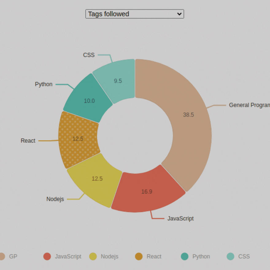
Here is data.js file that I look created based on data from hashnode. I took numbers and convert them to percentages instead.
const totalFollowers = 594.2
const totalMostPopularPosts = 434
const convertToPercent = (val, total) => {
  return ((val / total) * 100).toFixed(1)
}
export const data = {
  tagsByNumOfFollowers: [
    {
      id: 'General Programing',
      label: 'GP',
      value: convertToPercent(228.8, totalFollowers),
    },
    {
      id: 'JavaScript',
      label: 'JavaScript',
      value: convertToPercent(100.6, totalFollowers),
    },
    {
      id: 'Nodejs',
      label: 'Nodejs',
      value: convertToPercent(74.3, totalFollowers),
    },
    {
      id: 'React',
      label: 'React',
      value: convertToPercent(74.4, totalFollowers),
    },
    {
      id: 'Python',
      label: 'Python',
      value: convertToPercent(59.5, totalFollowers),
    },
    {
      id: 'CSS',
      label: 'CSS',
      value: convertToPercent(56.6, totalFollowers),
    },
  ],
  mostPopularPostsThisWeek: [
    {
      id: 'JavaScript',
      label: 'JavaScript',
      value: convertToPercent(134, totalMostPopularPosts),
    },
    {
      id: 'Web Dev',
      label: 'Web Dev',
      value: convertToPercent(97, totalMostPopularPosts),
    },
    {
      id: 'React',
      label: 'React',
      value: convertToPercent(60, totalMostPopularPosts),
    },
    {
      id: 'Dev Blogs',
      label: 'Dev Blogs',
      value: convertToPercent(46, totalMostPopularPosts),
    },
    {
      id: 'Python',
      label: 'Python',
      value: convertToPercent(60, totalMostPopularPosts),
    },
    {
      id: 'CSS',
      label: 'CSS',
      value: convertToPercent(37, totalMostPopularPosts),
    },
  ],
}
Lastly we import our PieChartDemo component and fed it with data. I used useState hook and wired it to select input so we rerender PieChart component and feed it other data.
import styles from '../styles/Home.module.css'
import { MyResponsivePie } from '../components/MyResponsivePie'
import { useState } from 'react'
import { data } from '../data'

export default function Home() {
  const [selected, setSelected] = useState('tagsByNumOfFollowers')

  return (
    <div className={styles.container}>
      <main className={styles.main}>
        <select
          onChange={(e) => {
            setSelected(e.target.value)
          }}
        >
          <option value='tagsByNumOfFollowers'>Tags followed</option>
          <option value='mostPopularPostsThisWeek'>
            Most popular posts this week
          </option>
        </select>
        <MyResponsivePie data={data[selected]} />
      </main>
    </div>
To conclude, Nivo is a great library that has many components with out-of-the-box templates and rich documentation. The number of props maybe look overwhelming especially for beginners however, it gives us developers the power of customization that other chart libraries may be limited to.
I hope this article was helpful to some of you guys. Thanks for reading!
Github Repo


Latest comments (0)