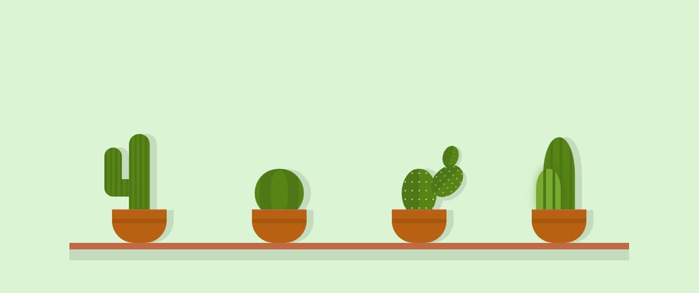
The first time I saw art created with CSS, I was stunned. I regularly get frustrated with CSS while creating basic layouts, and here were people who could wield CSS to this degree!
It seemed way out of my skill levels, and I was just happy to lurk and admire the amazing work of others. However, sometime back, I decided to give it a try (lockdown effects!). I looked up resources and tutorial online before attempting my own original one - a simple Panda!
After understanding the underlying principles used, I dug into specific CSS concepts to master those - and with practice, I have been attempting projects with increasing complexity. I even created a single div CSS bookshelf inspired by Lynn Fischer's asinglediv project.
While I am no expert at CSS art (I hope to get better with practice), I wanted to document my learning & process in case it is helpful to anyone else. This will be a two part series about
- the tools of the trade and
- a step-by-step demo.
Why try CSS Art?
While I agree CSS art doesn't seem to have a lot of practical or 'real' use - SVG or images would be the practical method for most website/apps. However, CSS art is a fun way to level up your CSS game. In my case, it helped to finally string together a lot of CSS hacks into concrete concepts.
I have documented it here:

Other than that, it enhances the ability to visualize graphics as a combination of basic shapes, and then to manipulate those shapes to create the desired graphics. In addition, I also find CSS art meditative and thus a favourite hobby.
The Tools (CSS concepts)
Ok, let's get started. Let's understand the tools we will use to create our CSS art.
Box Model
As we know, everything in CSS is a box. So, a rectangle(or square) is the basic shape we will manipulate to create every other shape. This is the raw material.
By default, the size (width, height) of a box is determined by the content and specified margin, padding. As we won't be having any HTML content, we need to explicitly mention the width and height of the (block) boxes - div is the normally used element.
::before, ::after
Along with every element we also have the pseudo-elements ::before and ::after as two additional boxes at our disposal. We can use those for some details as an alternative to adding more elements in our markup. (A good usage is adding new elements for different parts, and using pseudo-elements to add details like shades, patterns to a part).
Don't forget to add content:'' - without content, the pseudo-element won't be generated.
Positioning
A very important aspect of CSS art is positioning the shapes for alignment or for creating complex shapes from basic ones.
That requires manipulation of the co-ordinates of the shapes. To do that, we may need to set an absolute or relative positioning.
In a lot of case it helps to set *{position: absolute} - it's easier to calculate position relative to the parent element. But it's not always necessary - we can use relative positioning, or even flex/grid based on the particular use case (Flex with justify-content is a great tool for centering elements). The main point is figuring out how the different boxes are to be positioned wrt each other.
Along with positioning, z-index is handy to position elements in front of or behind other elements. *It helps to dig a bit into stacking context to deepen our understanding of z-index to wield it well (I wrote an article about that here)
DOM structure
This doesn't actually affect the CSS art as such. It's more about good practice for maintainable stylesheets . It better to have a hierarchy of elements to create the parts that make up the whole drawing. Ex: eyes divs should be placed inside a head div, if possible using ::before, ::after of an element for creating details only of that element (this won't and needn't be true if you are constraining the number of elements)
Border-radius
Now, we will move on to manipulating the square into different shapes.
Border-radius is a great way to create not only circles and ellipses, but also organic looking shapes.
This video explains how to manipulate horizontal and vertical radius for advanced control over the radius.
Here is the tool to easily you can use to generate radius.
Box-Shadow
While creating CSS art, box-shadow can be used create copies of a shape in addition to simulating a 3d effect. Multiple box-shadows can be applied to an element to create multiple copies of different sizes. Inset borders can be used to create shadows as well.
Clip Path
clip-path is another way to create custom shapes.
The clip-path CSS property creates a clipping region that sets what part of an element should be shown.
Here is a website to help create desired shapes.
Quick notes:
- Some shapes (ex: triangles, trapezoids) can be made using border as well as through clip-path. One advantage of clip-path over border is that it is easier to apply gradients.
-
border-radiusandbox-shadowmay not play well with clip-path
Gradients
Gradient is one of the most common tool used in CSS art. In websites, gradients are used for smooth transitions between two or more specified colors. However, once we know how to, gradients can be used to create shapes, patterns, shading, etc. in CSS art.
For example, in the following pen, all the details on the books have been created using gradients on a single element:
Multiple gradients can be applied separated by commas, and remember backgrounds are rendered from bottom(last) to top(first). This is a great article to refer for improving understanding of CSS gradients.
Breaking down objects into basic shapes
Again, this is not exactly a CSS property, but an essential requirement for CSS art. We break down what we want to draw into basic shapes (boxes, circles, semicircles, triangles, trapezoid, etc.), and try to think how those shapes combine, overlap or aligned to create our design.
We will initially have some idea about how those shapes can be generated (new element, copy through box shadow, through border-radius, or through gradients).
(It's alright to not pin down everything before starting -improvising along the way is ok!)
Conclusion
So, these are mostly the tools in your arsenal while creating CSS art. At times, a number of different methods can be used to create the same effect - which we use will depend on other interconnected shapes/factors.
For example:
- using clip-path or gradient to create a parallelogram - clip-path isn't suitable if you need a box-shadow;
- using a new box or box-shadow to create a new shape - box-shadow will only work if the required shape is of same aspect ratio and shape; box-shadow may affect your z-positioning
There is no formula to it - initially, it's a bit of trial & error. There are a number of nuances and tricks which can be picked up through the trial & errors. At times, choosing one is simply based on what we are more comfortable with.
Some notes:
i) I haven't talked about responsiveness yet (to keep it simple for now). It's good to use percentage units - atleast for inner elements - to avoid distortions. In the beginning, it is okay to optimize for smaller screens. Using viewport units for outer elements is a good way to create responsive designs. (along with considering max-width, max-height to handle larger screens)
ii) While I have provided links to tools for calculating radius, clip-path, etc. it is better to initially figure it out by trial & error - otherwise, it beats the purpose of leveling up CSS. (This is just a personal opinion)
iii) Check for browser compatibility. For example: conic-gradient isn't supported on Firefox. You can notice the difference in rendering of the following pen in Chrome & Firefox.
That's it. Now, we will move on to apply all of these to create a CSS lamp in the 2nd part


Top comments (2)
I always wondered how complex shapes were created with just the border. Now I know there's the clip-path too.
Thanks for the awesome article Poulami. I'm inspired to start doing my own art now :)
Looking forward to see what you create!