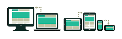
Media Query is a popular way for delivering a style sheet to different devices with different screen sizes and resolutions. They are used to alter the look of a website across numerous devices. A media query is made up of a media type and one or more expressions that can be true or false. If the supplied media matches the type of device on which the content is viewed, the query returns true. If the media query returns true, the style sheet is used.
The screen resolutions of different devices are listed below:
- Mobile (Smartphone) max-width: 480px
- Low Resolution Tablets and ipads max-width: 767px
- Tablets Ipads portrait mode max-width:1024px
- Desktops max-width:1280px
- Huge size (Larger screen) max-width: 1281px and greater
Syntax:
@media( media feature ) {
    // CSS Property
}
Assuming that you have a css file style.css:
        /* Media Query for Mobile Devices */
        @media (max-width: 480px) {
            body {
                background-color: red;
            }
        }

        /* Media Query for low resolution  Tablets, Ipads */
        @media (min-width: 481px) and (max-width: 767px) {
            body {
                background-color: yellow;
            }
        }

        /* Media Query for Tablets Ipads portrait mode */
        @media (min-width: 768px) and (max-width: 1024px){
            body {
                background-color: blue;
            }
        }

        /* Media Query for Laptops and Desktops */
        @media (min-width: 1025px) and (max-width: 1280px){
            body {
                background-color: green;
            }
        }

        /* Media Query for Large screens */
        @media (min-width: 1281px) {
            body {
                background-color: white;
            }
        }


Top comments (0)