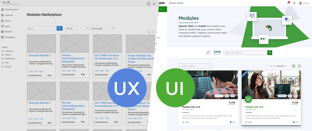
We are not a UX/UI agency, but there’s consensus at platformOS that User Experience and User Interface Design are integral part of our processes. Although UX/UI teams usually choose from the same pool of methods and tools, no two processes are the same. This article describes how we do things at platformOS including UX/UI research and design, communication and learnings.
People and tools
We believe that one of the main strengths of our UX/UI process is teamwork. Our team consists of a UX researcher, a UX designer and a UI designer.
We have always worked remotely: we use Zoom for our calls, Figma for everything UX/UI related, and Miro for remote workshops.
First steps first
We ask the client to fill out our Strategic and design brief document. It contains basic questions about their challenges, strategic objectives, unique value propositions, history, purpose, problems they want to solve, their target audience, and competition. Depending on the project complexity and how detailed answers we get in the homework, the actual kick-off can be done in a maximum 3-hour call with the main stakeholders. Here we break the ice, go through the answers the client gave, and make an inventory of the client’s resources.
We also agree on the processes we would like to use: means and frequency of communication, who to reach out to for various resources (copy, design guide, etc.) and the project timeline.
Research phase
User interviews
Organizing and conducting the interviews might be time consuming but it almost certainly will be worth the time and effort: UX only makes sense if you know who you are designing for. We can only solve our customer's problems by design if we understand their user's goals and the context of use. This is a key moment for a successful project.
“Learn” the client and the product
From the UX point of view we study all the resources we have from the client to learn their vocabulary, understand their way of thinking and get in the same boat.
As for UI design, we study the brand guide, the current site if it is a redesign, and create an inspirational mood board with pictures and illustrations.
Get to know the competition
We get a full picture of the features, strengths and weaknesses of competitors, to be able to place the product correctly. It also helps us to understand the unique value proposition of the product.
Deliverables
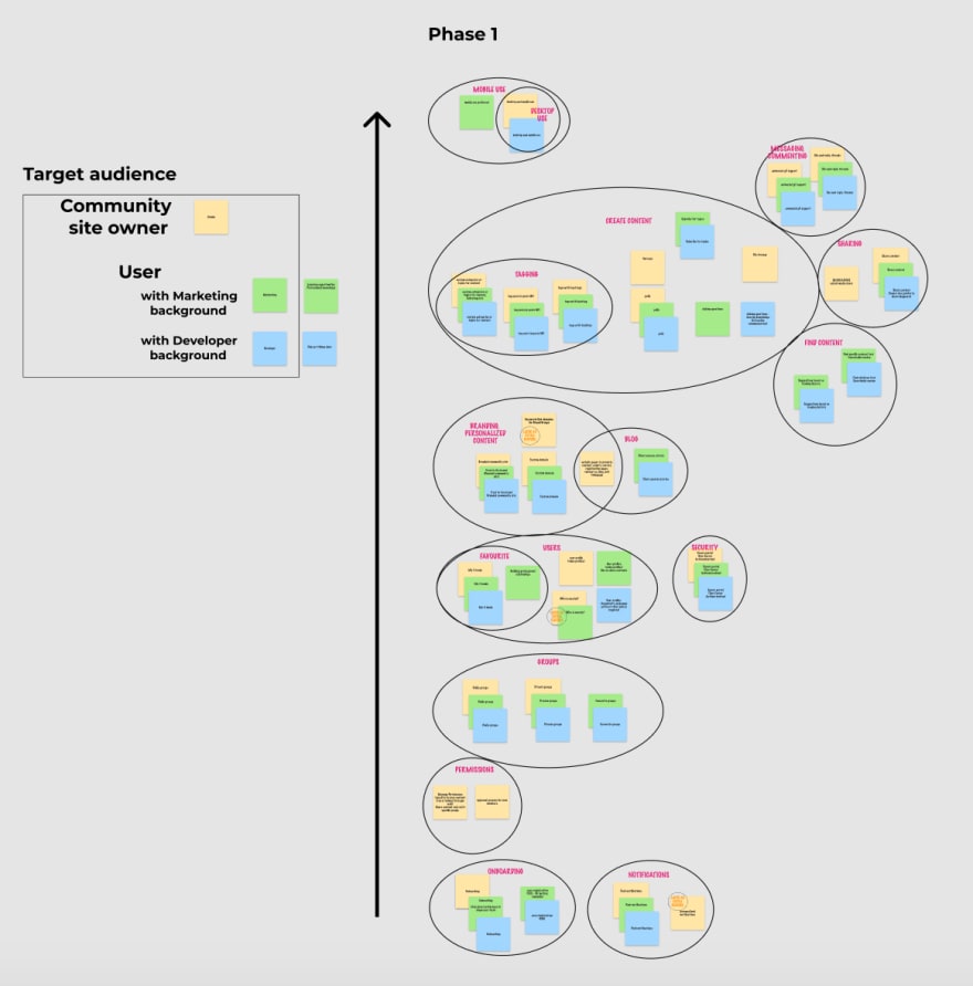
We visualize and analyze the research findings in an affinity map. It shows us the primary needs and current challenges of the users. This visualization has proven to be useful not only because it makes it easy to present and understand data, but it will still be easily scannable months later.
 The affinity map we created based on our research for the pOS Community site
Based on the research findings and the interviews we also identify the differences in the target group and summarize them in user personas.
 Our template for user personas
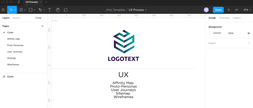
We like to keep all the deliverables in the same Figma file: this way we literally have everything in one place. It’s not only good for our team but also makes it easier for the customers to follow the project.
 The typical structure of a project’s Figma file
UX Design
Journeys and IA
platformOS is a limitless development platform that gives you the flexibility to customize every aspect of your digital build. This also means that our clients often require complex features and flows. It is essential to discover and discuss all user journeys in detail together with the client. We always start with the main and the most complex journey, and then add all the others in detail. In many sites that we work on (many to many marketplaces, community marketplaces, community hubs) user journeys often cross each other so we use different colors to reflect the journeys of different target groups.
 3 user journeys that make up the main flow of OndeCare
This is also the first point where we like to discuss the project with developers. They can give us invaluable feedback that can also eliminate problems that otherwise would emerge during the development phase and would make us change the central workings of the product. Cooperation between the project teams is essential for a successful project.
After we have enough information about the journeys and have all agreed on them we continue with the information architecture and the sitemap.
 The sitemap of our latest project: OndeCare
Wireframes
The journeys and the sitemap tell us what screens we need, so we have almost everything to create the wireframes. However, we strongly believe that only content driven design can ensure the best UX and design solutions. On one hand the sitemap delineates what copy is needed for the wireframes, so the client can prepare it. On the other hand, by this point we have “learned the product’s and the client’s language” and can use it for the UX copy. If needed we work together on the content strategy and UX copy.
Our wireframing process starts with sketches about various ideas that, depending on their complexity, we sometimes discuss in the design team. We create high-fidelity wireframes from one or maximum two of the ideas that emerged during our discussions. We ask for feedback on these wireframes from two sources: from the developers to have their feedback on feasibility and possible unseen glitches, and from the clients to see if we managed to realize their ideas. These first round discussions can save a lot of time later: we don’t need to modify pixel perfect designs let alone implemented pages. The most time consuming part at this stage is to think through all the possible user journeys, plan for edge cases, create notifications and different states. We always use real content on the plans to make it flexible enough for all cases.
 Ondecare homepage wireframe with actual content
We also create prototypes from the wireframes which can be a great tool to check the most complicated flows internally just as with usability tests. Depending on the project timeline we like to run usability tests during the planning phase to gather feedback from users fast and iterate the design based on their needs.
UI Design
The actual UI design phase starts with creating the style guide based on the brand defined colors and fonts.
 Style guide of the pOS design system
Style guides are a great resource for designers and developers but we can’t expect our clients to put together the site from the components in their minds. The first wireframe that we create is always a landing page, most often the homepage, because it contains the greatest variety of sections and elements: graphics, texts and layouts. We create two versions of the homepage and the client can choose which one they prefer. Then we add all the elements that are used on the site to the style guide so that we can reuse them and have consistent design.
 Two versions of the Ondecare homepage
Layouts and grids are an example of the essential things that we create during the high fidelity design phase. We always create layouts that can work both on mobile and desktops, and align all the elements based on these. We add the illustrations and modify them to match the brand colors. Talking about colors, we also put great emphasis on accessibility and contrast ratios. We create smaller (but equally important) pages like 404, under maintenance pages, and usually even an email template to be consistent everywhere.
As I mentioned we work as a team, which means that the wireframing and high fidelity design phase happen parallely: in our meetings with the client we present the wireframes and ask for feedback. It’s best if we can do the majority of necessary modifications on the wireframes, where we can focus more on the functionalities. Once a wireframe is accepted by the client, it is turned into a pixel perfect screen. Mobile versions can be created either in the wireframing or in the high fidelity design phase.
Figma is a great tool for design handoff, developers can easily export assets, but if necessary we collect all images and graphics for them.
Retrospective
Our process has been working well for us, but since there is no such thing as a perfect process we try to learn from each project. As a closing step for our process, we always hold a retrospective meeting where we check back to our flow and collect everyone’s experience. Our goal is to learn about the highlights and the improvement areas and to identify the necessary modifications for our next project.
For example, during our last project we learned that we needed to improve the way we sort our screens in Figma. We had two separate folders for wireframes and for pixel perfect designs which might not be optimal in each case: during implementation developers consult pixel perfect designs, but there are functional wireframes that don’t need to be turned into pixel perfect design, like confirmation popups. Based on the team's feedback in the next project we will put these next to each other on one page, so that we only have to check one page for the different states of a screen.
Of course every project is unique and they all have their own challenges, that we can only address if we handle our processes flexibly. But having this general framework helps us to stay consistent and not to leave out anything important, plus the client can have a clear picture throughout the project and know what to expect.
The platformOS UX/UI process was defined by our Director of UX Kata Nagygyörgy and Director of Visual Design Gyöngy Gora.


Oldest comments (0)