Hello Coders! Welcome to Coding Torque. In this blog, We are going to create 5 different hover effects on social media icons. Let's get started 🚀.
Demo
Add icons library
First of all, add fontawesome icons CDN in your HTML <head> tag for all the below codes. You can also get it from cdnjs website.
<link rel="stylesheet" href="https://cdnjs.cloudflare.com/ajax/libs/font-awesome/5.15.1/css/all.min.css"
integrity="sha512-4zCK9k+qNFUR5X+cKL9EIR+ZOhtIloNl9GIKS57V1MyNsYpYcUrUeQc9vNfzsWfV28IaLL3i96P9sdNyeRssA==" crossorigin="anonymous" />
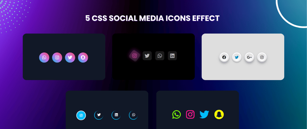
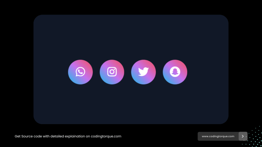
1. Icons with inverse hover effect
HTML Code
<ul class="social-icons">
    <li>
        <a href="#"><i class="fab fa-whatsapp"></i></a>
    </li>
    <li>
        <a href="#"><i class="fab fa-instagram"></i></a>
    </li>
    <li>
        <a href="#"><i class="fab fa-twitter"></i></a>
    </li>
    <li>
        <a href="#"><i class="fab fa-snapchat"></i></a>
    </li>
</ul>
CSS Code
body {
    background-color: #111827;
    color: white;
    display: flex;
    align-items: center;
    justify-content: center;
}

.social-icons {
    display: flex;
    justify-content: center;
    list-style: none;
}

.social-icons li {
    margin: 0 10px;
}

.social-icons li a {
    font-size: 30px;
    height: 70px;
    width: 70px;
    border-radius: 50%;
    display: flex;
    align-items: center;
    justify-content: center;
    text-decoration: none;
    color: white;
    position: relative;
    transition: 0.5s ease;
}

.social-icons li a:hover {
    background-image: linear-gradient(45deg, #12c2e9, #c471ed, #f64f59);
    background-clip: text;
    color: transparent;
    -webkit-text-fill-color: transparent;
    -webkit-background-clip: text;
    font-size: 40px;
}

.social-icons li a::before {
    content: '';
    position: absolute;
    z-index: -1;
    height: 70px;
    width: 70px;
    border-radius: 50%;
    background: linear-gradient(45deg, #12c2e9, #c471ed, #f64f59);
    transform: scale(1);
    transition: 0.5s ease-in-out;
}

.social-icons li a:hover::before {
    transform: scale(0);
}
2. Icons with dark neomorphic glow

HTML Code
<div>
    <a href="#" class="link">
        <i class="fab fa-instagram instagram"></i>
    </a>
    <a href="#" class="link">
        <i class="fab fa-twitter twitter"></i>
    </a>
    <a href="#" class="link">
        <i class="fab fa-whatsapp whatsapp"></i>
    </a>
    <a href="#" class="link">
        <i class="fab fa-linkedin linkedin"></i>
    </a>
</div>
CSS Code
body {
    display: flex;
    justify-content: center;
    padding-top: 20rem;
    background: #000;
}

div {
    display: flex;
}

.link {
    text-decoration: none;
    color: #b7b7b7;
    margin: 10px;
    width: 50px;
    height: 50px;
    display: flex;
    justify-content: center;
    align-items: center;
    background: rgb(28, 28, 28);
    border-radius: 10px;
    position: relative;
    transition: 0.4s;
}

.link:hover {
    transform: rotate(45deg);
}

.link::before {
    content: " ";
    position: absolute;
    width: 100%;
    height: 100%;
    opacity: 0;
    background: #373737;
    border-radius: 10px;
    transition: opasity 0.2s;
}

.link:hover::before {
    opacity: 0.4;
}

.link:nth-child(1)::before {
    background: #c32aa3;
}

.link:nth-child(2)::before {
    background: #1da1f2;
}

.link:nth-child(3)::before {
    background: #25d366;
}

.link:nth-child(4)::before {
    background: #0a66c2;
}

.link:hover::before {
    transform: translate(-4px, -4px);
    filter: blur(10px);
}

.link i {
    font-size: 1.7em;
    transition: all 0.4s;
}

.link:hover i {
    color: #c8c8c8;
    transform: rotate(-45deg);
}

.link:hover i.instagram {
    color: #c32aa3;
}

.link:hover i.twitter {
    color: #1da1f2;
}

.link:hover i.whatsapp {
    color: #25d366;
}

.link:hover i.linkedin {
    color: #0a66ca;
}
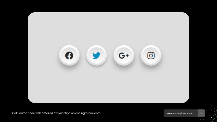
3. Floating neomorphic icons
HTML Code
<ul>
    <li><a href="#"><i class="fab fa-facebook"></i></a></li>
    <li><a href="#"><i class="fab fa-twitter"></i></a></li>
    <li><a href="#"><i class="fab fa-google-plus-g"></i></a></li>
    <li><a href="#"><i class="fab fa-instagram"></i></a></li>
</ul>
CSS Code
body {
    margin: 0;
    padding: 0;
    background: #dedede;
}

ul {
    position: absolute;
    top: 50%;
    left: 50%;
    transform: translate(-50%, -50%);
    margin: 0;
    padding: 0;
    display: flex;
}

ul li {
    list-style: none;
}

ul li a {
    position: relative;
    width: 60px;
    height: 60px;
    display: block;
    text-align: center;
    margin: 0 10px;
    border-radius: 50%;
    padding: 6px;
    box-sizing: border-box;
    text-decoration: none;
    box-shadow: 0 10px 15px rgba(0, 0, 0, 0.3);
    background: linear-gradient(0deg, #ddd, #fff);
    transition: .5s;
}

ul li a:hover {
    box-shadow: 0 2px 5px rgba(0, 0, 0, 0.3);
    text-decoration: none;
}

ul li a .fab {
    widht: 100%;
    height: 100%;
    display: block;
    background: linear-gradient(0deg, #fff, #ddd);
    border-radius: 50%;
    line-height: calc(60px - 12px);
    font-size: 24px;
    color: #262626;
    transition: .5s;
}

ul li:nth-child(1) a:hover .fab {
    color: #3b5998;
}

ul li:nth-child(2) a:hover .fab {
    color: #00aced;
}

ul li:nth-child(3) a:hover .fab {
    color: #dd4b39;
}

ul li:nth-child(4) a:hover .fab {
    color: #e4405f;
}
4. Icons with hover rotate

HTML Code
<ul class="social-icons">
    <li>
        <a href="#"><i class="fab fa-instagram"></i></a>
    </li>
    <li>
        <a href="#"><i class="fab fa-twitter"></i></a>
    </li>
    <li>
        <a href="#"><i class="fab fa-linkedin"></i></a>
    </li>
    <li>
        <a href="#"><i class="fab fa-whatsapp"></i></a>
    </li>
</ul>
CSS Code
* {
    font-family: 'Poppins', sans-serif;
}

body {
    background-color: #111827;
    color: white;
    display: flex;
    align-items: center;
    justify-content: center;
}


.social-icons {
    padding: 0;
    list-style: none;
    display: flex;
}

.social-icons li {
    margin: 0 20px;
}

.social-icons li a {
    border: 3px solid deepskyblue;
    height: 40px;
    width: 40px;
    display: flex;
    justify-content: center;
    align-items: center;
    text-decoration: none;
    color: white;
    border-radius: 50%;
    border-right: none;
    border-top: none;
    transition: 0.3s ease;
}

.social-icons li a:hover {
    border-top: 3px solid;
    border-right: 3px solid;
    transform: rotate(360deg);
    background-color: deepskyblue;
    border-color: white;
}
5. Icons with glowing effect

HTML Code
<ul class="social-icons">
    <li>
        <a href="#" style="color: lawngreen;"><i class="fab fa-whatsapp"></i></a>
    </li>
    <li>
        <a href="#" style="color: deeppink;"><i class="fab fa-instagram"></i></a>
    </li>
    <li>
        <a href="#" style="color: deepskyblue;"><i class="fab fa-twitter"></i></a>
    </li>
    <li>
        <a href="#" style="color: yellow;"><i class="fab fa-snapchat"></i></a>
    </li>
</ul>
CSS Code
body {
    background-color: #111827;
    color: white;
    display: flex;
    align-items: center;
    justify-content: center;
}

.social-icons {
    display: flex;
    justify-content: center;
    list-style: none;
}

.social-icons li {
    margin: 0 10px;
}

.social-icons li a {
    font-size: 36px;
    text-shadow: 0 0 0px;
    transition: 0.3s ease;
}

.social-icons li a:hover {
    text-shadow: 0 0 10px;
}


Top comments (2)
Looks Amazing!! Thanks For Sharing!!!
Glad you liked it!