
In this article, I'll teach you as many responsive design techniques as I possibly can in five minutes. This obviously isn't enough to learn it properly, but it will give you an overview of the most important concepts, which I personally define as these:
- Relative CSS units
- Media queries
- Flexbox
- Responsive typography
If you want to dive deeper into the subject afterward, you can check out our responsive web developer bootcamp on Scrimba, which will enable you to build responsive websites on a professional level.
 Click the image to get to the course.
But for now, let's start with the basics!
Relative CSS units
At the core of responsive web design are relative CSS units. These are units that get their value from some other external value. This is handy because it allows, for example, the width of an image to be based on the width of the browser.
The most common ones are:
- %
- em
- rem
- vw
- vh
In this article, we'll start with the percentage unit %, and then we'll look at the rem unit in the final section.
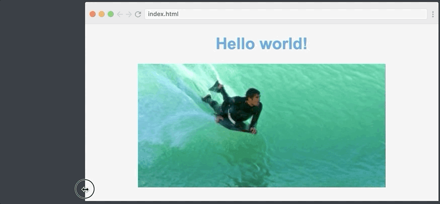
Let's say you have a very simple website, like this:
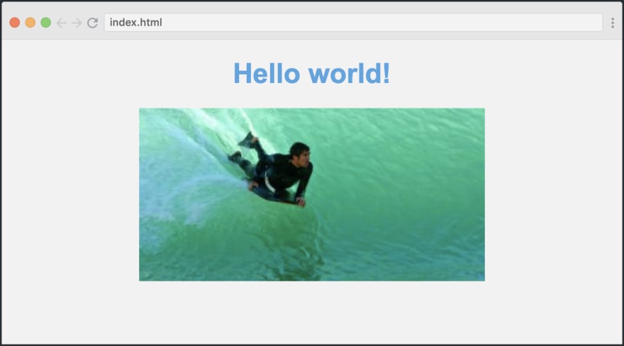
Its HTML is just the following:
<body>
    <h1>Welcome to my website</h1>
    <image src="path/to/img.png" class="myImg">
</body>
As you can see from the GIF below, our image will by default have a fixed width:
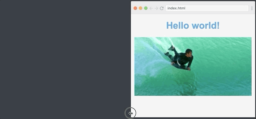
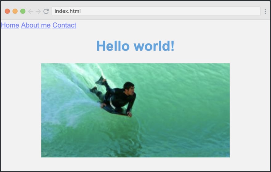
That's not particularly responsive, so let's change that to 70 percent instead. We'll simply do the following:
.myImg {
    width: 70%;
}
This sets the width of the image to 70 percent of the width of its parent, which is the <body> tag. As the <body> tag spans the entire width of the screen, the image will always be 70 percent of the screen itself.
Here's the result:
And that's how easy it is to create a responsive image!
Using media queries to improve the mobile experience
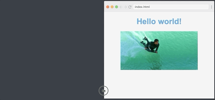
We have one problem with our responsive layout, though, which is that it looks weird on very small screens. The 70% width is to narrow when viewed on mobile. Just have a look for yourself:
Making it look better in this situation is a perfect task for media queries. They allow you to apply different styling based upon, for example, the width the screen. We can basically say if the screen is less than 768px wide, use a different styling.
Here's how we create a media query in CSS:
@media (max-width: 768px) {
    .myImage {
        width: 100%
    }
}
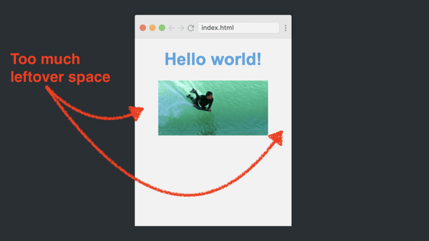
This CSS block will only be applied if the width of the screen is less than 768 pixels.
Here's the result:
As you can see, the page has a breakpoint where the image suddenly becomes wider. That's when the browser is 768 pixels wide, and the image swaps between 70% and 100%.
Using Flexbox for the navbar
Next up is Flexbox. You simply can't learn about responsiveness without learning about Flexbox. It changed the responsive design game when it was introduced a few years ago, as it makes a lot easier to position elements responsively along an axis.
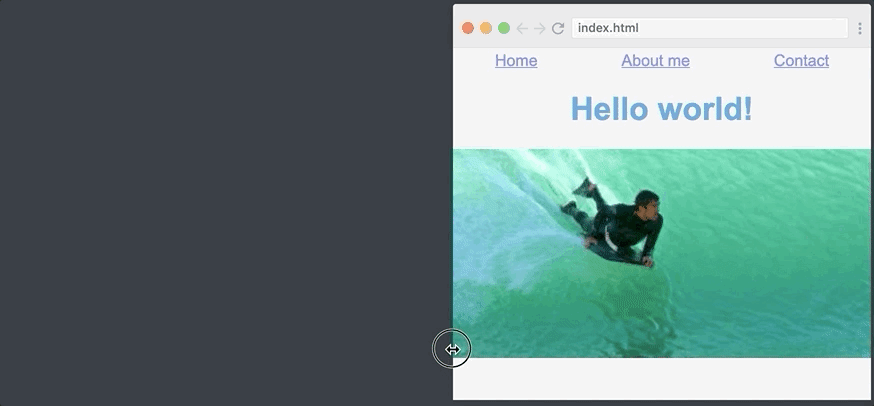
To utilize Flexbox we'll make our site a bit more complex by adding a navbar above the title. Here's the HTML for that:
<nav>
    <a href="#">Home</a>
    <a href="#">About me</a>
    <a href="#">Contact</a>
</nav>
By default, it'll simply look like this.
Our navigation items are all squeezed into the left side, which isn't what we want. We want them to be spaced evenly throughout the page.
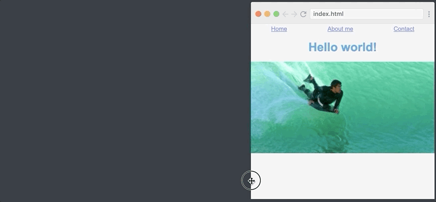
To achieve that, we'll simply turn the nav container into a flexbox, and then use the magical justify-content property.
nav {
    display: flex;
    justify-content: space-around;
}
The display: flex turns the <nav> into a flexible box, and the justify-content: space-around tells the browser that the items inside the flexible box should have space around them. So the browser distributes all leftover space equally around the three items.
Here's how it looks. And as you'll notice, it scales nicely:
Responsive typography: rem
The final step is to make our typography responsive as well. You see, I want the navbar and the title to shrink a bit when the screen is less than 768 pixels wide (our media query breakpoint, remember?).
One way to do this would be to decrease all the font sizes in the media query, like this:
@media (max-width: 768px) {
    nav {
        font-size: 14px;
    }
    h1 {
        font-size: 28px;
    }
}
This isn't ideal though. We might end up with several breakpoints in the app, and have multiple elements as well (h2, h3, paragraphs, etc). As a result, we'll have to keep track of all the elements in all the different breakpoints. It'll be a mess!
However, most likely, they're going to relate to each other in more or less the same way throughout the various breakpoints. For example, the h1 will always be larger than the paragraph.
So what if there was a way I could adjust one factor, and then make rest of the font sizes would scale relative to that factor?
Enter rems!
A rem is basically this: the font-size value you've set to your <html> element. Like this:
html {
    font-size: 14px;
}
So in this document, one rem equals 14px.
That means that we can set all our font sizes on our website in rem units, like this:
h1 {
    font-size: 2rem;
}

nav {
    font-size: 1rem;
}
And then we'll simply change the font-size value for the <html> tag inside our media query. This will ensure that the font size for our h1 and nav elements will change as well.
Here's how we change our rem value in a media query:
@media (max-width: 768px) {
    html {
        font-size: 14px
    }
}
And just like that, we have a breakpoint for all of our font-sizes as well. Notice how the font-size changes as the page crosses the 768-pixel mark:
It's only been five minutes, but now you've actually learned to make font-sizes, images, and navbar items to respond to the width of the page. That's pretty good, and you've taken your first steps towards learning the highly valuable skills of building responsive websites.
If you're interested in continuing this learning journey, I'd recommend you to take a look at our massive Scrimba course on the subject!. It's taught by one of YouTube's most popular teachers on the subject, and it'll take you to a professional level in responsive web design.
Happy coding :)


Top comments (12)
I feel like the fact that so much of this didn't exist when I first got into webdev hinders my capacity to reach for the good stuff these days. Stuck in my ways. I feel good for the new crop of devs that gets to grow up with all these options.
It's never too late to learn!
No, seriously. That "old dog new tricks" stuff is all kinds of wrong 😐
Great stuff! Responsiveness is so critical in the mobile era, but still so many sites, even for major corporations, are complete trash on mobile...
If I may shamelessly self-promote for a moment, I wrote an article a while back about how CSS Grid's named areas combined with media query breakpoints are an absolute dream for creating responsive layouts:
CSS Grid Areas are amazing
Ken Bellows ・ Dec 31 '18 ・ 8 min read
Thanks a lot, great and very interesting article! I met its russian translation with the link to this original page, read your original article and signed up here at dev.to for posting my first coment :)
Are there a couple of a small typos?
Using media queries to improve the mobile experience
Should class name be
myImginstead ofmyImage?Responsive typography: rem
Font-size already has been defined by 14 pixels for the whole document therefore should it be better to set font-size in the last listing, for example, by 10px for demonstrating purposes?
This is great article for responsive web pages. Now days all websites are responsive. On adding to that we can also use CSS grid for responsiveness. It has also very nice features for different size screens.
You have a great skill of teaching things. It would be awesome if you had covered other units but no issues will check on that bootcamp. This is wonderful article, you are unicorn 😃
Great intro article; thanks. I can never remember the @media query syntax for some reason - so it's always good to read more about it :)
Title checks out.
Thank you!!
Grate!
For the first time I just used the % to make my a landing page responsive in nature, by this post I also learned about rem.
Thanks to per.
Some comments may only be visible to logged-in visitors. Sign in to view all comments.