
In this post, you’ll learn the basics of CSS Flexbox, which has become a must-have skill for web developers and designers in the last couple of years.
We’ll be using a navbar as an example, as this is a very typical use case for Flexbox. This will introduce you to its most-used properties of the module while leaving out the ones which aren’t as critical.
I’ve also created a free 12-part course on Flexbox. Check it out here if you’re interested!
Now let’s get started!
Your first Flexbox layout
The two main components of a Flexbox layout are the container and the items.
Here’s the HTML for our example, which contains a container with three items:
<nav class="container">
  <div>Home</div>
  <div>Search</div>
  <div>Logout</div>
</nav>
Before we turn this into a Flexbox layout, the elements will be stacked on top of each other like this:

I’ve added a little bit of styling, but that has nothing to do with Flexbox.
To turn this into a Flexbox layout, we’ll simply give the container the following CSS property:
.container {
    display: flex;
}
This will automatically position the items nicely along the horizontal axis.

If you want to check out the actual code, you can head over to this Scrimba playground.
Now let’s shuffle these items around a bit.
Justify content and Align items
Justify-content and align-items are two CSS properties which help us distribute the items in the container. They control how the items are positioned along the main axis and cross axis.
In our case (but not always) the main axis is horizontal and the cross axis is vertical:

In this article, we’ll only look at justify-content, as I’ve found to be using this one much more than align-items. However, in my Flexbox course, I explain both properties in detail.
Let’s center all the items along the main axis by using justify-content:
.container {
    display: flex;
    justify-content: center;
}

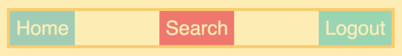
Or we can set it to space-between, which will add space between the items, like this:
.container {
    display: flex;
    justify-content: space-between;
}
Here are the values you can set for justify-content:
- flex-start (default)
- flex-end
- center
- space-between
- space-around
- space-evenly
I’d recommend you to play around with these and see how they play out on the page. That should give you a proper understanding of the concept.
Controlling a single item
We can also control single items. Let’s say we, for example, want to keep the first two items on the left side, but move the logout button to the right side.
To do this we’ll use the good old technique of setting the margin to auto.
.logout {
    margin-left: auto;
}

If we’d want both the search item and the logout item to be pushed to the right-hand side, we’ll simply add the margin-left to the search item instead.
.search {
    margin-left: auto;
}
It’ll push the search item as far to the right-hand side as possible, which again will push the log out item with it:

The flex property
So far, we’ve only had fixed-width items. But what if we want them to be responsive? To achieve that we have a property called flex. It makes it a lot easier than the old way of using percentages.
We’ll simply target all the items and give them a flex value of 1.
.container > div {
    flex: 1;
}

As you can see, it stretches the items to fill the entire container.
In many cases, you’d probably want one of the items to take up the extra width, and thereby only set one of them to have flexible width. We can, for example, make the search item take up all the extra space:
.search {
    flex: 1;
}

Before we end this article, I want to mention that the flex property is actually a shorthand three properties: flex-grow, flex-shrink and flex-basis. However, learning those takes more than five minutes, so it’s outside of the scope of this tutorial.
If you’re interested in learning them, though, I’m explaining all three properties thoroughly in my free Flexbox course.
Now that you’ve learned the basics you’ll definitely be ready to take my full-length course and become a Flexbox master!
Thanks for reading! My name is Per, I’m the co-founder of Scrimba, and I love helping people learn new skills. Follow me on Twitter if you’d like to be notified about new articles and resources.


Top comments (6)
When you demonstrate making the search item take up more space, you set it to
flex: 1, which is the same as it is already (from.container > div). What should it be instead? I've tried putting in higher numbers but don't know what to use to get it to appear like in your screenshot.I also think it would be helpful if in your initial HTML example you included the classes you refer to later.
Hi Ben,
I believe in the example of making the .search take up remaining space, you just need to turn off the .container > div styling so that flex: 1; only applies to .search and not all divs within .container.
Hope this helps/makes sense!:-)
Many thanks, Jack.
You have to replace the rule that came before it. So delete
.container > divand target the search item with a class name. Also it might be worth considering that you won't see much of a difference on smaller screen sizes or with narrower flex containers.I put together a visual explanation on Codepen to try and help to explain things and give working demos for you to see the effect in action.
Hope this helps!
Your style of writing and presenting the tutorial is amazing. Please write more tutorials like this.
this was crystal clear and easy to understand... thank you for this!
Nice job!