Hello Dev.to community!
This is my first article, so please be lenient!
So what's going on here?
What we're building
GitHub repo
Lately I have noticed a lot more people getting interested in front-end development and technology on my Twitter, and that's great - the more people we have creating tech, the more people we can help with it!
Who am I?
I'm Pavsky, and I work as a Product Designer. I remember when I first started creating simple html pages as a kid, all the tutorials I could find were, to put it bluntly, disgusting. I have been a designer for many years now, and have created hundreds of pages both professionally, or as a hobby. I have also worked with recruiters and evaluated portfolios/personal pages before, so I kind of know what I'm doing (or I think I do!).
Who is this for?
For anyone who's trying to get into the front-end game and who wants to create a personal landing page for themselves.
Maybe you know someone who'd love to start, but doesn't know how, this article will help them there!
I'm making a lot of assumptions here, and not every single selector and term will be explained, but trust me when I speak from experience; diving deep is the best thing you can do.
This tutorial is for people who at least know a div is, but If you don't, don't fret!
Please don't be discouraged if you don't understand something. If it's not explained, google it - learn to do research on things you don't understand.
Being a developer is mostly fixing stuff, and looking for solutions, so what I'm trying to do here is to make you a problem-solver, before you become a master ninja developer.
Game plan
We want this page to:
- Look spicy 🌶️
- Be 100% Responsive (perfect on all devices)
- Have code as readable as we can
What do you need?
- A text editor, I'll be using vscode
- An hour or two of your time
- A cup of tea/coffee wouldn't hurt!
First steps
Take a look at what we're going to build.
Click here to see the Figma file
It's a simple one-page design, using only 4 colours.
Hex codes for your css:
Navy Blue - #1E3B67
Cherry - #9E4361
Sand - #F4E8E2
White - #FFF
You can grab the images I used here.
Or you can use your own!
Before we dive in
First, navigate to your project folder. We'll create two files, index.html, and main.css.
First will be for our html code, second for our css (styling our html code!).
Next, navigate to index.html.
<!DOCTYPE html>
<html lang="en">
<head>
    <meta charset="UTF-8">
    <meta http-equiv="X-UA-Compatible" content="IE=edge">
    <meta name="viewport" content="width=device-width, initial-scale=1.0">
    <link rel="stylesheet" href="main.css" />
    <link rel="preconnect" href="https://fonts.googleapis.com" />
    <link rel="preconnect" href="https://fonts.gstatic.com" crossorigin />
    <link
      href="https://fonts.googleapis.com/css2?family=DM+Serif+Display&family=Roboto&display=swap"
      rel="stylesheet"
    />
    <title>Personal Page</title>
</head>
<body>

</body>
</html>
Copy this code into your index.html. This is what we call a boilerplate. It has all the necessary tags, our title, html tag, head, and body.
As a bonus, it is automatically linked to our css file, through link tag, as well as some free Google Fonts. Just so it's all nice and shiny.
In this tutorial we'll focus mostly on the body tag.
In main.css, write following code:
html,
body {
  margin: 0;
  padding: 0;
}

* {
  box-sizing: border-box;
}

#wrapper {
  background: #f4e8e2;
  width: 100%;
  display: flex;
  justify-content: center;
  align-items: center;
  flex-direction: column;
}
/* Typography */
h1,
h2,
h3,
h4,
h5 {
  font-family: "DM Serif Display", serif;
  font-weight: normal;
}
p,
a,
button,
span {
  font-family: "Roboto", sans-serif;
}
p {
  line-height: 150%;
}
This is my little code helping toolkit. You can see that most things are understandable just by knowing plain English, and that's exactly what we want. We want our code to be clean, and understandable.
It's good to separate things in code by comments, it makes it easy for you to go back and understand where everything is, and you'll be able to hand it over to someone else and it'll be clear for them too!
And you will see a lot of comments here.
/* I am a CSS comment */
<!-- I am an HTML comment -->
It's good practice to put comments everywhere, so if you were wondering about these weird things I'm putting in my code that don't make a lot of sense, that's what they are :)
📝 Navigation
Our first big step, will be to create a navigation.
In your index file, inside the
tag, write this code: <!-- Navigation -->
<nav>
<img class="brand" src="img/brand-logo.png" />
<div class="social-links">
<a href="#" target="_blank">
<img src="img/github-blue.png" />
</a>
<a href="#" target="_blank">
<img src="img/linkedin-blue.png" />
</a>
<a href="#" target="_blank">
<img src="img/twitter-blue.png" />
</a>
<a href="#" target="_blank">
<img src="img/instagram-blue.png" />
</a>
</div>
</nav>
<!-- End Navigation -->
You might have noticed, we're using class="" here. Now what is that? classes and ID's are your reference point. If the files are connected and talking to each other, you can reference an object with a class name, or an ID in your css file, and you'll be able to reference it using css!
<div id="i-am-an-id"></div>
<div class="i-am-a-class"></div>
In this tutorial, we'll be using just classes to keep everything simpler.
For navigation we're using a nav tag, which is a built-in tag for navigations. It doesn't assume much by itself, but it makes it extra clear in the code that hey, it's called nav, so it's navigation!
Inside it we have some social links, our brand logo, and we have defined the sizing for it, as well as the display rules we want this navigation to follow.
If you got back to the Figma file, you'll see that all sections align to each other, everything is nice and neat. And that's exactly what we want.
In the a tag, you'll see I put # in the src="". src is where we give our hyperlink the address we want to go to, so replace it with your social media links, or whatever you want, go back to your page, and see what happens!
If you want to learn more about display: flex, and exactly what it does, go here:
A Complete guide to Flexbox
If you're completely lost as to what's happening in the code, it's time to develop a habit of research.
Navigate here, and look for what you don't understand:
HTML Reference on w3schools
CSS Reference on w3schools
in main.css, we'll write:
/* Navigation */
nav {
  height: 80px;
  width: 800px;
  max-width: 100%;
  display: flex;
  justify-content: space-between;
  align-items: center;
}
nav a {
  text-decoration: none;
  margin-left: 5px;
}
Now why did I write nav a in the code, what does that mean? Those are to separate things, nav is navigation container, and a is a hyperlink!
What we're doing here, is pointing our css file to things that are inside of other objects.
a (hyperlinks) are inside of nav, so to get to them and only them, we'll write
nav a {

}
This way our changes will only be applicable to the hyperlinks inside of nav. Pretty neat, right?
If you think it's a lot to learn all at once, trust me, you'll get the hang of it before you know. And so what if sometimes you have to google stuff, or do a quick review of stuff you forgot, it's absolutely normal. We all do it.
📝 Next stop, hero section!
Every good landing page has a hero section, it's your change to capture attention of your audience. Usually in my experience, short and snappy works the best.
Hi, I'm this and that, and I'm a wizard. Boom. Attention caught!
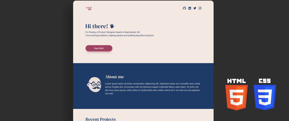
In your index.html file, below the nav tags but still inside the body, write following code:
      <!-- Hero Section  -->
      <section class="hero">
        <h1 class="headline">Hi there! <img src="img/hand.png" /></h1>
        <p class="paragraph">
          I’m Pavsky, a Product Designer based in Manchester, UK. I love solving
          problems, helping people and building beautiful products.
        </p>
        <a href="mailto:YOUREMAILADDRESS">
          <button class="hero-button">Say hello!</button>
        </a>
      </section>
      <!-- End Hero Section -->
Again, we're using comments to separate what's going in the file.
We're using another built in tag here, called section. It does exactly what it says it does, it helps you divide stuff into sections!
But this code by itself is not every exciting looks-wise, so we need to spice it up with some css magic!*
In your main.css file, below your existing code, write:
/* Hero */
.hero {
  width: 800px;
  max-width: 100%;
  padding: 100px 10px;
  text-align: left;
}
.hero .headline {
  text-align: left;
  color: #1e3b67;
  font-size: 48px;
  margin-bottom: 3px;
}
.hero .paragraph {
  width: 600px;
  max-width: 100%;
  text-align: left;
  color: #1e3b67;
  font-size: 18px;
  margin-bottom: 50px;
}
.hero-button {
  width: 200px;
  height: 50px;
  font-size: 16px;
  font-weight: 500;
  color: white;
  max-width: 100%;
  border: none;
  background: #9e4361;
  border-radius: 50px;
  cursor: pointer;
  transition: all 0.3s ease;
}
.hero-button:hover {
  box-shadow: 0px 14px 24px -10px rgba(158, 67, 97, 0.6);
  transform: translateY(-5px);
}
Now we're getting to the exciting stuff. Apart from the usual spacing, colours, font-sizes etc, we have the mysterious :hover, added to our button, proceeded by
  transition: all 0.3s ease;
}
in our .hero-button!
This is what's called a hover state. It means that when the user hovers over the button with our mouse, something might just happen!
After you write your code, try it out.
Pretty neat, right?
Our page already has some micro interactions, and is surely on it's way to becoming spicy.
📝 About me
Now that you have caught the attention of our user, it's time to let them know about yourself in a bit more detail.
In your index.html, still inside the body tag but under everything you have already written, write this:
      <!-- About Me Section -->
      <section class="about">
        <div class="container">
          <img class="profile-pic" src="img/profile-pic.png" />
          <div class="about-text">
            <h3 class="headline">About Me</h3>
            <p class="paragraph">
              Lorem ipsum dolor sit amet, consectetur adipiscing elit. Dignissim
              amet, orci convallis risus, amet, sed ac fringilla dui. Accumsan
              velit vel senectus sapien imperdiet libero, diam diam. At tortor
              est elit risus, lacus ipsum, dolor tellus id. Sollicitudin odio
              mollis viverra et in. Ac nam sit urna egestas non sed.
            </p>
          </div>
        </div>
      </section>
      <!-- End About Me Section -->
In here we have another section with a class name, a div with a class container inside of it so it's all lined up nicely, a profile picture, and some text.
Now let's sprinkle it with some of that css magic dust:
/* About Me */
.about {
  background-color: #1e3b67;
  width: 100%;
  max-width: 100%;
  text-align: left;
  padding: 100px 10px;
  display: flex;
  justify-content: center;
}
.about .container {
  width: 800px;
  max-width: 100%;
  padding: 0px 10px;
  display: inline-flex;
  justify-content: center;
  flex-direction: row;
  align-items: center;
}
.profile-pic {
  width: 20%;
  padding: 10px;
}
.about-text {
  margin-left: 30px;
}
.about .headline {
  color: #f4e8e2;
  font-size: 36px;
  margin-bottom: 5px;
}
.about .paragraph {
  color: #f4e8e2;
  font-size: 18px;
}
@media (max-width: 800px) {
  .about .container {
    justify-content: center;
    flex-direction: column;
    align-items: center;
    width: 100%;
    padding: 0;
  }
  .about-text {
    margin-left: 0px;
  }
  .profile-pic {
    width: 117px;
    height: 124px;
  }
}
Now what in the world is going on here, so many new things!
You already know most of these if you've been paying close attention and doing research, but there is something new here.
@media (max-width: 800px) {
  .about .container {
    justify-content: center;
    flex-direction: column;
    align-items: center;
    width: 100%;
    padding: 0;
  }
  .about-text {
    margin-left: 0px;
  }
  .profile-pic {
    width: 117px;
    height: 124px;
  }
}
This is what we call a Media query.
This nifty little thing helps us to make changes to our page in case the user that's viewing it is on different device.
You can see max-width: 800px. Essentialy what this is, is I am saying to our css file: 'If you encounter a user with a device with a width up to 800px, please apply these changes to my stuff!.
Just think of the possibilities. You can make changes to countless things based on countless devices, if you're feeling adventurous, you could even make the whole page different on mobile!
Truly, we live in a golden age of css.
Again, if you're struggling with anything, navigate here, and look for what you don't understand:
HTML Reference on w3schools
CSS Reference on w3schools
And one more thing, before we move forward.
It's ok if this feels intimidating. It's ok if you don't understand something, or everything for that matter. You don't have to learn it all in one day. Your pace is yours alone, so never compare yourself to other people, and don't put too much pressure on yourself. All I'm saying, is remember to have fun.
Ready to go even crazier now?
Let's create
📝 Recent projects
Now put your seatbelts on, because we're going for a ride here.
In your html file:
<!-- Recent Projects Section -->
      <section class="projects">
        <div class="container">
          <h3 class="headline">Recent Projects</h3>
          <p class="paragraph">Check out what I have been working on!</p>
          <div class="projects-cards">
            <div class="card">
              <img class="card-cover" src="img/card.png" alt="Project cover" />
              <div class="card-content">
                <h3 class="headline">Project Name</h3>
                <p class="paragraph">
                  Lorem ipsum dolor sit amet, consectetur adipiscing elit.
                  Dignissim amet, orci convallis risus, amet, sed ac fringilla
                  dui.
                </p>
                <a class="card-link" href="#">Your Link (Read more)</a>
              </div>
            </div>
          </div>
        </div>
      </section>
      <!-- End Recent Projects Section -->
And in your css file:
/* Recent Projects */
.projects {
  padding: 50px 10px;
}
.projects .headline {
  color: #1e3b67;
  font-size: 36px;
  margin-bottom: 5px;
}
.projects .paragraph {
  color: #1e3b67;
  font-size: 18px;
}
.projects .container {
  width: 800px;
  max-width: 100%;
  padding: 0px 10px;
  display: flex;
  justify-content: center;
  flex-direction: column;
}
.projects-cards {
  display: flex;
  flex-direction: row;
  justify-content: space-between;
  margin: 15px 0px;
}

.card {
  width: 31%;
  max-width: 100%;
  border-radius: 10px;
  background: white;
}
.card-cover {
  max-width: 100%;
}
.card-content {
  box-sizing: border-box;
  padding: 1em;
}
.card .headline {
  margin: 5px 0px;
  font-size: 24px;
}
.card .paragraph {
  font-size: 14px;
}
.card-link {
  font-size: 14px;
  color: #1e3b67;
  width: 100%;
  text-align: right !important;
  opacity: 0.75;
}
.card-link:hover {
  opacity: 1;
}

/* Responsive layout - makes a one column layout instead of a two-column layout */
@media (max-width: 800px) {
  .projects-cards {
    flex-direction: column;
    align-items: center;
  }
  .card {
    width: 300px;
    max-width: 100%;
    margin: 15px 0px;
  }
  .projects .container {
    padding: 0;
  }
}
Now hold on, that is a lot of code! But don't worry, all is still tasty in flavortown. As often is the case, large chunks of html or css are intimidating, but over time you'll learn to read them like you're an html whisperer and there are tags in a troubled village you need to rescue.
Apart from the usual craziness like spacing, colours and so on, we're using flex to make our page do something really interesting!
After you write the code, try resizing the window of your browser, and see if you notice any changes to that section.
If you're successful, the page should change the order of the 'cards', and make it display vertically on mobile, instead of horizontally on desktop!
Now isn't that just wonderful.
Upon closer inspection to our html file, and if you've been paying close attention to our Figma file, you know what the section we've just created is!
It's a set of cards we manufactured to create previews for our projects!
This is my way of helping you to create a little portfolio of your own. You can replace the images with whatever you want, and you can replace the links to go wherever you please!
I like to put a link to my GitHub repo in these, makes it easy for recruiters or whomever to see what I've done in real life!
But it can be whatever you want, remember, this is your page, and if you want it to link to a page full of dancing unicorns, go for it.
Once again, if you're struggling with anything, navigate here, and look for what you don't understand:
HTML Reference on w3schools
CSS Reference on w3schools
By now, if you have looked for at least few things on these pages, you should be more comfortable with looking for stuff!
And if you're not, all is good, just keep at it, and you'll remember all of this is no time!
Next up, we're getting to the biz side of your personal page.
A...
📝 ...Call to Action (also known as a CTA)
If you've ever worked on a project with someone from marketing, you know what CTA stands for. It's a call to action; a place where after a user has looked at some of your stuff and might be more comfortable with contacting you, you can give them another opportunity to do so!
I usually do this with something catchy, like 'Have a project in mind?'
It might sound cheesy, but in my mind, there's someone on the other side of the screen going 'Well spill my brew and call me Hagrid, I do have a project in mind! Let me contact this Pavsky guy!'
People are often intimidated by developers and designers, and it's our job to make them feel a bit more comfortable and to ensure them that if they don't have any tech knowledge, it's ok, and we're here to help.
And CTA is a perfect place to do just that!
In our html code, again, in body tag, below everything you have written already:
<!-- CTA Section -->
      <section class="cta">
        <div class="container">
          <h3 class="headline">Have a project in mind?</h3>
          <p class="paragraph">
            Let’s make this beatiful idea of yours reality!
          </p>
          <a href="mailto:YOUREMAILADDRESS">
            <button class="cta-button">Say hello!</button>
          </a>
        </div>
      </section>
      <!-- End CTA Section -->
And in css:
/* CTA */
.cta {
  padding: 100px 10px;
  background: white;
  width: 100%;
  max-width: 100%;
}
.cta .container {
  text-align: center;
}
.cta .headline {
  font-size: 36px;
  text-align: center;
  color: #1e3b67;
  margin: 5px;
}
.cta-button {
  margin-top: 20px;
  width: 200px;
  height: 50px;
  font-size: 16px;
  font-weight: 500;
  color: white;
  max-width: 100%;
  border: none;
  background: #1e3b67;
  border-radius: 50px;
  cursor: pointer;
  transition: all 0.3s ease;
}
.cta-button:hover {
  box-shadow: 0px 14px 24px -10px rgba(30, 59, 103, 0.6);
  transform: translateY(-5px);
}
Nothing crazy here, you know what you're doing. We've got a section, some colours, a nice button (with a different colours this time) that creates magic upon hovering it.
You might have noticed, that the button in html is wrapped in a hyperlink tag (a), and the src (our link destination) is 'mailto:'.
Replace that with an email address, and refresh the page before clicking the button.
If you haven't felt like a wizard/witch/magicitself up to now, this is the call you've been waiting for. You've just created a button that transcends the browser, and opens up a mail client to send a message!
P U R E. M A G I C.
Now, onto our last section.
📝 Footer
Not only does it look professional to have a footer, but it's quite useful. I'm at the bottom of the page, and let's say I want to go to your GitHub profile, but I don't want to scroll all the way up.
You think it's not that common? Think again. People are lazy, and a simple decision like 'Oh hold my pearls, I have to scroll to the top to find something AGAIN?' can have your user leaving your site.
Everything we create in these days is about user experience. You want to make the user as comfortable as you can.
Don't worry about all of that for now, just keep doing your thing, and keep in mind that user, just as customer, is usually right.
In your html file:
<!-- Footer -->
      <footer>
        <p class="paragraph">Pavsky, 2021. All rights Reserved</p>
        <div class="social-links">
          <a href="#" target="_blank">
            <img src="img/github-white.png" />
          </a>
          <a href="#" target="_blank">
            <img src="img/linkedin-white.png" />
          </a>
          <a href="#" target="_blank">
            <img src="img/twitter-white.png" />
          </a>
          <a href="#" target="_blank">
            <img src="img/instagram-white.png" />
          </a>
        </div>
      </footer>
      <!-- Footer End -->
and in css:
* Footer */
footer {
  background: #9e4361;
  width: 100%;
  max-width: 100%;
  padding: 50px 10px;
  text-align: center;
}
footer .social-links a {
  text-decoration: none;
  margin: 0px 5px;
}
footer .paragraph {
  color: white;
  font-size: 18px;
}
Different colour, who dis?
Nothing crazy to see here, just some more social links, and a line saying 'Yo, this is mine, please don't copy stuff, it's RESERVED!'.
One thing worth interest is the footer tag, which didn't exist when I first started using html.
It's just like nav, or section, it's a container for you to put stuff in, but named intuitively so when you look at your code you know what's popping!
Now you might be all like 'ok, I've got this spicy page now, but when I look at it on mobile or on tablet, it doesn't all line up!'
Now let's fix that.
It's often the case that at the end of a .css file you'll have some more instructions for the browser to create changes based on device width.
These are just some small changes to make sure everything is flavortown and on point.
So at the end of your css code, write:
/* Responsive fixes */
@media (max-width: 800px) {
  section {
    max-width: 100%;
  }
  nav {
    padding: 10px 20px;
  }
  .about-text {
    box-sizing: border-box;
    width: 100%;
  }
}
Once again, if you're struggling with anything, navigate here, and look for what you don't understand:
HTML Reference on w3schools
CSS Reference on w3schools
And that's it folks!
✨ The End
Well done! You have completed your landing page.
Remember, you can replace the colours and images with whatever you want, and really make it your own.
Really, you can use this code and maybe even create something from scratch, I mean, you have learned a lot today!
This is me, officially, giving you my permission, to go boldly into the world with this code, and use it in any way you see fit.
✨
Some links for you:
Demo - See it in action
GitHub repo
✨
If you liked this article, please consider following me on Twitter, and GitHub.
I'm always looking for new connections and friends, and always happy to help with whatever you're working on!
If the reception is good, I might make more of these with stuff like design guides for developers, tools you can use to speed up your workflow etc.
Ok, enough rambling for now.
Thanks for reading! 💖


Top comments (5)
This is some good quality stuff, thank you! my question is why did you choose 800px for the media query? do you always use 800px as a max-width or do you have a method to determine how much width is needed, also why did you choose px instead of em as a unit?? and again thank you and I hope your content reaches more people.
Thanks! A valid question, too.
I wanted to keep it as simple as I could, and make sure that the viewport would be easily visible for anyone testing it. I usually go for 750.
About font sizes, again, simplicity. Everyone knows pixels, thought I’d keep it simple. ✨
Oh, I get it now, I usually use rem for font-size and em for margins and paddings, is my approach correct? And since I've found someone who explains well, there is question that is always on my mind, and it's could we run into problems with font-size being too big (in small screens) and it being too small ( in Tv size monitors)? because unlike other things in the website (like divs and imgs) text-size doesn't scale up or down depending on the view port size, even when using rems and ems (because they are just relative the font-size of the root element which is usually 16px?). And sorry for bombarding you with my questions 😅.
In general, TV screens are such a minimal margin it’s not the best idea to make big decision based on that. Get to know your audience, find out what they use, and test on whatever you can.
Ideally you want to follow accessibility guidelines, as outlined in accessibility.psu.edu/fontsizehtml/
Noted, thanks!