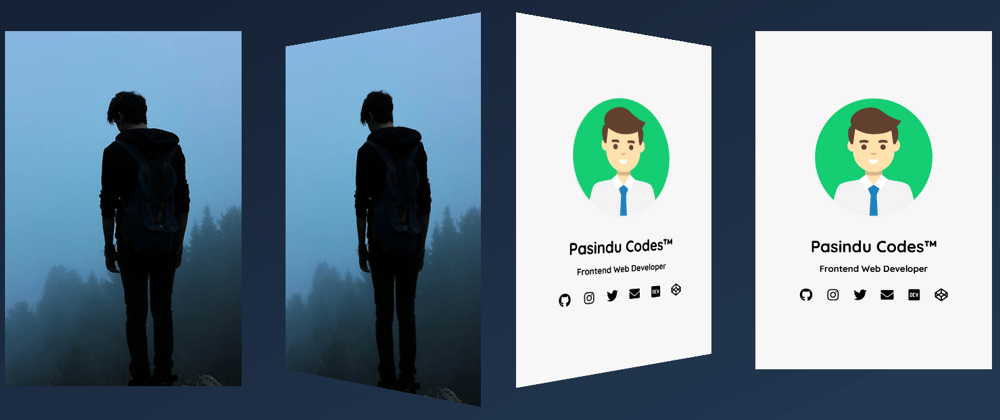
In this article we are going to create a 3D Flipping Profile Card Animation with HTML, CSS and little bit of JavaScript. This is a quick preview of what we are going to do today. 😉
So let's take a look at the code...
HTML
<div class="card">
  <div class="front">
    <img
      src="https://data.whicdn.com/images/225797123/original.jpg"
      alt="Boy Profile Picture"
    />
  </div>
  <div class="back">
    <div class="text">
      <img
        src="https://paperads.com/title-img/Assistant-Manager-Admin-&-HR-Jobs.png"
        alt="Profile"
      />
      <h2>Pasindu Codes™</h2>
      <h5>Frontend Web Developer</h5>
      <ul>
        <li>
          <a href="#"><i class="fab fa-github"></i></a>
        </li>
        <li>
          <a href="#"><i class="fab fa-instagram"></i></a>
        </li>
        <li>
          <a href="#"><i class="fab fa-twitter"></i></a>
        </li>
        <li>
          <a href="#"><i class="fas fa-envelope"></i></a>
        </li>
        <li>
          <a href="#"><i class="fab fa-dev"></i></a>
        </li>
        <li>
          <a href="#"><i class="fab fa-codepen"></i></a>
        </li>
      </ul>
    </div>
  </div>
</div>
So here is the CSS part.
CSS
@import url("https://fonts.googleapis.com/css2?family=Quicksand:wght@400;500;600;700&display=swap");

* {
  box-sizing: border-box;
  padding: 0;
  margin: 0;
}

body {
  width: 100%;
  height: 100vh;
  display: flex;
  align-items: center;
  justify-content: center;
  background: #141e30;
  overflow: hidden;
  background: linear-gradient(to left top, #243b55, #141e30);
}

.card {
  width: 350px;
  height: 500px;
  font-family: "Quicksand", sans-serif;
  position: relative;
  cursor: pointer;
}

.front,
.back {
  width: 100%;
  height: 100%;
  position: absolute;
  backface-visibility: hidden;
  transition: transform 2s cubic-bezier(0.175, 0.885, 0.32, 1.275);
  transform-style: preserve-3d;
}

.front {
  transform: perspective(1000px) rotateY(0deg);
}

.back {
  background-color: #f7f7f7;
  display: flex;
  align-items: center;
  justify-content: center;
  transform: perspective(1000px) rotateY(180deg);
}

img {
  width: 100%;
}

.text {
  text-align: center;
}

.text img {
  width: 200px;
}

.text h5 {
  padding-top: 10px;
}

ul {
  list-style-type: none;
  display: flex;
  justify-content: space-between;
  padding-top: 10px;
}

ul li a {
  display: flex;
  align-items: center;
  justify-content: center;
  text-decoration: none;
  color: black;
  width: 40px;
  height: 40px;
  border-radius: 20px;
  font-size: 1.2rem;
  transition: all 0.2s;
}

ul li a:hover {
  background-color: rgb(17, 17, 17);
  color: white;
}

.backTurn {
  transform: perspective(1000px) rotateY(0);
}

.frontTurn {
  transform: perspective(1000px) rotateY(-180deg);
}
This is the final and easiest part. Let's add the click event of the card with some JavaScript.
JAVASCRIPT
const card = document.querySelector(".card");
const front = document.querySelector(".front");
const back = document.querySelector(".back");

card.addEventListener("click", function () {
  front.classList.toggle("frontTurn");
  back.classList.toggle("backTurn");
});
It's done. 😀. So how was that ? Leave a like if you are interested.
Follow me on Twitter
Thank You :)


Top comments (1)
Cool !!