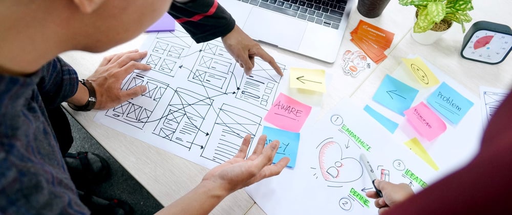
The "keep it simple, stupid" (KISS) mantra is often mentioned in planning meetings, design reviews, and user feedback discussions. While "simple" or "good" design can be quantified through the number of visible controls, time to complete a task or user feedback, the changes resulting from these debates don't always make a product simpler. The key to simplicity could lie in better structuring of the organisation and incentives.
Metrics for Measuring Simplicity
One possible proxy for "ease of use" is time-to-task or taps/clicks-to-task, but faster is not always better. Take the onboarding into a complex product like a banking app. It might be time-consuming, but it helps to build user trust, highlights how customisable the app is, or better complies with KYC requirements, lowering the chance of future negative experiences.
Data-focused giants might A/B test every minor change or use crowdsourcing platforms and marketing surveys to assess design "at scale." However, this could result in choosing generic or flashy options that might need to look or scale better. That's what designers are for in the teams, even if their opinion is easy to discard as "subjective."
Net Promoter Score (NPS) is another metric with limitations. Users are tired of every service in the world asking the same question (who even recommends apps to friends?). Users share opinions over the experience, not design bits. Therefore, late delivery can affect the score of the e-commerce app. I've seen teams set yearly goals of "moving NPS from X to Y," yet in practice, it's hard to define the metric drivers, and historical data might be useless due to the change in acquisition channels.
The After-Scenario Questionnaire (ASQ) is a 3-question scale used to assess how difficult a task was for users (by asking if they were satisfied with ease, time, and available support). Customer Effort Score (CES) suggests comparing a particular action to their original expectations (in line, harder, or easier), allowing the team to focus on problematic areas.
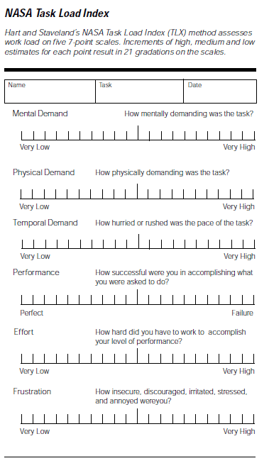
System Usability Score (SUS) originated in NASA to design spaceship cockpits, and it's a survey aimed at measuring cognitive load. It's a good metric in theory, but it's hard to measure it at scale since few people will bother with filling out a form when they come with a different intent. Sending the form later (for instance, in an email) is not an option: users might not remember how they felt by then. The good thing about SUS is that there are benchmarks to follow: a 70-ish score is considered "excellent," which can serve as an internal reference.
UMUX (Usability Metric for User Experience) is another approach where users rate if they agree with statements like 'This product meets my requirements' or 'This product is easy to use.' There's even a formula to compare it with SUS: 0.65 *((UMUX-Lite Item1 + UMUX-Lite Item2 − 2) ∗ (100/12))+22.9. However, this level of measurement complexity might indicate that the team is too focused on optimising the current solution: sometimes, a broader picture helps more.
Casey Winters, CPO of Eventbrite, suggests splitting the offering into multiple parts instead of trying to optimise a complex flow in the first place. This could mean separating the business offering from a consumer one, progressive disclosure of interface elements (though it comes with the risk of discoverability problems), or even waiting for people to learn the UI: unconventional gestures can become an industry standard, as happened with multitouch.
Another good idea is to have separate tracking dashboards for power users and all users, as they might have different needs. Sometimes things are complex, but it's better to keep them that way rather than suddenly change a tool that professionals came to rely on. Making things simpler for the majority of users might break a flow crucial for a particular niche.
Mindset for Avoiding Complexity
Another way of achieving simplicity is by avoiding complexity instead of spending time trying to come up with the right measurement for the interface. This was well described in a post by George Kedenburg, a former designer at Facebook and Instagram, who saw the rapid scaling of the latter first-hand.
The cost of craft rises along with the organisation size: when the product becomes popular due to being simple, it becomes hard to keep it that way. With more resources to invest and more competitors to consider, there's an incentive to expand into every vertical. Instead of picking the best people, companies hire those who are "good enough" to fill dozens of open positions.
Then there are incentives related to promotions and bonuses. Rolling out something new and boosting usage through popups and additional controls is a nice performance review achievement. Reworking something that is in place is not. Unless the company invests in system-centric KPIs or builds dedicated oversight teams for design system and infrastructure, complexity grows.
Paul Stamatiou, the former design leader at Twitter and head of design at Rewind AI, has also shared his view on this. In larger teams, decisions start to be driven by timelines and scopes rather than vision. People decide to 'ship, then iterate' but never follow up. Design and engineering phases are disconnected, with project managers making calls on what to cut.
Sometimes, products are rewritten and redesigned as part of "cleanup releases," only to become progressively more complex in the following years. Either you do things well or you don't, and we know what's "good": software that predicts your intent while feeling fast and personal.
Without the extra effort to re-evaluate and remove the unpopular features, extra time for designers and developers to collaborate, or planning for multiple iterations in advance, it's always hard to justify at the early stages. But unless you do, you'll make this your culture: Figma spent the first four years in stealth mode and still spends years nailing complex features like branching.

Spotify was famous for having a system with many small squads across the org. As the company grew, they introduced "horizontal layers" for tech, user experience, and personalisation to think about the experience holistically. Otherwise, PMs for the audiobooks or podcasts team wouldn't care about the song-listening experience, and growth features would conflict with core UX.
Decisions can be taste-driven. Metrics help to compare the incremental changes, but setting the initial benchmark is hard: even direct competitors have a different audience and development history (and people love things they're used to). A/B won't also help with major redesigns (except for the health metrics): if designs focus on different use cases, the usage patterns will vary as well.
Small, loveable, and complete products and releases are better than 'minimum' and 'viable' ones because the latter can become an excuse to ship half-baked things. The first version of AirPods didn't have noise cancellation or volume controls but had a case that's nice to play with and magical pairing (with music pausing when you take them out of your ears and beautiful setup animations).
Simplicity measurement by itself doesn't make things simpler. Alignment over the strategy, clear responsibility, and explicit tradeoffs help more, as well as building mutual trust between the team members and leadership. By doing so, you will be able to create things which are loveable, not just functional.


Top comments (6)
That’s an interesting take, thank you for sharing!
Interesting, I have never thought about avoiding complexity from this perspective. Thank you for an insightful article!
Thank you!
Nice thoughts, thanks!
Thanks!
Great article!