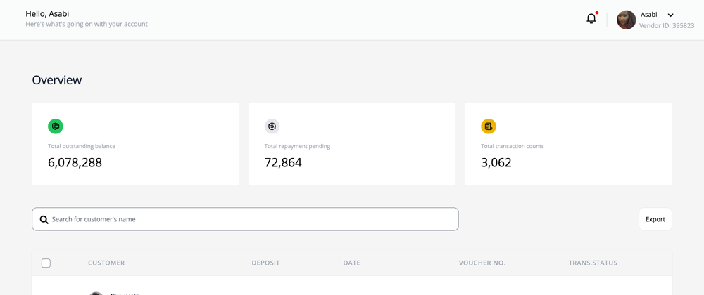
In this tutorial, we will be learning how to build a smart React data table UI with many functionalities such as searching, row and column selection, customised pagination using numbers using react-table and styling with Tailwind CSS.
Make sure you have the necessary requirements.
- Node.js installed
- Code editor ( Visual Studio Code preferably )
- Basic knowledge of React
React Table
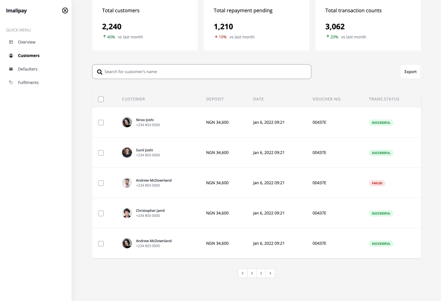
React-Table UI library is very lightweight and offers all the basic features necessary for displaying data on any simple table. For most developers, when building a dashboard displaying data in form of a table with columns is usually necessary and required, react-table provides features like search, filters, and sorting, pagination and many more.
First, let’s get started by creating our application using Create React App and installing all necessary dependencies by running the following commands:
npx create-react-app react-table-dashboard
cd react-table-dashboard
npm instal react-table
Setting Up Our project by a data folder with a dummy.js to provide the necessary data to display on our table.
export const customersData = () => {
  const data = [
  {
    customerID: 1001,
    customer: 'Nirav Joshi',
    CustomerEmail: 'nirav@gmail.com',
    imgUrl:
      avatar2,
    deposit: 'NGN 34,600',
    date: 'Jan 6, 2022 09:21',
    voucherNo: '00437E',
    status: 'Successful',
    selected: false,
    customerNumber: "+234 803 0000",
  },
  {
    CustomerID: 1002,
    customer: 'Sunil Joshi',
    deposit: 'NGN 34,600',
    date: 'Jan 6, 2022 09:21',
    voucherNo: '00437E',
    status: 'Successful',
    CustomerEmail: 'sunil@gmail.com',
    Status: 'Active',
    imgUrl:
      avatar3,
          customerNumber: "+234 803 0000",
      selected: false,
  },
  {
    CustomerID: 1003,
    customer:'Andrew McDownland',
    deposit: 'NGN 34,600',
    date: 'Jan 6, 2022 09:21',
    voucherNo: '00437E',
    status: 'Failed',
    CustomerEmail: 'andrew@gmail.com',
    imgUrl:
      avatar4,
      customerNumber: "+234 803 0000",
  },
  {
    CustomerID: 1004,
    customer:'Christopher Jamil',
    deposit: 'NGN 34,600',
    date: 'Jan 6, 2022 09:21',
    voucherNo: '00437E',
    status: 'Successful',
    CustomerEmail: 'jamil@gmail.com',
    imgUrl:
      avatar,
          customerNumber: "+234 803 0000",
  },
  {
    CustomerID: 1005,
    customer:'Andrew McDownland',
    deposit: 'NGN 34,600',
    date: 'Jan 6, 2022 09:21',
    voucherNo: '00437E',
    status: 'Successful',
    CustomerName: 'Michael',
    customerEmail: 'michael@gmail.com',
   imgUrl:
      avatar2,
        customerNumber: "+234 803 0000",
  },
 {
    CustomerID: 1005,
    customer:'Andrew McDownland',
    deposit: 'NGN 34,600',
    date: 'Jan 6, 2022 09:21',
    voucherNo: '00437E',
    status: 'Successful',
    CustomerName: 'Michael',
    customerEmail: 'michael@gmail.com',
    imgUrl:
      avatar2,
        customerNumber: "+234 803 0000",
  }

];
 return [data]
}
And creating a file in src/Table.js, we'll mostly use the code of the basic example from the React Table docs.
Let’s create the basic UI with the useTable Hook. We will create a new Table component that will accept two props: data and columns. data is the data we got through the dummy data we created, and columns is the object to define the table columns (headers, rows, how the row will be shown, etc.).
import React, {useMemo} from 'react';
import { customersData } from '../data/dummy';

function Table() {
     const columns = useMemo(() => [
      {
        Header: "Customer",
        accessor: "customer",
      },
      {
        Header: "Deposit",
        accessor: "deposit",
      },
      {
        Header: "Date",
        accessor: "date",
      },
      {
        Header: "Voucher NO.",
        accessor: "voucherNo",
      },
      {
        Header: "Trans.Status",
        accessor: "status",
      },

], []);

  const data = useMemo(() => customersData(), []);

  return (
    <>
      <h1>Hello React!</h1>
      <div>
        <Table columns={columns} data={data} />
      </div>
    </>
  );
}

export default Table;
run npm start
Building Our Table
React-table uses React Hook called useTable. The Hook will return the necessary props for the table, body, and transformed data to create the header and cells. The header will be created by iterating through headerGroups, and the rows for the table body will be created by looping through rows. We'll also set up Tailwind CSS in our project, follow the instructions from the documentation. It's a few steps, but it should work seamlessly, we'll also copy most of the classes from the table component on TailwindUI
import { useTable } from "react-table";

function Table({ columns, data }) {
  // Use the state and functions returned from useTable to build your UI
  const { getTableProps, getTableBodyProps, headerGroups, rows, prepareRow } =
    useTable({
      columns,
      data,
    });

  // Render the UI for your table and the styles
  return (
  <div className="mt-2 flex flex-col">
            <div className="-my-2 overflow-x-auto -mx-4 sm:-mx-6 lg:-mx-8">
              <div  className="py-2 align-middle inline-block min-w-full sm:px-6 lg:px-8">
                <div className="shadow overflow-hidden border-b border-gray-200 sm:rounded-lg">
                    <table {...getTableProps()} className="min-w-full divide-y divide-gray-200">
                      <thead className="bg-gray-10">
                      {headerGroups.map((headerGroup) => (
                          <tr {...headerGroup.getHeaderGroupProps()}>
                              {headerGroup.headers.map((column) => (
                                  <th {...column.getHeaderProps()}
                                  className="px-6 py-5 text-left text-20 font-medium text-gray-400 uppercase rounded-sm tracking-wider"
                                  >
                                    {column.render("Header")}
                                    </th>
                              ))}
                          </tr>
                      ))}
                  </thead>
                  <tbody {...getTableBodyProps()}
                  className="bg-white divide-y divide-gray-200">
                    {row.map((row, i) => {
                      prepareRow(row);
                      return (
                          <tr {...row.getRowProps()}>
                          {row.cells.map((cell) => {
                              return <td {...cell.getCellProps()} className="px-6 py-10 whitespace-nowrap">{cell.render("Cell")}</td>
                          })}
                          </tr>
                      );
                      })}
                  </tbody>
                    </table>
                </div>
              </div>
          </div>
         </div>
  );
}

export default Table;
Run npm start to open the app in the browser.
Adding Search Functionality with GlobalFilter
Let's add a global search feature to our table, it can enable users to find text typed in the input field, and the table only displays rows with data that matches this text.
In the src/Table.js, add the following code.
import { useTable, useGlobalFilter, useAsyncDebounce } from 'react-table'  // new

// Define a UI for filtering

function GlobalFilter({
    globalFilter,
    setGlobalFilter,
    placeholder
  }) {
    const [value, setValue] = useState(globalFilter)
    const onChange = useAsyncDebounce(value => {
      setGlobalFilter(value || undefined)
    }, 200)

    return (
      <span className='flex justify-between  pt-10 pb-10 '>
        <input
          value={value || ""}
          onChange={e => {
            setValue(e.target.value);
            onChange(e.target.value);
          }}
          className='w-8/12 rounded-xl border p-4 text-gray-500 cursor-pointer'
          type="search"
          placeholder="Search..."
        />
      </span>
    )
  };
The GlobalFilter component accepts a few props that will be provided by the Table component.
It also defines value using the useState hook, which is coupled to the element's value. When the user types in the element, the onChange handler will call the setGlobalFilter method to pass the value to the parent Table component. The useAsyncDebounce is used to add a little delay to avoid too many re-renders while the user is typing.
Finally, make a few updates to the Table component to integrate the GlobalFilter.
function Table({ columns, data }) {
  // Use the state and functions returned from useTable
  const {
    ...
    state, // new
    preGlobalFilteredRows, // new
    setGlobalFilter, // new
  } = useTable({
    columns,
    data,
  },
    useGlobalFilter // new
  )

  // Render the UI for your table
  return (
    <>
      <GlobalFilter
        preGlobalFilteredRows={preGlobalFilteredRows}
        globalFilter={state.globalFilter}
        setGlobalFilter={setGlobalFilter}
      />
      <table {...getTableProps()}>
        ...
      </table>
    </>
  )
}
run npm start and try out the search functionality in the browser.
Adding useRowSelectColumn
The useRowSelectColumn react-table plugin hook injects a new column at the beginning showing checkboxes to select rows. This hook depends on the useRowSelect hook from react-table.
First we need to add this dependency @lineup-lite/hooks to help with row and column selection in the table. Enter the following command
npm install @lineup-lite/hooks
In the src/Table.js, add the following code.
import { useTable, useGlobalFilter, useAsyncDebounce, useRowSelect } from 'react-table';
import { useRowSelectColumn } from '@lineup-lite/hooks';


  // Use the state and functions returned from useTable to build your UI
    const {
    ...
   getTableProps,
   getTableBodyProps,
   headerGroups,
   rows,
   prepareRow
  } = useTable({
    columns,
    data,
  },
    useRowSelect, //new
    useRowSelectColumn //new
  );

  // Render the UI for your table
  return (
    <table {...getTableProps()}>
      <thead>
        {headerGroups.map((headerGroup) => (
          <tr {...headerGroup.getHeaderGroupProps()}>
            {headerGroup.headers.map((column) => (
              <th {...column.getHeaderProps()}>
                {column.render('Header')}
                {column.id === 'selection' && column.render('Summary')}
              </th>
            ))}
          </tr>
        ))}
      </thead>
      <tbody {...getTableBodyProps()}>
        {rows.map((row, i) => {
          prepareRow(row);
          return (
            <tr {...row.getRowProps()}>
              {row.cells.map((cell) => {
                return <td {...cell.getCellProps()}>{cell.render('Cell')}</td>;
              })}
            </tr>
          );
        })}
      </tbody>
    </table>
  );
}
Custom Status cell component
Let's custom components for different cells, e.g. a show a thumbnail of the user image with the name, or a nice color-coded pill indicating the status.
Let's implement a custom cell for the status.
// src/Table.js
export function StatusPill({ value }) {
  const status = value ? value.toLowerCase() : "unknown";

  return (
    <span
      className={classNames(
        "px-3 py-1 uppercase leading-wide font-bold text-xs rounded-full shadow-sm",
        status.startsWith("active") ? "bg-green-100 text-green-700" : null,
        status.startsWith("inactive") ? "bg-yellow-100 text-yellow-700" : null,
        status.startsWith("offline") ? "bg-red-100 text-red-700" : null
      )}
    >
      {status}
    </span>
  );
}
Let's import this in our data and use it in the column definition.
function Table() {
  const columns = React.useMemo(
    () => [
      // ...
      {
        Header: "Status",
        accessor: "status",
        Cell: StatusPill, // new
      },
      // ...
    ],
    []
  );

  // ...
}
Let's check the result.
This is the greatness of React Table combined with the beauty of Tailwind CSS.
Adding User avatar cell component
In the first column, to show a user avatar and the email address. Let's write a component for this. plus necessary styles.
// src/Table.js
export function AvatarCell({ value, column, row }) {
  return (
    <div className="flex items-center">
      <div className="flex-shrink-0 h-10 w-10">
        <img
          className="h-10 w-10 rounded-full"
          src={row.original[column.imgAccessor]}
          alt=""
        />
      </div>
      <div className="ml-4">
        <div className="text-sm font-medium text-gray-900">{value}</div>
        <div className="text-sm text-gray-500">
          {row.original[column.emailAccessor]}
        </div>
      </div>
    </div>
  );
}
The AvatarCell takes two additional props as arguments, column and row. This is useful, because it allows you to use extra data from the object and use it within the cell.
Column configuration:
// src/App.js
function App() {
  const columns = React.useMemo(() => [
    {
      Header: "Name",
      accessor: "name",
      Cell: AvatarCell,
      imgAccessor: "imgUrl",
      emailAccessor: "email",
    },
    // ...
  ]);

  // ...
}
Pagination
The last feature I want to implement is pagination, to implement pagination, make the following changes (all of which are copied from the React Table pagination example)
// src/Table.js
import { ..., usePagination } from 'react-table'  // new

function Table({ columns, data }) {
    // Use the state and functions returned from useTable to build your UI
  const {
    getTableProps,
    getTableBodyProps,
    headerGroups,
    prepareRow,

    //new
    page, // Instead of using 'rows', we'll use page,
    // which has only the rows for the active page

    // The rest of these things are super handy, too ;)
    canPreviousPage,
    canNextPage,
    pageOptions,
    pageCount,
    gotoPage,
    nextPage,
    previousPage,
    setPageSize,

    state,
    preGlobalFilteredRows,
    setGlobalFilter,
  } = useTable({
      columns,
    data,
  },
    useGlobalFilter,
    usePagination,  // new
  )
Before we display on UI, let's customise the pagination, so as to display numbers as the pagination options.
Create another file ./useCustomPagination.js
import {useMemo} from 'react';

export const DOTS = '...';

const range = (start, end) => {
    const length = end - start + 1;
    return Array.from({length}, (_, idx) => idx + start);
};

export const useCustomPagination = ({totalPageCount, siblingCount = 1, currentPage}) => {
    return useMemo(() => {

        // Pages count is determined as siblingCount + firstPage + lastPage + currentPage + 2*DOTS
        const totalPageNumbers = siblingCount + 5;

        /*
          If the number of pages is less than the page numbers we want to show in our
          paginationComponent, we return the range [1..totalPageCount]
        */
        if (totalPageNumbers >= totalPageCount) {
            return range(1, totalPageCount);
        }

        const leftSiblingIndex = Math.max(currentPage - siblingCount, 1);
        const rightSiblingIndex = Math.min(
            currentPage + siblingCount,
            totalPageCount
        );

        /*
          We do not want to show dots if there is only one position left
          after/before the left/right page count as that would lead to a change if our Pagination
          component size which we do not want
        */
        const shouldShowLeftDots = leftSiblingIndex > 2;
        const shouldShowRightDots = rightSiblingIndex < totalPageCount - 2;

        const firstPageIndex = 1;
        const lastPageIndex = totalPageCount;

        if (!shouldShowLeftDots && shouldShowRightDots) {
            const leftItemCount = 3 + 2 * siblingCount;
            const leftRange = range(1, leftItemCount);

            return [...leftRange, DOTS, totalPageCount];
        }

        if (shouldShowLeftDots && !shouldShowRightDots) {
            const rightItemCount = 3 + 2 * siblingCount;
            const rightRange = range(
                totalPageCount - rightItemCount + 1,
                totalPageCount
            );
            return [firstPageIndex, DOTS, ...rightRange];
        }

        if (shouldShowLeftDots && shouldShowRightDots) {
            const middleRange = range(leftSiblingIndex, rightSiblingIndex);
            return [firstPageIndex, DOTS, ...middleRange, DOTS, lastPageIndex];
        }
    }, [totalPageCount, siblingCount, currentPage]);
};
import and integrate it into ./Table.js
import {DOTS, useCustomPagination} from './useCustomPagination';


function Table({ columns, data }) {
    // Use the state and functions returned from useTable to build your UI
  const {
    getTableProps,
    getTableBodyProps,
    headerGroups,
    prepareRow,

    //new
    page,
    canPreviousPage,
    canNextPage,
    pageOptions,
    pageCount,
    gotoPage,
    nextPage,
    previousPage,
    setPageSize,

    state,
    preGlobalFilteredRows,
    setGlobalFilter,
  } = useTable({
      columns,
    data,
  },
    useGlobalFilter,
    usePagination,  // new
  )


  const {pageIndex} = state;
            const paginationRange = useCustomPagination({
              totalPageCount: pageCount,
              currentPage: pageIndex
       }); //new

          useEffect(() => {
                  setPageSize(5);
            }, [setPageSize]); //set according to your preferrence


              return (
      <>
      ...
      <table {...getTableProps()} border="1">
        ...
        <tbody {...getTableBodyProps()}>
          {page.map((row, i) => {  // replace row with page
            ...
          })}
        </tbody>
      </table>
      {/* new */}
            <div className="py-3 flex items-center text-center justify-center pt-10">
        <div className="flex-1 flex justify-between md:hidden">
          <Button onClick={() => previousPage()} disabled={!canPreviousPage}>Previous</Button>
          <Button onClick={() => nextPage()} disabled={!canNextPage}>Next</Button>
        </div>
        <div className="hidden sm:flex-1 sm:flex sm:items-center sm:justify-between" aria-label="Pagination">
          <div className="relative z-0 inline-flex items-center ml-auto mr-auto rounded-md shadow-sm space-x-10" aria-label="Pagination">
                {paginationRange?.map((pageNumber, index) => {
                    if (pageNumber === DOTS) {
                        return (
                            <div
                            key={index}>...</div>
                        );
                    }

                    if ((pageNumber - 1) === pageIndex) {
                        return (
                            <div
                                key={index}
                                className=' active:bg-gray-500 active:border-gray-300'
                                onClick={() => gotoPage(pageNumber - 1)}>{pageNumber}</div>
                        );
                    }

                    return (
                        <div
                            key={index}
                            className='active:bg-gray-500 active:border-gray-300'
                            onClick={() => gotoPage(pageNumber - 1)}>{pageNumber}</div>
                    );
                })}
             </div>
          </div>
            </div>
          </div>
           )
};
Note that we've replaced row with page, which is an object provided by React Table that only contains the data for the current page.
In order to properly demo the pagination properly, we need a bit more data, so let's modify the getData function to concatenate the initial array three times using the JavaScript spread operator ..., before returning it.
const getData = () => {
  const data = [
    ...
  ]
  return [...data, ...data, ...data]
}
Run npm start and Vula!!!

Style the input elements
For the input elements (search field, filter drop-down and number-of-pages selector) we've relied on the default browser styling so far. Let's change that and make it fit to the rest of our design. I'll use another Tailwind plug-in for that: @tailwindcss/forms. Check out their live demo to see examples of styles you can achieve with it.
Install it with npm.
npm install @tailwindcss/forms
Then add it to your tailwind.config.js file:
// tailwind.config.js
module.exports = {
  theme: {
    // ...
  },
  plugins: [
    require("@tailwindcss/forms"),
    // ...
  ],
};
Conclusion
In this tutorial, we have learnt how to create table with data grid, checkbox and pagination using React table and Tailwind CSS. I hope you enjoyed and learnt from this tutorial, kindly like, share and drop your comment and also I've provided the code repo for you, below.
References
React Table Tutorial Part 1: Style the table with Tailwind CSS
Tailwind CSS
React-Table


Latest comments (0)