In my previous post, I introduced View-Hook Pair pattern. In this post, I describe how to implement a component with some variations with View-Hook Pair. Using it, we can achieve the modular frontend component without lacking the flexibility of spec change or refactoring-ability.
Variation of the component
During creating a web application, there are the visually similar component with almost the same usecase and the same place. It is because that, some parts look/behave a bit different according to its attribute, feature flags, customize by users, and so on.
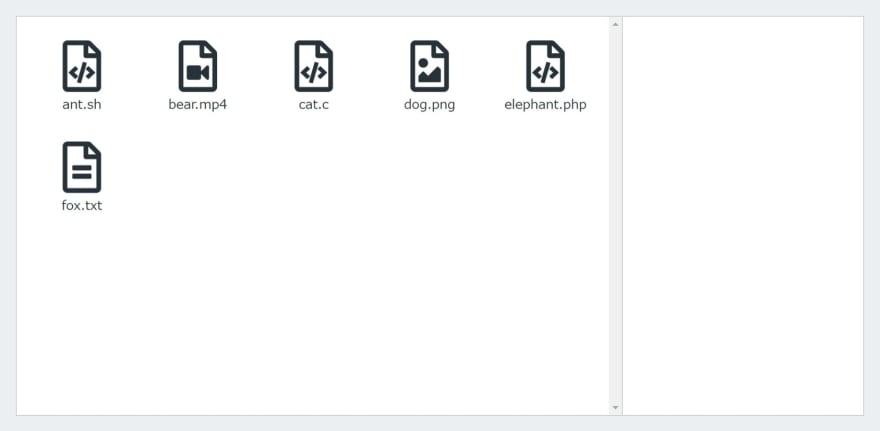
In this post, I bring up the example of a simple file viewer app with the component with the 2 variations. This app has 2 panes, the file list on the left and the detail on the right. Especially for an image file or a movie file, the detail pane additionaly shows the thumbnails (actually a made-up image).


At this time, I regard the difference of the detail pane as a variation.
Problem
Of course we hope all the components are highly maintainable. However, for the component shared part of the variants, it is hard. The spec change could leads code changes in many place due to duplication and/or forgetting the necessary changes. It costs more and has higher congnitive load than the usual components. We need to avoid them somehow.
Though there are several naive implementation for the component with the variants, it would cause problems when the component gets complex/large.
- Code changes in many place or miss by the duplication when the variants are implemented with the respective components.
- Difficult to change by the branch conditions when the varitants are implemented as the single component which changes UI/behavior by the parameters.
- The component requires unnecessary props for some variants and it is difficult to express as the type.
- Though we initially achieve the good shared parts or the good branch flows, it won't be that good after it adds many features.
I assume View-Hook Pair ease these problems.
View-Hook Pair
View-Hook Pair is, I previously proposed, an idea for divide-and-conquar method which consists with the formmaly defined pair of View and Hook. The former covers UI code and the latter covers state and logic.
In this post, I defined the "Standard form" against the problem like this.
function useObject({}: Props, {}: Dependencies): [ViewProps, Exports] {
  return [{}, {}] as const;
}
function View({}: ViewProps): ReactElement {
  return <div />;
}
export const Component = { useObject, View };
I newly propose the objects Dependencies and Exports. These are optional to use and we are also be able to implement the example project without these objects.
The former object Dependencies would be the port of Dependency Injection pattern. This is to the component free from the (static and technically detailed) external dependency with the side-effect and/or resource fetching, like the server layered architecture.
The latter object Exports would be the public methods/properties of Object-Oriented Programming class. These useObject "class" exchange messages with others through their "public" interfaces.
When to integrate the pair, integrate it in where it is used. For example, the component which uses Component with non View-Hook Pair form and the unit tests.
Tactics
From here, I describe how to implement the pair using child pairs.
First, make the normal component for the shared part. We don't need to use View-Hook Pair for a (simple) Presentational component or the one only with small logic and scoped state. If not and necessary, like "Standard form" above, split the component into the pair. That said, usually we just put the component states and callbacks to ViewProps, the functions run in useEffect like componentWillMount to Exports, and declarative UI (including animation state) to View, respectively.
In a View-Hook Pair form component which uses View-Hook Pair form components, combine Views and Hooks independently.
function useObject({}: Props, {}: Dependencies): [ViewProps, Exports] {
  const [childProps, childExports] = Child.useObject({}, {});
  return [{ childProps }, {}] as const;
}
function View({ childProps }: ViewProps) {
  return <Child.View {...childProps} />;
}
export const Parent = { useObject, View };
In useObject in the parent component, it combines its Prop, Dependencies, and children's useObjects and Exportss to implement its responsibility. In View, using HTML element and other component, it places children's Views and mark up its whole look. Maybe, its ViewProps has some structure to prevent the flood of flat children's ViewPropss.
At the top component which finally integrates the pair to the normal form, like Component_ above, call useObject, do necessary process, then finally call View.
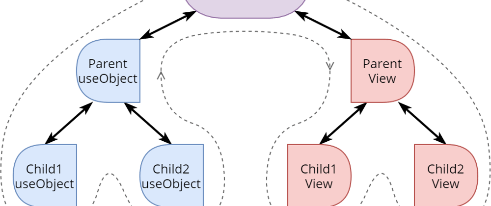
The flow of process is like this.
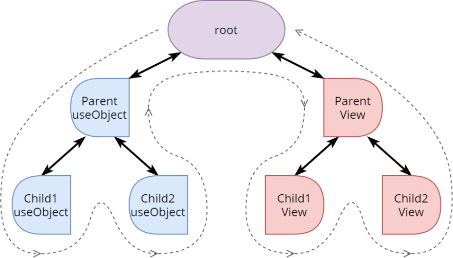
(Actually, the order is arbitrary for the Views in the same depth.)
In the tree of Hook side, the parent Hook can create its ViewProps and Exports by referencing children's encapsulated states from Exportss, in postorder. It is difficult to achieve with normal React component method except with redundant(duplicated) statea. In the tree of View side, the tree structure is almost the same and rendered in the similar order.
Example through the project
I pick some code for the component implementing variants from Example code. For the rest of the component, check 'src/Panel'. I don't mention the other components because it is off-topic.
As I mentioned the example project in the first section of this post, its detail pane has 2 variations which is for media files and for others. In this example, they are implemented separatedly as MediaPanel and TextPanel respectively (both components are located in 'src/Panel'). Both are "Parent" in the figure above and they share their contents in 'src/Panel/parts', except the spacing and the behavior/UI only in one.
First, I show the TextPanel which is easier. (Style definitions are excluded because it is off-topic.)
type Props = { name: string };
type Dependencies = {};
function useObject({ name }: Props, {}: Dependencies) {
  const [attributesProps] = Attributes.useObject({ name }, {});
  return [{ name, attributesProps }];
}
function View({ name, attributesProps }: ReturnType<typeof useObject>[0]) {
  return (
    <div>
      <div>
        <Header name={name} />
      </div>
      <div>
        <Attributes.View {...attributesProps} />
      </div>
    </div>
  );
}
export const TextPanel = { useObject, View };
It uses normal form Header shared component and View-Hook Pair form Attributes shared component. I placed <div /> to add spacing because it is responsibility of this component.
Then, I show the Hook of MediaPanel.
type Props = { id: string; name: string };
type Dependencies = { getPreviewUrl: (id: string) => Promise<string> };
function useObject({ id, name }: Props, { getPreviewUrl }: Dependencies) {
  const [previewUrl, setPreviewUrl] = useState<string>();
  const [previewProps] = Preview.useObject({ previewUrl }, {});
  const [attributesProps, { editing: attributesEditing }] = Attributes.useObject({ name }, {});
  const load = useCallback(async () => {
    setPreviewUrl(undefined);
    setPreviewUrl(await getPreviewUrl(id));
  }, [id, getPreviewUrl]);
  return [{ name, attributesEditing, previewProps, attributesProps }, { load }] as const;
}
It additionally uses Preview shared component because MediaPanel has a preview not like TextPanel. Then, MediaPanel has a requirement to stop the animation during editing Attributes, so it uses Exports of Attributes.useObject. Furthermore, it exports load in Exports to make the parent be able to control the load timing of it.
Finally, I show the View of MediaPanel.
function View({
  name,
  attributesEditing,
  previewProps,
  attributesProps,
}: ReturnType<typeof useObject>[0]) {
  const [previewHovered, setPreviewHovered] = useState(false);
  return (
    <div>
      <div className={previewHovered && !attributesEditing && style}>
        <Header name={name} />
      </div>
      <div onMouseEnter={() => setPreviewHovered(true)} onMouseLeave={() => setPreviewHovered(false)}>
        <Preview.View {...previewProps} />
      </div>
      <div>
        <Attributes.View {...attributesProps} />
      </div>
    </div>
  );
}
It just pass the props for the children's ViewPropss. Apart from that, it has previewHovered state for the UI decoration. (View-Hook Pair is to sweep out information state and logic from View and it doesn't mean to prohibit any kind of state. The state and logic are allowed which is only for the decoration.)
Cons
- Though it helps the essential part (in sence the of spec) to be well shared, this pattern forces many boilerplates.
- Conditional or loop process. This is due to React Hooks restriction. It also could be a problem when the View and Hook is located in the different depth in the tree.
- Typing for the pair. Declaring all the type and impose the pair or referring the actual implementation dynamically. (This example uses latter one.)
Summary
To explain the usage of View-Hook Pair, I describe the implementation for the component with variations to prevent the maintainability problem.


Top comments (0)