Today I want to share with you story about how date pickers (calendar, date input fields) have developed in our company.
Date input is a very important thing in our project, but this task is not easy in terms of UX.
First version
Problems:
We have duplicated the date to make it changeable with a keyboard.
To me such doubled information is very confusing and moreover eats a lot of screen space.You need to confirm input of the date. It takes extra click and there is a possibility of not saving the date.
In some cases user confirmation is helpful but not in such small things.
Second version
As you can see from the screenshot both problems are solved and we’ve come to a more common variant of date picker.
But there is one problem tormenting me for long days.
It is the selection of month and year. In this variant you can enter it from keyboard, but it is not so fast (and then possibly we don’t need a calendar at all if you should enter something from keyboard), or you can scroll months, but I don’t think that scrolling of hundreds of month to the birthday is a real pleasure.
Some of the variants you can find on the internet.
First variant — click on a year, you will see a table of years. In some implementations you should first select a decade and then the year itself. The same table for months.
This is the most appealing variant to me and it appears very intuitive. But it never passed hallway testing. The major argument— too many clicks, slowlier than when you will try to enter the date yourself.
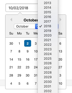
Another recurring variant — select of year and month with a dropdown list.
It has one major disadvantage — it looks awful. Now you have a popup window with a calendar with a dropdown list of years of … In general crossing popup windows is not a decent tone.
Current version
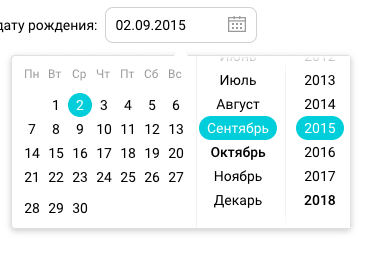
In the current variant you can select month and year from scrolling list next to the date. All problems solved, everyone satisfied.
I should mention two very helpful tricks:
When a window is opened current month and year should be in the center of the window.
The user shouldn’t be confused and should know what date is selected.The list should indicate what you can scroll.
You can see color lightening at top of list on the screen shot, but not at bottom.
I think it is not a final variant but now it is the most useful for us.


Top comments (0)