Welcome to CSSBattle Challenges!
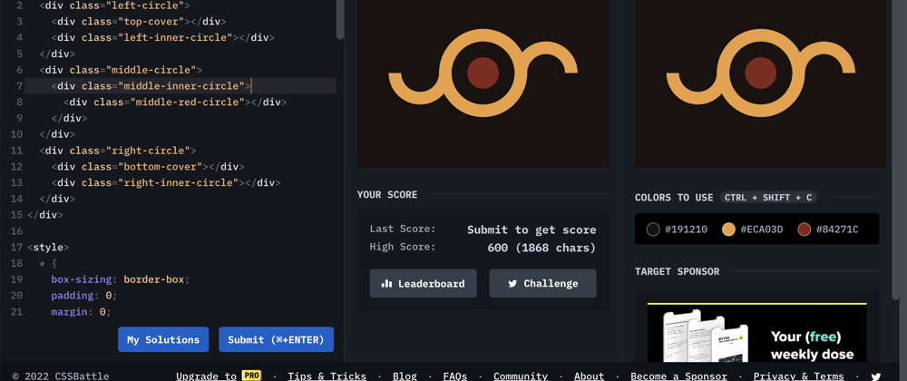
In this short article, I go through my solution for CSSBattle - #11 Eye of Sauron challenge. Please refer to the code snippet below to get a better insight into my thought processes and the implementation detail.
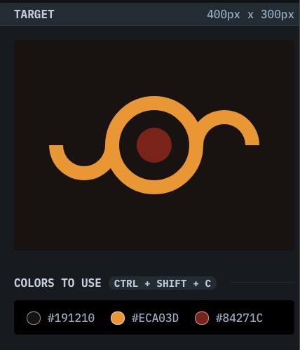
Challenge:
Solution:
<div class="container">
  <div class="left-circle">
    <div class="top-cover"></div>
    <div class="left-inner-circle"></div>
  </div>
  <div class="middle-circle">
    <div class="middle-inner-circle">
      <div class="middle-red-circle"></div>
    </div>
  </div>
  <div class="right-circle">
    <div class="bottom-cover"></div>
    <div class="right-inner-circle"></div>
  </div>
</div>

<style>
  * {
    box-sizing: border-box;
    padding: 0;
    margin: 0;
  }
  .container {
    width: 100%;
    height: 100%;
    background: #191210;
    position: relative;
  }
  .left-circle,
  .middle-circle,
  .right-circle {
    position: absolute;
    top: 50%;
    left: 50%;
    border-radius: 50%;
  }
  .left-circle,
  .right-circle {
    width: 100px;
    height: 100px;
    background: #eca03d;
    display: flex;
    justify-content: center;
    align-items: center;
  }
  .left-circle {
    transform: translate(calc(-50% + -100px), -50%);
  }
  .right-circle {
    transform: translate(calc(-50% + 100px), -50%);
  }
  .middle-circle {
    width: 140px;
    height: 140px;
    background: #eca03d;
    transform: translate(-50%, -50%);
    z-index: 1;
    display: flex;
    justify-content: center;
    align-items: center;
  }
  .left-inner-circle,
  .right-inner-circle {
    width: 60px;
    height: 60px;
    border-radius: 50%;
    background: #191210;
  }
  .middle-inner-circle {
    width: 100px;
    height: 100px;
    background: #191210;
    border-radius: 50%;
    display: flex;
    justify-content: center;
    align-items: center;
  }
  .middle-red-circle {
    width: 50px;
    height: 50px;
    background: #84271c;
    border-radius: 50%;
  }
  .top-cover,
  .bottom-cover {
    position: absolute;
    height: 50px;
    width: 100%;
    background: #191210;
  }
  .top-cover {
    top: 0;
  }
  .bottom-cover {
    bottom: 0;
  }
</style>
Key Takeaway(s):
- using z-index to control overlap of elements
- using absolute positioning to have manual control of an element's position
- using flexbox layout to vertically and horizontally center elements within a parent element
As always, I welcome any feedback or questions regarding the implementation detail of the challenge. Otherwise, I hope this was useful!


Top comments (0)