
There's many complaints I see online about Tailwind: it's WET, not DRY, it's the same as inline styles, you can't make global changes, and it's hard to read. I understand how this may seem to be the case when you first start working with Tailwind. The thing to bear in mind is Tailwind is nothing like traditional CSS, and you shouldn't treat it as such.
There's lots of ways that Tailwind can benefit us, such as its tiny bundle size and super-fast prototyping capabilities. I explained a bit more about that in a previous article. But we can only get these benefits if we use it in the right situation; used in the wrong context, Tailwind will only bring you headaches.
When is the wrong time to use Tailwind CSS?
The first thing I would recommend against using Tailwind for is plain HTML static websites. When you're building a static site, you will inevitably end up copy and pasting HTML, since there's likely to be more than one occurrence of the same component/section on a single page.
This is totally fine if you're using a traditional CSS methodology such as BEM: your CSS and HTML exist completely separately, so you can rely on your CSS as your single source of truth for how your website will look. If you change a CSS class, the change will be reflected everywhere the class is used without having to update the HTML. In this way, it doesn't really matter too much if you've copy and pasted some HTML.
// you can copy and paste these classes anywhere
<button class="button button--negative"></button>

<button class="button button--negative"></button>

// but you could also break rules like this
<div class="button"></div>
This is about as much as you can do when it comes to separation of concerns with CSS and plain HTML. Personally, I still think this method isn't properly DRY since you're copy and pasting the same code in multiple places, but it's about the best you can do with basic HTML- something that never sat right with me while I was learning CSS. To make this system truly DRY, you would want to use some form of templating or a component-based framework so you could only write HTML for a section one time, and then re-use the component wherever you like. This brings me onto...
When is the right time to use Tailwind CSS?
I'm glad you asked! If you don't want to repeat yourself when building websites with Tailwind, you're probably going to want to use some kind of JavaScript framework. Whether it's React, Vue or some other new-fangled framework, the important thing is that you can build JS components which can be reused over and over. You might be able to get it to work with PHP templates, but I'd say this method is best for JavaScript since you can keep your HTML, JS and CSS all in the same file.
That's the real way Tailwind should be used: as an entirely different paradigm where separation of concerns doesn't mean separating HTML, CSS and JS, it means separating entire components instead, and keeping everything related to that component inside one file or folder. It's a pretty different way of working to how we're used to with its own challenges, but this method has some great benefits:
- Components can behave independently of each other and be used across different projects without much hassle
- Components can be tested on their own so you don't need to worry about things changing later on
- Prototyping is much faster since you don't need to write a custom class for every single element
- Full access to use JavaScript for more advanced conditional styling than with regular HTML
- Encourages component composition - once you have a bunch of components, it's easy to build pages or even new variants of components by combining what you already have
Embracing component-based architecture
Once you have your HTML, JavaScript and CSS all in one place, you'll realise it's much easier to contain components within their own folders rather than having resources stretched across your whole project in different file trees. Working in this way opens up new opportunities, such as being able to use JavaScript to dictate your styles and building more complex logic for views.

Here's some tips to help you adjust to component-based development:
1. Break components down into small, reusable pieces
Have you ever noticed, when looking at a design, that there tend to be lots of repeating patterns? You can take advantage of this with class composition. It's common to see a 50/50 layout with text on one side, and some type of media on the other. I tend to call them SplitContent blocks. There are often variants on this, perhaps some of the text is a different size or the media slot is filled with a carousel instead of an image.
Instead of building two components that use the exact same styles for the most part, you could create a container component with props, slots where you can add any kind of content. You could set up logic for your styles inside - maybe you want a prop that changes which side the content will appear on, or add padding to a certain side. Alternatively, you could just add a prop which can be passed a string of class names, giving you the ability to customise the container as it's used in different contexts.

For areas where I want to use SplitContent as a dynamic content block with a CMS such as Wordpress, I might create a Handler component which breaks down the style options defined in the CMS and passes on the relevant combinations of components.
You might, for example, want your client to only have access to one SplitContent component in the CMS, but have the choice to create many different layouts using that one component. Some of the choices might include:
- Which type of content do you want on each side?
- Which side should each content type be on?
- Does this component need a different colour scheme?
These options can be taken in by the component Handler and it will return the correct layout, while keeping all this logic contained within itself so the other components can still be used across different components.
I usually keep everything related to SplitContent under one folder, and add a subfolder of smaller pieces which make up the main components:
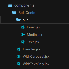
This is just one example; essentially, your components should all have a single purpose so it's easier to build larger and more complex components using the pieces you have created.
2. Use JS to build class lists
If you find Tailwind hard to read, you're not alone. It's one of the most common complaints and I can understand why: you have to read each class to understand what's going on, which doesn't work for everyone.
It may help to rely on JavaScript to build your class names. I often prefer this method over composing new CSS classes for the sake of it, especially when they might only be used in one place. Some people might say this is the same as using the @apply directive, but if the class isn't going to be used anywhere else there's no reason to write a whole new class for it. Writing classes with JavaScript like this helps to keep everything related to that component in a similar place, rather than placing it miles away in the CSS folder.
// components/Modal/View.jsx

export default function ModalView () {
  const modalContainerClass = "bg-white p-4 rounded shadow";
  const modalHeadingClass = "heading-1 text-darkgrey";

  return (
    <aside className={modalContainerClass}>
      <h1 className={modalHeadingClass}>...</h1>
    </aside>
  );
}
Storing classes in JavaScript variables makes it a little clearer what is trying to be accomplished with it, while also opening up the opportunity to use more advanced logic than would be possible with CSS.
3. Use props to extend components
One of the problems we encounter with Tailwind compared to normal CSS is that we lose the ability to extend a basic version of a component into a new modified version with classes:
// _button.scss

.button {
  padding: 20px;
  border: 1px solid black;
}
.button--negative {
  border-colour: red;
}

// index.html

<button class="button">Accept</button>
<button class="button button--negative">Cancel</button>
Of course we could manually add the border-red Tailwind class to any button we want to make negative, but what if there's more than one style? What if the background and text colour also change?
// this would be a nightmare if the negative styles ever changed

<button class="p-5 border-red bg-red text-white">Cancel</button>
The solution: Extend your components using JavaScript
When we make the switch over to component-based development, we gain the ability to use JavaScript in place of CSS for creating components. Since you're no longer tied to a separate stylesheet, you can create variants of your components by abstracting them to different files, using your base component as the starting point.
One of the most flexible ways of doing this is to pass class names down as props, and merge them with the existing classes on a component. This is an example of merging destructured props with other values, as shown on the fantastic resource reactpatterns.com.
Here's how our button variants might look using this method:
// components/Button/index.jsx

export default function Button = ({ classnames, handleOnClick, label }) {
  const buttonClass = [
    "p-5 border-1", // default button styles
    classnames      // any additional styles
  ].join(' ');

  return (
    <button className={buttonClass} onClick={handleOnClick}>
      {label}
    </button>
  )
}

// components/Button/Negative.jsx

export default function ButtonNegative = (props) {
  return (
    <Button
      classnames="border-red bg-red text-white"
      {...props}
    />
  )
}
Now we can use index.jsx as the base layer of our button, and keep all the logic on that level, while also having variants of that button clearly defined without any change to functionality. This way, if the styles change later on, anywhere <ButtonNegative /> is used will reflect changes made in that file.
4. Move view logic and business logic to separate files
This is quite a general tip for working with JavaScript frameworks, but in Tailwind it can help even more so because it separates your styles from your business logic without relegating them to a completely different folder. You can enter your Button folder, and know that everything in that folder will be related to buttons.
Once you've got everything in one place, you can start to break it down further: In React, you can keep the way your component looks separate from how it behaves. Here's an example of this:
// components/Carousel/View.jsx (view logic only)
export default function CarouselView ({ slides }) {
  return (
    <SomeCarouselPlugin>
      {Array.isArray(slides) && slides.map(slide => (
        <CarouselSlide {...slide} />
      ))}
    </SomeCarouselPlugin>
  )
}

// components/Carousel/Jobs.jsx (business logic only)
export default function JobsCarousel () {
  const [jobs, setJobs] = useState(null);

  const fetchJobs = async () => {
    const res = await request({
      url: 'my-api-url.com/jobs?limit=16',
      method: 'GET'
    })
    setJobs(res.data)
  }

  useEffect(() => {
    fetchJobs();
  }, [])

  return !!jobs ? (
    <CarouselView slides={jobs.map(job => ({
      title: job.title,
      description: job.description,
      salary: 'Up to ' + job.salary.max
    }))} />
  ) : <>Loading...</>
}
If we wanted to make another carousel which used the same styles, perhaps we want the carousel to be filled with staff members instead of jobs, we could do that by creating a new container component in Carousel/Staff.jsx.
This massively helps with breaking down huge components with hundreds or even thousands of lines, and this method means you could also include extra layers if you wanted to for even more customisation. This system of extension makes it easier to break down what a component is supposed to be doing, while making sure you don't repeat yourself.
5. Use class composition for containers, text styles and anything used between components
That's right: Even when components are your source of truth, there is still a place for custom classes. For example, you are likely to use a container class on many different components with a max width, margin: auto and some side padding. Since these aren't likely to change, it makes sense to compose a new custom class using the @apply directive.
Personally, I also like to include typographic classes such as for headings, standard blocks of content and the like. These are things that don't necessarily make a lot of sense to create a new JavaScript component for, but they combine the same styles in multiple places nevertheless.
.page-wrap {
  @apply max-w-page mx-auto px-4 tablet:px-5 laptop:px-6;
}

.paragraph {
  @apply text-16 font-body leading-loose;
}

// we can still create variants of .paragraph
<p class="paragraph text-white">Hello world!</p>
6. When composing classes, avoid using margins
You can make classes more reusable by making them position agnostic. If you leave out properties such as margins which only affect the position of the element, you are able to reuse it more often.
// _typography.scss

.heading-2 {
  @apply text-black text-24 bold;
}
<h2 className="heading-2 mb-4">Hello world!</h2>This might not be what you want in every situation - maybe you do want every heading to have a certain margin. But for many cases it's a trick worth keeping in mind that makes your components much more flexible and less dependent on their position on the page.
7. Treat tailwind.config.js as your source of truth
In SCSS or LESS, you might create variables for constants such as colours, fonts and max widths. You can reuse those variables anywhere in your CSS, and if you change the variable this change will be reflected everywhere it's used.
Tailwind works in much the same way, except everything is defined by variables. That means not just the text or background colours you can use, but also spacing, sizing, borders and almost any other property you can think of. You can make use of this with the theme object in tailwind.config.js, or extend the default theme with the extend object.
This file defined the way your whole app will look: If your designer has used a design system which commonly uses numbers like 4, 8, 12, 16, 32 etc. you can build that system right into your CSS:
spacing: {
  1: '4px',
  2: '8px',
  3: '12px',
  4: '16px',
}
These classes are then ready to use, straight away, and in the case of the spacing property will be applied to padding, margin and relative positioning classes such as left and right.
Don't forget that you can also use regular JavaScript to generate some of these properties, which can save a bit of time and clean the file up. I like to make a const containing an array similar to the one above, and using it for spacing, width, height and any other similar properties - even font size.
I've also entertained the idea of such a spacing/font system generated using the golden ratio, which might be a great option for fast prototyping while also maintaining a great visual flow.
8. Use tools to spot repeating patterns
On the topic of composing classes, there are some great tools to help you find repeating patterns in your class lists so you can refactor these into their own generic classes.
One of the most useful is Refactor CSS, a VS Code extension that automatically finds and presents very similar strings of classes, which helps when finding common patterns to abstract into new classes. Class strings will be highlighted if they have more than 3 classes and these 3 classes repeat more than 3 times in the current document. The order of classes is ignored, so you don't need to worry about maintaining a property sort order to make sure the tool works.
If you are worried about property sort order (Tailwind is much more readable if you are) then you can use another tool to deal with that for you: Headwind. This VS Code extension will format your Tailwind classes on save and group them by their function, making sure everything is where you expect it.
// before saving
<div class="bg-red container mb-6 text-white"></div>

// after saving
<div class="container mb-6 text-white bg-red"></div>
You can also change the regex of Headwind, so you can customise the sort order exactly how you like.
Conclusion
I'll won't pretend moving to this way of working is particularly easy, and there are many problems that still need solving. We're still in the early (ish) days of utility-first frameworks and component-based development, so everything hasn't been figured out yet.
Despite this, I feel confident that we'll start to see new tools, packages and methodologies that aim to tackle any issues we may face. What we can get out of this approach are lightweight, fast applications that are truly DRY. Isolated, independent components are great for building across different platforms, so I think we'll see a lot of companies building headless systems picking up this way of working.
I write more articles like this one about headless systems and component-based development over on my blog at npm run dev. Check it out if you want, and I'd love to get some feedback on my thoughts and writing style. Thanks for reading!


Top comments (16)
Never. The right answer to this is never.
Care to elaborate on why you think so?
Everyone tries to do complex mental gymnastics to find the usefulness of Tailwind, when, in fact, it brings (almost) nothing useful to the table.
Adding 25 classes to an element? Cool, how is that better than adding inline styling? Just because you can do hover & media queries? Oh, that changes everything!
But wait, you don't have to add tons of class names, you say, just extract it into a component! Good idea, but why you'd use tailwind class names instead of... you know, plain css?
Then you have class names like
text-blackortext-greenand the client ask you after a while: you know what? Let's make that black a dark gray and that green... blue. Sure, let's do a search & replace across all codebase, but now instead of having adiffwith 5 files with 1-2 lines changed, we have 43 files with 10 changed lines each.Just like bootstrap, Tailwind is another great example of things that were adopted wrongfully by the developers. Instead of using them as frameworks to create proof of concepts, they blown into abominations like „Tailwind themes” or „Bootstrap layouts”.
CSS evolved so much lately (with great browser support) that we, developers, shoot ourselves in our foot with tools like that and then cheer like mad mans. Tailwind is basically a solution to a problem that does not exists.
I hear you, this is a really common complain I see and it's understandable. I think the problem that Tailwind is primarily solving is excessive CSS bloat, which is 100% a problem with regular CSS. Using something like BEM you're guaranteed to repeat yourself which adds more bloat. So that's the problem, which I would say exists and is something people who are really concerned with performance could use a solution for. I think that's the main reason anyone would use Tailwind.
Most of this article is about how to avoid composing classes because I agree, you lose the benefit of Tailwind by using @apply too much. If you do that you may as well just use BEM with plain CSS.
Now how to change text-green to text-blue. To solve this you can use the same thinking as when writing SCSS variables: give the colours generic names. Instead of text-green you could call it text-primary or text-alpha, and if that colour needs to change just change the primary colour in your config.
What if it's not just every instance of text-primary you want to change? At that point, if you wanted to change individual elements surely there is no difference between that and changing the colour in the CSS?
I can understand that it's completely different to regular CSS. I won't pretend there aren't limitations that need addressing. You might not want to change your methodology to something totally different in many ways. As I say it's not for everyone; it might not be right for your website, but for enterprise-level applications that need the speed boost and can benefit from the component-centric way of working I think it's got huge potential.
By moving that bloat to HTML.
Actually BEM solves many problems in a very predictible way. At any point, if you see a class COMPLETELY out of context, something that reads like
.hero__content__media--is-videoyou're pretty sure where is that piece used. Now compare with that mambo-jumbo Tailwind introduce.You say it's better for enterprise? Sure, what it's easier to document?
hero__content__media--is-videoorp-6 max-w-sm mx-auto bg-white rounded-xl shadow-md flex items-center space-x-4?button-primaryorpx-4 py-1 text-sm text-purple-600 font-semibold rounded-full border border-purple-200 hover:text-white hover:bg-purple-600 hover:border-transparent focus:outline-none focus:ring-2 focus:ring-purple-600 focus:ring-offset-2?I'd say Tailwind has the same utility as Pug, HAML and other monstruosities that poped out in the last 20 years. Let's pause for a moment and think how hyped this language was if it wasn't pushed by Wathan & co.
It's fine to just say you don't like Tailwind 😊 Everyone likes different things.
Personally, the thing I don't like about this is that as a new developer on a project, I don't know what
.hero__content__media--is-videois going to add when I add the class. And by extension I don't necessarily know everywhere that class is used if I wanted to modify the class in some way.Every approaches has pros and cons, especially with something like CSS that is so flexible. If BEM works best for you, rock on 🤘🏻 But that doesn't mean you need to say that another approach should never be used.
I'm not sure who Wathan & co is, but it sounds like you're not going to like the framework anytime soon.
For the sake of answering your question, I think that a component called which has all the structure, styles and CSS associated with that component under the same folder is much easier to document than a SCSS file stored completely separately from the HTML itself, because you only need to look in one place to find everything related to that component and you could easily reuse that component in another project just by copying one folder. You could still use BEM for that, but you'd have a larger bundle size than if you used utilities only.
What I suggested in the article is that you'd never see a class completely out of context, because it would be attached to a JavaScript component or named in a variable. That's the context for how the class is used.
I wouldn't say the bloat is moved to the HTML in Tailwind unless you're just using plain HTML, which as I said you probably shouldn't be doing. Even then, GZIP can compress Tailwind classes much smaller than BEM classes due to how similar many of the classes are, often only having one character different between groups such as mb-1, mb-2 etc. So even if you were to copy and paste HTML, which isn't recommended, you'd still end up with a smaller bundle compared to BEM.
Actually... not really. The simplistic way archiving works (be it gzip or anything else) is that it:
That's why text documents compress so well.
The size argument is not valid, the gain is marginally in most cases.
use windicss, it does not require autoprefixer or postcss. just works with build tools like webpack, rollup, vite or many more interaction available. It is 100% compitable with tailwindcss i.e provides same classes with some extra variable classes like
m-{size}px, it works, windi css JIT handles it allHaven't heard of this one before - I'll check it out!
A lot of the advice you give here is good; but there's also a lot here that doesn't feel specific to Tailwind. Component-based frameworks scope CSS to components; so it's definitely good practice to break an application down into "small re-usable pieces" and this already solves some problems in terms of HTML code and design consistency etc. without the need for BEM.
But the component-based approach comes with its own set of problems; specifically related to theming and unified design. I think developers got hung up on the idea that a component should be some isolated element that can be taken out of project A and re-used in project B and work and look exactly the same. So they wrote component styles to handle all aspects of the component's styling in isolation; but that makes maintenance and future global changes very difficult. It also tends to introduce a lot of duplication. But, unless you're specifically building a UI library, isolated styling is rarely a concern; and so introducing global styles is not an issue...
And from my perspective that's all Tailwind is: a global set of utility styles with some handy configuration built in. The same result can be achieved with any well maintained global stylesheet. Issues around theming and consistency in component styles can also be solved with pre-processors (e.g. SCSS variables; mixins etc.) or to some extent CSS variables. I'm not saying don't use Tailwind; but I've seen too many articles that claim it's a magic bullet to styling; when really it's just a well-packaged tool that addresses an already solved problem.
Your perspective seems to be focused on a subset of type of businesses/organisations. e.g We're an agency - no 2 websites are designed the same. A website will get built, launched, general maintenance, until 5-10 years down the line the client wants a brand new website anyway. So having any requirement to "theming" or global changes - has never happened for us and a client in 10 years. So don't worry until it happens!
Can't disagree with you there, I agree that this approach has its own problems. Hopefully these can be solved over time.
You could apply this article to any component based style; I talked about Tailwind specifically, first because I see it get a lot of hate that it doesn't really deserve, and second because that's what I've got experience with. I've used it on several projects which had really fast turnarounds and I wouldn't have been able to get those over the line if I was writing custom classes, even if those classes were isolated. That's the reason I use Tailwind over other solutions, it's really fast and easy to use and it follows a design system instead of random amounts of space. But I won't deny you could get a more custom look with a different method.
It's also not the best to use if you think your theming will change, though there's plenty of ways to mitigate that. I prefer it for headless applications over traditional websites. All about choosing the right tool for the job!
Good article, with some nice examples!
It would be beneficial to people still learning to remove any loaded content such as "You might be able to get it to work with PHP templates, but I'd say this method is best for JavaScript" - You can absolutely and 100% do this with PHP with great ease, and other languages like Ruby, .Net etc etc etc - Remember they've been around longer and more mature so can handle this stuff in their sleep, we do it every single day, and it is in fact easier as those languages have less boilerplate than React/Vue/etc.
I hear you, I don't think I explained my reasoning very well there!
You're right, you can definitely get this working with PHP and any other language using templates. The reason I prefer to use JS is
With that said, I can already see holes in my arguments - at this point it's more to do with my personal preference/experience. I do encourage working like this in non-JS environments, but I'm not an expert in that area!
Good Post I learned Something new
Some comments have been hidden by the post's author - find out more