This guide will teach you how to create a CMS-Block in Shopware 6 with a plugin. We will start building a simple CMS-Block for a button and in the next article we will add the CMS-Element for the block.
Before we jump into the guide I highly recommend to also check the offical Shopware 6 documentation.
What is a CMS-Block
In the offical Shopware 6 documentation there is a difference between a CMS-Block and a CMS-Element.
Unfortunately both guides are completely independent from each other. To get a better understanding how blocks and elements work together, we will create a block and the element for it.
Now for me the CMS-Block is just the outer wrapper. It's just a block and you can put any element inside the block. That's the best description I have for it but let's take a look at it.
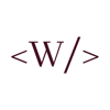
Block Categories
By default we have the following categories for a block:
- Text
- Text & Images
- Images
- Commerce
- Form
- Sidebar
- Video
You probably already saw all these categories in the shopping experiences.

Now we can put our CMS-Block in one of those categories. In this guide we are creating a simple button. A button is basically just text so we will choose that category. Time to finally jump into the code!
Administration Code
If you create a Shopware 6 Plugin the directory structure is pretty important. First thing we have to do is to create our index.js in
<plugin root>/src/Resources/app/administration/src/module/sw-cms/blocks/text/cms-button
The folder is responsible for the category. Since we want our CMS-Block to appear in the text directory the folder is called text. If you want to drop your CMS-Block in a different category simply change the folder name.
A look at the shopware platform code maybe helps.
Our index.js to register our CMS-Block should look like this:
import './component';
import './preview';

Shopware.Service('cmsService').registerCmsBlock({
    name: 'cms-button',
    label: 'sw-cms.blocks.text.ninja-cms-button.label',
    category: 'text',
    component: 'sw-cms-block-button',
    previewComponent: 'sw-cms-preview-button',
    defaultConfig: {
        marginBottom: '20px',
        marginTop: '20px',
        marginLeft: '20px',
        marginRight: '20px',
        sizingMode: 'boxed'
    },
    /* The slot config is important!
       We give the slot button the element text in this tutorial because
       we haven't defined a button element yet.
       You can use the existing blocks and elements out of the box
       but it gets interesting if you want to create your very own
       element with an own config.
       We'll take a look at this later in this guide.
    */
    slots: {
        button: 'text'
    }
});
Alright let‘s dive into the сode so you understand what everything means.
The code starts with two imports we can ignore for now. We need to create those directories first, which we will do later in this guide.
Then we use the method registerCmsBlock which takes a configuration object. We fill that configuration object with the needed data:
-
name: The technical name of your block. -
label: A name to be shown for your block -
category: The category this block belongs to. -
component: The Vue component to be used when rendering your actual block in the administration sidebar. -
previewComponent: The Vue component to be used in the "list of available blocks". Just shows a tiny preview of what your block would look like if it was used. -
defaultConfig: A default configuration to be applied to this block. Must be an object containing those default values. -
slots: Key-value pair to configure which element to be shown in which slot. Will be explained in the next few steps when creating a template for this block.
And that's our code! You maybe noticed that we neither created the component nor the previewComponent right? So we are going to do that now!
Please also read the comment it probably will help you later to understand how everything works
Block component
We need to create a directory with for the component <plugin root>/src/Resources/app/administration/src/module/sw-cms/blocks/text/cms-button/component
In this directory we create a sw-cms-block-button.html.twig file:
{% block sw_cms_block_button %}
    <div class="sw-cms-block-button">
        <slot name="button"></slot>
    </div>
{% endblock %}
Luckily we don‘t have much code to look at here. The one thing you probably noticed is that we set a slot here. The slot name is “button“. In our first file we put that slot in our configuration object. You can name the slots however you want but also make sure to change the configuration object accordingly.
Registering the block component
Like the block, we also need to register the block component. To register the component we create another index.js file and place it into <plugin root>/src/Resources/app/administration/src/module/sw-cms/blocks/text/cms-button/component
import template from './sw-cms-block-button.html.twig';

const { Component } = Shopware;

Component.register('sw-cms-button', {
    template
});
As you can see we just import the template we just created and then register the component. That‘s all for the component but we still need to implement the preview.
Block preview
The preview works pretty much like the component. But let‘s take a look at where you actually will see the preview so you know what the preview is for and what the component is for.

So that's the preview of our block. You will see the preview component in the choosen category.
To create the preview we create our preview directory <plugin root>/src/Resources/app/administration/src/module/sw-cms/blocks/text/cms-button/preview now we create a file sw-cms-preview-button.html.twig:
{% block sw_cms_block_ninja_button_preview %}
    <div class="ninja-button-flex-center">
        <button class="sw-cms-preview-ninja-button">Button</button>
    </div>
{% endblock %}
This code is responsible for our preview. Since we just have a button we don't need much code here.
Styling the preview component
We can style our preview component to make it look like we want. For that we simply create a .scss file like /src/Resources/app/administration/src/module/sw-cms/blocks/text/cms-button/preview/sw-cms-preview-button.scss
.ninja-button-flex-center {
    display: flex;
    align-items: center;
    justify-content: center;
    padding: 1rem;
    .sw-cms-preview-ninja-button {
        background-color: #4492ed;
        border: none;
        color: white;
        padding: 16px 60px;
        text-align: center;
        text-decoration: none;
        display: inline-block;
        font-size: 16px;
    }

}
Registering the block preview component
We also need to register the preview component. This also works the same as before. So we have to create another index.js again and place it into /src/Resources/app/administration/src/module/sw-cms/blocks/text/cms-button/preview/index.js
import template from './sw-cms-preview-button.html.twig';
import './sw-cms-preview-button.scss';

const { Component } = Shopware;

Component.register('sw-cms-preview-button', {
    template
});
Now we are almost done. We created the component and the previewComponent for the administration. Let's take a look on how to make these components also appear in the administration.
Injecting into the administration
We wrote our CMS-Block now it needs to be found by Shopware. For that we need the entry point which is in the main.js place this file into <plugin root>/src/Resources/app/administration/src and we only need to import our CMS-Block here like:
import './module/sw-cms/blocks/text/cms-button';
Build the administration
To make your block appear in the shopware administration you now need to run a build in your console
Development Template:
./psh.phar administration:build
Production Template:
./bin/build-administration.sh
The result in the administration
Now if we did everything correctly we should have a result in the administration which looks like this:

Now we have the block and can drag & drop it in the shopping experiences but it‘s not a button right? It‘s just a text element. To actually make it work like a button we have to create the CMS-Element for the block.
We also don‘t see anything in the frontend. Let‘s fix at least that real quick!
Frontend Implementation
To create a frontend view we just need to place a twig file in the right directory with the correct name. In this example we would place a file like this /src/Resources/views/storefront/block/cms-block-cms-button.html.twig
{% block block_cms_button_example %}
    <div class="cms-element ninja-cms-button-flex ninja-cms-button-flex-center">
        {% block element_text_button %}
            <a href="#">
                <button class="ninja-cms-btn">
                    Button
                </button>
            </a>
        {% endblock %}
    </div>
{% endblock %}
That‘s it! We have a block in the Shopware administration and now we have a frontend view as well. To complete the “How to create a CMS-Block in Shopware 6“-Guide let‘s add a bit of css to the frontend view as well.
Frontend scss
In the frontend our block looks horrible at the moment and it‘s also completely different from what we define in the shopping experience. Let‘s make our block at least look a bit better with a bit of css
.ninja-cms-btn {
    padding: 1rem;

    &:hover {
        filter: brightness(110%);
    }
}

.ninja-cms-button-flex {
    display: flex;
    margin: auto;

    &-start {
        justify-content: flex-start;
    }

    &-center {
        justify-content: center;
    }

    &-end {
        justify-content: flex-end;
    }

    a {
        button {
            background-color: #4492ed;
            border: none;
            color: #fff;
            padding: 14px 50px;
            text-align: center;
            text-decoration: none;
            display: inline-block;
            font-size: 16px;
            margin: 30px 0;
        }
    }
}
You can place this code into your base.scss but I recommend to create a separate file and just do an import in your base.scss. Don‘t forget to run bin/consle theme:compile after adding css
Administration and Storefront is different why?
In the shopping experiences our block is basically a text element if we want to use it right? If you read the comments in the code you already know why. We defined a slot and gave the slot the element „text“. Now if we want to have a real button with real configuration we need to create a CMS-Element for that.
So in the next guide we will take a look at How to create a CMS-Element in Shopware 6. The next guide will be based on this How to create a CMS-Block in Shopware 6 guide, because we will create the element for the block.
Github
If you just want to take a look at the code or if you want to clone the repository then just checkout the project on github.


Top comments (0)