
This tutorial introduces some fundamental Machine Learning and Data Science concepts by exploring the problem of heart disease classification.
It is intended to be an end-to-end example of what a Data Science and Machine Learning proof of concept looks like.
I completed this milestone project in March 2022, as part of the Complete Machine Learning & Data Science Bootcamp taught by Daniel Bourke and Andrei Neagoie.
You can also see the final version of this notebook in my GitHub repo.
What is classification?
Classification involves deciding whether a sample is part of one class or another (single-class classification). If there are multiple class options, we refer to the problem as multi-class classification.
What we'll end up with
Since we already have a dataset, we'll follow this 6-step Machine Learning modelling framework.

More specifically, we'll look at the following topics:
- Exploratory data analysis (EDA) - the process of going through a dataset to find out more about it.
- Model training - create model(s) to predict a target variable based on other variables.
- Model evaluation - evaluating a model's predictions using problem-specific evaluation metrics.
- Model comparison - comparing several different models to find the best one.
- Model fine-tuning - once we've found a good model, how can we improve it?
- Feature importance - since we're predicting the presence of heart disease, are there some things which are more important for prediction?
- Cross-validation - if we build a good model, can we be sure it will work on unseen data?
- Reporting what we've found - if we had to present our work, what would we show someone?
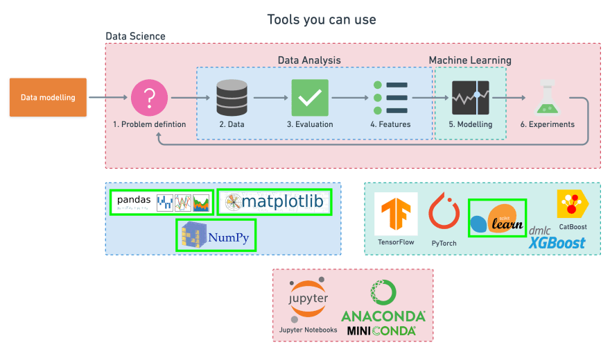
To work through these topics, we'll use pandas, Matplotlib and NumPy for data anaylsis, as well as, Scikit-Learn for machine learning and modelling tasks.
We'll work through each step and by the end of the notebook, we'll have a handful of models. These models can predict whether or not a person has heart disease based on a number of parameters with a considerable accuracy.
We'll also be able to describe which parameters are more indicative than others, for example, sex may be more important than age.
1. Problem Definition
The problem we will explore is a binary classification, which means a sample can only be one of two things.
This is because we're going to use a number of different features about a person to predict whether or not they have heart disease.
In a statement,
Given clinical parameters about a patient, can we predict whether or not they have heart disease?
2. Data
Here, we want to dive into the data that our problem definition is based on. This may involve sourcing, defining different parameters, talking to experts about it, and finding out what we should expect.
The original data comes from the Cleveland database from UCI Machine Learning Repository.
Howevever, we've downloaded it in a formatted way from Kaggle.
The original database contains 76 attributes, but here only 14 attributes are used. Attributes (also called features) are the variables that we'll use to predict our target variable.
Attributes and features are also referred to as independent variables, and a target variable can be referred to as a dependent variable.
We use the independent variables to predict our dependent variable.
In our case, the independent variables are a patient's medical attributes and the dependent variable is whether or not they have heart disease.
3. Evaluation
The evaluation metric is something we define at the start of a project.
Since machine learning is very experimental, we might say something like:
If we can reach 95% accuracy at predicting whether or not a patient has heart disease during the proof of concept phase, we'll pursue this project.
This is helpful because it provides a rough goal for a machine learning engineer or data scientist to work towards.
However, due to the nature of experimentation, the evaluation metric may change over time.
4. Features
Features are different parts of the data. During this step, we want to find out what we can about the data.
One of the most common ways to do this, is to create a data dictionary.
Heart disease data dictionary
A data dictionary describes the data we're dealing with. Not all datasets come with them so this is where we may have to do our research or ask a subject matter expert (someone who knows about the data) for more information.
The following are the features we'll use to predict our target variable (heart disease or no heart disease).
- age - age in years
- sex - (1 = male; 0 = female)
- cp - chest pain type
- 0: Typical angina: chest pain related decrease blood supply to the heart
- 1: Atypical angina: chest pain not related to heart
- 2: Non-anginal pain: typically esophageal spasms (non heart related)
- 3: Asymptomatic: chest pain not showing signs of disease
- trestbps - resting blood pressure (in mmHg on admission to the hospital)
- anything above 130-140 is typically cause for concern
- chol - serum cholestoral in mg/dl
- serum = LDL + HDL + .2 * triglycerides
- above 200 is cause for concern
- fbs - (fasting blood sugar > 120 mg/dl) (1 = true; 0 = false)
- '>126' mg/dL signals diabetes
- restecg - resting electrocardiographic results
- 0: Nothing to note
- 1: ST-T Wave abnormality
- can range from mild symptoms to severe problems
- signals non-normal heart beat
- 2: Possible or definite left ventricular hypertrophy
- Enlarged heart's main pumping chamber
- thalach - maximum heart rate achieved
- exang - exercise induced angina (1 = yes; 0 = no)
- oldpeak - ST depression induced by exercise relative to rest
- looks at stress of heart during exercise
- unhealthy heart will stress more
- slope - the slope of the peak exercise ST segment
- 0: Upsloping: better heart rate with exercise (uncommon)
- 1: Flatsloping: minimal change (typical healthy heart)
- 2: Downsloping: signs of unhealthy heart
- ca - number of major vessels (0-3) colored by fluoroscopy
- colored vessel means the doctor can see the blood passing through
- the more blood movement the better (no clots)
- thal - thalium stress result
- 1,3: normal
- 6: fixed defect: used to be defect but ok now
- 7: reversable defect: no proper blood movement when exercising
- target - have disease or not (1 = yes; 0 = no) (= the predicted attribute)
Note: No personal identifiable information (PPI) can be found in the dataset.
It's a good idea to save these to a Python dictionary or in an external file, so we can look at them later without coming back here.
Preparing the tools
At the start of any project, it's common to see the required libraries imported in a big chunk, like we can see below.
However, in practice, our projects may import libraries as we go. After we've spent a couple of hours working on our problem, we'll probably want to do some tidying up. This is where we may want to consolidate every library we've used at the top of our notebook (like in the cell below).
The libraries we use will differ from project to project. But there are a few which will we'll likely take advantage of during almost every structured data project.
- pandas for data analysis.
- NumPy for numerical operations.
- Matplotlib/seaborn for plotting or data visualization.
- Scikit-Learn for machine learning modelling and evaluation.
# Regular EDA and plotting libraries
import numpy as np
import pandas as pd
import matplotlib.pyplot as plt
import seaborn as sns

# We want our plots to appear in the notebook
%matplotlib inline

## Models
from sklearn.linear_model import LogisticRegression
from sklearn.neighbors import KNeighborsClassifier
from sklearn.ensemble import RandomForestClassifier

## Model evaluators
from sklearn.model_selection import train_test_split, cross_val_score
from sklearn.model_selection import RandomizedSearchCV, GridSearchCV
from sklearn.metrics import confusion_matrix, classification_report
from sklearn.metrics import precision_score, recall_score, f1_score
from sklearn.metrics import plot_roc_curve
Loading data
There are many ways to store data. The typical way of storing tabular data --data similar to what you'd see in an Excel file-- is in .csv format. .csv stands for comma separated values.
Pandas has a built-in function to read .csv files called read_csv() which takes the file pathname of our .csv file. We'll likely use this one often.
df = pd.read_csv('heart-disease.csv') # 'DataFrame' shortened to 'df'
df.shape # (rows, columns)

# (303, 14)
Data exploration (exploratory data analysis or EDA)
Once we've imported a dataset, the next step is to explore it. There's no set way of doing this, but we should try to become more familiar with the dataset.
Comparing different columns to each other, or comparing them to the target variable. Referring back to our data dictionary and reminding ourself of what different columns mean.
Our goal is to become a subject matter expert on the dataset we're working with. So, if someone asks us a question about it, we can give them an explanation, and when we start building models, we can sound check them to make sure they're not performing too well (overfitting) or understand why they might be performing poorly (underfitting).
Since EDA has no real set methodology, the following is a short check list we might want to walk through:
- What question(s) are we trying to solve (or prove wrong)?
- What kind of data do we have and how do we treat different types?
- What’s missing from the data and how do we deal with it?
- Where are the outliers and why should we care about them?
- How can we add, change, or remove features to get more out of our data?
One of the quickest and easiest ways to check our data is with the head() function. Calling it on any dataframe will print the top 5 rows, and tail() calls the bottom 5. We can also pass a number to them like head(10) to show the top 10 rows.
# Let's check the top 5 rows of our dataframe
df.head()
age sex cp  trestbps    chol    fbs restecg thalach exang   oldpeak slope   ca  thal    target
0   63  1   3   145 233 1   0   150 0   2.3 0   0   1   1
1   37  1   2   130 250 0   1   187 0   3.5 0   0   2   1
2   41  0   1   130 204 0   0   172 0   1.4 2   0   2   1
3   56  1   1   120 236 0   1   178 0   0.8 2   0   2   1
4   57  0   0   120 354 0   1   163 1   0.6 2   0   2   1
# And the bottom 10
df.tail(10)
age sex cp  trestbps    chol    fbs restecg thalach exang   oldpeak slope   ca  thal    target
293 67  1   2   152 212 0   0   150 0   0.8 1   0   3   0
294 44  1   0   120 169 0   1   144 1   2.8 0   0   1   0
295 63  1   0   140 187 0   0   144 1   4.0 2   2   3   0
296 63  0   0   124 197 0   1   136 1   0.0 1   0   2   0
297 59  1   0   164 176 1   0   90  0   1.0 1   2   1   0
298 57  0   0   140 241 0   1   123 1   0.2 1   0   3   0
299 45  1   3   110 264 0   1   132 0   1.2 1   0   3   0
300 68  1   0   144 193 1   1   141 0   3.4 1   2   3   0
301 57  1   0   130 131 0   1   115 1   1.2 1   1   3   0
302 57  0   1   130 236 0   0   174 0   0.0 1   1   2   0
value_counts() allows us to show how many times each of the values of a categorical column appear.
# Let's see how many positive (1) and negative (0) samples we have in our dataframe
df["target"].value_counts()
1    165
0    138
Name: target, dtype: int64
Since these two values are close to each other, our target column can be considered balanced. An unbalanced target column, when some classes have far more samples, can be harder to model than a balanced set. Ideally, all of our target classes have the same number of samples.
If we'd prefer these values in percentages, value_counts() takes a parameter, normalize which can be set to True.
# Normalized value counts
df.target.value_counts(normalize=True)
1    0.544554
0    0.455446
Name: target, dtype: float64
We can plot the target column value counts by calling the plot() function and telling it what kind of plot we'd like, in this case, bar is good.
# Plot the value counts with a bar graph
df["target"].value_counts().plot(kind="bar", color=["salmon", "lightblue"]);

df.info() shows the number of missing values we have and what type of data we're working with.
In our case, there are no missing values and all of our columns are numerical.
Another way to get some quick insights on our dataframe is to use df.describe(). describe() shows a range of different metrics about our numerical columns such as mean, max, and standard deviation.
Heart disease frequency according to gender
If we want to compare two columns, we can use the function pd.crosstab(column_1, column_2).
This is helpful when we want to gain an intuition about how our independent variables interact with our dependent variables.
Let's compare our target column with the sex column.
In our data dictionary, for the target column, 1 = heart disease present, 0 = no heart disease. And for sex, 1 = male, 0 = female.
df.sex.value_counts()
There are 207 males and 96 females in our study.
# compare target column with sex column
pd.crosstab(df.target, df.sex)
sex 0   1
target
0   24  114
1   72  93
What can we infer from this? Let's make a simple heuristic.
Since there are about 100 women and 72 of them have a positive value of heart disease being present, we might infer, based on this one variable that if the participant is a woman, there's a 75% chance she has heart disease.
As for males, there's about 200 total with around half indicating a presence of heart disease. So we might predict, if the participant is male, that 50% of the time he will have heart disease.
Averaging these two values, we can assume, based on no other parameter, if there's a person, there's a 62.5% chance they have heart disease.
This can be our very simple baseline, and we'll try to beat it with machine learning.
Making our crosstab visual
We can plot the crosstab by using the plot() function and passing it a few parameters such as, kind (the type of plot we want), figsize=(length, width) (how big we want it to be) and color=[color_1, color_2] (the different colors we'd like to use).
Different metrics are best represented with different kinds of plots. In our case, a bar graph is great. We'll see more examples later. And with a bit of practice, we'll gain an intuition of which plot to use with different variables.
# Create a plot
pd.crosstab(df.target, df.sex).plot(kind="bar",
                                    figsize=(10,6),
                                    color=["salmon", "lightblue"])

# Add some attributes to it
plt.title("Heart disease frequency for sex")
plt.xlabel("0 = No disease, 1 = Disease")
plt.ylabel("Amount")
plt.legend(["Female", "Male"])
plt.xticks(rotation=0); # keeps the labels on the x-axis vertical

Age vs. max heart rate for heart disease
Let's try combining a couple of independent variables, such as age and thalach (maximum heart rate) and then compare them to our target variable.
Because there are so many different values for age and thalach, we'll use a scatter plot.
# Create another figure
plt.figure(figsize=(10,6))

# Start with positve examples
plt.scatter(df.age[df.target==1],
            df.thalach[df.target==1],
            c="salmon")

# Now for negative examples, we want them on the same plot, so we call plt again
plt.scatter(df.age[df.target==0],
            df.thalach[df.target==0],
            c="lightblue")

# Add some helpful info
plt.title("Heart disease in function of Age and Max Heart Rate")
plt.xlabel("Age")
plt.ylabel("Max Heart Rate")
plt.legend(["Disease", "No Disease"]);
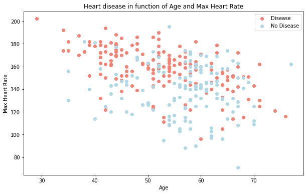
What can we infer from this?
It seems the younger someone is, the higher their max heart rate (dots are higher on the left of the graph) and the older someone is, the more light blue dots there are. But, this may be because there are more dots all together on the right side of the graph (older participants).
Both of these are observational of course, but this is what we're trying to do, get an understanding of the data.
Now, let's check the age distribution.
# Histograms are a great way to check the distribution of a variable
df.age.plot.hist();
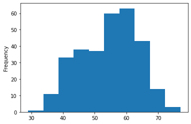
We can see that it's a normal distribution, but slightly skewed to the right, which is reflected in the scatter plot above.
Let's keep going.
Heart disease frequency per chest pain type
Let's try another independent variable. This time, cp (chest pain).
We'll use the same process as we did before with sex.
pd.crosstab(df.cp, df.target)
arget   0   1
cp
0   104 39
1   9   41
2   18  69
3   7   16
# Create a new crosstab and base plot
pd.crosstab(df.cp, df.target).plot(kind="bar",
                                   figsize=(10,6),
                                   color=["lightblue","salmon"])

# Add attributes to the plot to make it more readable
plt.title("Heart Disease Frequency per chest pain type")
plt.xlabel("Chest Pain Type")
plt.ylabel("Amount")
plt.legend(["No Disease", "Disease"])
plt.xticks(rotation=0);

What can we infer from this?
Let's check in our data dictionary what the different levels of chest pain are.
cp - chest pain type
- 0: Typical angina: chest pain related decrease blood supply to the heart
- 1: Atypical angina: chest pain not related to heart
- 2: Non-anginal pain: typically esophageal spasms (non heart related)
- 3: Asymptomatic: chest pain not showing signs of disease
It's interesting that the atypical angina (value of 1) states that it's not related to the heart but seems to have a higher ratio of participants with heart disease than not.
But, what does "atypical angina" even means?
At this point, it's important to remember, if our data dictionary doesn't supply enough information, we may want to do further research on our values. This research may come in the form of asking a subject matter expert (such as a cardiologist or the person who gave us the data) or Googling to find out more.
According to PubMed, it seems even some medical professionals are confused by the term.
Today, 23 years later, “atypical chest pain” is still popular in medical circles. Its meaning, however, remains unclear. A few articles have the term in their title, but do not define or discuss it in their text. In other articles, the term refers to noncardiac causes of chest pain.
Although not conclusive, this graph above is a hint at the confusion of definitions being represented in data.
Correlation between independent variables
Finally, we'll compare all of the independent variables. This may give us an idea of which independent variables may or may not have an impact on our target variable.
We can do this using df.corr() which will create a correlation matrix for us, in other words, a big table of numbers telling us how related each variable is to the others.
# Find the correlation between our independent variables
corr_matrix = df.corr()

# Let's make our correlation matrix look a little prettier
corr_matrix = df.corr()
fig, ax = plt.subplots(figsize=(15,10))
ax = sns.heatmap(corr_matrix,
                 annot=True,
                 linewidths=0.5,
                 fmt=".2f",
                cmap="YlGnBu");

A higher positive value means a potential positive correlation (increase) and a higher negative value means a potential negative correlation (decrease).
Enough EDA, let's model!
We've done exploratory data analysis (EDA) to start building an intuition about the dataset.
What have we learned so far? Aside from our baseline estimate using sex, the rest of the data seems to be pretty distributed.
So what we'll do next is model driven EDA, meaning, we'll use machine learning models to drive our next questions.
A few extra things to remember:
- Not every EDA will look the same, what we've seen here is an example of what we could do for structured, tabular dataset.
- We don't necessarily have to do the same plots as we've done here, there are many more ways to visualize data.
- We want to quickly find:
- Distributions (
df.column.hist()) - Missing values (
df.info()) - Outliers
- Distributions (
Let's build some models.
5. Modeling
We've explored the data, now we'll try to use Machine Learning to predict our target variable based on the 13 independent variables.
What is the problem we're solving?
Given clinical parameters about a patient, can we predict whether or not they have heart disease?
That's what we'll be trying to answer.
And remember our evaluation metric?
If we can reach 95% accuracy at predicting whether or not a patient has heart disease during the proof of concept, we'll pursue this project.
That's what we'll be aiming for.
But before we build a model, we have to get our dataset ready.
Let's look at it again with df.head().
We're trying to predict our target variable using all of the other variables. To do this, we'll split the target variable from the rest.
# Everything except target variable
X = df.drop("target", axis=1)

# Target variable
y = df["target"]
Training and test split
Now comes one of the most important concepts in Machine Learning, the training / test split.
This is where we split our data into a training set and a test set.
We use our training set to train our model and our test set to test it.
The test set must remain separate from our training set.
Why not use all the data to train a model?
Let's say we wanted to take our model into the hospital and start using it on patients. How would we know how well our model performs on a new patient not included in the original full dataset we had?
This is where the test set comes in. It's used to mimic taking our model to a real environment as much as possible.
And it's why it's important to never let our model learn from the test set, it should only be evaluated on it.
To split our data into a training and test set, we can use Scikit-Learn's train_test_split() and feed it our independent and dependent variables (X & y).
# Random seed for reproducibility
np.random.seed(42)

# Split into train & test sets
X_train, X_test, y_train, y_test = train_test_split(X,
                                                    y,
                                                    test_size=0.2) # percentage of data to use for test set
The test_size parameter is used to tell the train_test_split() function how much of our data we want in the test set.
A rule of thumb is to use 80% of our data to train on and the other 20% to test on.
For our problem, a train and test set are enough. But for other problems, we could also use a validation (train/validation/test) set or cross-validation (we'll see this later).
But again, each problem will differ. The post, How (and why) to create a good validation set by Rachel Thomas is a good place to learn more.
Let's look at our training data: we can see we're using 242 samples to train on.
Let's look at our test data: we've got 61 examples we'll test our model(s) on.
Model choices
Now that we've got our data prepared, we can start to fit models. We'll be using the following and comparing their results:
- Logisitc Regression -
LogisticRegression() - K-Nearest Neighbors Classifier -
KNeighborsClassifier() - Random Forest Classifier -
RandomForestClassifier()
Why these?
If we look at the Scikit-Learn algorithm cheat sheet, we can see that we're working on a classification problem and these are the algorithms that it suggests (plus a few more).
"Wait, I don't see Logistic Regression, and why not use LinearSVC?"
Good questions.
It is confusing that Logistic Regression isn't listed as well because it's a model for classification.
Let's pretend that we've tried LinearSVC, and that it doesn't work, so now we're following other options in the map.
For now, knowing each of these algorithms inside and out is not essential.
Machine Learning and Data Science is an iterative practice. These algorithms are tools in our toolbox.
In the beginning, on our way to becoming a practitioner, it's more important to understand our problem (such as, classification versus regression) and then knowing what tools we can use to solve it.
Since our dataset is relatively small, we can experiment to find which algorithm performs best.
All of the algorithms in the Scikit-Learn library use the same functions, for training a model, model.fit(X_train, y_train) and for scoring a model model.score(X_test, y_test). score() returns the ratio of correct predictions (1.0 = 100% correct).
Since the algorithms we've chosen implement the same methods for fitting them to the data as well as evaluating them, let's put them in a dictionary and create a function which fits and scores them.
# Put models in a dictionary
models = {"Logistic Regression": LogisticRegression(),
          "KNN": KNeighborsClassifier(),
          "Random Forest": RandomForestClassifier()}

# Create a function to fit and score models
def fit_and_score(models, X_train, X_test, y_train, y_test):
    """
    Fits and evaluates given machine learning models.
    models: a dict of different Scikit-Learn machine learning models
    X_train: training data
    X_test: testing data
    y_train: labels associated with training data
    y_test: labels associated with test data
    """
    # Set random seed for reproducible results
    np.random.seed(42)
    # Make a list to keep model scores
    model_scores = {}
    #Loop through models
    for name, model in models.items():
        # Fit the model to the data
        model.fit(X_train, y_train)
        # Evaluate the model and append its score to model_scores
        model_scores[name] = model.score(X_test, y_test)
    return model_scores

model_scores = fit_and_score(models,X_train,X_test,y_train,y_test)

model_scores
{'Logistic Regression': 0.8852459016393442,
 'KNN': 0.6885245901639344,
 'Random Forest': 0.8360655737704918}
Since our models are fitting, let's compare them visually.
Model comparison
Since we've saved our models' scores to a dictionary, we can plot them by first converting them to a DataFrame.
model_compare = pd.DataFrame(model_scores, index=["accuracy"])
model_compare.T.plot.bar();
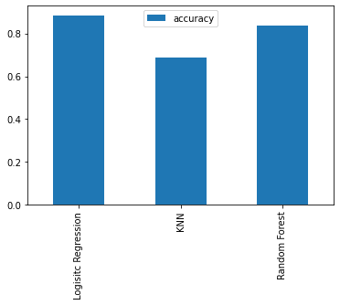
We can't really see it from the graph but looking at the dictionary, the LogisticRegression() model performs best.
We've found the best model. Now, let's put together a classification report to show to the team, including a confusion matrix, and the cross-validated precision, recall, and F1 scores. We'd also want to see which features are most important. And look at a ROC curve.
Let's briefly go through each before we see them in action.
- Hyperparameter tuning - Each model we use has a series of dials we can turn to dictate how they perform. Changing these values may increase or decrease model performance.
- Feature importance - If there are a large amount of features we're using to make predictions, do some have more importance than others? For example, for predicting heart disease, which is more important, sex or age?
- Confusion matrix - Compares the predicted values with the true values in a tabular way, if 100% correct, all values in the matrix will be top left to bottom right (diagonal line).
- Cross-validation - Splits our dataset into multiple parts to train and test our model on each part, then evaluates performance as an average.
- Precision - Proportion of true positives over total number of samples. Higher precision leads to less false positives.
- Recall - Proportion of true positives over total number of true positives and false negatives. Higher recall leads to less false negatives.
- F1 score - Combines precision and recall into one metric. 1 is best, 0 is worst.
-
Classification report - Sklearn has a built-in function called
classification_report()which returns some of the main classification metrics such as precision, recall, and f1-score. - ROC Curve - Receiver Operating Characteristic is a plot of true positive rate versus false positive rate.
- Area Under Curve (AUC) - The area underneath the ROC curve. A perfect model achieves a score of 1.0.
Hyperparameter tuning and cross-validation
To cook our favourite dish, we know to set the oven to 180 degrees and turn the grill on. But when our roommate cooks their favourite dish, they use 200 degrees and the fan-forced mode. Same oven, different settings, different outcomes.
The same can be done for machine learning algorithms. We can use the same algorithms but change the settings (hyperparameters) and get different results.
But just like turning the oven up too high can burn our food, the same can happen for machine learning algorithms. We change the settings and it works so well that it overfits the data.
We're looking for the goldilocks model. One which does well on our dataset but also does well on unseen examples.
To test different hyperparameters, we could use a validation set but since we don't have much data, we'll use cross-validation.
The most common type of cross-validation is k-fold. It involves splitting our data into k-fold's and then testing a model on each. For example, let's say we have 5 folds (k = 5).
We'll be using this setup to tune the hyperparameters of some of our models and then evaluate them. We'll also get a few more metrics like precision, recall, F1-score, and ROC at the same time.
Here's the game plan:
- Tune model hyperparameters, see which performs best
- Perform cross-validation
- Plot ROC curves
- Make a confusion matrix
- Get precision, recall, and F1-score metrics
- Find the most important model features
Tune KNeighborsClassifier (K-Nearest Neighbors or KNN) by hand
There's one main hyperparameter we can tune for the K-Nearest Neighbors (KNN) algorithm, and that is the number of neighbors. The default is 5 (n_neigbors=5).
What are neighbors?
KNN works by assuming that dots which are close to each other belong to the same class. If n_neighbors=5 then it assumes a dot with the 5 closest dots around it are in the same class.
Note: We're leaving out some details here like what defines close or how distance is calculated.
For now, let's try a few different values of n_neighbors.
# Create a list of train scores
train_scores = []

# Create a list of test scores
test_scores = []

# Create a list of different values for n_neighbors
neighbors = range(1,21) # 1 to 20

# Setup algorithm
knn = KNeighborsClassifier()

# Loop through different neighbors values
for i in neighbors:
    knn.set_params(n_neighbors=i) # set neighbors value

    # Fit the algorithm
    knn.fit(X_train, y_train)

    # Update the training scores
    train_scores.append(knn.score(X_train, y_train))

    # Update the test scores
    test_scores.append(knn.score(X_test, y_test))
Let's look at KNN's train scores and test scores.
train_scores
[1.0,
 0.8099173553719008,
 0.7727272727272727,
 0.743801652892562,
 0.7603305785123967,
 0.7520661157024794,
 0.743801652892562,
 0.7231404958677686,
 0.71900826446281,
 0.6942148760330579,
 0.7272727272727273,
 0.6983471074380165,
 0.6900826446280992,
 0.6942148760330579,
 0.6859504132231405,
 0.6735537190082644,
 0.6859504132231405,
 0.6652892561983471,
 0.6818181818181818,
 0.6694214876033058]
test_scores
[0.6229508196721312,
 0.639344262295082,
 0.6557377049180327,
 0.6721311475409836,
 0.6885245901639344,
 0.7213114754098361,
 0.7049180327868853,
 0.6885245901639344,
 0.6885245901639344,
 0.7049180327868853,
 0.7540983606557377,
 0.7377049180327869,
 0.7377049180327869,
 0.7377049180327869,
 0.6885245901639344,
 0.7213114754098361,
 0.6885245901639344,
 0.6885245901639344,
 0.7049180327868853,
 0.6557377049180327]
These are hard to understand so let's plot them.
plt.plot(neighbors, train_scores, label="Train score")
plt.plot(neighbors, test_scores, label="Test score")
plt.xticks(np.arange(1,21,1))
plt.xlabel("Number of neighbors")
plt.ylabel("Model score")
plt.legend()

print(f"Maximum KNN score on the test data: {max(test_scores)*100:.2f}%")
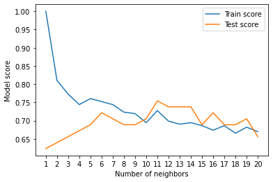
Looking at the graph, n_neighbors = 11 seems best.
Even knowing this, the KNN's model performance didn't get near what LogisticRegression or the RandomForestClassifier did.
Because of this, we'll discard KNN and focus on the other two.
We've tuned KNN by hand but let's see how we can tune LogisticsRegression and RandomForestClassifier using RandomizedSearchCV.
Instead of manually trying different hyperparameters by hand, RandomizedSearchCV tries a number of different combinations, evaluates them, and saves the best.
Tuning models with RandomizedSearchCV
Reading the Scikit-Learn documentation for LogisticRegression, we find there's a number of different hyperparameters we can tune.
The same for RandomForestClassifier.
Let's create a hyperparameter grid (a dictionary of different hyperparameters) for each and then test them out.
# Different LogisticRegression hyperparameters
log_reg_grid = {"C": np.logspace(-4, 4, 20),
                "solver": ["liblinear"]}

# Different RandomForestClassifier hyperparameters
rf_grid = {"n_estimators": np.arange(10, 1000, 50),
           "max_depth": [None, 3, 5, 10],
           "min_samples_split": np.arange(2, 20, 2),
           "min_samples_leaf": np.arange(1, 20, 2)}
Now let's use RandomizedSearchCV to tune our LogisticRegression model.
We'll pass it the different hyperparameters from log_reg_grid as well as set n_iter = 20. This means, RandomizedSearchCV will try 20 different combinations of hyperparameters from log_reg_grid and save the best ones.
# Setup random seed
np.random.seed(42)

# Setup random hyperparameter search for LogisticRegression
rs_log_reg = RandomizedSearchCV(LogisticRegression(),
                                param_distributions=log_reg_grid,
                                cv=5,
                                n_iter=20,
                                verbose=True)

# Fit random hyperparameter search model
rs_log_reg.fit(X_train, y_train)
Fitting 5 folds for each of 20 candidates, totalling 100 fits
RandomizedSearchCV(cv=5, estimator=LogisticRegression(), n_iter=20,
                   param_distributions={'C': array([1.00000000e-04, 2.63665090e-04, 6.95192796e-04, 1.83298071e-03,
       4.83293024e-03, 1.27427499e-02, 3.35981829e-02, 8.85866790e-02,
       2.33572147e-01, 6.15848211e-01, 1.62377674e+00, 4.28133240e+00,
       1.12883789e+01, 2.97635144e+01, 7.84759970e+01, 2.06913808e+02,
       5.45559478e+02, 1.43844989e+03, 3.79269019e+03, 1.00000000e+04]),
                                        'solver': ['liblinear']},
                   verbose=True)
rs_log_reg.best_params_
{'solver': 'liblinear', 'C': 0.23357214690901212}
rs_log_reg.score(X_test, y_test)
0.8852459016393442
Now that we've tuned LogisticRegression using RandomizedSearchCV, we'll do the same for RandomForestClassifier.
# Setup random seed
np.random.seed(42)

# Setup random hyperparameter search for RandomForestClassifier
rs_rf = RandomizedSearchCV(RandomForestClassifier(),
                           param_distributions=rf_grid,
                           cv=5,
                           n_iter=20,
                           verbose=True)

# Fit random hyperparameter search model
rs_rf.fit(X_train, y_train)
Fitting 5 folds for each of 20 candidates, totalling 100 fits
RandomizedSearchCV(cv=5, estimator=RandomForestClassifier(), n_iter=20,
                   param_distributions={'max_depth': [None, 3, 5, 10],
                                        'min_samples_leaf': array([ 1,  3,  5,  7,  9, 11, 13, 15, 17, 19]),
                                        'min_samples_split': array([ 2,  4,  6,  8, 10, 12, 14, 16, 18]),
                                        'n_estimators': array([ 10,  60, 110, 160, 210, 260, 310, 360, 410, 460, 510, 560, 610,
       660, 710, 760, 810, 860, 910, 960])},
                   verbose=True)
# Find the best hyperparameters
rs_rf.best_params_
{'n_estimators': 210,
 'min_samples_split': 4,
 'min_samples_leaf': 19,
 'max_depth': 3}
# Evaluate the randomized search RFC model
rs_rf.score(X_test, y_test)
0.8688524590163934
Tuning the hyperparameters for each model saw a slight performance boost in both RandomForestClassifier and LogisticRegression.
This is akin to tuning the settings on our oven and getting it to cook our favourite dish just right.
But since LogisticRegression is ahead, we'll try tuning it further with GridSearchCV.
Tuning a model with GridSearchCV
The difference between RandomizedSearchCV and GridSearchCV is that RandomizedSearchCV searches over a grid of hyperparameters performing n_iter combinations, but GridSearchCV will test every single possible combination.
In short:
-
RandomizedSearchCV- triesn_itercombinations of hyperparameters and saves the best. -
GridSearchCV- tries every single combination of hyperparameters and saves the best.
Let's see it in action.
# Different LogisticRegression hyperparameters
log_reg_grid = {"C": np.logspace(-4, 4, 30),
                "solver": ["liblinear"]}

# Setup grid hyperparameter search for LogisticRegression
gs_log_reg = GridSearchCV(LogisticRegression(),
                          param_grid=log_reg_grid,
                          cv=5,
                          verbose=True)

# Fit grid hyperparameter search model
gs_log_reg.fit(X_train, y_train);

# Check the best parameters
gs_log_reg.best_params_
{'C': 0.20433597178569418, 'solver': 'liblinear'}
# Evaluate the model
gs_log_reg.score(X_test, y_test)
0.8852459016393442
In this case, we get the same results as before since our grid only has a maximum of 20 different hyperparameter combinations.
Note: If there are a large amount of hyperparameters combinations in our grid, GridSearchCV may take a long time to try them all out. This is why it's a good idea to start with RandomizedSearchCV, try a certain amount of combinations and then use GridSearchCV to refine them.
Evaluating a classification model, beyond accuracy
Now that we've got a tuned model, let's get some of the metrics we discussed before.
We want:
- ROC curve and AUC score -
plot_roc_curve() - Confusion matrix -
confusion_matrix() - Classification report -
classification_report() - Precision -
precision_score() - Recall -
recall_score() - F1-score -
f1_score()
Luckily, Scikit-Learn has these all built-in.
To access them, we'll have to use our model to make predictions on the test set. We can make predictions by calling predict() on a trained model and passing it the data we'd like to predict on.
We'll make predictions on the test data.
# Make predictions on test data
y_preds = gs_log_reg.predict(X_test)
Let's see them.
Since we've got our prediction values, we can find the metrics we want.
Let's start with the ROC curve and AUC scores.
ROC curve and AUC scores
What's a ROC curve?
It's a way of understanding how our model is performing by comparing the true positive rate to the false positive rate.
In our case:
To get an appropriate example in a real-world problem, consider a diagnostic test that seeks to determine whether a person has a certain disease. A false positive in this case occurs when the person tests positive, but does not actually have the disease. A false negative, on the other hand, occurs when the person tests negative, suggesting they are healthy, when they actually do have the disease.
Scikit-Learn implements a function plot_roc_curve which can help us create a ROC curve as well as calculate the area under the curve (AUC) metric.
Reading the documentation on the plot_roc_curve function, we can see it takes (estimator, X, y) as inputs. Where estimator is a fitted machine learning model and X and y are the data we'd like to test it on.
In our case, we'll use the GridSearchCV version of our LogisticRegression estimator, gs_log_reg as well as the test data, X_test and y_test.
# Plot ROC curve and calculate AUC metric
plot_roc_curve(gs_log_reg, X_test, y_test);

Our model does far better than guessing which would be a line going from the bottom left corner to the top right corner, AUC = 0.5. But a perfect model would achieve an AUC score of 1.0, so there's still room for improvement.
Let's move onto the next evaluation request, a confusion matrix.
Confusion matrix
A confusion matrix is a visual way to show where our model made the right predictions and where it made the wrong predictions (or in other words, got confused).
Scikit-Learn allows us to create a confusion matrix using confusion_matrix() and passing it the true labels and predicted labels.
Because Scikit-Learn's built-in confusion matrix is a bit bland, we probably want to make it visual. Let's create a function which uses Seaborn's heatmap() for doing so.
sns.set(font_scale=1.5) # Increase font size

def plot_conf_mat(y_test, Y_preds):
    """
    Plots a confusion matrix using Seaborn's heatmap().
    """
    fig, ax = plt.subplots(figsize=(3,3))
    ax = sns.heatmap(confusion_matrix(y_test, y_preds),
                     annot=True, # Annotate the boxes
                     cbar=False)
    plt.xlabel("Predicted label")
    plt.ylabel("True label")

plot_conf_mat(y_test, y_preds)
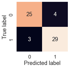
We can see the model gets confused (predicts the wrong label) relatively the same across both classes. In essence, there are 4 occasions where the model predicted 0 when it should have been 1 (false negative) and 3 occasions where the model predicted 1 instead of 0 (false positive).
Classification report
We can make a classification report using classification_report() and passing it the true labels as well as our models predicted labels.
A classification report will also give us information of the precision and recall of our model for each class.
# Show classification report
print(classification_report(y_test, y_preds))
          precision    recall  f1-score   support

           0       0.89      0.86      0.88        29
           1       0.88      0.91      0.89        32

    accuracy                           0.89        61
   macro avg       0.89      0.88      0.88        61
weighted avg       0.89      0.89      0.89        61
What's going on here?
Let's refresh our memory.
- Precision - Indicates the proportion of positive identifications (model predicted class 1) which were actually correct. A model which produces no false positives has a precision of 1.0.
- Recall - Indicates the proportion of actual positives which were correctly classified. A model which produces no false negatives has a recall of 1.0.
- F1 score - A combination of precision and recall. A perfect model achieves an F1 score of 1.0.
- Support - The number of samples each metric was calculated on.
- Accuracy - The accuracy of the model in decimal form. Perfect accuracy is equal to 1.0.
- Macro avg - Short for macro average, the average precision, recall and F1 score between classes. Macro avg doesn’t class imbalance into effort, so if you do have class imbalances, pay attention to this metric.
- Weighted avg - Short for weighted average, the weighted average precision, recall and F1 score between classes. Weighted means each metric is calculated with respect to how many samples there are in each class. This metric will favour the majority class (e.g. will give a high value when one class out performs another due to having more samples).
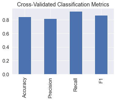
Ok, now we've got a few deeper insights on our model. But these were all calculated using a single training and test set.
What we'll do to make them more solid is calculate them using cross-validation.
How?
We'll take the best model along with the best hyperparameters and use cross_val_score() along with various scoring parameter values.
cross_val_score() works by taking an estimator (machine learning model) along with data and labels. It then evaluates the machine learning model on the data and labels using cross-validation and a defined scoring parameter.
Let's remind ourselves of the best hyperparameters and then see them in action.
# Instantiate best model with best hyperparameters (found with GridSearchCV)
clf = LogisticRegression(C=0.20433597178569418,
                         solver="liblinear")
Now that we've got an instantiated classifier, let's find some cross-validated metrics.
# Cross-validate accuracy score
cv_acc = cross_val_score(clf,
                         X,
                         y,
                         cv=5, # 5-fold cross-validation
                         scoring="accuracy")
cv_acc = np.mean(cv_acc) # since there are 5 metrics here, we'll take the average
cv_acc
0.8479781420765027
Now we'll do the same for other classification metrics.
# Cross-validated precision score
cv_precision = cross_val_score(clf,
                         X,
                         y,
                         cv=5,
                         scoring="precision")
cv_precision = np.mean(cv_precision)
cv_precision
0.8215873015873015
# Cross-validated recall score
cv_recall = cross_val_score(clf,
                         X,
                         y,
                         cv=5,
                         scoring="recall")
cv_recall = np.mean(cv_recall)
cv_recall
0.9272727272727274
# Cross-validated F1 score
cv_f1 = cross_val_score(clf,
                         X,
                         y,
                         cv=5,
                         scoring="f1")
cv_f1 = np.mean(cv_f1)
cv_f1
0.8705403543192143
We've got cross validated metrics. Let's visualize them.
# Visualizing cross-validated metrics
cv_metrics = pd.DataFrame({"Accuracy": cv_acc,
                           "Precision": cv_precision,
                           "Recall": cv_recall,
                           "F1": cv_f1},
                         index=[0])

cv_metrics.T.plot.bar(title="Cross-Validated Classification Metrics",
                      legend=False);
The final thing to check off the list of our model evaluation techniques is feature importance.
Feature importance
Feature importance is another way of asking, "which features contribute most to the outcomes of the model?"
Or for our problem, trying to predict heart disease using a patient's medical characteristics, which characteristics contribute most to a model predicting whether someone has heart disease or not?
Unlike some of the other functions we've seen, because how each model finds patterns in data is slightly different, how a model judges how important those patterns are is different as well. This means for each model, there's a slightly different way of finding which features were most important.
We can usually find an example via the Scikit-Learn documentation or via searching for something like "[MODEL TYPE] feature importance", such as, "random forest feature importance".
Since we're using LogisticRegression, we'll look at one way we can calculate feature importance for it.
To do so, we'll use the coef_ attribute. Looking at the Scikit-Learn documentation for LogisticRegression, the coef_ attribute is the coefficient of the features in the decision function.
We can access the coef_ attribute after we've fit an instance of LogisticRegression.
# Fit an instance of LogisticRegression (taken from above)
clf.fit(X_train, y_train);

# Check coef_
clf.coef_
array([[ 0.00316728, -0.86044619,  0.6606706 , -0.01156993, -0.00166374,
         0.04386123,  0.31275813,  0.02459361, -0.60413061, -0.56862832,
         0.45051624, -0.63609879, -0.67663383]])
Looking at this, it might not make much sense. But these values are how much each feature contributes to how a model makes a decision on whether patterns in a sample of patient's health data leans more towards having heart disease or not.
Even knowing this, in its current form, this coef_ array still doesn't mean much. But it will if we combine it with the columns (features) of our dataframe.
# Match features to columns
feature_dict = dict(zip(df.columns, list(clf.coef_[0])))
feature_dict
{'age': 0.003167276981166473,
 'sex': -0.8604461876496617,
 'cp': 0.6606705956924419,
 'trestbps': -0.011569931456373254,
 'chol': -0.0016637425660326452,
 'fbs': 0.04386123481563001,
 'restecg': 0.3127581278180605,
 'thalach': 0.02459361121787892,
 'exang': -0.6041306062021752,
 'oldpeak': -0.5686283181242949,
 'slope': 0.4505162370067001,
 'ca': -0.6360987949046014,
 'thal': -0.6766338344936489}
Now, let's visualize them.
# Visualize feature importance
feature_df = pd.DataFrame(feature_dict, index=[0])
feature_df.T.plot.bar(title="Feature Importance",
                      legend=False);

We notice some are negative and some are positive.
The larger the value (bigger bar), the more the feature contributes to the model's decision.
If the value is negative, it means there's a negative correlation. And vice versa for positive values.
For example, the sex attribute has a negative value of -0.904, which means as the value for sex increases, the target value decreases.
We can see this by comparing the sex column to the target column.
pd.crosstab(df["sex"], df["target"])
arget   0   1
sex
0   24  72
1   114 93
We can see, when sex is 0 (female), there are almost 3 times as many (72 vs. 24) people with heart disease (target = 1) than without.
And then as sex increases to 1 (male), the ratio goes down to almost 1 to 1 (114 vs. 93) of people who have heart disease and who don't.
What does this mean?
It means the model has found a pattern which reflects the data. Looking at these figures and this specific dataset, it seems if the patient is female, they're more likely to have heart disease.
How about a positive correlation?
# Contrast slope (positive coefficient) with target
pd.crosstab(df["slope"], df["target"])
arget   0   1
slope
0   12  9
1   91  49
2   35  107
Looking back at the data dictionary, we see slope is the "slope of the peak exercise ST segment" where:
- 0: Upsloping: better heart rate with excercise (uncommon)
- 1: Flatsloping: minimal change (typical healthy heart)
- 2: Downslopins: signs of unhealthy heart
According to the model, there's a positive correlation of 0.470, not as strong as sex but still more than 0.
This positive correlation means our model is picking up the pattern that as slope increases, so does the target value.
What can we do with this information?
This is something we might want to talk to a subject matter expert about. They may be interested in seeing where machine learning model is finding the most patterns (highest correlation) as well as where it's not (lowest correlation).
Doing this has a few benefits:
- Finding out more - If some of the correlations and feature importances are confusing, a subject matter expert may be able to shed some light on the situation and help us figure out more.
- Redirecting efforts - If some features offer far more value than others, this may change how we collect data for different problems. See point 3.
- Less but better - Similar to above, if some features are offering far more value than others, we could reduce the number of features our model tries to find patterns in as well as improve the ones which offer the most. This could potentially lead to saving on computation, by having a model find patterns across less features, whilst still achieving the same performance levels.
6. Experimentation
We've completed all the metrics requested. We should be able to put together a great report containing a confusion matrix, a handful of cross-validated metrics such as precision, recall, and F1, as well as which features contribute most to the model making a decision.
But after all this we might be wondering where step 6 in the framework is, experimentation.
The whole thing is experimentation!
From trying different models, to tuning different models to figuring out which hyperparameters were best.
What we've worked through so far has been a series of experiments.
And we could keep going. But of course, things can't go on forever.
So by this stage, after trying a few different things, we'd ask ourselves: did we meet the evaluation metric?
We defined one in step 3.
If we can reach 95% accuracy at predicting whether or not a patient has heart disease during the proof of concept, we'll pursue this project.
In this case, we didn't. The highest accuracy our model achieved was below 90%.
What's next?
What happens when the evaluation metric doesn't get hit?
Is everything we've done wasted?
No.
It means we know what doesn't work. In this case, we know the current model we're using (a tuned version of LogisticRegression) along with our specific data set doesn't hit the target we set ourselves.
This is where step 6 comes into its own.
A good next step would be to discuss with our team or research on our own different options for going forward.
- Could we collect more data?
- Could we try a better model? If we're working with structured data, we might want to look into CatBoost or XGBoost.
- Could we improve the current models (beyond what we've done so far)?
- If our model is good enough, how would we export it and share it with others? (Hint: check out Scikit-Learn's documentation on model persistance)
The key here is to remember, our biggest restriction will be time. Hence, why it's paramount to minimise delay between experiments.
The more we try, the more we figure out what doesn't work, the more we'll start to get a hang of what does.


Top comments (0)