
Exploratory Data Analysis (EDA) is an approach to analyzing datasets to summarize their main characteristics. It is used to understand data, get some context regarding it, understand the variables and the relationships between them, and formulate hypotheses that could be useful when building predictive models.
All data analysis must be guided by some key questions or objectives. Before starting any data analysis tasks, you should have a clear goal in mind. When your goal allows you to understand your data and the problem, you will be in a good position to get meaningful results out of your analysis!
In this tutorial, we will learn how to perform EDA using data visualization. Specifically, we will focus on seaborn, a Python library that is built on top of matplotlib and has support for NumPy and pandas.
seaborn allows us to make attractive and informative statistical graphics. Although matplotlib makes it possible to visualize essentially anything, it is often difficult and tedious to make the plots visually attractive. seaborn is often used to make default matplotlib plots look nicer, and also introduces some additional plot types.
We will cover how to visually analyze:
- Numerical variables with histograms,
- Categorical variables with count plots,
- Relationships between numerical variables with scatter plots, joint plots, and pair plots, and
- Relationships between numerical and categorical variables with box-and-whisker plots and complex conditional plots.
By effectively visualizing a dataset’s variables and their relationships, a data analyst or data scientist is able to quickly understand trends, outliers, and patterns. This understanding can then be used to tell a story, drive decisions, and create predictive models.
This brief tutorial is adapted from Next Tech’s full Data Analysis with Python course, which includes an in-browser sandboxed environment with Python, Jupyter Notebooks, and seaborn pre-installed. You can get started with this course for free!

Data Preparation
Data preparation is the first step of any data analysis to ensure data is cleaned and transformed in a form that can be analyzed.
We will be performing EDA on the Ames Housing dataset. This dataset is popular among those beginning to learn data science and machine learning as it contains data about almost every characteristic of different houses that were sold Ames, Iowa. This data can then be used to try to predict sale prices.
This dataset is already cleaned and ready for analysis. All we will be doing is filtering some variables to simplify our task. Let’s begin by reading our data as a pandas DataFrame:
import pandas as pd
import matplotlib as plt

housing = pd.read_csv('house.csv')
housing.info()

If you run this code in Next Tech’s sandbox which already has the dataset imported, or in a Jupyter notebook, you can see that there are 1,460 observations and 81 columns. Each column represents a variable in the DataFrame. We can see from the data type of each column what type of variable it is.
We will only be working with some of the variables — let’s filter and store their names in two lists called numerical and categorical, then redefine our housing DataFrame to contain only these variables:
numerical = [
  'SalePrice', 'LotArea', 'OverallQual', 'OverallCond', '1stFlrSF', '2ndFlrSF', 'BedroomAbvGr'
]
categorical = [
  'MSZoning', 'LotShape', 'Neighborhood', 'CentralAir', 'SaleCondition', 'MoSold', 'YrSold'
]

housing = housing[numerical + categorical]
housing.shape
From housing.shape, we can see that our DataFrame now only has 14 columns. Let’s move onto some analysis!
Analyzing Numerical Variables
Our EDA objective will be to understand how the variables in this dataset relate to the sale price of the house.
Before we can do that, we need to first understand our variables. Let’s start with numerical variables, specifically our target variable, SalePrice.
Numerical variables are simply those for which the values are numbers. The first thing that we do when we have numerical variables is to understand what values the variable can take, as well as the distribution and dispersion. This can be achieved with a histogram:
import seaborn as sns

sns.set(style='whitegrid', palette="deep", font_scale=1.1, rc={"figure.figsize": [8, 5]})
sns.distplot(
    housing['SalePrice'], norm_hist=False, kde=False, bins=20, hist_kws={"alpha": 1}
).set(xlabel='Sale Price', ylabel='Count');

Note that, due to an inside joke, the seaborn library is imported as sns.
With just one method sns.set(), we are able to style our figure, change the color, increase font size for readability, and change the figure size.
We use distplot to plot histograms in seaborn. This by default plots a histogram with a kernel density estimation (KDE). You can try changing the parameter kde=True to see what this looks like.
Taking a look at the histogram, we can see that very few houses are priced below $100,000, most of the houses sold between $100,000 and $200,000, and very few houses sold for above $400,000.
If we want to create histograms for all of our numerical variables, pandas offers the simplest solution:
housing[numerical].hist(bins=15, figsize=(15, 6), layout=(2, 4));

From this visualization, we get a lot of information. We can see that 1stFlrSF (square footage of the first floor) is heavily skewed right, most houses do not have a second floor, and have 3 BedroomAbvGr (bedrooms above ground). Most houses were sold at an OverallCond of 5 and an OverallQual of 5 or higher. The LotArea visual is more difficult to decipher — however we can tell that there is one or more outliers that may need to be removed before any modeling.
Note that the figure keeps the style that we set previously using seaborn.
Analyzing Categorical Variables
Categorical variables are those for which the values are labeled categories. The values, distribution, and dispersion of categorical variables are best understood with bar plots. Let’s analyze the SaleCondition variable. seaborn gives us a very simple method to show the counts of observations in each category: the countplot.
sns.countplot(housing['SaleCondition']);

From the visualization, we can easily see that most houses were sold in Normal condition, and very few were sold in AjdLand (adjoining land purchase), Alloca (allocation: two linked properties with separate deeds), and Family (sale between family members) conditions.
In order to visualize all the categorical variables in our dataset, just as we did with the numerical variables, we can loop through pandas series to create subplots.
Using plt.subplots, we can create a figure with a grid of 2 rows and 4 columns. Then we iterate over every categorical variable to create a countplot with seaborn:
fig, ax = plt.subplots(2, 4, figsize=(20, 10))
for variable, subplot in zip(categorical, ax.flatten()):
    sns.countplot(housing[variable], ax=subplot)
    for label in subplot.get_xticklabels():
        label.set_rotation(90)
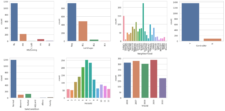
The second for loop simply gets each x-tick label and rotates it 90 degrees to make the text fit on the plots better (you can remove these two lines if you want to know how the text looks without rotation).
As with our numerical variable histograms, we can gather lots of information from this visual — most houses have RL (Residential Low Density) zoning classification, have Regular lot shape, and have CentralAir. We can also see that houses were sold more frequently during the summer months, the most houses were sold in the NAmes (North Ames) neighborhood, and there was a dip in sale in 2010.
However, if we inspect the YrSold variable further, we can see that this “dip” is actually due to the fact that only data up to July was collected.
housing[housing['YrSold'] == 2010].groupby('MoSold')['YrSold'].count()
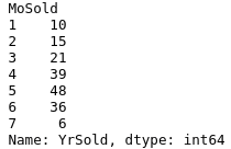
As you can see, thorough exploration of variables and their values is incredibly important — if we built a model to predict sale prices under the assumption that there was a decrease in sales in 2010, this model would likely be very inaccurate.
Now that we have explored our numerical and categorical variables, let’s take a look at the relationship between these variables — more importantly, how these variables impact our target variable, SalePrice!
Analyzing Relationships Between Numerical Variables
Plotting relationships between variables allows us to easily get a visual understanding of patterns and correlations.
The scatter plot is often used for visualizing relationships between two numerical variables. The seaborn method to create a scatter plot is very simple:
sns.scatterplot(x=housing['1stFlrSF'], y=housing['SalePrice']);

From the scatter plot, we see here that we have a positive relationship between the 1stFlrSF of the house and the SalePrice of the house. In other words, the larger the first floor of a house, the higher the likely sale price.
You can also see that the axis labels are added for us by default, and the markers are automatically outlined to make them clearer — this is opposed to matplotlib in which these are not the default.
seaborn also provides us with a nice function called jointplot which will give you a scatter plot showing the relationship between two variables along with histograms of each variable in the margins — also known as a marginal plot.
sns.jointplot(x=housing['1stFlrSF'], y=housing['SalePrice']);
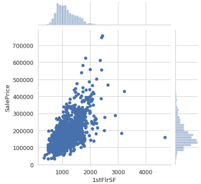
Not only can you see the relationships between the two variables, but also how they are distributed individually.
Analyzing Relationships Between Numerical and Categorical Variables
The box-and-whisker plot is commonly used for visualizing relationships between numerical variables and categorical variables, and complex conditional plots are used to visualize conditional relationships.
Let’s start by creating box-and-whisker plots with seaborn’s boxplot method:
fig, ax = plt.subplots(3, 3, figsize=(15, 10))
for var, subplot in zip(categorical, ax.flatten()):
    sns.boxplot(x=var, y='SalePrice', data=housing, ax=subplot)
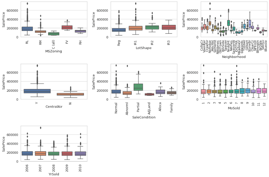
Here, we have iterated through every subplot to produce the visualization between all categorical variables and the SalePrice.
We can see that houses with FV (Floating Village Residential) zoning classification have a higher average SalePrice than other zoning classifications, as do houses with CentralAir, and houses with a Partial (home not completed when last assessed) SaleCondition. We can also see that there is little variance in average SalePrice between houses with different LotShapes, or between MoSold and YrSold.
Let’s take a closer look at the Neighborhood variable. We see that there is definitely a different distribution for different neighborhoods, but the visualization is a bit difficult to decipher. Let’s sort our box plots by cheapest neighborhood to most expensive (by median price) using the additional argument order.
sorted_nb = housing.groupby(['Neighborhood'])['SalePrice'].median().sort_values()
sns.boxplot(x=housing['Neighborhood'], y=housing['SalePrice'], order=list(sorted_nb.index))

In the above snippet, we sorted our neighborhoods by median price and stored this in sorted_nb. Then, we passed this list of neighborhood names into the order argument to create a sorted box plot.
This figure gives us a lot of information. We can see that in the cheapest neighborhoods houses sell for a median price of around $100,000, and in the most expensive neighborhoods houses sell for around $300,000. We can also see that for some neighborhoods, dispersion between the prices is very low, meaning that all the prices are close to each other. In the most expensive neighborhood NridgHt, however, we see a large box — there is large dispersion in the distribution of prices.
Finally, seaborn also allows us to create plots that show conditional relationships. For example, if we are conditioning on the Neighborhood, using the FacetGrid function we can visualize a scatter plot between the OverallQual and the SalePrice variables:
cond_plot = sns.FacetGrid(data=housing, col='Neighborhood', hue='CentralAir', col_wrap=4)
cond_plot.map(sns.scatterplot, 'OverallQual', 'SalePrice');

For each individual neighborhood we can see the relationship between OverallQual and SalePrice.
We also added another categorical variable CentralAir to the (optional) hue parameter — the orange points correspond to houses that do not have CentralAir. As you can see, these houses tend to sell at a lower price.
The FacetGrid method makes it incredibly easy to produce complex visualizations and to get valuable information. It is good practice to produce these visualizations to get quick insights about variable relationships.
I hope you’ve enjoyed this brief tutorial on exploratory data analysis and data visualization with seaborn! I covered how to create histograms, count plots, scatter plots, marginal plots, box-and-whisker plots, and conditional plots.
During our exploration, we discovered outliers and trends within individual variables, and relationships between variables. This knowledge can be used to build a model to predict the SalePrice of houses in Ames. For example, since we found a correlation between SalePrice and the variables CentralAir, 1stFlrSf, SaleCondition, and Neighborhood, we can start with a simple model using these variables.
If you are interesting in learning how to do this and more, we have a full Data Analysis with Python course available at Next Tech. Get started for free here!
This course explores vectorizing operations with NumPy, EDA using pandas, data visualization with matplotlib, additional EDA and visualization techniques using seaborn, statistical computing with SciPy, and machine learning with scikit-learn.


Latest comments (0)