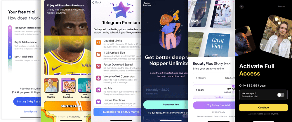
80% of purchases of in-app subscriptions happen on the first paywall. So it’s safe to say that experiments on paywalls directly impact app monetization. To help you get the most out of your app, we launched the monthly paywall newsletter with paywall ideas commented by industry experts. Here you can get familiar with the ideas from our 1st issue.
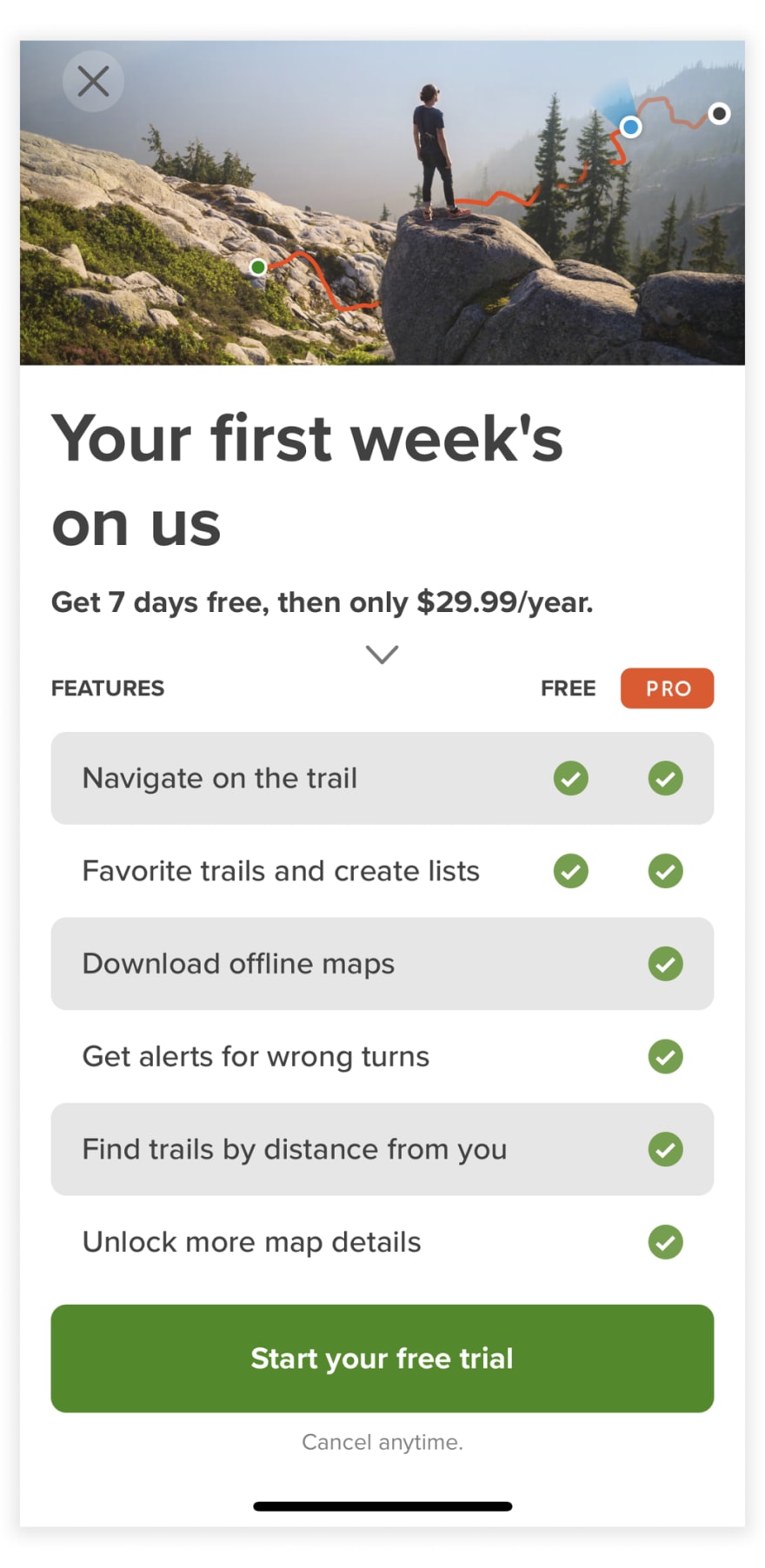
Comparison Table
They’re used on the web quite often, but we rarely see them in apps. Still, they are very descriptive when it comes to showing user benefits of the paid plan. Look at this example by AllTrails:
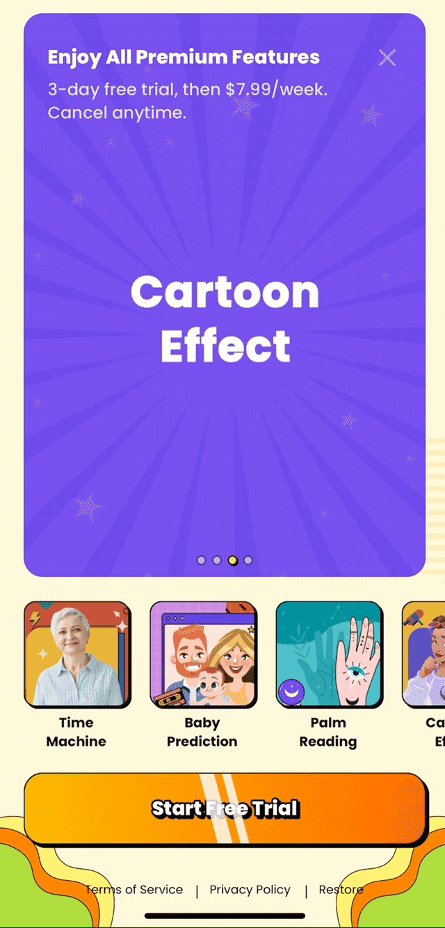
Video
Videos are catchy. That’s why apps love to add them on paywalls. Not every paywall video shows the benefits of its app, but the MagicMe one does it brilliantly. Have a look!
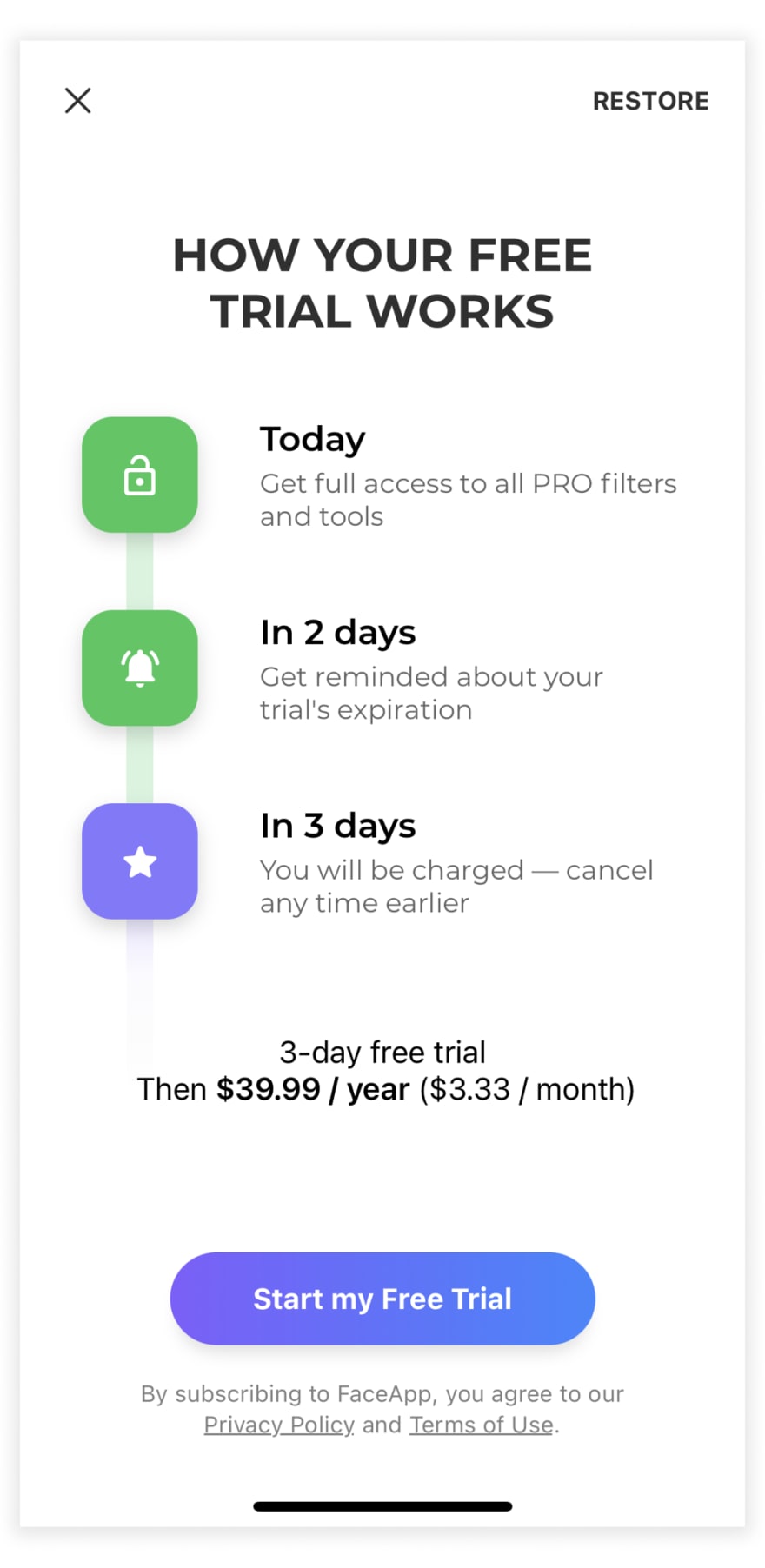
Trial End Reminder
It might sound dubious, but trial end reminders are worth trying. A promise to remind users that the trial period is coming to an end can lower the friction on the paywall and motivate them to subscribe. A face editor FaceApp, that makes more than $6m a month uses this on their paywall:
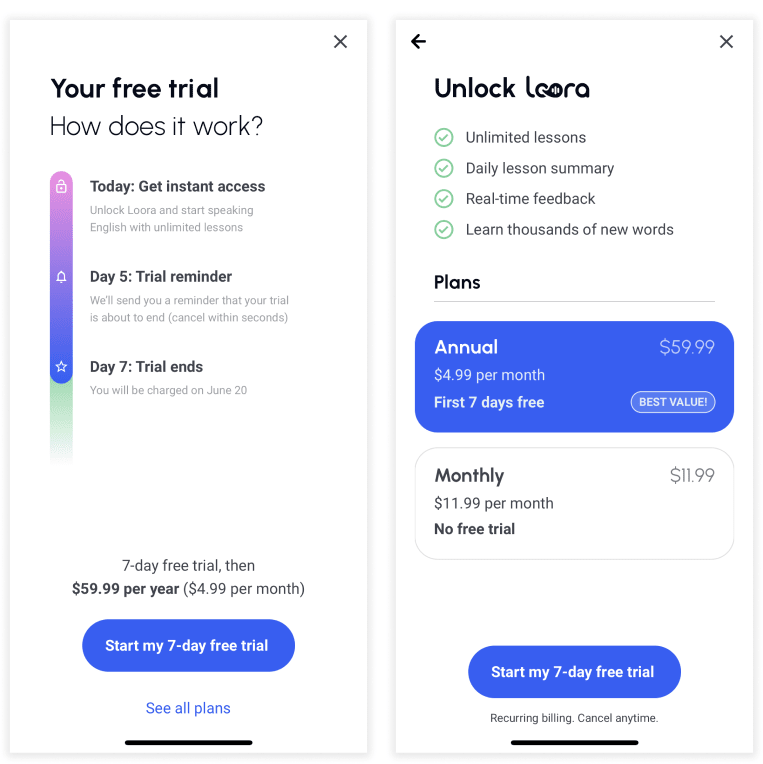
Double Paywall
What if one paywall opens the door to another? This is what you’ll find in Loora, an app for learning English. The first paywall that the user sees after the onboarding sells only the annual plan. But it also has a link to another paywall selling both annual and monthly subscriptions.
Such a trick can make users choose the plan most beneficial for the app, but still leaving them space to choose alternatives.
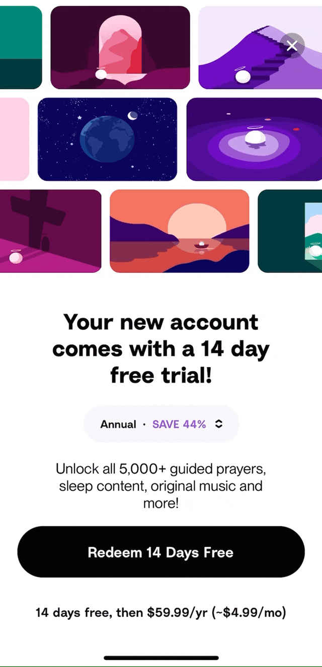
Plan Switcher
A plan switcher is another technique for motivating users to subscribe to a certain plan, that still provides an opportunity to choose another one.
This is what Hallow, a catholic meditation app, uses on its paywall. It has a tiny button with up and down arrows. After clicking it, the plan on the button changes. I bet very few people notice it, so it’s likely that most of them go with the annual plan by default.


Latest comments (0)