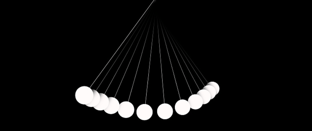
Two weeks ago I shared this animation using only rotations. This time I'm back at it, but only using translations.
Newton said time is absolute, Einstein said time is relative. I don't know who's right and who's wrong, but what I can say is that timing is everything (at least for this animation).
So what do you see?
ℹ️ If you can't see the Codepen above, click here to see the animation.
| Disclamer |
|---|
On i̶n̶t̶e̶r̶n̶e̶t̶ ̶e̶x̶p̶l̶o̶r̶e̶r̶ iOS safari the implementation below doesn't work correctly because for some reason we can't animate left from 0% to 100%. So I did a special implementation for safari. I talk more about it at the end of the article. |
Follow me on Twitter at twitter.com/theAngularGuy as I tweet (almost) every day about the things I learned in my 6+ years journey in web development ✅
Step 1
Ok so let's start right away. The first thing is to place all the 12 dots on a horizontal container like this (I outlined each line wrapper):
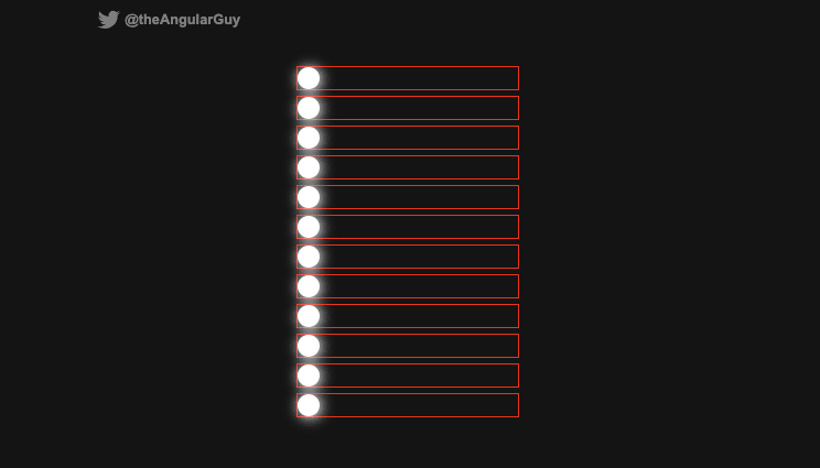
To achieve this, nothing extraordinary, we have a container div that contains the horizontal wrappers around the dots.
.wrapper {
  width: 200px;
  margin: auto;
  display: flex;
  flex-direction: column;
  align-items: center;

  .line {
    width: 100%;
    height: 20px;
    position: relative;

     .dot {
      width: 20px;
      height: 20px;
      border-radius: 50%;
      position: absolute;
      background: #fff;
    }
  }
}
Step 2

Next, we need to simulate this pendulum effect using only translations. For this we need each ball moving left and right and we also need each ball to be at a slightly lower vertical position when it hits its equilibrium position (when it's in the middle of the line wrapper).
The balls' position starts at the left, so we want them to move to the right then return to the left. So, at the start of the animation, we set left to 0, at fifty percent of the animation we set it at 100% (minus the width of the ball so it doesn't overflow), and finally, at one hundred percent of the animation we set left back to 0;
With this, each ball will hit its equilibrium position at 25% (of the animation) and at 75% (on the return). So at these timings, we need to move the ball to the bottom.
So the animation code looks like this:
@keyframes move {
  0% {
    top: 0; left: 0;
  } 25% {
    top: 7px;
  } 50% {
    top: 0; left: calc(100% - 20px);
  } 75% {
    top: 7px;
  } 100% {
    top: 0; left: 0;
  }
}
And this is the result we have so far:

Step 3
We are almost there. We only need two things:
- Decrease the width of each line wrapper from bottom to top (so each line width increase from top to bottom)
- Decrease the animation speed (or increase the animation duration) from top to bottom (because the more a ball is near the bottom the more distance it needs to travel)
You can do this in many different ways, I choose to do it using sass for through loop (there is also the for to loop but the final number is excluded).
@for $i from 1 through 12 {
  .line:nth-child(#{$i}) {
    width: calc(100% - 12% + #{$i}%);

    .dot {
      animation-duration: calc(1s + calc(#{$i} * 5ms));
    }
  }
}
And that's it actually. With only these few lines of CSS (or scss 😉) we completed this crazy animation. Here's the final code:
.wrapper {
  width: 200px;
  margin: auto;
  display: flex;
  flex-direction: column;
  align-items: center;

  .line {
    height: 20px;
    position: relative;
    margin-bottom: 7px;

    .dot {
      background: #fff;
      width: 20px;
      height: 20px;
      border-radius: 50%;
      position: absolute;
      animation: move 1s ease-in-out infinite;
    }
  }

  @for $i from 1 through 12 {
    .line:nth-child(#{$i}) {
      width: calc(100% - 12% + #{$i}%);

      .dot {
        animation-duration: calc(1s + calc(#{$i} * 5ms));
      }
    }
  }
}

@keyframes move {
  0% {
    top: 0; left: 0;
  } 25% {
    top: 7px;
  } 50% {
    top: 0; left: calc(100% - 20px);
  } 75% {
    top: 7px;
  } 100% {
    top: 0; left: 0;
  }
}
Safari implementation
So like I said before, on Safari (iOS) we can't animate left from 0% to 100% (at the moment I write these lines). So we have to be a little cleaver in the way we place the dots to translate them using the transform property.
This fix was suggested by u/mountainunicycler.
There are two problems if we want to use the transform CSS property:
- First, each line wrapper width is different so we can't use pixels (px unit). We have to use percent (%). But when we transform an HTML element the percent unit is relative to the element itself and not the parent container like with
left. So if a dot is20pxlarge and we translate it by100%it will move by20px. That's not what we want. - Second, we have two animations: from left to right and from top to bottom, and it's tricky because the two animations use the same property:
transform(So they will overload each other).
To fix these problems, we will set the dots widths to 100% (so when we translate them by a percentage, they will move (pretty much) relatively to their parents since they have the same width). And to draw the dots we will use the ::after pseudo-element and make it 20px large and 20px tall (original size of the dots).
Then to fix the second problem we will animate two elements instead of one (so the horizontal translation won't mess with the vertical translation since these translations will be applied to two different HTML elements). We will animate the .dot horizontally and we will animate the .dot::after pseudo-element vertically.
So, this is the code we end up with:
// Little hack to detect safari browsers
@media not all and (min-resolution: 0.001dpcm) {
  .wrapper {
    .line {
      position: relative;
      width: 100%;

      .dot {
        background: transparent; // resetting the background
        box-shadow: none; // resetting the box-shadow
        width: 100%;
        animation: moveHoriz 1s ease-in-out infinite;

        &::after {
          content:'';
          position: absolute;
          background: $color;
          box-shadow: 1px 1px 12px 2px $color;
          width: 20px;
          height: 20px;
          border-radius: 50%;
          animation: moveVert ease-in-out infinite;
        }
      }
    }

    @for $i from 1 through 12 {
      .line:nth-child(#{$i}) {
        width: calc(100% - 12% + #{$i}%);

        .dot, .dot::after {
          animation-duration: calc(1s + calc(#{$i} * 5ms));
        }
      }
    }
  }

  @keyframes moveVert {
    0% {
      transform: translateY(0);
    } 25% {
      transform: translateY(7px);
    } 50% {
      transform: translateY(0px);
    } 75% {
      transform: translateY(7px);
    } 100% {
      transform: translateY(0);
    }
  }

  @keyframes moveHoriz {
    0% {
      transform: translateX(0);
    } 50% {
      transform: translateX(calc(100% - 20px));
    } 100% {
      transform: translateX(0);
    }
  }
}
ℹ️ I purposefully left the two animations because I think the first one is easier to implement and easier to grasp. But the second one (for Safari) works on all evergreen browsers and at some extent is more performant (animating the transform property is more performant than the left and top properties).
That's it for this post. I hope you liked it. If you did, please share it with your friends & colleagues and follow me on Twitter at @theAngularGuy where I tweet about web development and computer science.
Cheers!


Top comments (2)
Cool, Loving your post keep it coming
Pretty cool!