
Words can improve your conversion. Here's how.
CALL TO ACTION (CTA). People easily leave your website because you lost their attention. It's your job as a UI designer, web designer, developer, founder, CEO, -insert fancy title here- to grab that attention and hold it. And a change in words can accomplish that.
1. Beta's don't own only 1 CTA text
When the user scrolls further than the fold the text is all about that they haven't launched yet. So is this manipulative? Perhaps a little bit, but they do mention on their website that they're still in beta. So the blame is not on the website when you subscribe. You just read too fast.
2. Put the focus on your user
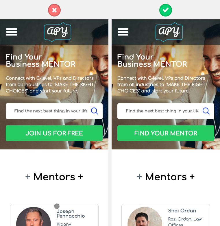
When I read "Join us for free" I don't read the value that's in it for me. However, when you change this to "Find your mentor" I know what I can get when I press the CTA.
3. Me vs You

According to ContentVerve, conversion boosted with 90% (!) when they changed a text from "Start your 30 day trial" to "Start my 30 day trial". This is because a person feels more connected to the word "my" instead of "you/your".
4. But it depends on the context
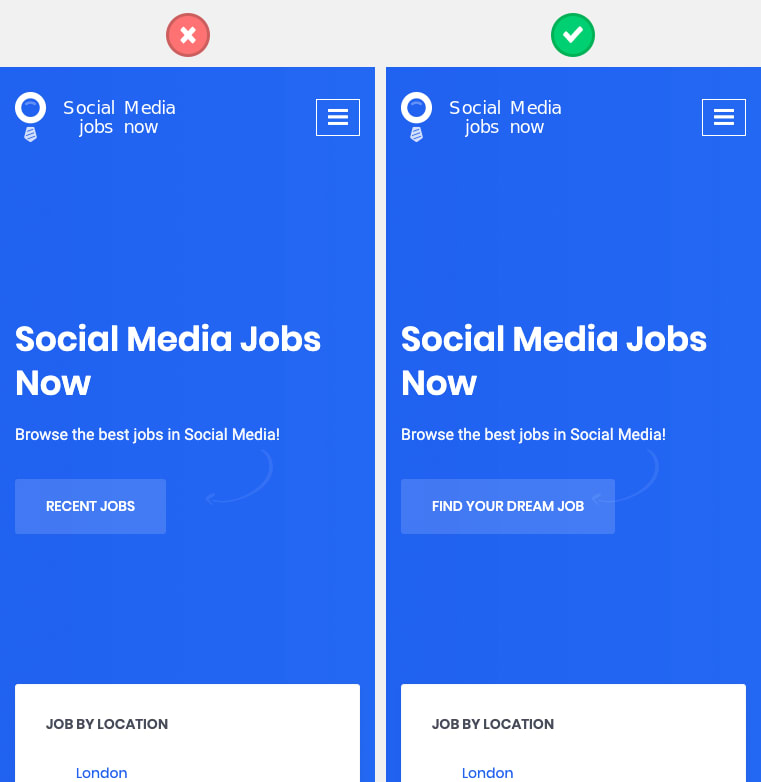
It can also sound if the website is going to do something for you. In the case of a job board, this might not be the case. If the CTA would contain "find my dream job" it implies that the website is going to find a job that suits you. But in this case, you have to pick it yourself.
5. Tell your user what happens when they click on it
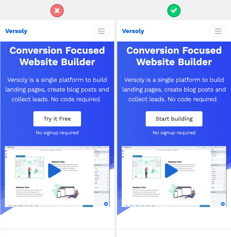
This way they know what's going to happen when they click on it and what they can expect. Especially the help text "No signup required" lets them know you can directly start building a website when you click on it.
6. Make your CTA a Call To Value
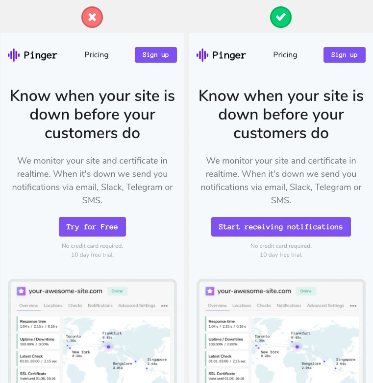
A call to value is when you have a button which directly states the value you get when you click on it. With a call to value you also show them what they will miss when they don't sign up for your product or service.
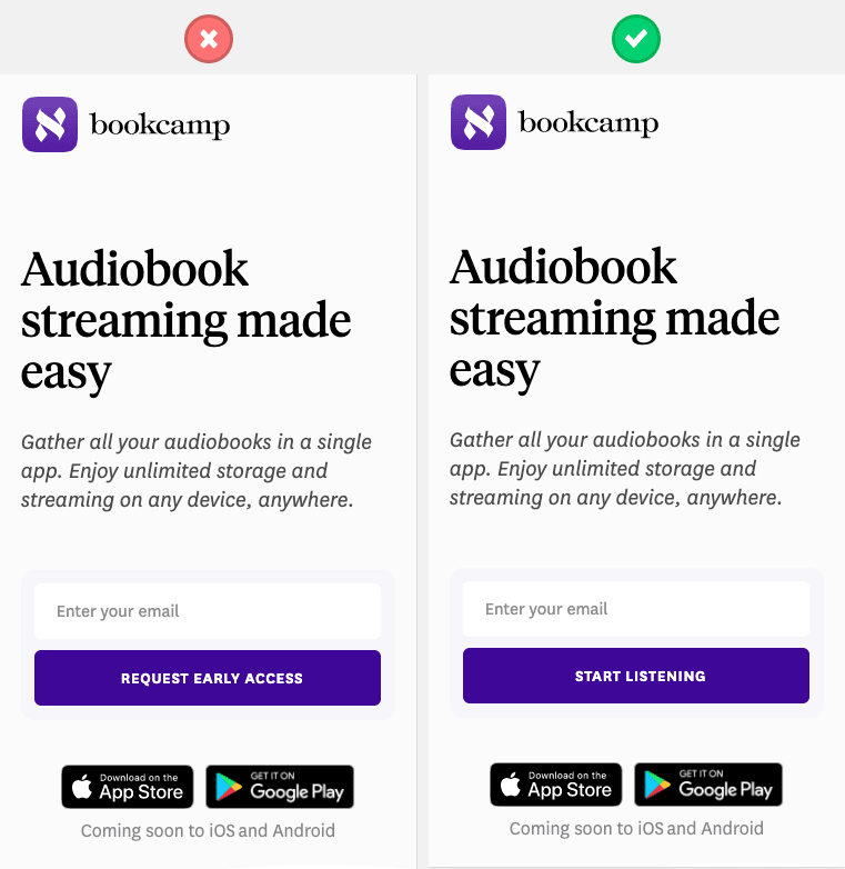
7. Express what you offer in the CTA
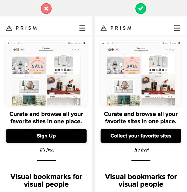
I think this image is a good example of how you can play with a CTA. It tells you what you can do with the website and it does not include the word Free directly. However, in an eye blink, we still know it's free due to the help text.
It took me several hours to put this together! If you liked this, please send some love to this tweet:
 Sjors van Dongen@sjorsvdongen
 7 practical examples of how to improve CTA's.
Words can improve your conversion. Here's how.
THREAD20:45 PM - 04 Jun 2020
0
0


Top comments (0)