
A good UI design must accommodate the various device formats and resolutions that users have. Element placement cannot be absolute, but rather be constrained and expanded by the available space. Layouts that adapt themselves dynamically are called responsive layouts and a critical part of modern interface design.
This article is part of a series on Writing a UI Engine.
Dependent Sizes
Dependently sized elements are perhaps the first line responsive features. Consider this basic title bar:
Panel {Padding=5,2,5,4}
    Icon {Alignment=Left Type=Menu}
    Icon {Alignment=Right Type=Share}
    Text {Alignment=Center Value="News Browser"}
    Rectangle {Alignment=Bottom Color=Black Height="2"}

The icons may have a fixed size, but their position, to the left and right, doesn't assume anything about the total width of the title bar. The separator line, drawn with the rectangle, doesn't know how tall the element is, or it's actual width; we've added 2points of padding to give it room at the bottom. The text is centred regardless of the element size, yet the size of the text will contribute to the overall size of the element.
We've created a responsive title bar. Regardless of device size and orientation, this will take up the full width, with the icons positioned at the sides, and a dividing line. The size of the icons and font could also come from a user setting, or OS value: we don't need to fixate the size.
Constraints and dependent sizing provide features necessary for responsive layout, but more is still required. An expanding title bar isn't always the best use of space, especially on a small device in landscape mode.
Columns and flowing
Instead of expanding individual elements, we could instead fit more of them into the display. On a phone, in portrait layout, we may have several items listed vertically. A user on a tablet has a lot more space so we can use multiple columns to display more items.
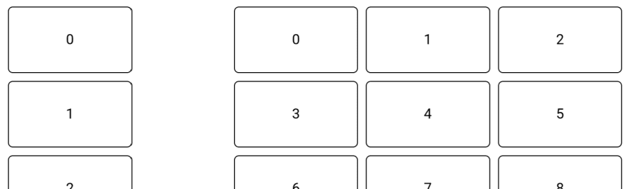
One approach is to divide a screen logically into some columns, say 12. When placing elements, you specify how many columns it logically covers. Items flow into the columns: they fill the columns from left-to-right, and if they hit the end of the row wrap to the next one. A smaller device will adapt to have fewer columns: the wrapping will occur sooner.
This flowing approach, sometimes called a column or grid, still needs to be combined with dependent sizing: not just the number, but the resulting column sizes will also change to fill in the available space.
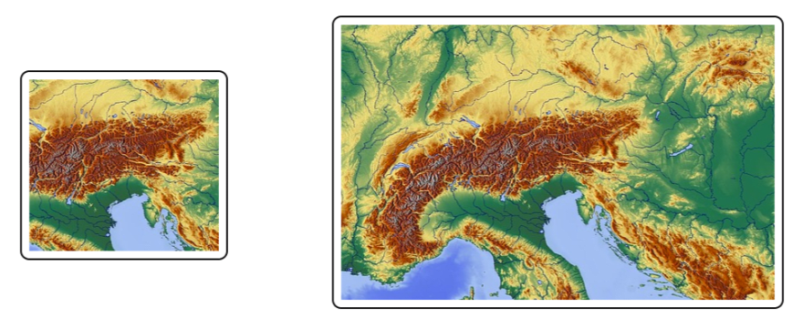
Expanding coverage
Similar to viewing more items, we could expand visualization to cover a larger range or area. For example, a bar chart could show a greater timespan in landscape versus portrait mode. A map's visible area will cover whatever available space it has. A comment box can show more of the text.
These types of controls demonstrate a difference between internal and external layout. The layout engine concerns itself with how to place the control itself, not the contents it displays. Other than expanding to fit an area, the layout engine does little extra to support this type of control. Each control on its own has to deal with how it presents the data and manages its internal layout.
Collapsing and hiding
Another option and significant challenge for performance is the ability to hide and reveal elements. A compact user profile may show just an image and name, while a larger one may introduce location and tags. Instead of showing more time, a graph may instead get larger and show more numbers and overlay key figures.
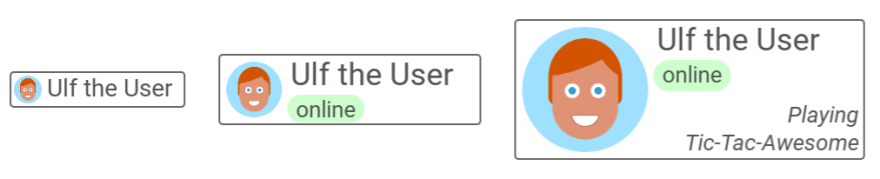
Small pieces of information don't change the overall layout of an application; they fit within it. The layout engine needs a way to encode and respond to changing constraints. A small piece may be revealed when a certain size is reached, or based on the orientation.
Panels may be hidden behind user actions in addition to static constraints. An action button may expand to a large control while pressed. An infobox may remain collapsed until the user taps on it. For an organic display, the user will expect these changes to be animated in some way, putting enormous pressure on the layout engine to handle this efficiently. We'll get deeper into performance in a later article.
Rearrangement
A one-layout-fits-all design is not necessarily the best for a given program. It's great that an app targetting a phone can work anywhere, but perhaps the tablet deserves a significantly different layout. A tool meant for a large display may have to be trimmed considerably and modified to provide any use on a small display.
Supporting these significant layout differences is both a feature of the layout engine and the supporting framework. On the simple end of the spectrum, we can program multiple layouts and switch them out at various resolutions -- though it may be a jarring experience for a user if he has a slightly larger phone with an entirely different layout than a smaller device. On the complex end, the large and small UIs as unified into a single highly-responsive constraint system.
Not all software must be optimized for all devices. It's essential for the developers to understand their target market and design accordingly. Using multiple layouts may not feel as sleek as using a unified one, but it can be a lot cheaper and easier to accomplish. Cost will be an important factor.
Altogether
A modern UI will combine all of these techniques to create a responsive design. It necessarily combines graphic and UI design with layout coding; a lot of pressure is placed on tooling to use this system effectively.
Providing these features, being easy-to-use, and remaining efficient is a hurdle for a UI engine. We'll want to ensure ease-of-use as a priority -- unusable and needlessly complicated features tend not to be used. We must, as best as possible, improve performance based on ad-hoc and seemingly chaotic combinations of accessible features.
There's also no definitive approach to responsive design: what works well in one view may not work in another. A UI engine should be open and flexible.


Top comments (0)