If you missed Part 1 - Analysis, it could be found here.
Table of Contents
- Implementing static design components
- Implementing motion design
- Summary
- Your contribution
Implementing static design components
First of all, let’s create the corresponding file structure:
lib
|   constants.dart
|   main.dart
|
+---screens
|   +---login
|   |   |   login.dart
|   |   |
|   |   \---widgets
|   |
|   \---onboarding
|       |   onboarding.dart
|       |
|       \---widgets
|
\---widgets
All widgets which are reused across onboarding and login screens are placed under the lib/widgets folder. Every screen has its own folder with the main screen widget having the same name (login.dart or onboarding.dart). Also, every screen contains a separate widgets folder for components which are used only in that screen.
All the common properties are stored in the constants.dart file:

Ok, that is the first step of keeping the code clean and consistent. Now we can start implementing components one by one.
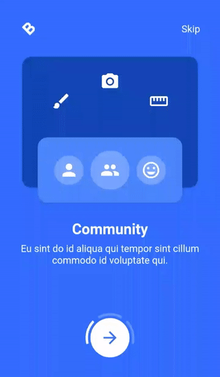
* Onboarding screen
Logo (1)
This component is used in both — onboarding and login — screens, so we put it under the lib/widgets folder. Also, instead of the logo, a format_bold icon rotated 45° counterclockwise is used. The component accepts two parameters: color and size.

Header (2)
Wraps the logo and skip button (a text-only button implemented using GestureDetector) with a Row widget, adds the spacing between them using MainAxisAlignment.spaceBetween alignment. Accepts onSkip parameter used as a skip button’s action.

Icon container (3)
Accepts icon, padding properties and uses them to create a white (with the opacity of 25%) circle around the icon.

Text column (4)
Accepts title and text properties, wraps them by the Column widget and applies the corresponding text style.

Stacked cards (5)
Accepts the current onboarding page number (1–3) property pageNumber and cards' content widgets — lightCardChild and darkCardChild. Cards' dimensions are calculated based on the screen width/height. To place the light blue card on top of the dark blue one, a Stack widget is used.
Also, the light blue card should be placed at the top or bottom of the darker card based on the current onboarding page — for this, an isOddPageNumber getter is used together with the Positioned widget to place the lighter card at the bottom for odd pages (1 and 3) and at the top for the 2nd onboarding page. Correspondingly, the darker card’s padding is adjusted using the same getter just not to cover the content with the light blue card.

Onboarding page (6)
Accepts the same properties as CardsStack with the addition of a textColumn widget. Based on the current onboarding page number, adds the right spacing between CardsStack and TextColumn.

Each onboarding page has a separate folder where the corresponding content is stored — the content of dark, light cards and text column:
lib
|   ...
|
+---screens
|   |   ...
|   |
|   \---onboarding
|       |   onboarding.dart
|       |
|       +---pages
|       |   |   page.dart
|       |   |
|       |   +---community
|       |   |       community_dark_card_content.dart
|       |   |       community_light_card_content.dart
|       |   |       community_text_column.dart
|       |   |       index.dart
|       |   |
|       |   +---education
|       |   |       education_dark_card_content.dart
|       |   |       education_light_card_content.dart
|       |   |       education_text_column.dart
|       |   |       index.dart
|       |   |
|       |   \---work
|       |           index.dart
|       |           work_dark_card_content.dart
|       |           work_light_card_content.dart
|       |           work_text_column.dart
|       |
|       |   ...
|
|   ...
Community page widgets (onboarding page 1):
- Community page dark card content:

- Community page light card content:

- Community page text column:

Education page widgets (onboarding page 2):
- Education page dark card content:

- Education page light card content:

- Education page text column:

Work page widgets (onboarding page 3):
- Work page dark card content:

- Work page light card content:

- Work page text column:

“Next page” button (7)
Accepts the onPressed parameter used as a button’s action. The button itself is just a simple circular white button with an arrow_forward icon inside.

Current page indicator (8)
The page indicator component is the most complex one in the onboarding screen since there is no such pre-built widget, so we need to draw some custom shapes to implement it.
First of all, we implement a custom painter — OnboardignPageIndicatorPainter. This painter only draws a single indicator step (single curved line).

We pass three parameters to it: colour, startAngle and indicatorLength. Let’s dive deeper into the paint() method:
1) We define our line properties (colour, style, stroke width) and store them in the variable paint;
2) We use the drawArc() method since we need to paint an arc around the button;
3) We set the centre of the circle which is the exact centre of our button and assign the radius value 12.0 points bigger than the radius of our button. As a result, we will draw an arc which is a little bit further from the button;
4) We start drawing the arc from the startAngle radians around our circle up to startAngle + indicatorLength radians around the circle (what does that even mean, we will get to this soon, stay tuned);
5) We pass false for the useCenter property since we need to draw only the circle segment, but not the circle sector connected to the centre — in simple words, we need to draw only the pizza crust, but not the whole slice.

In the OnboardingPageIndicator we set the indicator length as pi/3 and we set the gap between indicators as pi/12. Now, three indicator arcs are needed, so we just stack them inside each other with different parameters 3 times — we have our indicator.
A lot of calculations for the start angle of the indicator arcs are made in this step, so let’s dive a little bit deeper. When drawing arcs on canvas, Flutter uses the radian SI unit which looks like this:

When we set the indicator line’s length to pi/3, that’s an arc around 60° of the circle (1/6 length of the whole pizza crust). Now, for the first arc we set the start angle to this value: 4 * pi/3 — (pi/3 + pi/12) = 11 * pi/12. This value is equal to 165° so we start drawing the arc from this point to 165°+60°=225°. Identical calculations are made for the other two arcs and we have our final result — onboarding page indicator.
Finally, we connect all the separate components in the parent onboarding screen widget:

Based on the current page, we create the corresponding page component using the _getPage() method, change the current onboarding page using the _nextPage() method. The widget’s build part is very straightforward: we use Scaffold, SafeArea widgets, then add some padding and place all the components using Column.
* Login screen
Logo (1)
Good news, the logo component is already implemented! Let’s take a little break…

Header (2)
Just a simple Column widget with some padding around it which places logo, title and subtitle, aligns them to the left of the screen.

Lines (3)
As mentioned in the analysis part, we need to clip the top three layers of the login screen to draw these two colourful curves provided in the design. To achieve it, we need to implement the CustomClipper (actually, three of them). For instance, clipper of the top white layer is implemented like this:

If you are wondering about the class name, it is called BlueTopClipper as it is the top line for the blue curve. Anyway, some magic is happening in the getClip() method which should be explained:

1) We start by drawing a straight line from the point of (0, 0) to (0, 220);
2) A Bézier curve is drawn from the point of (0, 220) to (size.width, 170), using the control point (size.width / 2.2, 260);
3) We draw another straight line from (size.width, 170) to (size.width, 0);
4) Lastly, the path is closed by connecting the last point (size.width, 0) with the first one (0, 0).
The implementation of the other clippers are identical, only some coordinates differ.
- GreyTopClipper:

- WhiteTopClipper:

Input field (4)
Accepts label, prefixIcon and obscureText properties, builds a TextField widget with some custom decoration, such as padding, border colour, hint text style, prefix icon, etc.

Button (5)
Accepts color, textColor, text, image and onPressed properties. If image is not null, it creates a custom OutlineButton with the image (used for the “Continue with Google” button), otherwise, a custom FlatButton is created.

Login form (6)
It is just a container widget for the login form elements to be placed in a single column. Also, based on the device screen dimensions, it calculates the spacing between form elements.

To finish the implementation, we put all components to the Login widget:

The implementation mostly relies on the Stack widget, the content is placed on the screen using Column.
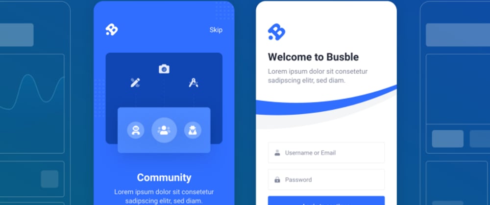
After implementing all the components and screens, a static version of the design looks like this:
If you want to see the code of the static design implementation, it is provided here.
Implementing motion design
Based on the analysis, we will implement all the transitions one by one, but we need to make some global adjustments first. To begin with, we add some new constants defining animation durations:

Since some of the animations will use the screen height for their calculations, we get it in the main.dart and pass it down to the Onboarding widget:

The screen height is injected into the Onboarding and Login widgets (screens) via constructor (you will see the corresponding code changes later in the article).
* Onboarding page transition
As already mentioned, this transition consists of three separate animations, hence we can implement them separately and then join together to make a single, smooth transition.
1) Cards’ slide transition
First of all, we adjust the Onboarding widget:

An animation controller _cardsAnimationController is created and initialised in initState() method, disposed in dispose() method. Also, the _setCardsSlideOutAnimation() method is called during the initialisation since the first animation for the cards is that they slide out of the screen.
Talking about the slide in/out animations, they pretty much mirror each other:
- When cards slide in, we set the end offset to
Offset.zeroand the begin offset toOffset(1.5, 0.0)for the bigger card andOffset(3.0, 0.0)for the smaller one; - When cards slide out, we set the begin offset to
Offset.zeroand the end offset toOffset(-1.5, 0.0)for the bigger card andOffset(-3.0, 0.0)for the smaller one; - When the begin offset is positive (e.g.
Offset(1.5, 0.0)) and the end offset isOffset.zero, it means that the card’s position changes over time from the right of the screen to its final position (slide-in animation); - When the begin offset is
Offset.zeroand the end offset is negative (e.g.Offset(-1.5, 0.0)), it means that the card’s position changes over time from the current position to the left of the screen (slide-out animation).
One more thing to note — why the Offset value of the bigger card (1.5) is smaller than the value of the smaller one (3.0)? In the analysis part, I have mentioned that there is an effect when a smaller card moves faster than the bigger one. Also, the transition for both of these cards starts and ends at the same time. Having basic physics in mind (S = v * t, right?), we can increase the velocity of the smaller card by increasing its travel distance but end the transition at the same time nonetheless. Hence, we set the offset two times bigger for the smaller one. As a result, it looks like the smaller card slides faster than the bigger one.
Then, some logic is added to the _nextPage() method. For instance, when we go from the onboarding page 1 to 2, we start the cards’ slide-out animation. When it is finished (for that, we wait for the animation to end using await), we change the current onboarding page, set the cards’ transition to the slide-in animation using _setCardsSlideInAnimation() method and the start the cards’ animation again. After that, we set the cards’ animation back to slide-out. Similar logic is used when going from page 2 to 3, but we do not need to reset the animations afterwards.
In other widgets, there are only some minor changes. The whole work is done in the Onboarding widget, we just pass down the animation properties to the OnboardingPage widget:

From there, we pass these animation properties further down to the CardsStack widget:

Both cards are wrapped by the SlideTransition widget which use the corresponding animation to handle the slide in/out animation (to be more specific, to handle the cards’ position, offset at any given time).
The cards’ slide transition looks like this:
2) Text column crossfade animation
Crossfade transition is already implemented in Flutter as AnimatedSwitcher widget, we just need to use it:

In the OnboardingPage widget, we wrap the textColumn widget with AnimatedSwitcher, pass the duration for the transition and… that’s it! The crossfade transition works out of the box:

3) Current onboarding page indicator’s rotate animation
Firstly, we create a separate animation controller, ensure that it is initialised and disposed:

We set the indicator’s animation using the _setPageIndicatorAnimation() method. The animation idea is simple: when we were drawing the indicator, we set the startAngle property for each of the indicator’s lines. To rotate the whole indicator 360°, we simply need to shift that startAngle property by around 360° over the transition duration. Hence, we set the begin animation value to 0.0 and the end value to 2*pi or -2*pi (using 2 or -2 multiplicator depends on whether we want to rotate the indicator clockwise or counterclockwise). Also, we start the animation at the same time as the cards’ slide-out animation and set the animation again after finishing the transition from page 1 to 2.
To make the indicator’s animation work, we wrap the OnboardingPageIndicator widget with AnimatedBuilder and pass the animation value via the angle property.
In the OnboardingPageIndicator widget, we simply add the angle value to each of the startAngle values in _OnboardignPageIndicatorPainter widget.
The current onboarding page indicator’s rotate animation looks like this:

* Ripple effect
To implement the ripple effect, we create a Ripple widget:

It is just a simple circular-shaped container, which will be positioned in the centre of the “Next page” button. The idea here is to set the circle radius to 0 in the beginning, pass it as the radius property and later expand the value to make the circle fill the screen over time. To make it work, we create another animation controller _rippleAnimationController, initialise it by setting the begin value to 0.0 and end value to the height of the screen:

Then we wrap the whole SafeArea widget with Stack and put the Ripple widget, wrapped in AnimatedBuilder, on top of the stack (as the last children). Now, when we are at the onboarding page 3 and press the “Next page” button (or just press the skip button at any time), we start the ripple animation, wait for it to end and then navigate to the Login screen.

* Login screen transition
1) Graphical element/curves transition
Since the login screen transition is a single staggered animation, we set everything up in the Login widget:

A single animation controller _animationController is created with 5 separate animations: three animations for each of the clipper animation, one for the header and one for the form elements. All of these animations are initialised in initState() method, each of the animation start/end values is set based on the graph provided in the analysis part.
The implementation of the clipper animation is quite simple: we pass the animation value for each of the clippers as the yOffset property and wrap every clipper with AnimatedBuilder widget. In the specific implementation of the clipper, we adjust some of the path properties by adding the yOffset value.
- BlueTopClipper:

- GreyTopClipper:

- WhiteTopClipper:

2) Header text and form elements fade-slide transition
For the header and form elements, we need to implement a custom fade-slide transition:

It accepts the animation, additionalOffset and child properties. The transition itself consists of Opacity and Transform widgets which change the child widget offset and opacity both at the same time. The additionalOffset property is used to make the effect described in the analysis part when some of the elements appear from further away than the previous ones in the column.
We use the FadeSlideTransition in Header widget by wrapping both of the text components:

In the same way, we wrap each of the login form element with the FadeSlideTransition widget:

The final result looks like this:

Summary
We can look at the original design concept once again and compare it to the end result provided above:

- Some of the design details are not fulfilled: a rotated icon is used instead of a logo, some details are missing in the onboarding screen (I am talking about those white dotted squares slightly visible in the background). However, based on the rule “The implementation (final result) could be less than 100% accurate” and that these details do not have a major impact on the design, I could say that the static design components are implemented;
- All the animations and transitions of the provided design are implemented, some properties or animation durations may differ, but they could be adjusted at any time to reach perfection.
- In the beginning, it looked like the implementation would not be difficult, only the onboarding page indicator and curved lines’ parts seemed challenging. Talking about the static design implementation part — this statement is true. However, I have underestimated how many different parts are moving at the same time, how many different parameters are changing. The orchestration of both — onboarding and login — transitions took most of the analysis and implementation time.
As always, the final code is open-source and could be found here.
Your contribution
💖 or 🦄 this article to show your support and motivate me to write better!
💬 Leave a response to this article by providing your insights, comments or wishes for the next topic.
📢 Share this article with your friends, colleagues in social media.
➕ Follow me on dev.to or any other social media platform.
⭐ Star the Github repository.


Top comments (0)