With some simple CSS you can easily enhance the look of a user profile image.
Here are 5 bright and bold examples you can use as inspiration.
View demo on CodePen.
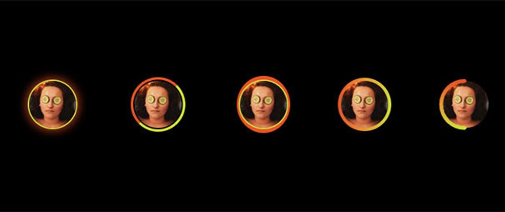
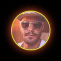
(1) CSS filter with a drop-shadow can be used to give a glow-like appearance.
<img class="css-shadow" src="https://i.pravatar.cc/75" />
.css-shadow {
  width: 75px;
  height: 75px;
  border-radius: 50%;
  border: 2px solid #cddc39;
  filter: drop-shadow(0 0 8px #ff5722);
}
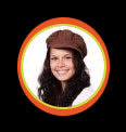
(2) By setting the top & left border colors different than the other borders we get this nice effect.
<img class="css-border" src="https://i.pravatar.cc/75" />
.css-border {
  border: 4px solid #cddc39;
  padding: 2px;
  border-radius: 50%;
  border-top-color: #ff5722;
  border-left-color: #ff5722;
  width: 75px;
  height: 75px;
}
(3) Using the ::after pseudo-element we can insert an off shaped circle behind the profile image.
 <div class="css-after">
   <img src="https://i.pravatar.cc/75" />
 </div>
.css-after {
  position: relative;
}
.css-after img {
  width: 75px;
  height: 75px;
  border-radius: 50%;
  border: 2px solid #cddc39;
}
.css-after::after {
  content: "";
  width: 85px;
  height: 91px;
  border-radius: 50%;
  background-color: #ff5722;
  display: block;
  position: absolute;
  top: -6px;
  left: -3px;
  z-index: -1;
}
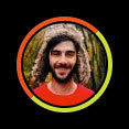
(4) Another example using the ::after pseudo-element, this time a gradient is applied to the background.

<div class="css-after-gradiant">
  <img src="https://i.pravatar.cc/75" />
</div>
.css-after-gradiant {
  position: relative;
}
.css-after-gradiant img {
  width: 75px;
  height: 75px;
  border-radius: 50%;
}
.css-after-gradiant::after {
  content: "";
  width: 85px;
  height: 85px;
  border-radius: 50%;
  background: linear-gradient(
    90deg,
    rgba(255, 87, 34, 1) 0%,
    rgba(205, 220, 57, 1) 100%,
    rgba(0, 212, 255, 1) 100%
  );
  display: block;
  position: absolute;
  top: -5px;
  left: -5px;
  z-index: -1;
}
(5) Overlaying the profile image with a half circle SVG gradient gives us this popular effect.

<div class="svg-half">
  <img src="https://i.pravatar.cc/75" />
  <svg>
    <linearGradient id="gradiant">
      <stop offset="0%" style="stop-color: #ff5722;" />
      <stop offset="100%" style="stop-color: #cddc39;" />
    </linearGradient>
    <path d="M0,38 a1,1 0 0,0 75,0" />
  </svg>
</div>
.svg-half {
  position: relative;
}
.svg-half img {
  border-radius: 50%;
  width: 75px;
  height: 75px;
}
.svg-half svg {
  position: absolute;
  top: 0;
  left: 0;
  width: 75px;
  height: 75px;
  fill: none;
  stroke-linecap: round;
  stroke-linejoin: round;
  overflow: visible;
  stroke: #ff5722;
  stroke-width: 6;
  transform: rotate(90deg);
  stroke: url(#gradiant);
}
All placeholder user photos used in this article are from Pravatar.


Top comments (0)