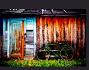
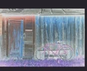
𝐂𝐒𝐒 𝐜𝐚𝐧 𝐛𝐞 𝐮𝐬𝐞𝐝 𝐭𝐨 𝐚𝐩𝐩𝐥𝐲 𝐚 𝐟𝐢𝐥𝐭𝐞𝐫 𝐭𝐨 𝐲𝐨𝐮𝐫 𝐢𝐦𝐚𝐠𝐞😎.
The 𝒇𝒊𝒍𝒕𝒆𝒓 𝒑𝒓𝒐𝒑𝒆𝒓𝒕𝒚 gives items visual effects. It has predefined functions like blur, brightness, contrast, hue, and sepia, as well as the ability to create custom SVG filters.
As a result, you may easily tweak the attributes' values to make your image more appealing. Here is the demonstration for the same.
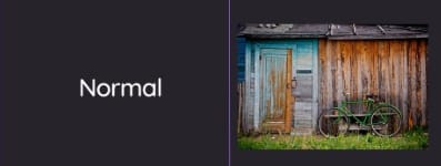
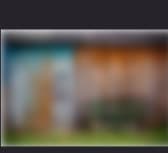
Blur
Applies a Gaussian blur to the input image. The value of ‘radius’ defines the value of the standard deviation to the Gaussian function, or how many pixels on the screen blend into each other, so a larger value will create more blur. If no parameter is provided, then a value 0 is used. The parameter is specified as a CSS length, but does not accept percentage values.
.img{
filter:blur(8px);
}
Brightness
Applies a linear multiplier to input image, making it appear more or less bright. A value of 0% will create an image that is completely black. A value of 100% leaves the input unchanged. Other values are linear multipliers on the effect. Values of an amount over 100% are allowed, providing brighter results. If the “amount” parameter is missing, a value of 100% is used.
.img{
filter:brightness(1.5);
}

Contrast
Adjusts the contrast of the input. A value of 0% will create an image that is completely black. A value of 100% leaves the input unchanged. Values over the amount over 100% are allowed, providing results with less contrast. If the “amount” parameter is missing, a value of 100% is used.
 img{
filter:contrast(250%);
}
Hue Rotate
Applies a hue rotation on the input image. The value of “angle” defines the number of degrees around the color circle the input samples will be adjusted. A value of 0deg leaves the input unchanged. If the “angle” parameter is missing, a value of 0deg is used. The maximum value is 360deg.
.img{
filter:hue-rotate(60deg);
}
Invert
Inverts the samples in the input image. The value of “amount” defines the proportion of the conversion. A value of 100% is completely inverted. A value of 0% leaves the input unchanged. Values between 0% and 100% are linear multipliers on the effect. If the “amount” parameter is missing, a value of 100% is used. Negative values are not allowed.
.img{
filter:invert(85%);
}
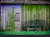
Saturate
Saturates the input image. The value of “amount” defines the proportion of the conversion. A value of 0% is completely un-saturated. A value of 100% leaves the input unchanged. Other values are linear multipliers on the effect. Values over 100% are allowed, providing super-saturated results. If the “amount” parameter is missing, a value of 100% is used. Negative values are not allowed.
.img{
filter:saturate(50%);
}

Sepia
Converts the input image to sepia. The value of “amount” defines the proportion of the conversion. A value of 100% is completely sepia. A value of 0 leaves the input unchanged. Values between 0% and 100% are linear multipliers on the effect. If the “amount” parameter is missing, a value of 100% is used. Negative values are not allowed.
.img{
filter:sepia(80%);
}

Multiple Filters
.img{

filter:hue-rotate(70deg);
filter:saturate(145%);
filter:brightness(145%);
}

The CSS filter property provides access to effects like blur or color shifting on an element’s rendering before the element is displayed. Filters are commonly used to adjust the rendering of an image, a background, or a border.


Top comments (2)
So cool! Thanks for sharing!
Glad to hear that article helped you