CSS Positioning is one of those CSS features that has been around for quite some time but it is still in heavy use today. it's an excellent skill and a necessity to learn if you are going to be working on the web. Throughout this article, we'll explore the Position property in CSS, its many values, and how they all function.
What is the CSS position property?
The CSS position property determines how elements are positioned within an HTML document.
The terms top, right, bottom, and left are used in conjunction with the CSS position property. It is important to keep in mind that if you use CSS positioning, your items will always be positioned using the four keywords top, right, bottom, and left position. You will always be working with these four keywords, whether you use em, rem, px, or any other CSS unit of measurement. It's also important to keep in mind that while using CSS positioning, you are always offsetting from the keyword you employ. Let's examine this simple example to better understand what offset in CSS positioning entails.
.box-1{
  position:relative;
  top:100px;
}
So as you have seen here we used the keyword top and what that means is that it is our box is going to be offset or pushed away from the top edge based on the value assigned to the top property. In this illustration, our box moved 100px down away from the top edge.
CSS Positioning Values
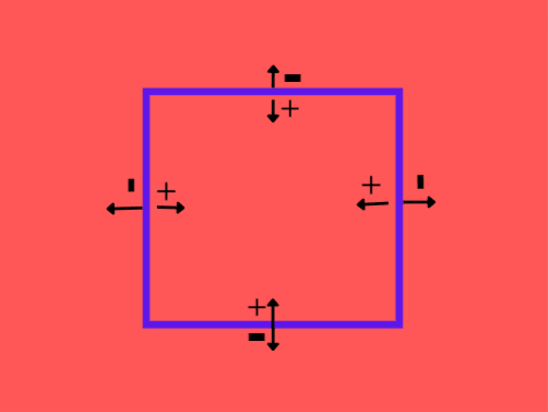
From the image above, we can see that we have the positive(+) values pointing inside and the negative values (-) pointing outside the box. The meaning of this is that positioned elements with positive values will offset inward and negative values will offset or push outward.
Normal Flow in CSS
In HTML and CSS, we have an order in which elements are stacked, just like in the real world where we have systems and procedures following an order or process. This sequence is referred to as the normal flow in CSS. Before any changes to this layout are made, block and inline elements are shown on a page in accordance with the normal flow or flow layout. According to the CSS 2.1 Specification
Boxes in the normal flow belong to a formatting context, which may be block or inline, but not both simultaneously. Block boxes participate in a block formatting context. Inline boxes participate in a line formatting context.
Put simply, the order in which elements appear or are stacked from top to bottom without any changes to the elements' positions is known as the "normal flow" of a document.
There are five fundamental types of the CSS position properties you should know:
1.Static
2.Relative
3.Absolute
4.Fixed
5.Sticky.
To better grasp how they operate and when to use them, let's go over each of them with examples.
Position: Static
This is the default position for all HTML elements within an HTML document. This means that an element's position will be set to static even if you don't declare it in CSS. Keep in mind that a static position is equivalent to not specifying the position property at all. All elements positioned static are not affected by the top, right, bottom and left properties used when positioning elements in CSS.
Let's use the position:static property in this example.
.main{
  position:static;
  top:30px;
  right:30px;
  background:red;
  padding: 15px;
}
As we can see, the position:static property has no effect on the element that was set to a static position.
Position: Relative
Relative Positioning helps us to move or position our elements from its original position to anywhere we want it to be. Unlike elements positioned static, relative positioned elements are affected by the top, right, bottom, left, and z-index properties. Relative positioning does not remove elements from the document flow. Relative positioned elements do not modify the document flow visually. They just simply move visually and the other elements appear where they should appear in the normal document flow.
Using the same illustration above, we are going to change our position property on the .main element to relative position to help us understand how relative positioning works.
.main{
  position:relative;
  top:20px;
  right:30px;
  background:red;
  padding: 15px;
}
Notice that the right and top properties now affect the position of the element. Also notice that the element remains in the normal flow of the document and the offset is applied relative to itself. Take note of this as we move on to other values.
Position: Absolute
Compared to relative positioned elements, absolute positioned elements are positioned differently. Elements that are absolute positioned are placed in relation to the nearest contained or parent element. In contrast to relative positioned elements, which are positioned according to themselves, the position of the nearest container or parent element serves as the basis for positioning absolute positioned elements. Therefore, while using absolute positioning, the parent element and the child element are constantly in play. The element to which position:absolute will be applied is the child element. You should keep in mind that with absolute placement, a parent element is always involved.
Let's get back to our example. In this case, we change the position of the main element to position: absolute. We will also give its parent element div a relative position so that it does not get positioned relative to the html element.
div{
  position:relative;
  border:10px solid blue;
  padding:10px;
}
.main{
  position:absolute;
  bottom:70px;
  right:40px;
  background:red;
  padding: 15px;
}
Notice that no space was created in the document for the element. The other element immediately acted as though the .main element never existed in the document flow. The element is now positioned relative to the parent element div.
Position:Fixed
Similar to absolute positioned elements are fixed positioned elements. They are also excluded from the document natural flow. They are always positioned relative to the html element, unlike elements that are absolutely positioned.
One thing to keep in mind is that scrolling has no impact on fixed positioned elements. On the screen, they remain in the same place at all times.
html{
  height:800px;
}
div{
  border:10px solid blue;
  padding:10px;
}
.main{
  position:fixed;
  bottom:80px;
  left:80px;
  background:red;
  padding: 15px;
}
.child{
  background:green;
  padding:15px;
}
in this case, the .main is positioned fixed. Try scrolling to see that the element gets fixed on the screen.
Let's move to the final value.
Position:Sticky
position: sticky combines position: fixed and position: relative. Up to a specific scroll point, it behaves as a relative positioned element; after that, it behaves as a fixed positioned element. Don't worry if you don't grasp what this implies; the example below will clarify it for you.
div{
  position:relative;
  border:10px solid blue;
  padding:10px;
}
.main{
  position:sticky;
  top:100px;
  background:red;
  padding: 15px;
}
Scroll on the result tab to see the result. You see it acts as a relative element until it gets to a certain point on the screen, top: 100px and then it gets there just like a fixed element.
Conclusion
We now understand CSS positioning. I hoped this post would be helpful to you. Feel free to experiment with the codepens if you don't fully understand them. To see the impacts, try experimenting with various values. Even better, try using the position property to work on a side project. Don't forget to send in your feedbacks; I'd love to hear your thoughts.
I am open to connection on Twitter


Top comments (0)