Hey! A few months ago, I started work on a custom captcha mechanism.

It should be maximum user friendly and easy to solve for human. So I picked the image recognition on canvas way to challenge the user. However, I am not sure about the UX aspects of my work.
I would be very happy for any advice about what change in my project.
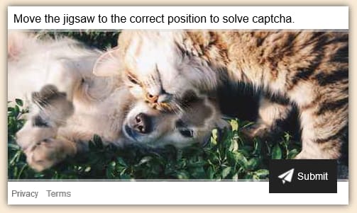
This is how it looks now:


Top comments (5)
As me:
I echo this.
White space is your friend, don't be afraid to use it and try to be consistent here to give balance.
Revise the border radius on the card, and amend the box shadow. A light amendment to the position on the Y and X axis will make your card appear more professional and realistic.
Its difficult to make out where the pieces are, try to emphasise their presence by using an outline of some sort. Use a colour that gives a good contrast to the image behind it.
Great work, would love to see the final result.
I would recommend you some tips:
Finding the piece(s) was difficult. Without a closer look, it was also hard to determine which piece I needed to drag/drop.
I would suggest filling the hole where the piece needs to go with a solid, dark color. Then you do not need any border shadow or other visual callout. It will be clear all by itself.
No opacity on the drag/drop piece (cannot tell if it has any, but looks like it might), but maybe a solid border of a few pixels. I feel like the shadow softens the piece too much, making it more difficult to locate.
If you really want to thrill your users, slightly rotate the drag/drop piece (10 degrees?), then animate the rotation back to the correct angle on mouse down. This would make that piece stand out even more, while simulating the natural interaction of a physical puzzle piece.
Overall, I really like the concept. Thanks for sharing your work, and for being open to feedback.
I would change whitespace from #fff to #fafafa to make it a tad softer and not be as harsh against the tan background.
I would also change fonts. Switching to something like Roboto or Open Sans from Google fonts will make text look a lot smoother.
I would also toss a small border radius around your card and submit button to soften things out as well. Sharp edges are more aggressive and round edges are more gentle. We got some gentle looking cat and dog bonding going on here, so rounding your edges here can go a long way.