Hey Devs! 🌼
I'm a dev student, and I would like to start producing content that can help other people. Since I'm starting in the dev community, I can relate to many difficulties that starters have, and I know that some of them seem too simple and don't even have content explanations on the internet.
Today I will be helping you to create a menu just like the one in the cover gif. As a bônus, I also set the current page with a different color on the nav bar. In this article, I'll be using a React application, which means some of the processes may be different if you're using a different kind of framework (or none at all). To create the logic that changes the page style, I'll use React Hooks.
The project is available in this repository, to use it you just need to follow the instructions in the README file. Also, there is deploy with the result if you want to see it.
I like to use this feature in my projects, however, I've never seen a tutorial explaining how to. So let's get started!😄
1. Installing Tailwind in your project
So, first thing, you need to install Tailwind. I recommend you look at the documentation (aka your best friend when coding).
2. Create the component
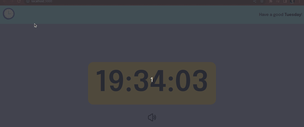
Now, you have to create the menu component. When I use React, I prefer to make it apart and add it to the pages. Here is an example of a navigation menu that I produced in my timer's project.
// component:  Nav
import  logo  from  '../assets/images/icon.png'
import  Button  from  '../components/Button';
import  LinkComponent  from  "./LinkComponent";

const  Nav  = () => {
    return (
        <nav>
            <Button
                func={() =>  setIsOpen(!isOpen)}
                txt={<img  alt="menu-burguer"  src={logo} />}
            />
            <div>
                <LinkComponent  path={"/"} txt={"Home Page"} />
                <LinkComponent  path={"/countdown"} txt={"Countdown"} />
                <LinkComponent  path={"/timer"} txt={"Timer"} />
                <LinkComponent  path={"/settings"} txt={"Settings"} />
                <LinkComponent  path={"/about"} txt={"About"} />
            </div>
        </nav>
    );
}

export  default  Nav;

// component: Button
const  Button  = ({ func, txt, isDisabled, className }) => {
    return (
        <button
            className={className}
            disabled={isDisabled}
            type="button"
            onClick={  func  }
        >
            {  txt  }
        </button>
    );
}

Button.defaultProps  = {
    isDisabled:  false,
}

export  default  Button;

// component: LinkComponent
import { Link } from  "react-router-dom"

const  LinkComponent  = ({ path, txt }) => {
    return (
        <Link
            to={path}
        >
            {txt}
        </Link>
    );
}

export  default  LinkComponent;
3. Create the logic
For this animation to work as we expect, it's necessary to have a code that allows a change of the HTML classes. That is important because you need a different animation when opening and closing de menu, besides, it's fundamental that the position set to the bar is the one where it's supposed to stay when the animation is over.
// component:  Nav
import { useState } from  "react";
import  logo  from  '../assets/images/icon.png'
import  Button  from  '../components/Button';
import  LinkComponent  from  "./LinkComponent";

const  Nav  = () => {
// the state used to change the current situation (open or closed)
    const [isOpen, setIsOpen] =  useState(false);

    return (
        <nav>
            <Button
// when the "menu" button is clicked, it sets the state for the opposite boolean value
                func={() =>  setIsOpen(!isOpen)}
                txt={<img  alt="menu-burguer"  src={logo} />}
            />
// this is the div where the menu is "hidden", so it's where the change of classes needs to happen
            <div
                className={isOpen  ? ('class for open menu') : ('class for closed menu')}
            >
                <LinkComponent  path={"/"} txt={"Home Page"} />
                <LinkComponent  path={"/countdown"} txt={"Countdown"} />
                <LinkComponent  path={"/timer"} txt={"Timer"} />
                <LinkComponent  path={"/settings"} txt={"Settings"} />
                <LinkComponent  path={"/about"} txt={"About"} />
            </div>
        </nav>
    );
}

export  default  Nav;
The bonus part, where the link to the current page is highlighted, it's a bit more complicated, since it needs more logic.
// component: LinkComponent
import { useContext, useEffect, useState } from  "react";
import { Link, useRouteMatch } from  "react-router-dom"
import  TimeContext  from  "../context/TimeContext";

const  LinkComponent  = ({ path, txt }) => {
// first, we need to get the current pathname
    const  pathname  =  useRouteMatch();
    const [isCurrent, setIsCurent] =  useState(false);
    const [currentPath, setCurrentPath] =  useState('/');

// always when the pathname is changed the function occurs
    useEffect(() => {
        setCurrentPath(pathname.path)
    }, [pathname]);

// always when the pathname or the path (props) is changed the function occurs
    useEffect(() => {
        const  changeIsCurrent  = () => {
            if (currentPath  ===  path) {
                setIsCurent(true);
            } else {
                setIsCurent(false);
            }
        }
        changeIsCurrent();
    }, [currentPath, path]);

    return (
// where happens the highlight depends if it's true (happen) or false (don't happen)
        <Link
            className={isCurrent  ? ('class when the page is the current'): ('class when the page is not the current')}
            to={path}
        >
            {txt}
        </Link>
    );
}

export  default  LinkComponent;
4. Create the animation
In the document tailwind.config.js, there's an object where you can add your custom settings. We're going to add our animation config, just like the example.
// tailwind.config.js
/** @type  {import('tailwindcss').Config} */

module.exports  = {
    content: ["./src/**/*.{js,jsx,ts,tsx}"],
    theme: {
        extend: {
            animation: {
                openmenu:  'openmenu 1s ease-in',
                closemenu:  'closemenu 1s ease-in',
            },
            keyframes: {
                openmenu: {
                // initial position
                    '0%': {left:  '-224px'},
                // final position
                    '100%': {left:  '0px'}
                },
                closemenu: {
                // initial position
                    '0%': {left:  '0px'},
                // final position
                    '100%': {left:  '-224px'}
                },
            }
        },
    },
    plugins: [],
}
5. Add the classes to the menu component
Now that you have your animation, it's time to add it to the component. This one is the result of my timer's project, but you can style it the way you like.
Alert: Don't forget to set the final position from the animation as the default in your component. That is necessary because once the animation is over, it'll be redirected to the position set.
// component:  Nav
import { useState } from  "react";
import  logo  from  '../assets/images/icon.png'
import  Button  from  '../components/Button';
import  LinkComponent  from  "./LinkComponent";

const  Nav  = () => {
    const [isOpen, setIsOpen] =  useState(false);

    return (
        <nav  className="font-epilogue">
            <Button
                className="w-20"
                func={() =>  setIsOpen(!isOpen)}
                txt={<img  alt="menu-burguer"  src={logo} />}
            />
            <div
                className={isOpen  ?
                "left-[0px] font-epilogue flex top-[12vh] animate-openmenu w-56 absolute flex-col   bg-light-ocean p-12 h-[88vh]" :
                "animate-closemenu top-[12vh] left-[-224px] flex w-56 absolute flex-col bg-light-ocean p-12 h-[88vh]"}
            >
                <LinkComponent  path={"/"} txt={"Home Page"} />
                <LinkComponent  path={"/countdown"} txt={"Countdown"} />
                <LinkComponent  path={"/timer"} txt={"Timer"} />
                <LinkComponent  path={"/settings"} txt={"Settings"} />
                <LinkComponent  path={"/about"} txt={"About"} />
            </div>
        </nav>
    );
}

export  default  Nav;

// component: LinkComponent
import { useContext, useEffect, useState } from  "react";
import { Link, useRouteMatch } from  "react-router-dom"
import  TimeContext  from  "../context/TimeContext";

const  LinkComponent  = ({ path, txt }) => {
    const  pathname  =  useRouteMatch();
    const { currentPath } =  useContext(TimeContext);
    const [isCurrent, setIsCurent] =  useState(false);
    const [currentPath, setCurrentPath] =  useState('/');

    useEffect(() => {
        setCurrentPath(pathname.path)
    }, [pathname]);

    useEffect(() => {
        const  changeIsCurrent  = () => {
            if (currentPath  ===  path) {
                setIsCurent(true);
            } else {
                setIsCurent(false);
            }
        }
        changeIsCurrent();
    }, [currentPath, path]);

    return (
        <Link
            className={isCurrent  ? (
            "mb-3 text-dark-purple font-bold bg-soft-purple p-2 text-center rounded-2xl"): (
            "mb-3 text-dark-purple hover:font-bold p-2 text-center")}
            to={path}
        >
            {txt}
        </Link>
    );
}

export  default  LinkComponent;
I hope I've enjoyed this tutorial. If you see something that can be improved, don't hesitate to get in touch with me! All feedback is very welcome.✨


Latest comments (2)
what different or any better with writing normal css animation ?
Actually, it isn't any better, it all depends on what you prefer. I choose Tailwind because I was trying to learn and when I tried to do the animation I didn't find any content about it. If you want to use the normal CSS, it will work the same way, just with a style file extra where you have to "translate" the tailwind classes into conventional CSS.