So in our previous blog post about Web Components we mainly implemented them with vanilla JS, directly writing them in the browser. In reality though, this is a fairly verbose way of creating them. Ideally we want to make use of some other technologies to help make the process a little easier.
You can of course use whatever frameworks you want to create these as many now support generating Web Components, but I think the likelyhood is that most devs will simply use whatever Umbraco uses which will be Lit.
Before we dive into creating Web Components with Lit however, I think we need to lay some groundwork and look at a couple of other technologies that we'll need to use in combination with Lit for our desired outcome.
The first of those technologies we'll look at is Vite.
About Vite
Vite is a super fast build tool to aid with development of modern web projects. We say modern as it is based around ES Modules, a new native feature of modern browsers that allows JavasScript applications to be split up into separate modules to be imported when needed.
By using only ES Modules, Vite doesn't need the large overheads of other build tools such as WebPack which tries to replicate this feature in a scripted way, often resulting in complex build configurations.
As well as being a build tool, Vite also acts as a development server allowing you to easily preview your project as your are working, saving additional complex build configurations.
Getting Started with Vite
Before you get started with Vite, you'll need to make sure you have Node.js version 14.18+, 16+ installed.
With Node.js installed, we can initialize a project by launching a terminal window and issuing the command:
$ npm create vite@latest
You'll then be presented with a setup wizard when you will give your project a name, choose the framework you want to use, and whether to use regular JavaScript, or use TypeScript.
For working our example, we'll go with the default vite-project name and choose the Lit framework with TypeScript.
To finish our project setup, we can then navigate to our project folder, install the relevant npm modules, and launch our application in the Vite dev sever by issuing the following commands:
cd vite-project
npm install
npm run dev
After running these commands, you should see the dev server URL displaying in the terminal which you can navigate to in your browser and then should see a placeholder page like so:
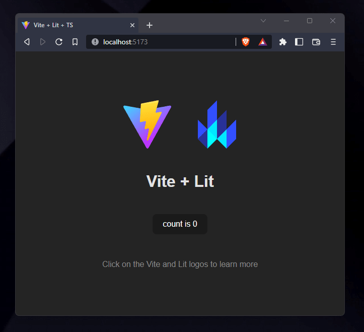
The placeholder page contains a simple example component that when clicked increments a count, just to show that everything is working correctly.
If we take a look inside our project folder, you'll see that the wizard has setup a series of config files along with a simple example Web Component.
vite-project
├── public
|   └── vite.svg
├── src
|   ├── assets
|   |   └── lit.svg
|   ├── index.css
|   ├── my-element.ts
|   └── vite-env.d.ts
├── .gitignore
├── index.html
├── package-lock.json
├── package.json
├── tsconfig.json
├── tsconfig.node.json
└── vite.config.ts
Configuration
If we take a look at our package.json file, which contains our npm configuration, we can see the Vite wizard has setup our entry point, configured our dev and build scripts, and loaded in our baseline dependencies.
{
  "name": "vite-project",
  "private": true,
  "version": "0.0.0",
  "type": "module",
  "main": "dist/my-element.es.js",
  "exports": {
    ".": "./dist/my-element.es.js"
  },
  "types": "types/my-element.d.ts",
  "files": [
    "dist",
    "types"
  ],
  "scripts": {
    "dev": "vite",
    "build": "tsc && vite build"
  },
  "dependencies": {
    "lit": "^2.3.1"
  },
  "devDependencies": {
    "typescript": "^4.6.4",
    "vite": "^3.1.0"
  }
}
We can tell from here, as we develop our own project we'll likely need to update the main, entry point component, but the rest should be fine to leave as is for basic solutions.
Next, we can take a look at vite.config.ts, which has minimal initial configuration, but again we can see a mention to our example component we'll likely need to update later on.
import { defineConfig } from 'vite'

// https://vitejs.dev/config/
export default defineConfig({
  build: {
    lib: {
      entry: 'src/my-element.ts',
      formats: ['es']
    },
    rollupOptions: {
      // external: /^lit/
    }
  }
})
Handily there is also a link to more info on the possible config options, should we need to do more advanced things later on.
In this config file though, we can see mention of rollupOptions and this is because under the hood Vite makes use of RollUp for building our project.
One thing I have changed from the default here is to comment out the external reference to Lit. It's not clear if Umbraco will be making Lit a global reference for others to use, so for the time being we can remove this line and it will ensure Lit get's bundled with our component when we build it later.
Source Files
Moving on from the config, we can also see a number of source files defined, namely index.html in the project root, and my-element.ts in the src folder.
The most important source file here is probably index.html. This is what Vite will use as the entry point to our application. If we take a look at the sample index.html file we should see something like the following:
<!DOCTYPE html>
<html lang="en">
  <head>
    <meta charset="UTF-8" />
    <link rel="icon" type="image/svg+xml" href="/vite.svg" />
    <meta name="viewport" content="width=device-width, initial-scale=1.0" />
    <title>Vite + Lit + TS</title>
    <link rel="stylesheet" href="./src/index.css" />
    <script type="module" src="/src/my-element.ts"></script>
  </head>
  <body>
    <my-element>
      <h1>Vite + Lit</h1>
    </my-element>
  </body>
</html>
A few key things to point out are that we have a script tag importing our root, entry point element
<script type="module" src="/src/my-element.ts"></script>
and then we have our markup in the body of the page using our root element Web Component tag.
<my-element>
  <h1>Vite + Lit</h1>
</my-element>
This is all Vite needs to know to be able to run our application during development. It's clever enough to automatically resolve the root components path, and will also auto-prefix any URLs it finds.
If we take a look at the my-element.ts component, we can see all the code that goes into the example click counter component on the placeholder page (we aren't going to go through this here, so you feel free to skim it):
import { LitElement, css, html } from 'lit'
import { customElement, property } from 'lit/decorators.js'
import litLogo from './assets/lit.svg'

/**
 * An example element.
 *
 * @slot - This element has a slot
 * @csspart button - The button
 */
@customElement('my-element')
export class MyElement extends LitElement {
  /**
   * Copy for the read the docs hint.
   */
  @property()
  docsHint = 'Click on the Vite and Lit logos to learn more'

  /**
   * The number of times the button has been clicked.
   */
  @property({ type: Number })
  count = 0

  render() {
    return html`
      <div>
        <a href="https://vitejs.dev" target="_blank">
          <img src="/vite.svg" class="logo" alt="Vite logo" />
        </a>
        <a href="https://lit.dev" target="_blank">
          <img src=${litLogo} class="logo lit" alt="Lit logo" />
        </a>
      </div>
      <slot></slot>
      <div class="card">
        <button @click=${this._onClick} part="button">
          count is ${this.count}
        </button>
      </div>
      <p class="read-the-docs">${this.docsHint}</p>
    `
  }

  private _onClick() {
    this.count++
  }

  static styles = css`
    :host {
      max-width: 1280px;
      margin: 0 auto;
      padding: 2rem;
      text-align: center;
    }

    .logo {
      height: 6em;
      padding: 1.5em;
      will-change: filter;
    }
    .logo:hover {
      filter: drop-shadow(0 0 2em #646cffaa);
    }
    .logo.lit:hover {
      filter: drop-shadow(0 0 2em #325cffaa);
    }

    .card {
      padding: 2em;
    }

    .read-the-docs {
      color: #888;
    }

    h1 {
      font-size: 3.2em;
      line-height: 1.1;
    }

    a {
      font-weight: 500;
      color: #646cff;
      text-decoration: inherit;
    }
    a:hover {
      color: #535bf2;
    }

    button {
      border-radius: 8px;
      border: 1px solid transparent;
      padding: 0.6em 1.2em;
      font-size: 1em;
      font-weight: 500;
      font-family: inherit;
      background-color: #1a1a1a;
      cursor: pointer;
      transition: border-color 0.25s;
    }
    button:hover {
      border-color: #646cff;
    }
    button:focus,
    button:focus-visible {
      outline: 4px auto -webkit-focus-ring-color;
    }

    @media (prefers-color-scheme: light) {
      a:hover {
        color: #747bff;
      }
      button {
        background-color: #f9f9f9;
      }
    }
  `
}

declare global {
  interface HTMLElementTagNameMap {
    'my-element': MyElement
  }
}
There is a fair bit going on here, but we'll save that for another article. For now we just need to know, we have a Lit web component then runs on our page.
Building
The last thing we will need from our build process for noe is for it to be able to build our web component to a regular JavaScript file we can import into Umbraco.
To do this we can issue the following command in a terminal window from the root of our project:
npm run build
Vite should now build our project and place our compiled files in the root level dist folder ready for us to deploy. How exactly we deploy these files / get them into a NuGet file I'm yet to figure out the relevant process, but this is a good first step and hopefully I'll blog about deployments later on.
Conclusion
The reality is, if you are just working with the Umbraco UI codebase, Vite isn't likely going to be something you need to worry about as it's already configured and just works, allowing you to get on with developing new features / fixing bugs. But if you are looking to build your own extensions for Umbraco, I think Vite will be a logical choice for many and so it's really worth getting to know it.
Having worked with other build tools in the past, Vite offers a fresh perspective with minimal config so will definately be a tool I'll be tryng to use in my projects.
The thing I'm not quite sure of yet, is how we'll be able to build and test things like property editors independently of the backoffice. Maybe there will be some mocking framework we can use, and maybe Umbraco will create some pre-configured Vite templates we can use with such a feature pre-configured.
There is also still the question of how to package our compiled files ready for deployment.
Hopefully I'll find these things out as I learn more.


Oldest comments (0)