
Originally published in Web Designer Mag: July 2017
Make SASS do the repetitive work for you
SASS is powerful tool which brings many features from other programming languages into CSS — such as functions, variables and loops — as well as bringing its own intuitive features such as mixins, nesting and partials to name a few.
Today we'll be creating social icons using SASS loops, mixins and functions. We'll also be utilising the powerful nesting available in SASS.
We'll be creating a list in SASS to generate our social icons, the list will consist of — at first — the classname, font reference and colour — and later the tooltip. We'll be using mixins to create reusable Media Queries and creating a function to turn a pixel value into an em value, to do this we'll also be creating a variable for our base font-size.
There are a number of ways to install and use SASS depending on your system and your build tooling needs — more details can be found here http://sass-lang.com/install — however we'll be using CodePen to compile our SASS into CSS to keep things as simple as possible.
To truly harness the power of SASS and not get yourself into a mess of specificity and complexity a solid understanding of CSS is required.
The particular flavour of SASS we'll be using is SCSS, meaning we'll still be using the curly braces ({}) in our SASS.
Step One - Codepen Setup
The first thing we'll need to do is create a new pen (https://codepen.io/pen/) and change some of the default settings for the CSS editor in CodePen. We'll change the CSS Preprocessor to SCSS and turn on Normalize and Autoprefixer.

CodePen CSS setup
Step Two - HTML Setup
Now we've set everything up we can start writing some code. Inside the HTML editor we'll create a container and a number of items inside containing the link and icon for each of our icons. The names used here will be used in our SASS list as a reference in CSS. We'll also be using the BEM naming convention for our class names.
<div class="social__container">
    <div class="social__item">
        <a target="_blank" href="..."
            class="social__icon--twitter">
            <i class="icon--twitter"></i>
        </a>
    </div>
    ...
</div>
Step Three - Basic Styles
Moving over to the CSS editor we'll start by including font-awesome, setting a variable for our base font-size and some basic styles for the page.
@import url(http://srt.lt/w8yT8);

// Variables
$base-font-size: 16px;

// Basic Styling
body {
    font-size: $base-font-size;
    ...
}
Step Four - Functions
Next we'll create a basic function to turn a pixel value to an em value using our $base-font-size variable. Functions in SASS are created using @function followed by the name of the function and the input used to perform the function. Then inside the declaration we use @return to output the value when using the function. The #{} surrounding the calculation is used for interpolation (http://srt.lt/g9p6Q4).
// Functions
@function px-to-em($pixels) {
    @return #{$pixels/$base-font-size}em;
}
Step Five - Mixins
Continuing on with our set-up we'll create mixins for simple mobile first media-queries utilising our px-to-em function which we will pass in a px value to return an em value.
Mixins are created using @mixin followed by a name for the mixin. Then inside the declaration we use @content to output the code we put inside the mixin when calling it later in our codebase.
@mixin viewport--large {
    @media only screen and
        (min-width: px-to-em(1680px)) {
        @content;
    }   }
@mixin viewport--medium {
    @media only screen and
        (min-width: px-to-em(1080px)) {
        @content;
    }   }
Step Six - SASS List
The last step in our setup is to create a list. Lists in SASS are created using a variable, after that the exact syntax is pretty loose, accepting a wide variety of ways to define it (http://srt.lt/aD5e8C). Inside the variable we'll define the class name, unicode value and colour for each icon, separating them with a comma, inside parentheses.
$icon-list: (
    vimeo "\f27d" #1ab7ea,
    twitter "\f099" #1da1f2,
    ...
    github "\f113" #333,
    rss "\f09e" #f26522
);
Blob
Source the icons and colours
In order to find the icons unicode values in font-awesome we can use the FontAwesome cheat sheet (http://fontawesome.io/cheatsheet/) and look for the values next to each icon. In order to find the correct hex code for each button we can use the BrandColors (https://brandcolors.net/) website.
Step Seven - Ducks in a Row
In order for our social icons to display in row we'll add some simple CSS to each of their containers.
.social__item {
    display: inline-block;
    margin-right: 0.05em;
}
Step Eight - Icon Style
To minimise the amount of CSS we output we'll be using a CSS3 selector to find all classes beginning with icon and create a shared style for them.
[class^="icon"] {
    font-family: 'FontAwesome';
    speak: none;
    font-style: normal;
    font-weight: normal;
    font-variant: normal;
    text-transform: none;
    line-height: 1;
    -webkit-font-smoothing: antialiased;
    -moz-osx-font-smoothing: grayscale; }
Step Nine - Style Button Backgrounds
Using the same method we'll do the same for the buttons defining our values in em, allowing us later to resize them using the container.
[class^="social__icon"] {
    font-size: 1em; width: 2em; height: 2em;
    background-color: #333;
    color: white;
    text-decoration: none;
    border-radius: 100%;
    text-align: center;
    display: flex;
    align-items: center;
    justify-content: center;    }
Step Ten - @each Loop for our Icons
Now we have all our base styles we can use our list to generate the CSS specific to each icon. To create a loop in SASS we use @each followed by names for each value of each item — $icon,$unicode and $icon-background — followed by the word in and then the name of the list.
Inside the loop we'll apply the $unicode value to the before pseudo element of each icon we've created in the HTML allowing our shared style we created earlier to take care of all the other styles needed.
@each $icon, $unicode, $icon-background
in $icon-list {

    .icon--#{$icon} {
        &::before {
            content: $unicode;
        }
    }

}

We've used our loop to generate the icons for each of our social icons.
Step 11 - @each Loop for our Background Colours
The icons are now all working but we still have the fallback background colour. We'll add some more code to our list to fix that. Using the same method as above we'll output the $icon name but this time on the social__icon classes and inside that the $icon-background colour.
@each $icon, $unicode, $icon-background
in $icon-list {

    ...

    .social__icon--#{$icon} {
        background-color: $icon-background;
    }
}

We've added the background colours as well as the icons to our @each loop.
Step 12 - Using our mixins
Using the mixins we created earlier and because we styled the icons using em values we can apply a font-size to the container and increase it using our media-query mixin using @include and the name of the mixin followed by the code we want to include in the media-query.
.social__container {
    font-size: 1em;

    @include viewport--medium {
        font-size: 1.5em;
    }
    @include viewport--large {
        font-size: 2em;
    }
}

Using our mixins we've updated the font size of the container to change the icons size depending on the viewport width.
Tip
Functions
Functions in css are used to return a value, usually after performing a calculation, functions can be used to perform common calculations, they can accept multiple input values to be used as part of the calculation inside the function.
In Depth
Mixins in depth
Mixins can be defined requiring input or not — for example we could create a mixin for a simple clear fix, requiring no input at all which you can simply call is using @include clearfix; — although this could also be achieved using a silent class, created using a % selector and called using @extend.
More complicated mixins can be created requiring some input or content to be passed to them when being called — for example we could create a flexbox mixin to provide a fallback for older browsers. This mixin would take a flex grow, shrink and basis property and called using @include flex(1,1,50%);.
The mixin we've created as part of the tutorial is another way mixins can be used; accepting property value pairs and replicating them inside mixins contents.
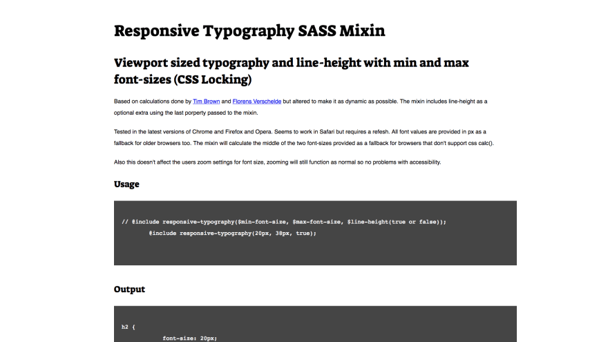
This responsive typography or CSS Locking mixin is an example of how much complexity a mixin can handle http://srt.lt/sTp6zP.
Step 13 - Interaction states and built in functions
We can add some interactivity to our buttons by changing the background colour when the button is interacted with either using the mouse or the keyboard. Sass has a number of built in colour functions (http://srt.lt/q9L1z) allowing us to take the background colour we've set in our list and mix it with black to darken the button — when interacted with.
icon--#{$icon} {
    background-color: $icon-background;

    &:hover,
    &:focus,
    &:active {
        background-color:
            mix(black, $icon-background, 15%);
    }
}
Step 14 - Transition the background colour
We can also utilise the transition property in CSS to animate the differences between the background colours. We could use the all value but that is both expensive in terms of performance and would not allow us to transition different values at different timings and timing-functions.
[class^="social__icon"] {
    ...
    transition: background-color
        150ms ease-in-out
    ;
}
Step 15 - Additional transition effects
By adding a relative positioning to the buttons and a top value and adding top to our transition property we can ready the elements for further interaction.
[class^="social__icon"] {
    position: relative;
    top: 0;
    ...
    transition: background-color
        150ms ease-in-out,
        top 250ms linear
    ;
}
Step 16 - Move the buttons up upon interaction
For this interaction there's nothing specific needed to create it therefore we can add the code to the shared class. By applying a negative top value and removing the outline we have an even clearer visual cue of interaction.
[class^="social__icon"] {
    ...
    &:hover,
    &:focus,
    &:active {
        outline: none;
        top: -0.25em;
    }
}
Step 17 - Drop shadow
We can also use the same method to create and animate a box-shadow — adding a little more depth to the interaction — changing the vertical height of the shadow at the same time as the top value.
box-shadow:
    0 0 0.25em -0.25em rgba(0,0,0,0.2);
&:hover,
&:focus,
&:active {
    ...
    box-shadow:
        0 0.5em 0.25em -0.25em rgba(0,0,0,0.3);
}

Using transition properties we've animated any interaction with the buttons — moving them up, darkening the background and adding a drop shadow.
Step 18 - Tooltips
We can easily add tooltips with CSS to add further clarity for our users. The first thing we'll do is to add the tooltip value to the list. Making sure to write them in quotes to allow the use of spaces if required.
$icon-list: (
    vimeo "Vimeo" "\f27d" #1ab7ea,
    twitter "Twitter" "\f099" #1da1f2,
    ...
    github "GitHub" "\f113" #333,
    rss "RSS" "\f09e" #f26522,
);
Step 19 - Modify the @each Loop
Due to the addition to our list we'll need to modify our @each loop to include the tooltip value ($name). We can then output that name as the content of the before pseudo element on our buttons.
@each $icon, $name, $unicode,
    $icon-background in $icon-list {
    ...

    .social__icon--#{$icon} {
        ...
        &::before {
            content: '#{$name}';
        }
    }
}
Step 20 - Style the before pseudo element
Now we have the name of each element displayed on the screen we need to style the element, adding a background colour, padding and other styling elements — as well as positioning the element and readying it for transitions and modifying the opacity and top values upon interaction.
&::before { ...
    top: -3.5em;
    opacity: 0;
    transition:
        top 250ms linear, opacity 150ms linear 150ms;
}
&:hover, ... {  ...
    &::before {
        opacity: 1;
        top: -2.5em;    }   }

We've added some basic styles to the tooltips again adding transitions to animate them into position.
Step 21 - Style the after pseudo element
We will use CSS triangles (http://srt.lt/eS9a) to create the bottom of our tooltips — again positioning the element readying it for transitions — by transitioning the opacity and top values at different timings, and adding a delay we get an animation consisting of the tooltip fading in and moving down into place.
&::after {  ...
    top: -1.9em;
    opacity: 0;
    transition:
        top 250ms linear, opacity 150ms linear 150ms;
}
&:hover, ... {  ...
    &::after {
        opacity: 1;
        top: -0.9em;    }   }
CodePen Collection of tutorial steps
http://srt.lt/tG2G7Z


Top comments (0)