TL;DR
With four steps of coding, we can animate transitions for a React app without relying on external libraries.
First, use four state values for UI change: closed, opening, open, and closing.
Second, render a component when the state value is either opening, open, or closing. In other words:
{state !== "closed" ? (
  <div />
) : null}
Third, trigger the exiting animation by adding a data attribute to the exiting component:
{state !== "closed" ? (
  <div data-closing={state === "closing"} />
) : null}
With the following CSS selectors, entering and exiting animation start when the state turns opening and closing, respectively:
div {
  animation: /* Set entering animation parameters here */
}
div[data-closing="true"] {
  animation: /* Set exiting animation parameters here */
}
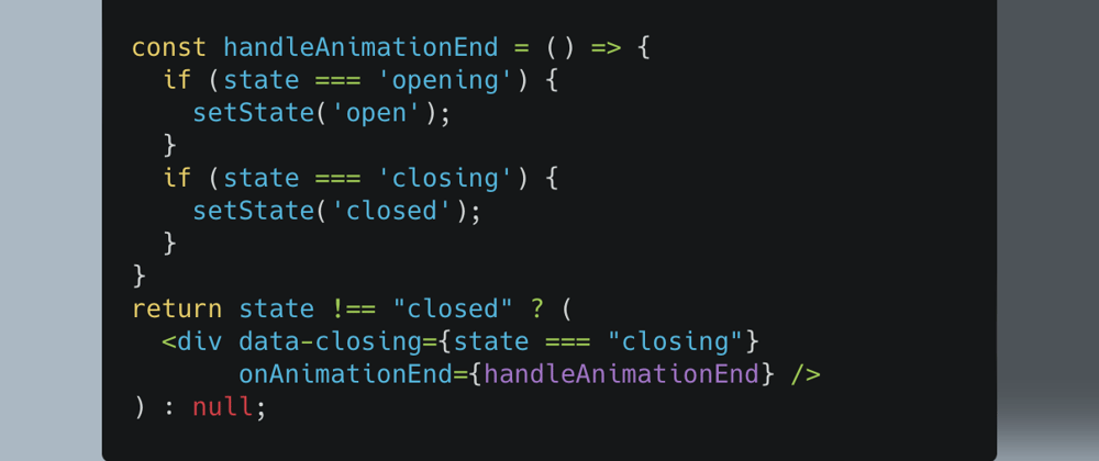
Finally, to switch the UI state from opening to open, or from closing to closed, use the onAnimationEnd prop:
{state !== "closed" ? (
  <div
    data-closing={state === "closing"}
    onAnimationEnd={handleAnimationEnd} // ADDED
  />
) : null}
const handleAnimationEnd = () => {
  if (state === 'opening') {
    setState('open');
  }
  if (state === 'closing') {
    setState('closed');
  }
}
In the text below, I use an example of opening and closing a search box popup for more detailed description. Here is the CodeSandbox demo for this article.
1. Motivation
Implementing transition animation with React is a bit tricky. Entering animation is fine. We can simply use CSS animation, which will be triggered when a React component gets mounted. Difficulty comes with exiting animation. When a component gets dismounted, we have no opportunity to apply a set of CSS declarations for animation to that component.
There are a bunch of animation libraries to overcome this difficulty. The most famous is probably React Transition Group. There are also Framer Motion, React Spring, and Transition Hook.
To my eyes, all these libraries make the code for React components less intuitive than necessary. I'd rather code from scratch on my own to keep the code base easy to maintain.
Below I describe how I did so for My Ideal Map, a web app I’m building. As a specific example, this article aims to animate the opening and closing of a search box popup. But the same logic can be applied to other cases of transition animation.
For the ease of exposition, I stick to a simple transition animation of fade-in and fade-out (which I use for the reduced motion mode) so that the reader will not get distracted by the complexity of animation per se.
 Fade-in and fade-out transitions that this article will implement with React
2. UI state management with React
Imagine that an app does not show a search box by default, to save the screen space. Instead, it shows a search button the pressing of which will open the search box.
2.1 Initial state
I set the UI state as an object called ui with two properties, searchButton and searchBox. The initial values of these two properties are open and closed, respectively.
const [ui, setUi] = useState({
  searchButton: 'open',
  searchBox: 'closed',
});
2.2 Opening search box
When the user presses the search button, the following event handler will be executed to change the UI state to closing and opening:
const handleClickSearchButton = () => {
  setUi({
    searchButton: 'closing',
    searchBox: 'opening',
  });
};
This handler is going to be attached to the search button element as the onClick prop value (see below for detail).
Then, when the transition animation ends, which triggers the animationend event, the following event handler will be executed to set the UI state to be closed and open:
const handleAnimationEnd = () => {
  setUi({
    searchButton: 'closed',
    searchBox: 'open',
  });
This handler is going to be attached to the form element, the parent of both the search button and the search box popup, as the onAnimationEnd prop value (see Section 2.6 below).
2.3 Closing search box
When the close button in the search box popup is pressed, the following event handler will set the UI state to be opening and closing:
const handleClickCloseButton = () => {
  setUi({
    searchButton: 'opening',
    searchBox: 'closing',
  });
};
This handler is going to be attached to the close button element as the onClick prop value (see Section 2.5 below).
When the transition animation ends, the event handler will set the UI state to be the initial values. This is done by revising the handleAnimationEnd function as follows:
  const handleAnimationEnd = () => {
    if (ui.searchButton === 'closing') { // ADDED
      setUi({
        searchButton: 'closed',
        searchBox: 'open',
      });
    } // ADDED
    // ADDED FROM HERE
    if (ui.searchBox === 'closing') {
      setUi({
        searchButton: 'open',
        searchBox: 'closed',
      });
    }
    // ADDED UNTIL HERE
  };
Since the animationend event is fired both when the search button completely disappears and when the search box popup completely disappears, I need to check which of these two events occurs. This is why I use the following two conditions:
if (ui.searchButton === 'closing') {}
if (ui.searchBox === 'closing') {}
2.4 Rendering search button
Now, we want to render the search button unless its UI state is closed:
{ui.searchButton !== 'closed' ? (
  <ButtonCloud
    aria-expanded="false"
    aria-label="Search a place on the map"
    onClick={handleClickSearchButton}
    type="button"
  >
    <!-- SVG code for magnifying glass icon (omitted) -->
  </ButtonCloud>
) : null}
where the ButtonCloud component refers to the search button element. Its CSS code for animation will be set with Styled Components in Section 3 below.
Note that the handleClickSearchButton function, defined in Section 2.2 above, is attached as the onClick prop value.
2.5 Rendering search box
We also want to render the search box unless its UI state is closed:
{ui.searchBox !== 'closed' ? (
  <DivSearchBackground
    data-testid="div-search-background"
  >
    <CloseButton
      ariaLabel="Close search box"
      handleClick={handleClickCloseButton}
    />
    <SearchBox closeSearchBox={closeSearchBox} id="searchbox" />
  </DivSearchBackground>
) : null}
where DivSearchBackground, CloseButton, and SearchBox refer to the popup, the close button, and the search box, respectively. Among these, DivSearchBackground will be styled with Styled Components for animation in Section 3 below.
Note that the handleClickCloseButton function, defined in Section 2.3 above, is attached to CloseButton as its handleClick prop (see Day 18 of this blog series how the CloseButton component is composed).
2.6 “Animaitonend” event handler
To listen to the animationend event, its event handler is attached to the <form role="search"> element that contains both the search button and the search box popup as its child elements. The entire JSX is now as follows:
<form
  onAnimationEnd={handleAnimationEnd}
  role="search"
>
  {ui.searchButton !== 'closed' ? (
    <ButtonCloud
      aria-expanded="false"
      aria-label="Search a place on the map"
      onClick={handleClickSearchButton}
      type="button"
    >
      <!-- SVG code for magnifying glass icon (omitted) -->
    </ButtonCloud>
  ) : null}
  {ui.searchBox !== 'closed' ? (
    <DivSearchBackground
      data-testid="div-search-background"
    >
      <CloseButton
        ariaLabel="Close search box"
        handleClick={handleClickCloseButton}
      />
      <SearchBox closeSearchBox={closeSearchBox} id="searchbox" />
    </DivSearchBackground>
  ) : null}
</form>
As the event bubbles up in the DOM tree, both the end of animation for the search button (ButtonCloud) and for the search box popup (DivSearchBackground) will be caught by their parent element, the <form role="search"> element.
2.7 For styling the exit animation
Finally, to animate the disappearance of the search button and the search box popup, the data-closing attribute is added to them to trigger CSS animation:
return (
  <form role="search" onAnimationEnd={handleAnimationEnd}>
    {ui.searchButton !== 'closed' ? (
      <ButtonCloud
        aria-expanded="false"
        aria-label="Search a place on the map"
        data-closing={ui.searchButton === 'closing'} // ADDED
        onClick={handleClickSearchButton}
        type="button"
      >
        <!-- SVG code for magnifying glass icon (omitted) -->
      </ButtonCloud>
    ) : null}
    {ui.searchBox !== 'closed' ? (
      <FocusLock>
        <DivSearchBackground
          data-closing={ui.searchBox === 'closing'} // ADDED
          data-testid="div-search-background"
        >
          <CloseButton
            ariaLabel="Close search box"
            handleClick={handleClickCloseButton}
          />
          <SearchBox closeSearchBox={closeSearchBox} id="searchbox" />
        </DivSearchBackground>
      </FocusLock>
    ) : null}
  </form>
)
This way, we can use the attribute selector
[data-closing="true"] {
  animation: ...
}
to style the exit animation (see Section 3 below for more detail).
We’re done with the coding for React components. Now it’s time to style transition animation with CSS.
3. Setting animation parameters
3.1 Opening search box
For the search box to enter, we want it to fade in with the duration of 300ms and the linear easing.
The choice of 300ms is inspired from Material Design. Jonas Naimark, a Material Design team member, states as follows:
Since nav transitions usually occupy most of the screen, a long duration of 300ms is a good rule of thumb. — Naimark (2018).
The linear easing is typically used for animation that doesn’t involve any movement:
Linear motion can, for example, be used only when the object changes its color or transparency. Generally speaking, we can use it for the states when an object does not change its position. — Skytskyi (2018)
The fade-in animation can be achieved with the following keyframes and the backwards value of animation-fill-mode property:
@keyframes fade-in {
  0% {
    opacity: 0;
  }
  100% {
    opacity: 1;
  }
}
animation-fill-mode: backwards;
animation-name: fade-in;
The backwards value of animation-fill-mode prevents the flash of the default style before animation starts. Every HTML element has the opacity of 1 by default. If animation starts with the opacity value less than 1, we need animation-fill-mode: backwards.
At the same time as the search box enters, we want the search button to disappear with fade-out animation. To match the timing of animation, I use the same duration and easing values.
The fade-out animation can be defined as follows:
@keyframes fade-out {
  0% {
    opacity: 1;
  }
  100% {
    opacity: 0;
  }
}
animation-fill-mode: forwards;
animation-name: fade-in;
By default, an HTML element’s default style (including opacity: 1) will appear after animation is over. To avoid the flash of an element after fade-out animation, therefore, we need the forwards value of aniamtion-fill-mode.
To summarize the animation parameters I have set so far, let’s define a JavaScript object called animation:
// ./utils/animation.js
import { keyframes } from "styled-components";
export const animation = {
  openSearchBox: {
    duration: "300ms",
    easing: "linear",
    button: {
      opacity: keyframes`
        from {
          opacity: 0;
        }
        to {
          opacity: 1;
        }
     `,
      fillMode: "backwards",
    },
    popup: {
      opacity: keyframes`
        from {
          opacity: 0;
        }
        to {
          opacity: 1;
        }
     `,
      fillMode: "backwards",
    },
  },
};
Styled Components allow us to store keyframes as a variable with its keyframes helper (see Styled Components docs for detail).
To apply these parameters to the DivSearchBackground styled component for the search box popup, we code as follows:
// ./styled-components/DivSearchBackground.js
import styled, {css} from 'styled-components';

...

const animateTransitionIn = css`
  animation-duration: ${animation.openSearchBox.duration};
  animation-fill-mode: ${animation.openSearchBox.popup.fillMode};
  animation-name: ${animation.openSearchBox.popup.opacity};
  animation-timing-function: ${animation.openSearchBox.easing};
`;

export const DivSearchBackground = styled.div`
  ...
  ${animateTransitionIn}
`;
where the css helper is necessary to refer to the keyframes for the animation-name property.
To apply the animation parameters to the ButtonCloud styled component for the search button, we code as follows:
// ./styled-components/ButtonCloud.js
import styled, {css} from 'styled-components';

...

const animateTransitionOut = css`
  &[data-closing="true"] {
    animation-duration: ${animation.openSearchBox.duration};
    animation-fill-mode: ${animation.openSearchBox.button.fillMode};
    animation-name: ${animation.openSearchBox.button.opacity};
    animation-timing-function: ${animation.openSearchBox.easing};
  }
`;
export const ButtonCloud = styled.button`
  ...
  ${animateTransitionOut}
`;
Note that I use the [data-closing="true"] attribute selector to define animation. This will apply only when the React state value for ui.searchButton is "closing" (see Section 2.7 above).
I believe this way of setting the parameters of transition animation is easier to maintain than using CSS variables with which (1) the nested structure of variables is infeasible and (2) the content of @keyframes cannot be stored. (Let me know if you have a different opinion.)
With the help of Styled Components (or other CSS-in-JS solutions), just going through one set of code, we can be reminded of how animation parameters were set by someone else or by ourselves in the past.
3.2 Closing search box
To close the search box, I want the fade-out animation with the duration of 250ms and the linear easing.
Duration is 50ms shorter than for opening the search box. According to the Material Design guidelines:
Transitions that close, dismiss, or collapse an element use shorter durations. Exit transitions may be faster because they require less attention than the user’s next task. — Google (undated)
For the search button to appear, I want the fade-in animation with the same duration and easing.
So we update the animation parameter object as follows:
// ./utils/animation.js
import { keyframes } from "styled-components";
export const animation = {
  openSearchBox: {
    ...
  },
  // ADDED FROM HERE
  closeSearchBox: {
    duration: "250ms",
    easing: "linear",
    button: {
      opacity: keyframes`
        from {
          opacity: 0;
        }
        to {
          opacity: 1;
        }
     `,
      fillMode: "backwards"
    },
    popup: {
      opacity: keyframes`
        from {
          opacity: 1;
        }
        to {
          opacity: 0;
        }
      `,
      fillMode: "forwards"
    },
  },
  // ADDED UNTIL HERE
};
These parameters are applied to the two styled components as follows:
// ./styled-components/DivSearchBackground.js
import styled, {css} from 'styled-components';

...

// ADDED FROM HERE
const animateTransitionOut = css`
  &[data-closing="true"] {
    animation-duration: ${animation.closeSearchBox.duration};
    animation-fill-mode: ${animation.closeSearchBox.popup.fillMode};
    animation-name: ${animation.closeSearchBox.popup.opacity};
    animation-timing-function: ${animation.closeSearchBox.easing};
  }
`;
// ADDED UNTIL HERE

export const DivSearchBackground = styled.div`
  ...
  ${animateTransitionIn}
  ${animateTransitionOut} /* ADDED */
`;
// ./styled-components/ButtonCloud.js
import styled, {css} from 'styled-components';

...

// ADDED FROM HERE
const animateTransitionIn = css`
  animation-duration: ${animation.closeSearchBox.duration};
  animation-fill-mode: ${animation.closeSearchBox.button.fillMode};
  animation-name: ${animation.closeSearchBox.button.opacity};
  animation-timing-function: ${animation.closeSearchBox.easing};
`;
// ADDED UNTIL HERE

export const ButtonCloud = styled.button`
  ...
  ${animateTransitionIn} /* ADDED*/
  ${animateTransitionOut}
 ;
3.3 More elaborate transition animation
For My Ideal Map, the web app I’m building, I use more elaborate transition animation for the search box popup. That’ll be the topic of next two posts of this blog series.
However, the above simple fade-in and fade-out animation will be used for the reduced motion mode.
4. Demo
The entire code is available in the CodeSandbox for this blog post.
Compare this demo to the one without transition animation. I believe it feels nice and tender with transition animation.
References
Google (undated) “Speed”, Material Design, undated.
Naimark, Jonas (2018) “Motion Design Doesn’t Have to be Hard”, Google Design, Sep 27, 2018.
Skytskyi, Taras (2018) “The ultimate guide to proper use of animation in UX”, UX Collective, Sep 5, 2018.


Top comments (0)