If you're familiar with Material Design, it's a common UI trend nowadays, and creating the floating label for inputs can be hard to achieve with pure CSS. Here's how to do it easily using pure CSS and JavaScript.
1. Creating the CSS
      * {
        box-sizing: border-box
      }
      body {
        width: 30vw;
        margin: auto;
        font-family: 'Roboto', sans-serif;
      }
      .input {
        margin-bottom: 10px
      }
      .input label {
        position: absolute;
        color: #aaa;
        font-size: 15px;
        margin-top: 15px;
        transition: margin-top .3s, font-size .3s, margin-left .3s, padding .3s, color .2s;
      }
      .input input {
        outline: none;
        border: 0;
        width: 100%;
        padding: 15px 0px;
        transition: border .2s, box-shadow .2s;
        border-bottom: 1.5px solid #aaa;
        font-size: 15px
      }
      .input input:focus {
        border-color: #512da8;
        box-shadow: 0px -1px 0px 0px #512da8 inset;
      }
      .input input:focus ~ label {
        color: #512da8
      }
      .input-active label {
        font-size: 13px !important;
        margin-top: -5px;
        margin-left: -1px;
        color: #512da8;
      }
      .input-border input {
        border: 1.5px solid #aaa;
        padding-left: 10px;
        border-radius: 3px;
      }
      .input-border input:focus {
        box-shadow: 0px 0px 0px 1px rgba(81,45,168,1);
      }
      .input-border label {
        background: white;
        margin-left: 10px;
      }
      .input-border.input-active label {
        margin-top: -6px;
        padding: 0 3px;
        margin-left: 6px;
        color: #512da8
      }
      .input-filled-in-not-focus label {
        color: #aaa !important
      }
Explained
.input - this is the input's container.
.input label - Targeting the input's label
.input-border - Just another example with a border-style input
.input input - Targeting the input container's input
.input-active - When the input is active, the label will float up
.input-filled-in-not-focus - If the input is filled in and not focused, sets the label to default color.
2. Creating the HTML
This is the easy part. Just a couple of divs, labels, and inputs!
 <div class="input">
  <label>Name</label>
  <input type="text" autocomplete="off" autofocus spellcheck="false">
 </div>
 <div class="input">
  <label>Email</label>
  <input type="text" autocomplete="off" autofocus spellcheck="false">
 </div>
 <div class="input input-border">
  <label>Bordered</label>
  <input type="text" autocomplete="off" autofocus spellcheck="false">
 </div>
Note that the last one is a bordered input
3. Creating the JS
Now we're talking! Let's add a simple JS function to get all the inputs, and move the labels up and down on focus and blur.
   var inputs = document.getElementsByClassName('input');
      for (i = 0; i < inputs.length; i++) {
        inputs[i].getElementsByTagName('input')[0].addEventListener('focus', function() {
          this.parentElement.classList.add('input-active');
          this.parentElement.classList.remove('input-filled-in-not-focus');
        });
        inputs[i].getElementsByTagName('input')[0].addEventListener('blur', function() {
          if(this.value == "") {
            this.parentElement.classList.remove('input-active');
          }
          else {
            this.parentElement.classList.add('input-filled-in-not-focus');
          }
        });
      }
Final Code!!!
<!DOCTYPE html>
<html>
<head>
<link href="https://fonts.googleapis.com/css2?family=Roboto&display=swap" rel="stylesheet">
<style>
* {
box-sizing: border-box
}
body {
width: 30vw;
margin: auto;
font-family: 'Roboto', sans-serif;
}
.input {
margin-bottom: 10px
}
.input label {
position: absolute;
color: #aaa;
font-size: 15px;
margin-top: 15px;
transition: margin-top .3s, font-size .3s, margin-left .3s, padding .3s, color .2s;
}
.input input {
outline: none;
border: 0;
width: 100%;
padding: 15px 0px;
transition: border .2s, box-shadow .2s;
border-bottom: 1.5px solid #aaa;
font-size: 15px
}
.input input:focus {
border-color: #512da8;
box-shadow: 0px -1px 0px 0px #512da8 inset;
}
.input input:focus ~ label {
color: #512da8
}
.input-active label {
font-size: 13px !important;
margin-top: -5px;
margin-left: -1px;
color: #512da8;
}
.input-border input {
border: 1.5px solid #aaa;
padding-left: 10px;
border-radius: 3px;
}
.input-border input:focus {
box-shadow: 0px 0px 0px 1px rgba(81,45,168,1);
}
.input-border label {
background: white;
margin-left: 10px;
}
.input-border.input-active label {
margin-top: -6px;
padding: 0 3px;
margin-left: 6px;
color: #512da8
}
.input-filled-in-not-focus label {
color: #aaa !important
}
</style>
</head>
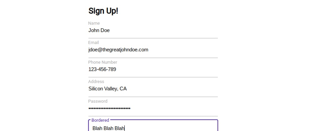
<body>
<br>
<h2>
Sign Up!
</h2>
<div class="input">
<label>Name</label>
<input type="text" autocomplete="off" autofocus spellcheck="false">
</div>
<div class="input">
<label>Email</label>
<input type="text" autocomplete="off" autofocus spellcheck="false">
</div>
<div class="input">
<label>Phone Number</label>
<input type="text" autocomplete="off" autofocus spellcheck="false">
</div>
<div class="input">
<label>Address</label>
<input type="text" autocomplete="off" autofocus spellcheck="false">
</div>
<div class="input">
<label>Password</label>
<input type="password" autocomplete="off" autofocus spellcheck="false">
</div>
<div class="input input-border">
<label>Bordered</label>
<input type="text" autocomplete="off" autofocus spellcheck="false">
</div>
<script>
var inputs = document.getElementsByClassName('input');
for (i = 0; i < inputs.length; i++) {
inputs[i].getElementsByTagName('input')[0].addEventListener('focus', function() {
this.parentElement.classList.add('input-active');
this.parentElement.classList.remove('input-filled-in-not-focus');
});
inputs[i].getElementsByTagName('input')[0].addEventListener('blur', function() {
if(this.value == "") {
this.parentElement.classList.remove('input-active');
}
else {
this.parentElement.classList.add('input-filled-in-not-focus');
}
});
}
</script>
</body>
</html>
Demo: https://webcode.rf.gd/index.php?id=66
Hopefully this was useful.
This would have in pure CSS easier if it had a parent element selector!


Top comments (1)
Nice one.
I've battled this too making a marko-component with floating lables. Never had so much use of the sibling selectors
~and+before =)