In the current world, you can find the data everywhere. It is easier to get lost while analyzing data and may result in no outcome from it. Data can be represented in the form of chart / graph & makes it easier to analyze & helps to tell stories from it. You can visualize the chart in variety of forms to describe different sets of data & different use-cases. It's up to you to choose the best suitable chart to describe your data. This article gives some tips & tricks to make your data visualization better.
Organize the Data
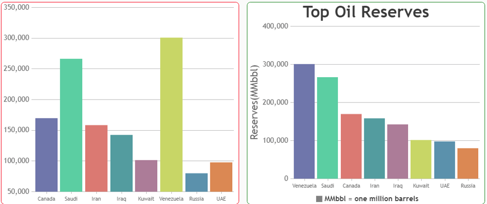
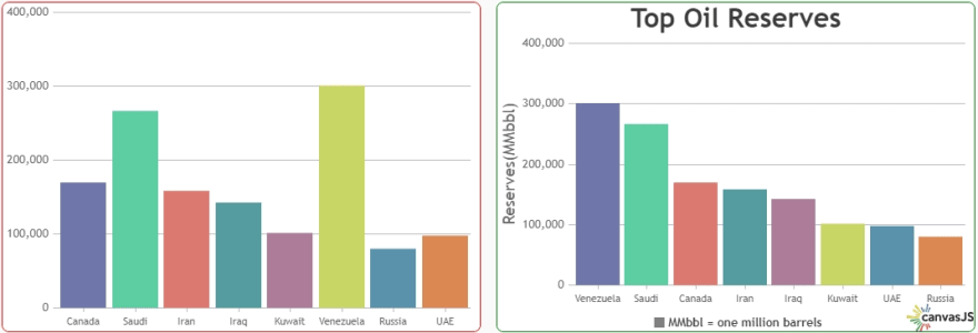
Unsorted data makes chart less readable and difficult to interpret the data. Especially in case of bar charts, this can be a make a huge difference. For bar chart, the better sequence is to show data in descending order from left to right.
Combine Similar Charts
If there are multiple data-set with similar metrics to be presented in a page, try to combine them and show it in a single chart. For e.g., if sales team wants to compare their actual and projected metrics, it can be shown using multi series chart.

Give Descriptive Title
Chart title should describe the context of the chart - users will recall the chart with its title. Try to make the title as simple and descriptive as possible. Along with the descriptive title, you should also match it up with application theme - like font-family and color. Giving title to axes can also help in improving readability of the chart.
Format Axis Labels & Use Proper Units
Showing labels with infinite decimal numerals doesn't make sense and are pointless until and unless the range of chart is too small. One should avoid showing decimals or try to have some precision for displaying numbers in the axis labels. Also, you should represent the thousand separator based on regions. Some of the region uses "," or "." as thousand separator. Along with separator, you should also try to reduce the label length. For e.g., if the data is in the range of millions like 2000000, 4000000, etc., you can try to reduce the label length by denoting it as 2M, 4M, etc.

Select Appropriate Color Palettes
Don't try to make rainbow in your chart. By choosing appropriate color palettes, you can grab the attention of user and can help them visualize data better. You can select color based on the brand colors or website theme. Same type of data can be presented in single color. For e.g. Let's consider a scenario of showing monthly page visits across different years as bar chart. Instead of representing each month value by different color you should use single color to display value for each year. Using different color for different year data will make comparison easier. Also, in case of stock data one can show different colors whenever stock value is increasing or decreasing.

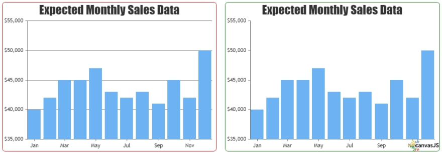
Remove Distractions from the Chart
Try to make your chart cleaner without any distractions. As Tufte's principle states, "Erase non-data-ink and Erase redundant data-ink". Gridlines in chart can result in distraction and are redundant to depict the chart.
Use Legends only for Multi Series Chart
Legends shows information about data-set which makes it easier to identify them in the chart. But showing legend for a single series is irrelevant as either chart title or axis itself provides such information. You should try to show legend only when you have multiple data-sets to be displayed in the chart or in case of pie or donut.

Thus, we have gone through some of the tips that makes your data visualization intuitive and lets you tell your data stories in the form of chart more efficiently & effectively.
If you have any tips which I have missed out on this list, please let me know in the comments below.


Oldest comments (0)