This week, a colleague and I developed a couple of plugins for ContentStack. A theme-picker:

... as well as a layout-picker:

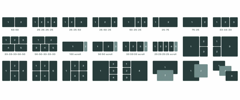
Working on the layout-picker, I quickly realized, that I'd need some JavaScript to help me render SVG-icons for all the various layout-options. The ones pictured above are the simple ones – on other projects, the layouts are much more complicated.
The icons consists of <rect> and <text>-elements.
Each <rect> have width, height, x and y-attributes:
<rect width="${w}" height="${h}" x="${x}" y="${y}" />
If we store the logic for a simple icon with two "columns" in JavaScript, it looks like this:
{
  text: '50-50',
  rects: [
    { w: 50, h: 100, x: 0, y: 0  },
    { w: 50, h: 100, x: 50, y: 0  }
  ]
}
In SVG, this equals to:
<svg viewBox="0 0 100 100">
  <rect rx="0" width="50" height="100" x="0" y="0" />
  <rect rx="0" width="50" height="100" x="50" y="0" />
</svg>
– which looks like this (for clarity, I've added text for the "columns"):

Still not looking great ... we need to control gaps as well.
Let's create a gap-const, and deduct it from w and h:
<rect width="${w - gap}" height="${h - gap}" x="${x}" y="${y}" />
And maybe some border-radius? For a <rect>-element, this is the rx-attribute:

Much better!
Let's add the <text>-elements. These just need the x and y-attributes:
<text x="${x}" y="${y}">TEXT</text>
We want to center these, relative to the <rect>:
  const tX = x + (w / 2) - 4;
  const tY = y + (h / 2) + 2;
The -4 and +2 is relative to the font-size, and might need to be adjusted, if you change the font and/or size.
So ... that's the core of it. An object-representation (either native or converted from JSON) of a layout, rendered with <rect>- and <text>-nodes.
I find the object-representation super-simple to work with:
{
  text: '25-25-25-25',
  rects: [
    { w: 25, h: 50, x: 0, y: 25  },
    { w: 25, h: 50, x: 25, y: 25  },
    { w: 25, h: 50, x: 50, y: 25  },
    { w: 25, h: 50, x: 75, y: 25  }
  ]
},
{
  text: '25-25-50',
  rects: [
    { w: 25, h: 50, x: 0, y: 25  },
    { w: 25, h: 50, x: 25, y: 25  },
    { w: 50, h: 50, x: 50, y: 25  }
  ]
},
/* etc .*/
Now we just need a function we can call with the array of layout-objects, gap and border-radius:
function renderIcons(layouts, gap, borderRadius) {
  return layouts.map(icon => {
    return `<svg viewBox="0 0 100 100">${
      icon.rects.map((rect, index) => {
        const tX = rect.x + (rect.w / 2) - 4;
        const tY = rect.y + (rect.h / 2) + 2;
        return `
        <rect rx="${borderRadius}" width="${rect.w - gap}" height="${rect.h - gap}" x="${rect.x}" y="${rect.y}"${rect.class ? `class="${rect.class}"`:''} />
        <text x="${tX}" y="${tY}%">${index+1}</text>` }).join('')

    }${icon.text? `<text x="50%" y="90%" class="text">${icon.text}</text>`:''}
    </svg>`
  }).join('')
}
To render the icons, simply create a wrapper and call the method:
wrapper.innerHTML = renderIcons(layouts, 2, 3)
Demo
Here's a Codepen-demo. Scroll down for hue- and saturation-controls, if you want to adjust the colors:


Top comments (0)