All websites need <button>s. With CSS Custom Properties it's easier than ever to maintain complex scenarios.
Because a <button> can be rather complex.
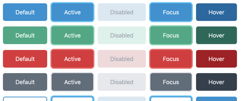
First of all, it has 5 states:

- Default
- Active
- Disabled
- Focus
- Hover
Each state can — or rather should — have different styling, for example:
background-colorborder-colorbox-shadowcolor
You could also add border-width and many more, but with just these 4 properties, we already have 20 variants:
5 states ✕ 4 properties
Let's throw in "dark mode" as well, and we have 40 variants:

Adding a simple modifier such as "outline", creates another 40 variants:

So far we have 80 variants, just for a "blue button".
With CSS Custom Properties we can simplify the amount of CSS-code needed to create all these variants.
To start with, we define the 4 properties like this:
--btn-bdc: hsl(201, 79%, 46%);
--btn-bgc: hsl(201, 79%, 46%);
--btn-bxsh: transparent;
--btn-c: hsl(195, 100%, 100%);
And in the CSS for the button:
.c-btn {
  /* Excerpt */
  background-color: var(--btn-bgc);
  border-color: var(--btn-bdc);
  box-shadow: var(--btn-bxsh--sz) var(--btn-bxsh);
  color: var(--btn-c);
}
The next step is to create CSS properties for all the other states — we need 20 properties in total per button color:
/* :active */
--btn-bdc--act: hsl(201, 79%, 46%);
--btn-bgc--act: hsl(201, 79%, 46%);
--btn-bxsh--act: hsl(197, 92%, 61%);
--btn-c--act: hsl(195, 100%, 100%);
We also need CSS for all the states, here's "active":
.c-btn:active {
  background-color: var(--btn-bgc--act);
  border-color: var(--btn-bdc--act);
  box-shadow: var(--btn-bxsh--act);
  color: var(--btn-c--act);
}
Repeat these for :disabled, :hover and :focus.
Putting it all together
Now to create — let's say — the 20 variants needed for a green button, all we have to do is add a modifier-class with updated properties:

.c-btn--green {
  --btn-bdc: hsl(162, 63%, 41%);
  --btn-bdc--act: hsl(162, 63%, 41%);
  --btn-bdc--foc: hsl(162, 63%, 41%);
  --btn-bgc: hsl(162, 63%, 41%);
  --btn-bgc--act: hsl(162, 63%, 41%);
  --btn-bgc--dis: hsl(162, 50%, 90%);
  --btn-bgc--foc: hsl(162, 63%, 41%);
  --btn-bgc--hov: hsl(168, 80%, 23%);
  --btn-bxsh--act: hsl(158, 58%, 62%);
  --btn-bxsh--foc: hsl(158, 58%, 62%);
  --btn-c: hsl(152, 68%, 100%);
  --btn-c--hov: hsl(152, 68%, 100%);
}
Here's a Codepen with all the variants:
Thanks for reading!


Top comments (0)